* * * * * * * * * *
This work is by Mike Kecseg.
"Chicago Fire"
For many years the Chicago Calligraphy Collective has sponsored a juried exhibition for their members. Normally, members are invited to submit their best work with few restrictions or rules as to what they can submit. However, at one of the earliest shows back in the late 1980's, the exhibit committee decided to have a theme. They picked the theme of Chicago and all submitted work needed to reflect that theme.
At that time I was doing some experimenting with developing a pointed pen script that would break with the more traditional letterforms that are normally associated with pointed pen. I had been doing and teaching traditional copperplate for many years and while I enjoyed the look and usefulness of it, I also felt restricted by it at the same time. I started to feel frustrated by the fact that while broad pen letterers had an array of styles available to them, pointed pen letterers seemed to be relegated to just two styles, copperplate and spencerian. Those traditional styles worked well for most of the jobs I did as a working calligrapher but when it came to doing more personal work I wanted to be able to use the tool I loved but in a more expressive way. I started to play with the pointed pen and concentrate more on the strokes the
pen made rather than making specific letters. At the same time I tried to imitate some broad edge pen letter styles knowing that the two tools work in different ways and create totally different marks. I realized that I needed to keep the visual flavor of the broad edge pen style but not exactly imitate it. The first style I worked on was the informal script I developed which is basically a mix of copperplate and italic.
In the Chicago Fire piece I used that style to create the flames. The lettering is going vertical creating a flame like look that is helped by the use of color. If you look at a flaming match the hottest part of the flame near the head is bright white and gradually turns to yellow and orange so I used those colors to help create the same effect. I also wanted to add some movement to the lettering so all straight lines were eliminated and adding some flourishing at the end of each line helped with that. I also added a small gold mark at the top of each line of text to add some more visual interest.
For the text I used three newspaper accounts of the fire that went from describing it as a disaster to which the city would never recover, to a hopeful account that spoke of a bright future for the city despite the disaster. Because of the length of the texts the piece ended up being long and vertical which was exactly what I wanted but I also felt it needed some base for the flame like lettering to sit on. I knew I wanted to use capitals but wasn't sure what style or tool I wanted to use. I experimented using both a broad edge pen and a pointed pen. I ultimately decided to keep with a pointed pen and ended up developing a pointed pen uncial style.
After the juried show was over I took the piece with me to the calligraphy conference in Portland and put it up in the student exhibit. It got a lot of interest there from other participants and the following year I was asked to teach at the calligraphy conference held outside of Detroit. I knew I'd be teaching a traditional copperplate but I also wanted to develop a class that would use the things I developed in the Chicago Fire piece. That was the first time I taught my Pointed Pen Variations class. Since then I've had the pleasure of teaching it all over the country to lots of other calligraphers.
In Chicago we have had our study group meetings for the last 32 years. It has been a great source of support for friendship and creativity. Of course some months are better attended than others, and the quality and volume of the work varies. But I have always come away feeling better. From time to time, however, I’m saddened by the thought that with all the inspiring work that has passed through those doors, none of it has been chronicled. There will be no evidence that we even existed!
I know that over the years other study groups in other cities have sprung up, varying in size and frequency of meeting. In featuring all levels of works from them, the point is to show just how important a study group can be in our development as calligraphers, at so many different levels. And, YES, it shows, indeed, WE WERE HERE! This informal gathering of kindred spirits has nurtured us, given us continuity in ways we may have hoped for, or may never have expected. I would like for it to be a legacy to pass on to current and future calligraphers: a way to inspire others to start their own study groups.
So, for the beginning of this year I will be featuring attendees of our Chicago group. We have had an embarrassment of riches over the decades when it comes to talent. This is a sampling. PLEASE send me works from any study group you may have been part of so it may be featured here and inspire others:

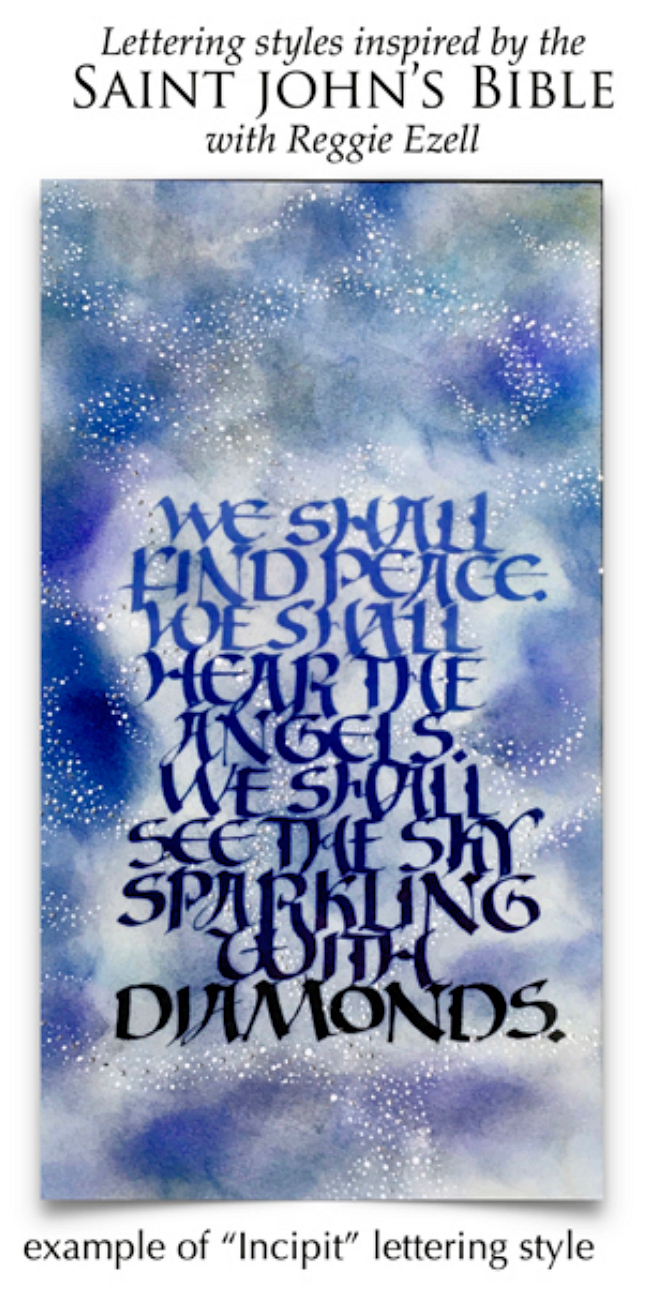
The greatest work of art in western calligraphy and illumination in the last 500 years is the Saint John’s Bible.
www.saintjohnsbible.org
It is written out in essentially four different lettering styles: incipit, standard bible script, free form capitals,
and versals. We will be analyzing, writing out, and creating finished works inspired by and based on these.
More detailed information will be forthcoming in mid-February.
Class dates: March 25, April 15, May 20, June 17
11 am to 5 pm Central Time US & Canada.
All the classes will be on Zoom. They will be recorded and available to students for at least a month after the class dates.
Cost: $200 - To enroll click Add to Cart Below after payment you will receive an email from me with instructions.
* * * * * * * * * * * * * * * * *

Click on http://www.reggieezell.com/thepick
You can enjoy all the Pics of the Week from 2009 through 2020,
archived on the home page of my website www.reggieezell.com
——————————————————————————
You can contact me directly: contactreggie@comcast.net
or 773-202-8321
__________________________________________
Click to see several short (free) Calligraphy videos:
http://www.youtube.com/reggieezell
____________________________________________________
Full length calligraphy VIDEOS and PORTFOLIOS by Reggie:
www.reggieezell.com


Follow me on Instagram and Facebook (@reggieezellcalligraphy)
https://instagram.com/reggieezellcalligraphy?igshid=148dz3cpok6
https://www.facebook.com/reggieezellcalligraphy/
UNSUBSCRIBE from these emails - click below.
