* * * * * * * * * *
TITLE: Legacy Manuscript Book
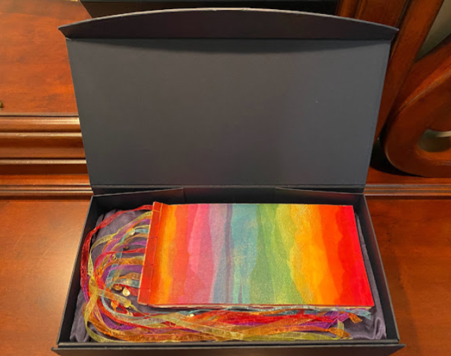
A friend recently retired from teaching Kindergarten. For 35 years she poured her energy and creativity into the lives of her little humans with hopes of making a difference and laying a strong foundation for them to use to change the world around them as they matured. As my gift to her, I made a 7x10 inch Japanese 4-stab manuscript book that would remind her of the Legacy she has left behind. I meditated on the definitions of legacy and the themes or images that surround the world of a Kindergarten teacher. I decided to portray images of the rainbow for the colorful vibrancy of the kindergarten classroom, I chose strips of paper weaving to remind the reader that the teacher daily interweaves her life into the lives of her students, and I wanted to portray the idea of tiny seeds growing up into something significant and meaningful. As the reader flips through the pages of the book, all 3 themes are integrated with six definitions of the world Legacy.
RAINBOW: The art of Eric Carle dominates every lower elementary classroom. His mastery of painted tissue papers and simple shapes captures the imagination of children and adults alike. I wanted to emulate his work. For the cover of the book, I pasted torn strips of tissue paper of rainbow colors onto Arches 90-pound watercolor paper with matt medium and while still wet, I sparingly sprinkled Schmincke gold powder for a bit of shimmer.
Between each page, in the margin of the spine, I attached long strands of organza ribbons in rainbow hues with ¼ inch wide acid-free double-sided tape. Each ribbon had 2-3 small gold charms knotted into it with the letters of the alphabet stamped upon them. I wanted the book to look joyful and fun.
As the rainbow has 6 colors (R,O,Y,G,B,P), I chose 6 quotes about what it means to leave a legacy; each quote showcasing one color of the rainbow with colored inks and colored paper shapes. These pages were lettered on Arches 90# hot press watercolor paper and separated with appropriately colored mulberry papers. For vibrancy, I lettered most of the pages with bright shades of Diamine inks. I tried to choose only alkaline inks for longevity.
Most inks were matt finish, but each page had at least one word lettered with shimmer ink for emphasis. The artwork on each page was again a nod to Eric Carle. With a sheet of plastic as my base, I made a tissue-paper skin of torn pieces of tissue paper glued together with matt medium. The colors were placed next to one another in the order of the rainbow. When dry, the plastic sheet was carefully removed (not an easy task) and I was left with a translucent sheet of beautiful colors that seemed to melt together. This skin was placed under heavy weights for a few days to completely flatten it. From this tissue-paper skin, I cut out simple shapes of flowers, butterflies, and hearts to complement the text.
SEEDS: The life cycle of an oak tree is slowly revealed as you flip through the pages of the book. The images of the oak tree as it grows up are placed on the back side of the text pages. The first and last images of acorn and mature oak tree are executed in 23 karat gold. All the other images are constructed with cut out shapes from the tissue paper skin. The tiny oak leaves were not cut out by hand but formed with a hand-held paper punch. I was impressed that the tissue-paper skin I made was stiff enough to allow the hand punch to yield a crisp shape.
WEAVING: I took one 9x12 sheet of Arches text wove and with acrylic paints, I painted a gradation of rainbow colors in a diagonal across the page on both sides. When dry, this paper was cut into ½ inch long strips. Before I lettered any page, I cut vertical slits in the watercolor paper and wove the rainbow hued strips through the paper. The ends were secured with doublesided tape.
Gold Leaf: Both the acorn and the mature oak tree had some challenges. Before I began the gold work, I turned off the HVAC in the room to minimize air movement and keep the humidity high. I worked on the mature oak tree first. The design was drawn on tracing paper first, then transferred onto navy Canson Mi-Teintes paper using yellow Saral paper and a stylus. Yellow instacol was laid onto the image with a small round brush; first in the large areas of the trunk and branches as those areas would need more time to dry, and then I moved onto the small leaves. Most of leaves were so small I had to use a stylus to lay down the instacol and form the shapes. The tree measured 4 x 5 inches and it took almost two hours to lay down the instacol.
Now the dilemma; how much time should I allow to pass before I lay downthe gold leaf? I chose 3 hours from the start to lay down the gold. It was successful! The gold burnished beautifully without having to add activator. The acorn, by comparison, I thought would be simple. I repeated the same process with the acorn, but the first addition of gold leaf was a disappointment. It was not crisp and the center of the acorn sunk in. I followed the directions of laying down the gold leaf on a hard surface, but I neglected to remember that I also needed to use a firm paper. The acorn was placed on the back of the paper I used to emboss the word, Legacy. For the embossing, I used a soft paper; Rives BFK and I used a French fold to allow the weaving and the gold acorn to not show at all on the pure white side of the embossed word. Rives BFK allowed a nice puffy and crisp embossed letter, but it was not well suited for gold leaf; lesson learned. I allowed the acorn to sit for another hour, and then I added activator and a second sheet of gold leaf. While still not perfect, the acorn looked better.
ACKNOWLEGEMENT PAGE: On purple Canson Mi-Teintes paper, I embossed a note to my friend using the Quill Hot Foil pen and a sheet of gold foil. The note was lettered first on copy paper and then traced onto the purple paper using the foil pen.
PRESENTATION: Gifting a handmade book of an odd size proved to be a challenge. As the book took so much time to complete, I wanted the presentation to be more impressive than a simple envelope. I settled on a navy collapsible gift box with a magnetic clam shell lid from the Container store (14 3/8 x 10 ¾ x 3 1/8 inches). As it was far too deep for a thin booklet, I cut a 3 inch piece of foam, wrapped it in navy satin and inserted it into the box. The box made for an impressive a way to store the book easily and safely.
In total, I had at least 52 hours invested in the construction of the book. The process has given me a better understanding for why artists charge so much for their original artist books. They are indeed a labor of love.
a Year to Grow” is filled. However, if you send
me your name (not money) I will place you on a
waiting list. If any places open up I will immediately
contact you. Thank you. Reggie
Email me at contactreggie@comcast.net
Click for info/enroll: https://www.reggieezell.com and to sign-up

Click on http://www.reggieezell.com/thepick
You can enjoy all the Pics of the Week from 2009 through 2020,
archived on the home page of my website www.reggieezell.com
——————————————————————————
You can contact me directly: contactreggie@comcast.net
or 773-202-8321
__________________________________________
Click to see several short (free) Calligraphy videos:
http://www.youtube.com/reggieezell
____________________________________________________
Full length calligraphy VIDEOS and PORTFOLIOS by Reggie:
www.reggieezell.com


Follow me on Instagram and Facebook (@reggieezellcalligraphy)
https://instagram.com/reggieezellcalligraphy?igshid=148dz3cpok6
https://www.facebook.com/reggieezellcalligraphy/
UNSUBSCRIBE from these emails - click below.