PICK OF THIS WEEK -
Week # 04
* * * * * * * * * *
This work is by Dave Flattery
* * * * * * * * * *
This work is by Dave Flattery
TITLE:
Cut Letter #3
#1: This work was done by Dave Flattery this year in Boston for the first month class "Modernizing a Traditional Calligraphic Hand: Blackletter".
This work is cut from gray Fabriano paper. It is 16" x 17" . I started out with a Coit 3/8 inch pen. I then traced over those letters adding swells and waists.
Next I tried to arrange the words in lines. The problem area was "another" above "till" because of the ascenders. I tried many times but each time came
up with a bad spot. When I would start over I always started from the top again. When I got to the problem spot and tried to fix it the domino affect would mess up everything I did above it. It took me a bunch of tries before thinking of starting with "the problem area" and working outward.
#2. This work was done by Amy Bebee in Philadelphia for the session “Variations on Romans”, in 26 Seeds: a Year to Grow.
Materials: watercolor, collage pieces, gouache for lettering. I will always remember the year long class with much pleasure & appreciation for the great time we had & for the great teaching we got. It's an honor to be on your pic list. Thanks so much for everything!!! Amy Beebe (I'm guessing 18 x14" for size)
#3. This work was done by Lois Rossiter this year in the Boston class for the frost month class "Modernizing a Traditional Calligraphic Hand:
Blackletter". Black letter with ProWhite on black Canson MiTientes; center counters and surrounding spaces cut away Paste paper in background, lettering with gel marker Prismacolor pencil Among other influences, Sr Corita Kent, artist and teacher, guides my own seeing, making and teaching. In this quote she says, "We are accustomed to looking at objects. We need to become accustomed to seeing spaces between and around objects as if they too were solid." 12" x 12”
|
|
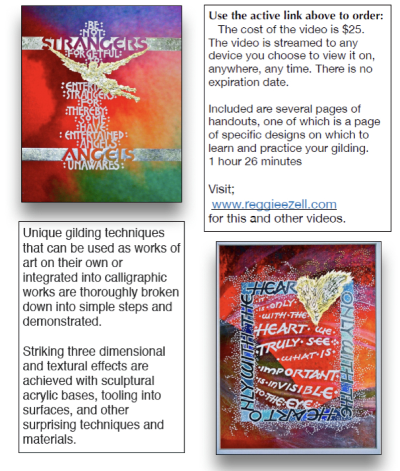
New Special Gilding Techniques: 3-D and
Textures  Click on http://www.reggieezell.com/thepick You can enjoy all the Pics of the Week from 2009 through 2020, archived on the home page of my website www.reggieezell.com —————————————————————————— You can contact me directly: contactreggie@comcast.net or 773-202-8321 __________________________________________ Click to see several short (free) Calligraphy videos: http://www.youtube.com/reggieezell ____________________________________________________ Full length calligraphy VIDEOS and PORTFOLIOS by Reggie: www.reggieezell.com 
 Follow me on Instagram and Facebook (@reggieezellcalligraphy) https://instagram.com/reggieezellcalligraphy?igshid=148dz3cpok6 https://www.facebook.com/reggieezellcalligraphy/ |
UNSUBSCRIBE from these emails - click below.
