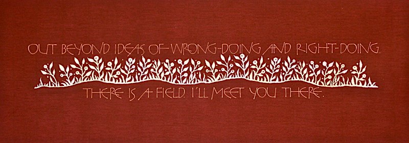
26 Seeds: A Year To Grow brought me to
the gilding table with Reggie Ezell; a place of wonder, frustration
and discovery. I had come into this class with a fair amount of
experience with the technique but he taught me an enormous amount
about experimentation with a wider variety of leaf colors and
textures, more tools and mediums to use and the behaviors of all the
above. Needless to say, I stepped into the homework assignment with
excitement and trepidation. First, which quote to illustrate where
the gilding technique could be the star?
I decided to use
another favorite quote of mine from the mystic poet Rumi. For me, it
speaks to the assignment of blame - something that can be so
insidious in our relationships with others. My work was also
inspired by the work of two artists I deeply admire: Georgia
Angeloupolos and Gemma Black. I was lucky enough to have classes
with each of these inspiring women, coming away from each experience
with a renewed understanding for the importance of experimentation
with an eye to the past. Georgia: the ancient art of gilding and
using nature as your model and Gemma: looking to the ancient
manuscripts to find fresh and invigorating ways to create
letterforms.
In challenging us to bring in a gilded work of
our own choosing, Reggie connected these dots for me. His openness
to we students taking risks and bringing different perspectives to
our
assignments encouraged me to illustrate these wonderful
words of truth.
I began by sketching out a very simple idea
of a field; trying to capture a landscape of flowers and foliage but
without too much detail. I wanted an undulating flow to the floral
silhouette but didn’t want to distract from the words. After many
disastrous attempts, I finally arrived at what you see here. At one
point, having decided to just use a circle to represent the flowers,
I noticed that it had begun to look like a row of one-eyed alien
beings. Yikes! Alternating the placement of the shapes and adding
variety to all the sizes fixed that problem. |
Next was deciding what lettering style to use. I had just returned
from taking a weekend Versals workshop with Gemma through the
Houston Calligraphy Guild and was so inspired by the interesting,
infinite possibilities found in studying Roman Versals and the
Winchester Bible. Reggie was, of course, taking us through our paces
with Roman Caps at the same time and had shown and illustrated for
us many examples of the creative possibilities of Versals,
particularly the wonderfully quirky work of David Jones (1895-1974).
Verso is a Latin word that means to turn. The word Versals may have
come from the vellum being turned to view ornamental letters; in a
bound book the recto was the right side of the page but when turned
became the verso! The lettering you see here is from a wonderfully
quirky alphabet of Gemma’s and I found that it fit my quotation
perfectly.
The lettering was done in my favorite gouache,
naples yellow, with a Mitchell nib, on a long rectangular piece of
wine colored, vintage, thirty-year old Fabriano Roma paper. (I have
hoarded a variety of colored pieces of this stunning paper for
years!) In the gilded field of flowers, I used a combination of 24 K
gold leaf and moon gold leaf, wanting the textures of the different
leafs to aid in the effect of an undulating line of flowers.
In my Rumi field, I worked to create a place of quiet simplicity
with an elegant and transformative message; for me, the very essence
of the writings of this 13th century poet, so relevant and needed in
our very noisy and complex world. |


