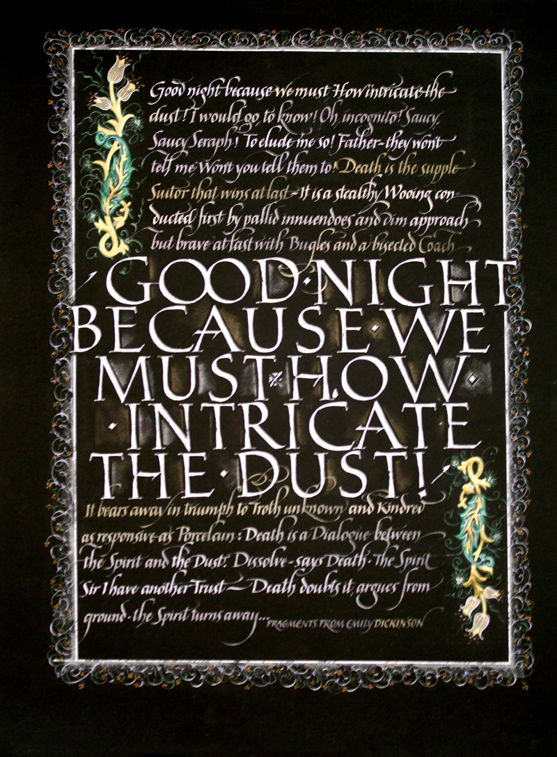
GOOD NIGHT
This piece was done when the class assignment was to letter on
Black.
Actually, lettering on dark surfaces is one my favorite ways to add
drama, and has in some ways become my trademark. This particular
piece, however, does not hold all that much excitement for me.
Still, I brought it to class, as it was homework. When it comes to
homework, sometimes better done than perfect. Sometimes it is pretty
perfect. Not this time.
I would never have the patience to do my letters in white first, and
then paint them over in color, so what you see here is just one
layer of Dr. martin’s bleed proof white with different tints added,
then changed around. The white actually improves and covers black
paper better if a few drops of color (gouache) have been added. I
almost never ever use white straight out of the jar. |
I
lettered the Roman caps first with a speedball C nib, then added the
rather contemporary italic around. I like to practice my italic and
my romans regularly, as I consider both of these lettering styles to
be the base of any calligrapher’s “toolbox”. Cannot do much without
them, as you would be somewhat limited. I’m pretty sure I used
Mitchell nibs for my italic.
What turned out of my lettering was somewhat cacophonous, so I
decided to add decoration to pull it all together. Colored pencils,
watercolors and gilding. Again, as you cannot take anything away to
improve your piece (you can start over), you can only add. I usually
add rather than start over. That is something that comes from my
personal traits and character, rather than from being smart.
I come from an art background as well, so it is natural to me to
decorate, and even more natural to keep decorating. It is calming to
me. If I am upset or bored or just blue, I will decorate late late
late into the night.
I am pretty sure that is what happened here. |
