About Koi Po-loi
Sabrina Hill
As part of the Primitive to Modern Class in San
Diego, Reggie wanted to show us how to make use of
digital images to create unusual compositions.
And so, it begins…
We started with a piece of heavy watercolor paper
that Reggie had lovingly coated with wax. This
creates a permanently sticky surface that allows you
to place paper cut-outs and lift them off to
reposition. (NOTE: Reggie has a fancy-schmancy
machine that applies the wax, but you can use a
tacky spray adhesive—I recommend 3M™ Scotch® Spray
Mount™ Spray Adhesive).
Our homework the preceding month was to come with 11
x 17 prints of photos (some from the Hubble
telescope, others from stained glass or the ocean)
and a few phrases to render in calligraphy. The
photos provided the color that would be used to
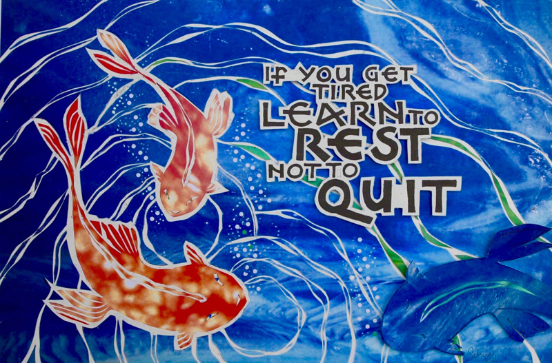
“paint” this picture. I chose “If you get tired,
learn to rest, not to quit.” By Banksy.
Calligraphy was done with Speedball “B” nibs
and a Brause pointed pen nib. Though the “B” nib is
rounded, you square off the letters with the pointed
pen nib. The effect is a very even letter with
chiseled ends. Using a printer, we took our
calligraphy, cut it into words and phrases, and
enlarged or shrunk it to produce changes in letter
sizes. Using this technique allows you to experiment
much more easily that writing it out. It’s very
satisfying to play with the words until they come
together in a pleasing pattern. |
Next came the images. Using a very pleasing
blue photo, I laid it down on the waxy paper. It looked like water to
me (though I think it was a close-up of stained glass). I thought I
could see fish. And that got me thinking about Koi. The first time we
went to Hawaii (many years ago) there was a gorgeous koi pond in the
hotel. I was mesmerized by the stunning creatures. I grabbed other
photos with patterns that seemed “fishy” and went to town drawing Koi
fish and enlarging or reducing the drawings until I had something.
After cutting out the fish, I knew that the image needed movement.
Ripples came next, then word placement. A hole punch gave me air
bubbles. While placing the air bubbles, I kept losing them against the
white background. I grabbed the blue fish cut out that made way for
the orange fish and loaded it up with bubbles. It was poised over the
lower right corner.
And I liked the effect. So, it stayed.
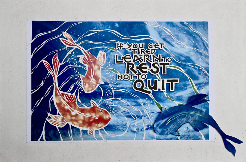
I call this Koi Po-loi. I made postcards and I send them out
frequently. This process was very satisfying and kind of joyful. It
evolved as I got deeper into it. I like the very graphic quality of
it, and I liked working on the waxy paper.
|