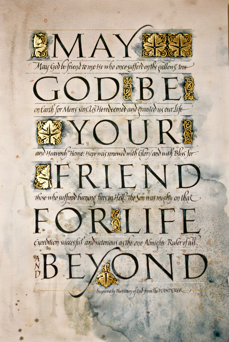
Here
goes: God be your Friend....
A few years ago I got extremely bored with what I had been doing in
very traditional field of calligraphy for a very traditional
calligraphy organization, and all of a sudden wanted something new,
free, and uncontrolled. It was a start of m “rebellion”. It can
easily happen when you’ve been doing calligraphy for almost forty
years like me. I happened to be in extended private study with
Sheila Waters, the almost only student extended there, and came
across her samples and notes on watercolor backgrounds, in one of
the hundreds of drawers of treasures she has. When she was not
looking, I feverishly copied the notes.
When I arrived at home, I dipped about twenty sheets of various
watercolor paper in my bathtub, soaked them , and laid them one
after another on top of my glass table. I applied watercolors,
powders and salt. Then had them dry, and they dried absolutely
smooth and straight. No tape. Amazing.
This (2017) year, about 18 months later, I was faced with Reggie’s
homework assignments. I pulled out my since unused watercolor
backgrounds, by kind of accident, and was determined to make some
use of them. After all, what a waste otherwise. In my life, I cannot
afford to waste anything, sadly! I know, sounds boring. A yawn! |
What I actually did,
is I took the backgrounds and let them speak to me. What color do
you want. What areas should be left exposed. Some places looked like
stone or marble to me, perfect for Roman caps. Like almost to be
carved in. So that was meant to be. And it was the assignment.
This piece was in no way inspired or planned. I needed a piece for
class and I did it. Simple as that. Not everything has to be so very
deep. Deep thought does not make it necessarily better at all.
Practice at best is what it is here. I constructed and drew the
letters right on the original piece, filled them in with brush, and
filled the rest of the space in with design elements where I saw
fit. All I relied on composing the piece rather randomly was my
sense of layout and design. Now, that was when the almost forty
years of experience came in handy.
Later, I added the rather contemporary style of italic. For
interest. And a fill. And the lines with ruling pen that gradually
change color. The most sophisticated touch.
Tools used: sketching pencil, arches cover paper, fine acrylic
brushes size0 and 00, various tubed watercolors (mainly Payne’s
gray), Mitchell nibs, ruling pen, loose leaf gilding on top of
Instacoll, golden watercolor, pointed pen. |
