* * * * * * * * * *
Week #5
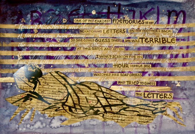
This work was done by Sabrina Hill in San Diego in 2017 for the session “DESIGN: Deconstructing the Grid ” in PRIMITIVE TO MODERN. In her own words:
|
My Mother’s Back. One of the final projects for Reggie Ezell’s Primitive to Modern 2017 San Diego class was to use digital and hand tools to create a piece that would become a postcard. Being the pain in the neck that I am, I ditched the gorgeous space photos and decided to start from scratch. My mother has been heavy on my mind and heart this year. She’s in the final stage of Alzheimer’s disease. She doesn’t know who I am, can’t speak in sentences, has to be spoon fed, has moved to a wheel chair…all the things that make us adults have been taken from her. Over the past year I have done several pieces that were inspired by her, my first art teacher. My mother had five children; I was the oldest. In my early childhood, I imagine a very pregnant mom trying to carve out some time to just rest. And it is here that a memory surfaces. I can remember vividly laying on the big bed with my mother to play a game we’ll call Make Some Letters. She would expose her bare back, I would draw letters on her back, and she would guess them. She was terrible at this game. She could NEVER guess. So, I would erase them and with my little four-year-old finger draw a new set of letters. Once in a great while she would get one or two letters. Mostly, she failed. I wrote a lot of words in those sessions. Sometimes her entire soap opera, Days of Our Lives, would run whilst she tried to guess even one letter correctly. For this piece, I wanted to capture the simple beauty of a quiet moment with my mother. I began with Aquarelle watercolor paper. I covered it in Ziller’s Wild Plum ink and sprayed it with water and alcohol to get some interesting effects. Using my 57-year-old finger, I drew the letters on by dipping my finger in the Wild Plum ink and drawing them on. |
This gesture was so familiar to me that it
evoked a very emotional response to the process. Once everything was
dry, I went over the hand-drawn letters with Copperplate Capitals done
with a Nikko G pointed pen in Sumi ink. This represented the space I
had travelled calligraphically. Now for the figure. I had drawn a reclining woman, but I didn’t like how it looked against the purple. Using Reggie’s suggestion of printing out a background, I found an old French manuscript on Etsy, which I purchase (as a pdf download) and used to print my reclining woman on. I then cut this out and pasted it to the composition. It was HORRIBLE. What to do next? About this time, Reggie posted a Pick of the Week by Maria Helena in New Orleans. She is a friend and a brilliant calligrapher and artist. The piece was made of multiple layers of calligraphy, and Maria Helena remarked that she didn’t like it and tried using lines of color to give structure to her piece. Genius! Out came gold Schmeinke ink to create bands of gold over the existing writing. I liked the effect, but it wasn’t finished. Then I cut up the original wording, “One of my earliest memories...” (done in black and printed on the French manuscript background), and lined it up between the gold bands. Better. Weirdly, my own memory held the answer. In the background noise of this childhood memory was the theme music for Days of Our Lives and the voice-over “Like sands through the hourglass, so are the days of our lives.” I googled the soap and found the annual synopsis of the show for 1965. Close enough. “Tom and Alice Horton were almost alone in a house that once brimmed with the activities of five children, twins Tommy and Adele, Mickey, Billy, and Marie...” I rendered this is a variation of italic script in white Dr. Marten’s bleed proof ink and a speedball C4 nib. This is the finished piece. |

* * * * *
| You can enjoy all the Pics of the Week from 2009 through 2018, archived on the home page of my website www.reggieezell.com ————————————————————————————— NEW: ON LINE COURSES! Live, one on one with Reggie Ezell Information on courses and workshops www.reggieezell.com You can contact me directly: contactreggie@comcast.net or 773-202-8321 ____________________________________________________ Click to see several short (free) Calligraphy videos: http://www.youtube.com/reggieezell ____________________________________________________ Full length calligraphy videos and PORTFOLIOS by Reggie: www.reggieezell.com |