* * * * * * * * * *
Week #1
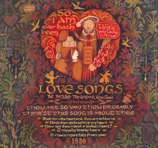
This work was done by Lisa Devlin in New Orleans in 2018 for the session “ Carolingian and Variations” in 26 Seeds: a Year to Grow. In her own words:
|
Tudor England has fascinated me since I was 10 years
old. I’ve read so many books and seen just about
every movie and TV series ever made about this
world. I love the period fashion, the architecture,
the music, dancing, portraiture and court life. It’s
been part of my life for so long that I just had to
make it the subject for a calligraphy project on
Carolingian lettering. For people unfamiliar with Henry VIII, he ruled England from 1509 to 1547. He was a monarch of many talents who also had a way with words, expressed through song lyrics and poetry. You might say he seemed more in love with the idea of love rather than the reality of marriage. The man had six wives, beheading numbers two and five. Wife number two, Anne Boleyn, was a highly intelligent and cultured woman. And although many believe she was extremely ambitious and hot-tempered, Anne hardly deserved the fate she suffered. Most historians feel she was not guilty of adultery (as opposed to wife #5 who was). So in this drawing, Anne Boleyn’s severed head is understandably scornful of her husband’s love making. At first, I thought I might simply letter one of Henry VIII’s songs called “Green Groweth the Holly.” But this idea gradually evolved into one I thought might be more interesting: a 16th-century record album cover with titles of contemporary pop songs about broken hearts written in old English. Channeling the 1980s Greenwich Village art scene, this would be a kind of surreal commentary comparing a world of courtly love and troubadours with more modern expressions heard on the radio and via other forms of pop culture. I decided to mix up Renaissance tapestry motifs with other ingredients taken from consumerism, cartoons and tattoos. |
Multiple references to love were made with the
King and Queen of hearts from playing cards, pierced hearts
which are popular tattoo motifs (although these are pierced by
calligraphy pens) and homicidal cupids. Love-struck Tex Avery
cartoon characters appear in place of the small birds and
mammals you’ll find in tapestries of this period. Because this
is a consumer product, I included a logo (K-tel was a popular
brand in the ‘70s, offering lots of songs for a low low price).
The price label for Tower Records (a 20th century retail chain
store) also refers to the Tower of London.
I created this piece using Prismacolor pencils on 130# Canson paper. References for the drawing were found online such as the famous Hans Holbein portrait of Henry and foliage from Renaissance tapestries. Some of the lettering was hand drawn with a pencil in Carolingian style and some was drawn in various monoline styles learned earlier in Reggie’s 26 Seeds course. The song titles at the bottom were written with a #2 Mitchell nib in Winsor & Newton gouache. This project turned out to be a mixed-media endeavor. I discovered that you really can find just about anything on the internet - including a photo of an old Tower Records price label which I printed on acid-free paper, touched up with color pencils and glued with rubber cement to the drawing. It seemed appropriate to add some gilding which I did for the very first time by myself (consulting class notes and hand outs). These gold touches are the diamond-shaped ornaments by the song titles at the bottom. In sum, I’ve never created a drawing like this before and I thoroughly enjoyed myself. There was something very liberating about irreverently throwing history and pop culture in a blender together and whipping up an extra-chunky concoction of something entertaining and strange. |

Click for
 Video
Video* * * * * * * * * * * *
| You can enjoy all the Pics of the Week from 2009 through 2018, archived on the home page of my website www.reggieezell.com ————————————————————————————— NEW: ON LINE COURSES! Live, one on one with Reggie Ezell Information on courses and workshops www.reggieezell.com You can contact me directly: contactreggie@comcast.net or 773-202-8321 ____________________________________________________ Click to see several short (free) Calligraphy videos: http://www.youtube.com/reggieezell ____________________________________________________ Full length calligraphy videos and PORTFOLIOS by Reggie: www.reggieezell.com |