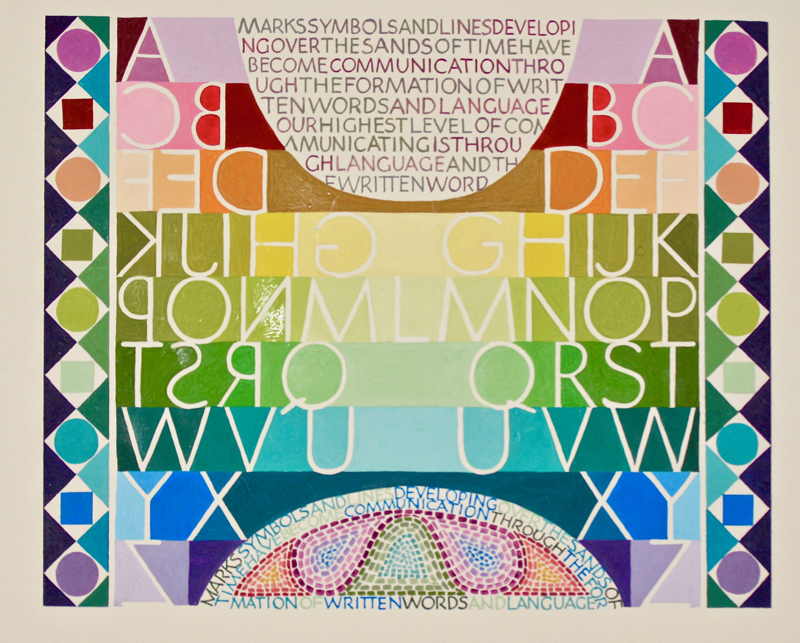
I was not going to take Reggie’s last year long class
this year but somehow found myself doing just that.
Looking through my old papers and possible designs never
finished, I found this outlined alphabet that was flush
right. I decided to make a mirror image of the alphabet
and that left a top round empty space and a bottom round
empty space, which I thought was really cool. Little did
I know how hard it would be to come up with a design for
those spaces.
Once I got the letters
properly drawn and fitted into gridded lines, I began to
fill in the back ground around the letters, mostly going
from a light tint in the middle of the piece to the
actual color and then having the darkest color on the
outsides. |
I wasn’t sure that I liked the W/N primary gouache
series of colors, but when I painted them in the order
that I arrived at, I was amazed at how well they all
blended together and the color just sang.
But the piece did not look finished so I added lettering
in the top empty space using a B2 nib. On a separate
piece of paper, I then made several different designs
for the bottom area but was not happy with them, so I
moved onto creating the side borders. I wanted them in
grays, but after several test tries of various colors
and shapes and sizes of the shapes, realized they dulled
the colors in the original middle part. So, I went back
to using some of the original colors and that seemed to
work. Then I went back and made several more designs for
the bottom area, combining some lettering and the color
design. My vow to do simple smaller works this year had
gone by the wayside. Though this piece is only 9” X 7”
it got more involved than when I first started it. I
rarely name my pieces, but this one I am calling “More
than Rainbow Colors”. |
