This is my third time to take Reggie's year-long class,
but my first time to submit to what has become to be
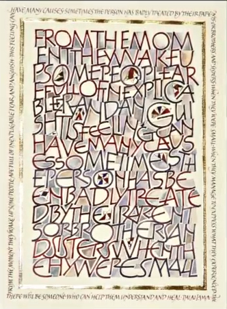
known as his signature homework assignment - mono-line,
somewhat rustic caps, very recognizable. Some know them
as Neugebauer caps, others as a play on Tom Perkins
take, either way they are just one of hundreds of
variations on Roman caps. Why are they so good for
beginners, I'm not sure, but everyone always loves them
and tries them out. Everyone in class brings some
homework! Goal achieved !!!
From the beginning of my
limited time and planning on this assignment, I knew I
had to make these caps my own, somehow. I used the
speedball B series mono-line, clumsy, nib yes, but that
was about it. I squared the ends with pointed pen. I
decided to play with spacing between letters, different
line heights, "weird" letter forms (literally making
them almost mutilated), and adding color. After adding
varying degrees of color to letters, I also added it to
the background, making it all look one twisted texture,
as one mess of a memory. Instead of painting the insides
of seriously exaggerated round letters, I left them
empty to symbolize the holes in our remembrance. Dalai
Lama's quote about childhood relationships following us
as inexplicable fears into adulthood made perfect sense
as my text, and I used it by abandoning any word spacing
into illegible whole rectangular center. |
Now, I had picked a special paper for this piece. That
gave a certain quality to everything I did on it. If I'm
not mistaken, it is no longer made fabulous Fabriano
Italia. It has heavy textured laid surface lines. It
makes the letters, gilding, and even delicate brush
painting look like traces left by a tractor tires in wet
mud. I very much chose, enjoyed, and used that effect to
add another dimension to this piece. Something my human
hand could not have created on its own. The decorations
amidst the letters are like little kites of hope
floating around, with no care paid to their exact
placement. Randomness is their message.
As I by now know about myself, I am an accidental
artist, not a careful planner. Ideas, colors, and
solutions come to me as I work and create. I have to
decide when to stop. And I don't always know when to
stop. After the gilding, I decided the piece lacked some
finer, more delicate quality. To take away some of the
childishness of it all. That is when I added the same
quote once more in more refined and sensitive "small
caps" going around the "messy center", in much
more skilled, smaller, and delicate version, this time
totally legible. The uniform color of these small caps
is to calm down the eye before it finally leaves the
piece.
Size 18.5"x14" . Tools and materials used: speedball B
nib, Mitchell nib, pointed pen, ruling pen, fine brush,
various watercolors, gold leaf over Instacoll base. |
 Video
Video