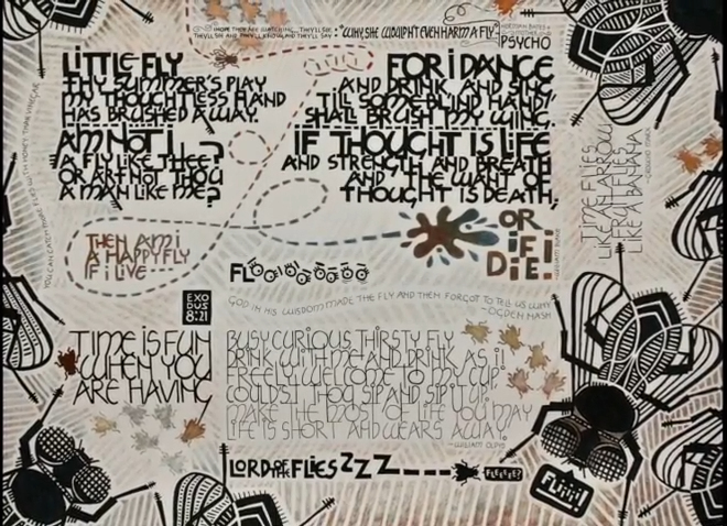
“Flies” was inspired by the work of Joke Boudens. I
enjoy the graphic boldness and humor of her work which
she achieves by butting up images and different text
blocks of various shapes, sizes and styles. Although she
seems particularly intrigued with beetles and other
insects, the subject matter for my piece actually was
inspired by a swarm of flies that had infested my house.
I found this disturbing as I recalled a passage in the
Bible (Exodus 8:21). Perhaps I, too, was being punished.
Or maybe I’m just sloppy.
Artistic expression helped
me cope with these feelings. I started by exploring the
subject through online research and sketching. I
sketched and played with many ideas and, because of
limited space, many of them wound up on the “cutting
room floor.” It’s interesting how such profound insights
can be made and expressed by comparisons to something
humble or overlooked. Flies can be playful, a nuisance,
evidence of dirt or incarnations of evil (i.e.
Beelzebub). I liked the idea of portraying the humble
fly with references from poetry (e.g. William Blake),
comedy (Groucho Marx), movies (Psycho) and everyday
expressions. I thought it would be fun to explore the
word “FLIES” itself by writing the first two letters and
then repeating the letter “i” or “e” and even drawing
eyes to create the word.
I chose a process that,
although time consuming, was familiar and forgiving. I
first hand-lettered the Neugebauer text blocks on grid
paper, drawing the letters so the lines of text touched
each other. |
I particularly enjoyed how the ascender of one letter
could merge with the descender of another with the dot
in the letter “i” adding another contrasting and playful
element. I extended some of these lines into adjacent
letters and added “fly hairs” to various letters in the
William Blake text block (thus echoing the legs of a
fly). I created a carbon by tracing each text block with
tracing paper, turned the paper over and traced it again
with a soft lead pencil, taped the paper to a sheet of
Canson paper and traced each letter yet again (phew!).
Then I drew over each letter with Micron and Sharpie
markers. It was a laborious process, but one that gave
me a feeling of control and allowed me to make
adjustments where necessary. Using a similar process, I
drew graphic flies of various sizes, traced, transferred
and redrew onto the Canson sheet.
Design decisions were made by considering contrasts in
size, weight and balance within the layout. But as the
work progressed, I noticed that it really didn’t have
the wonderful feeling of Joke Boudens’s piece because
the text blocks and images were placed too far apart. A
patterned background would help create unity. Thick
lines were drawn in Prismacolor pencils and then erased
in areas to create subtle texture. These lines echoed
the design of the larger flies and generated a sense of
movement. Conceptually, my goal was for the viewer’s
attention to move here and there around the page—much
like the movement of a fly.
“Am not I a fly like thee?” |

 Video
Video