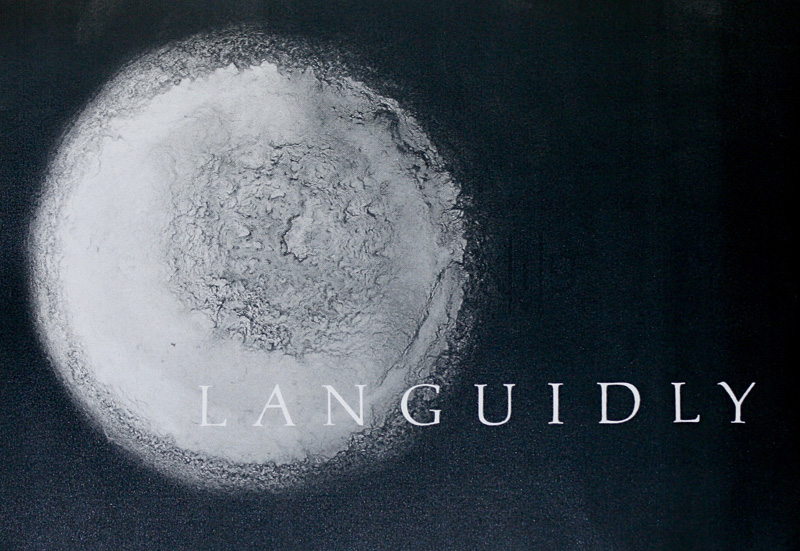
Languidly
This was done for the spacing homework assignment for
Month 1. For the background image, I used a photograph
that I had taken and then edited it in photoshop to make
it black and white and to add black to the rest of the
image. The photograph is of the dried paint left at the
bottom of a paintbrush-washing bowl after the water had
evaporated. It is a mid-century, pottery ashtray that I
found as my in-laws were cleaning out and restoring an
old farm. Using an ashtray sounds odd, I admit, but it
has a nice depth and the slots originally for cigarettes
now keep my paintbrushes from rolling away. I took the
photo on a nice, sunny day to increase the contrast of
that old paint. The original color was yellow paint in a
green bowl. As a black and white, though, it reminds me
of an abstract, lunar landscape. |
After I edited the photograph, I extended the image size
to fit the paper I’d print it on, and scanned in my
properly spaced letters. However, they didn’t quite fit
the way I wanted it to. Instead of correcting the letter
cut-outs and rescanning, I edited the word in photoshop
directly. I can’t recommend photoshop for projects like
this enough. To fit the word to the image, I separated
each letter into a different layer, and used the
“hide/show” feature to only show the three letters I was
working on at a time. Then, I nudged the letters right
or left using the arrow keys (rather than my mouse) for
greater precision. Photoshop does have an auto-arrange
feature, which would distribute the space between each
letter. But, that only accounts for the total width of
the letter, not the white space within the letter
itself. The letter L is a good example of where that
feature doesn’t work for lettering spacing. |
