* * * * * * * * * *
|
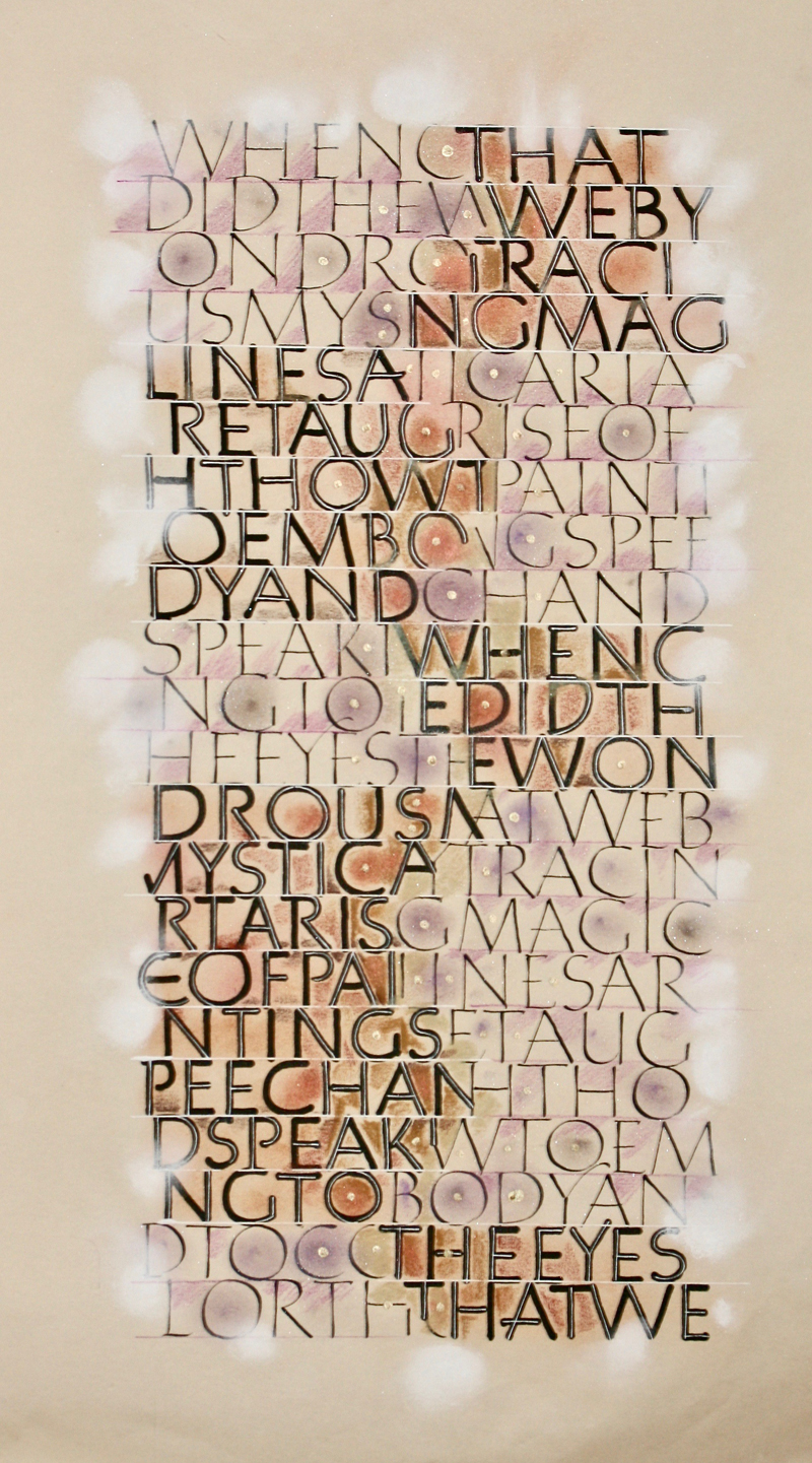
Week #28 This work was done by Maria Helena Hoksch in New Orleans this year in for the session “Basic Romans” in 26 Seeds: a Year to Grow. In her own words:
 * * * * * * * * * * * * * * * * * * You can enjoy all the Pics of the Week from 2009 through 2018, archived on the home page of my website www.reggieezell.com ————————————————————————————— NEW: ON LINE COURSES! Live, one on one with Reggie Ezell Information on courses and workshops www.reggieezell.com You can contact me directly: contactreggie@comcast.net or 773-202-8321 ____________________________________________________ Click to see several short (free) Calligraphy videos: http://www.youtube.com/reggieezell ____________________________________________________ Full length calligraphy videos and PORTFOLIOS by Reggie: www.reggieezell.com |