Among the homework in Reggie’s Primitive to
Modern Class, 2017, San Diego, was an assignment
to write a short quote in a variation of
blackletter script; then create a piece
combining two styles of script in one piece.
Additionally, Reggie showed us how to invert a
piece (reverse it from black on white to white
on black). The inversion makes for a much more
dramatic effect. In this project, I combined
these elements in one piece.
Inspired by the
USPS rooster stamp, I had based my homework
assignments for the first month on the 2017 Year
of the Rooster. For this piece, I wanted to use
the Chinese proverb, “If you were born lucky
even your rooster will lay eggs.” It made me
laugh!
A Barred Rock
rooster, distinctive for it’s black and white
zigzag patterned feathers, was the model for the
piece. The feather pattern looks zig-zaggy. I
wanted to make the body with calligraphy that
mimicked the feathers. Choosing the scripts was
easy. One of the hand-outs Reggie gave us had
very bold variations of blackletter scripts from
the 1930’s. I chose this squattier, plainer
script for the main quote and a more traditional
textura for the body of the rooster. Now I just
needed an additional quote. I googled “quotes
about roosters in Latin” and found this gem,
“Post coitum omne animal triste est gallus et
mulier.” (Translation: After sex, all animals
are sad except the rooster and the woman.)
Perfecto! |
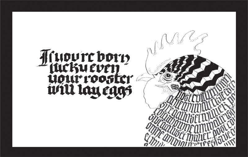
Image #1: The first step (after sketching all
possibilities) was to create the piece on
Strathmore Gemini Watercolor Paper, 300 lb. Cold
Pressed (8” x 12”) using Sumi ink.
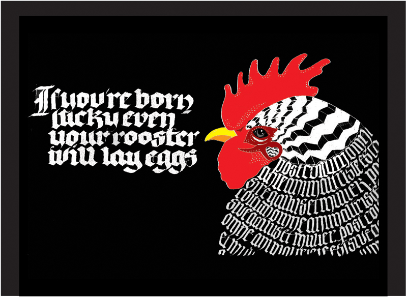
Image #2: Next, I inverted the image using my
scanner and Photoshop. On the initial scan, I
didn’t have the cockscomb colored in, so I
filled in the red comb with the paint bucket
function. (#2) Printed on 8.5” x 11” Arches 90
lb cold press.
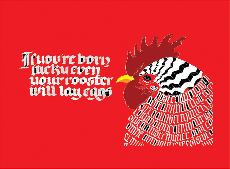
Image #3: In playing around with the red, I
accidentally hit the paint bucket on the
background. I loved the effect of the red
background and patches of black. (#3) Printed on
8.5” x 11” Arches 90 lb cold press.
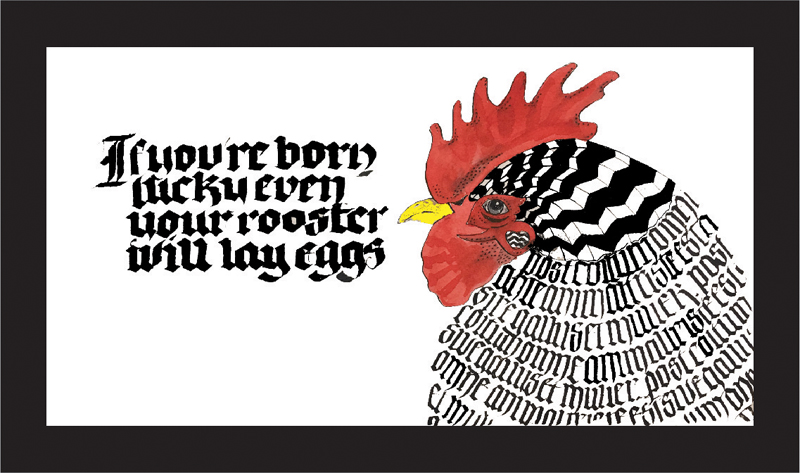
Image #4: Finally, I returned to the original
and using Sennelier watercolors painted the
cockscomb and eye.
Overall, I like this piece, especially the red
version. I use the Strathmore paper all the
time, but I had never used it for calligraphy.
It has a rough texture, and I was not as happy
with the results of the lettering. Next time, I
will use a finer surface. I love using
traditional techniques and modern technology
together—it makes it easy to play with color and
layout. |


