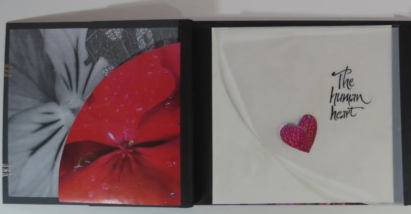
This book was the last assignment for our Primitive to
Modern class. (sigh) The meeting before, Reggie told us
to bring in photo printouts on paper and transparency,
but was rather mysterious about how we would be using
them. My impression was that he wanted us to bring in
images of pattern and color. So when I went home after
class, I grabbed the camera, went into my yard and
captured some of those types of images. Then I went
through my digital archive of photos, to get a better
variety.
Armed and ready, we came
to class and had a whirlwind weekend of book creation.
As I was working with the format and images, trying to
pull something cohesive together, it occurred to me that
instead of just one main panel in the middle, with
throw-away sections to the outside, there was an
opportunity to make this a three-panel image. So I
worked backward and forward, trying to pay attention to
how all three panels worked together. |
As the main panel pieces moved to the side, it created a
secondary, reversed, image. That meant every page had an
image front and back. And I was really happy with the
peek-a-boo effect in the later pages of the book. (The
light table was a big help with positioning and
designing).
There was not enough time to complete the book in class,
so I finished it at home, thankful for the perspective a
little time can give a project. But still limited myself
to the items brought to class. Calligraphy was added at
the very end using a ruling pen, Moon Palace sumi and
Dr. Martin’s Pen White.
I’m sure that there are many additional, interesting
design options for this book structure, especially when
the three panels are taken into consideration.
Additional planning ahead of time could produce some
surprise elements and bold storylines to the structure.
A big thank you to Reggie for challenging us to bring
our best efforts to class |
