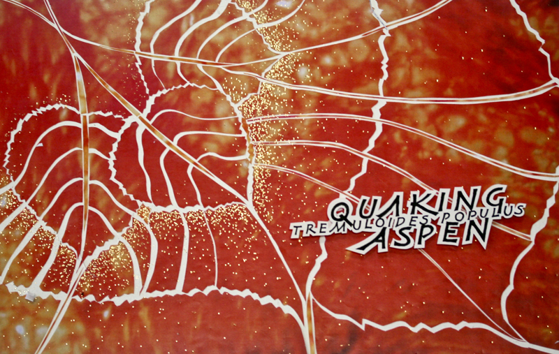
I always have a more satisfying artistic experience when
I connect it to something personally meaningful. So when
we were asked to bring a simple design to class I took
inspiration from my friend Doris. She was planning a
trip to Colorado so see the Quaking Aspens. This
intrigued me. I imagined clumps of trees huddled
together at the foot the Rockies trembling in fear.
Research revealed that the common name refers to the
shaking of the leaves in a light wind. The poetry of the
common name appealed to me and having a “Q" was a bonus
since Qs are not very common in English. Research also
provided images of the trees and leaves. Since the
assignment was to supply a “simple design" I refined it
down to 3 leaves. These are the 3 leaves that you see in
the upper left of the final piece.
From the beginning the
piece was intended for reproduction. The first step was
to determine the best size of the design by photo
copying it in several sizes onto a transparency, cutting
out each size and trying out the placement keeping mind
the final size would be approximately 11 x 17 inches.
Once I had a rough idea of placement of the leaves I
expanded the 3 leaf design by creating more lines that
echoed the outside of the leaves and extended the
veining of the leaves on a large sheet of tracing paper
being sure to make it large enough to fill ½ sheet of
waxed watercolor paper that I knew we would be working
with. After establishing this part of the design the
same process was used with the words written using
Reggie’s lettering example with the Latin name in a
smaller size for contrast. Once the best size was
determined the words were photocopied onto 90# hot press
Arches watercolor paper and cut out with an ample
border. Tiny pieces of foam core were attached to the
back so they words would sit away from the background
and create a shadow when photographed. |
Next the leaf design on the tracing paper was
transferred onto one of the 11 x 17 color copies Reggie
provided in class. Orange and yellow was the obvious
choice for these fall leaves. The photo copy was lightly
pressed onto the waxed cold press watercolor paper and
the design was carefully cut out with an Exacto knife
with a new blade along the lines. After completing this
task it was "fractured" by peeling up each piece and
moving it a bit to let the white of the background
create and outline of each piece. The sticky wax made
adjusting the placement a breeze. This process was not
precise and often small bits of the pieces needed to be
trimmed and pieces of the colored paper inserted into
the spaces that were gaping. A “happy accident” occurred
when I discovered that there was too much white space
running down the center of the leaves. By adding a
sliver if the lighter toned paper (contrast again) to
the middle of the leaves they became more "leaf-like".
As embellishment gold foil pen dots were applied along
the outside edges of the original 3 leaves and then
scattered throughout the piece. For more contrast and
interest, I later added 1/4 inch and 1/8 inch gold dots
made by punching them out of gold card stock.
Since the piece was intended for reproduction and not as
an original piece art piece it lends itself to multiple
uses. I have since made thank you cards by using this
back ground and the same process with the words “thank
you”.
I’m sure this project could have been accomplished on
the computer, but for me doing it “old school” slowed me
down and helped me physically connect with the process.
I am a firm believer that the journey is as important as
the destination….sometimes more so. |