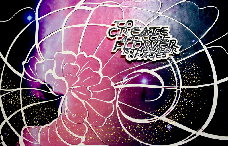
Concept: The quote: "To create a little flower is the
labor of ages" immediately fascinated me.. To contrast
the vastness of the universe (the ages)
with the delicate creation
of a flower was an intriguing, but very challenging
theme for me. To be honest, it pushed me beyond my
normal borders as did the
technique that Reggie
introduced us to. I was grateful for the opportunity to
move beyond the confines of prescribed page limits as
the quote and concept seemed to require a dramatically
new approach.
Technique: On the first
day, as Reggie demonstrated to us, we first wrote out
the words in black, using a speedball B nib. Then we
explored copying the words at various sizes by reducing
or enlarging on a copy machine. Further work was done to
rearrange the quote exploring a contrast in sizes and
position of the individual words. When this was
completed, the final layout was copied onto Arches 90 lb
paper. To complete this part of the project, we
carefully cut around the words using a # 11 Xacto knife
leaving a border of white. By using small pieces of foam
core board attached to the back side of this
arrangement, the quote could work as a unit that stood
up in relief against a background.
The next day we created the background that did open up
a whole new set of ways to think about "breaking out of
the grid of convention.” |
After creating an image that would work with the quote,
we explored gestural lines that would express both quote
and image. These were sketched lightly on tracing paper.
When satisfied we transferred these to 11" X 17"
background colored prints (Hubble images or stain glass
abstracts
that Reggie provided for us.) Then came the real
challenge as we numbered each area to cut, then cut the
lines, spreading the pieces apart to create new areas
and shapes, often pushing beyond our original borders.
All this was done on heavy weight watercolor paper that
Reggie had prepared in advance with a waxed surface. The
waxed surface allowed us to re position our pieces until
we were satisfied with the final result.
As Reggie explained it was important to keep in mind
that this was done for purposes of reproducing the image
in different size formats. By carefully positioning the
lighting, a very dramatic effect could be achieved from
shadows cast by the raised letter group. An important
part of our home work for the following month was to get
good quality reproductions. This was a whole other
learning process;
but well worth the time and effort. As always, we were
grateful to Reggie "for helping us get old enough" in
our calligraphic life!
Materials: 90# Arches hot press paper for the quote
Many sharp #11 Xacto blades
Speedball B nib, Moon Palace Sumi ink
11" X 17"color prints |