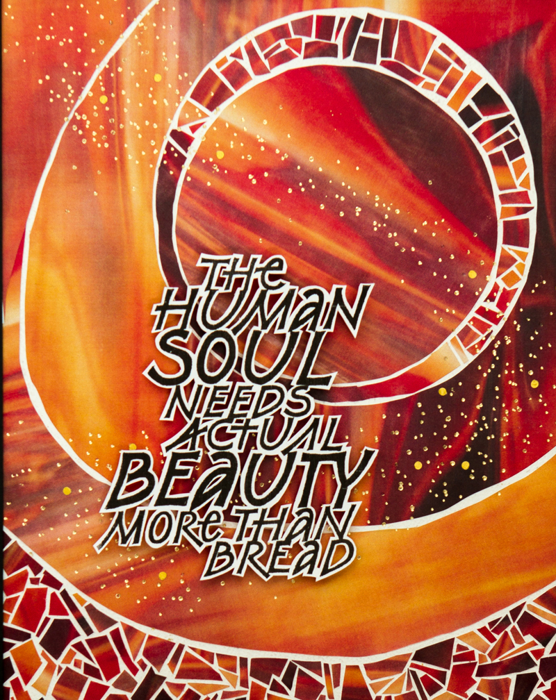
This work was done by Joanna Zdzienicka in Chicago in 2015 for the session “DESIGN: Deconstructing the Grid”, in Primitive to Modern. In her own words:
| I
started working on the piece during our class. First we lettered
our quotes, copied them in variety of sizes on transparencies
and worked on a layout of interlocking words. A final version
was then printed on a white card stock, and we cut out the quote
leaving white margin around letters. As a base for the background we used a large sheet of heavy paper covered with wax, on which it was easy to temporary place all elements and create a desired design. My background is made with 2 sheets of the same print - photograph of stained glass provided by Reggie. |
I wanted to use simple shapes rather then a figurative image. I
started with a circle and curvy lines, then added mosaic like
pieces in the wide space within the circle. Later I added more
mosaic to the bottom to balance the image. The stream of golden
dots is made with gold foil pen. Finally I decided where to place the quote. Working on this project was a very interesting and fun process! There are so many possibilities - changing just one element or turning the background to a horizontal orientation makes a completely new image. |
* * * * * * * * *
Week #2
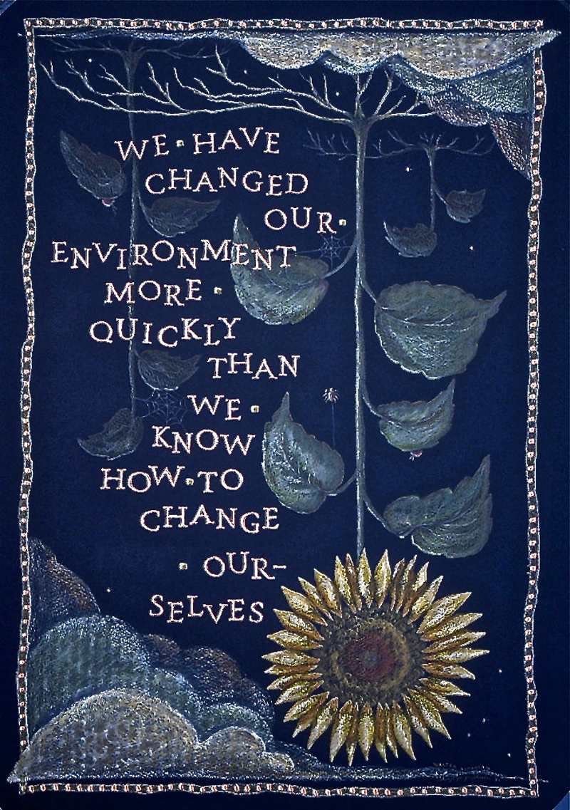
This work was done by Cheryl Sheeler in 1995 in Philadelphia for the session “Drawn Romans”, in 26 Seeds: a Year to Grow. In her own words:
| The
15”x22” work is entitled “Living Land Inspiration” and is based
upon a quote by Walter Lippmann, which I had seen on a wall at
the Living Land exhibition at Disney’s Epcot. The piece was done
on black Mi-Teintis paper, using gouache for the lettering and
Prismacolor pencils for the illustration. Highlights were added
to the lettering using Dr. Martin’s Bleedproof White. Although the work was done 20 years ago, I remember it well and have always considered it a turning point for me as an artist. I’d always been a perfectionist with my lettering, drawing and design, so much so that it had become more stressful than enjoyable to create or design anything. Everything had to be clean and straight and orderly and logical…and perfect. |
So it was with this piece I made a conscious decision to push myself into uncomfortable territory. I used unforgiving and impossible to erase black paper with orange gouache (a color combination that I typically loathe). I “bounced” the letters/words without a lot of planning (and believe me when I say that I almost lost it when I discovered I’d have to hyphenate the word “ourselves,” which was the very last word/thing I had to do on the entire piece...lol). I drew plants growing upside down, even letting parts of the illustration break the border. AND I purposely drew the border loose, freehanded and crooked, without a ruler! Yes, these things might sound silly, but for me, they were huge. Moreover, to see it all actually still work somehow was really freeing…and enjoyable. |
* * * * * * * * * * *
Week #3
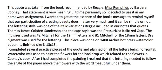
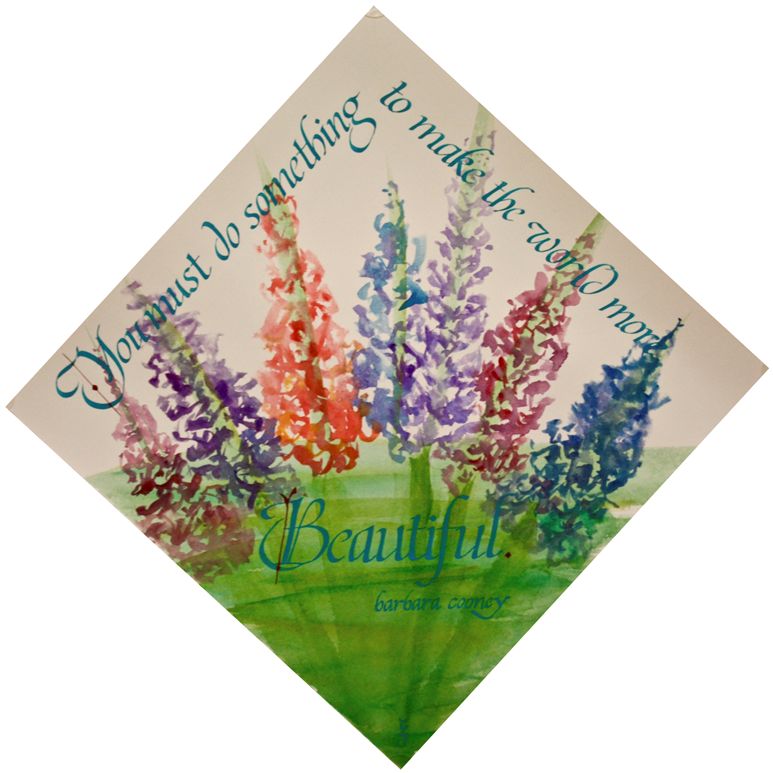
This work was done by Cynthia Stiles in Fort Worth in 2015 for the session “Italic and Variations, in 26 Seeds: a Year to Grow. In her own words:
* * * * * * * * * *
Week #4
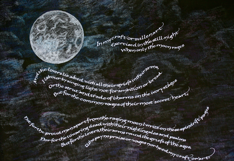
This work was done by Robin Gebhart in Seattle this year for the session “Carolingian and Variations”, in 26 Seeds: a Year to Grow. In her own words:
| “In
My Craft or Sullen Art” by Dylan Thomas was a quote suggested in
our class material to use for a longer quote. I love this poem
with its insight of artistic drive and passion. While reading
it, I could just imagine the type of night that inspired such a
contemplative poem. So I took a piece of Arches 88 from my stash
and gave it several coats of flat black gesso with a foam brush.
I researched images of the moon and clouds to get an idea of
where I could go with the background. I settled on a moody
attitude with a full moon and tested out several colors of
colored pencil on a piece of paper trimmed off from the main
piece. Then I turned to the composition of the space. The idea was to allow the text to become a part of the whole. Sketching out a few ideas, I decided to go with a wispy, rambling baseline for the text. To me it feels like a bit of cloud, wind or spirit, and Carolingian was the perfect hand to represent it. To get an idea of where the text would fit into the design, I wrote out the text in a straight line on good practice paper. Then I trimmed it out closely and snipped it top and bottom to the baseline. |
This allowed the paper to bend as I attached it to a full-scale
rough by twisting and turning it - affixing it to the page with
a bit of removable tape here and there. When I was happy with
the layout, I took a piece of tracing paper and drew the
baseline and x-height on it. Turning back to the Arches coated in black gesso, I was now ready to place the moon (done with a compass and white lead) and transfer the text lines from the tracing paper. I took my colored pencils and started by creating the image of the moon, then radiating out from it with the clouds/atmosphere. When I was happy with that, I wrote out the quote with Dr. Martin’s Pen White. I still had to make a few line adjustments here and there, but happily it worked out well. To finish, I erased anywhere that the transferred text lines showed - a tedious but necessary task. Lastly, I went back over the image with the colored pencil to add drama or depth where needed. 15” x 17” |
* * * * * * * * * *
Week #5
This work was done by Lisa Tsang in Seattle this year for the session “Roman Variations”, in 26 Seeds: a Year to Grow. In her own words:
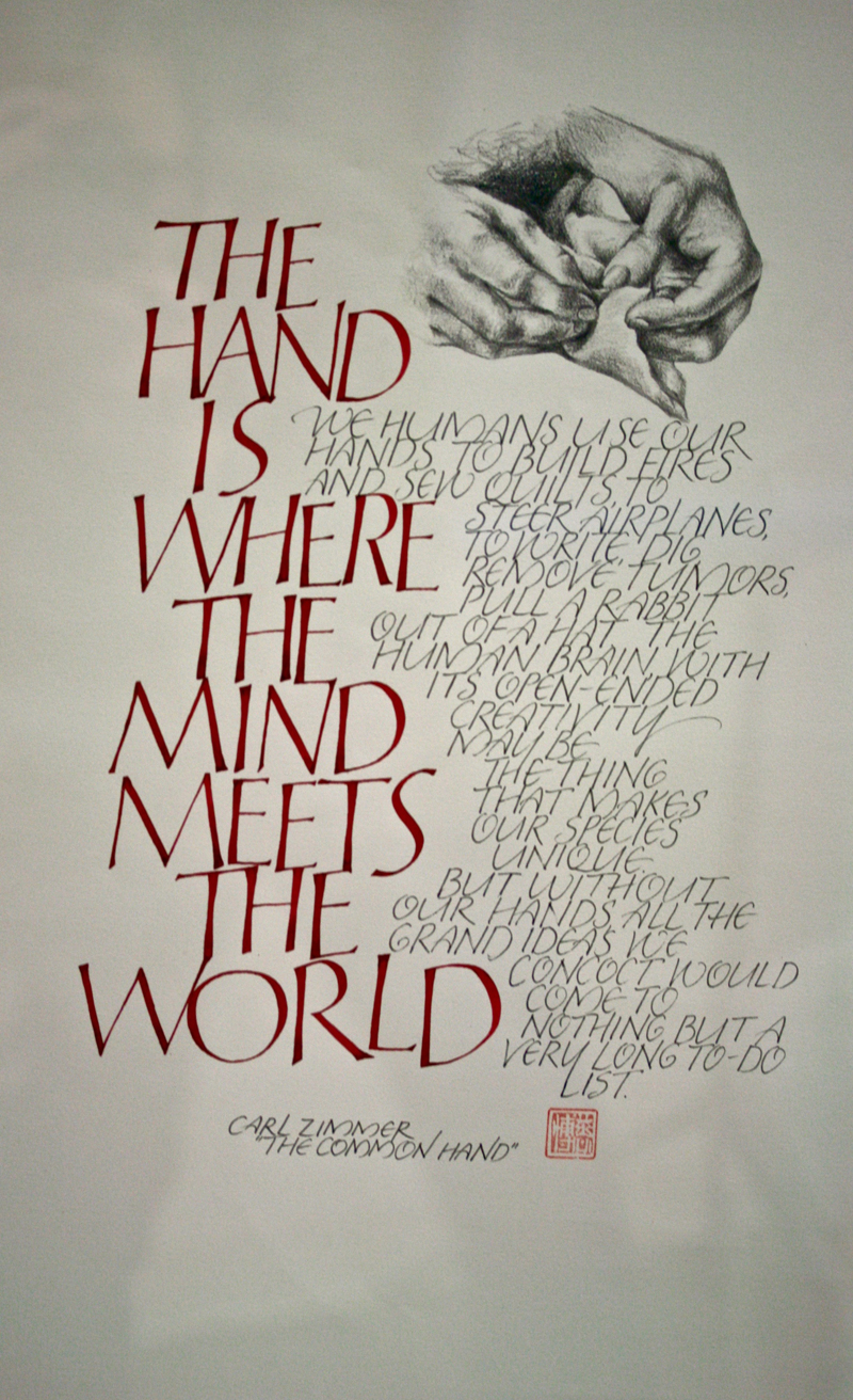
| This
was done for the Romans variations assignment using Tom Perkin's
pressurized script in gouache and a italicized capitals using a
pointed pen EF66 with Winsor Newton ink. The drawing was
rendered in PrismacolorPencils. |
I did 3 versions of the layout to
figure out the design and used a light box to interlock the
letterforms in the final. Image size is 18 x 20". This piece was juried into the Arts of the Terrace, thanks to your encouragement to get our work"out there for others to see." So many thanks for your vote of confidence! |
* * * * * * * * * * *
Week #6
This work was done by Jean Ferrier in Seattle this year for the session “Carolingian and Variations”, in 26 Seeds: a Year to Grow. In her own words:
|
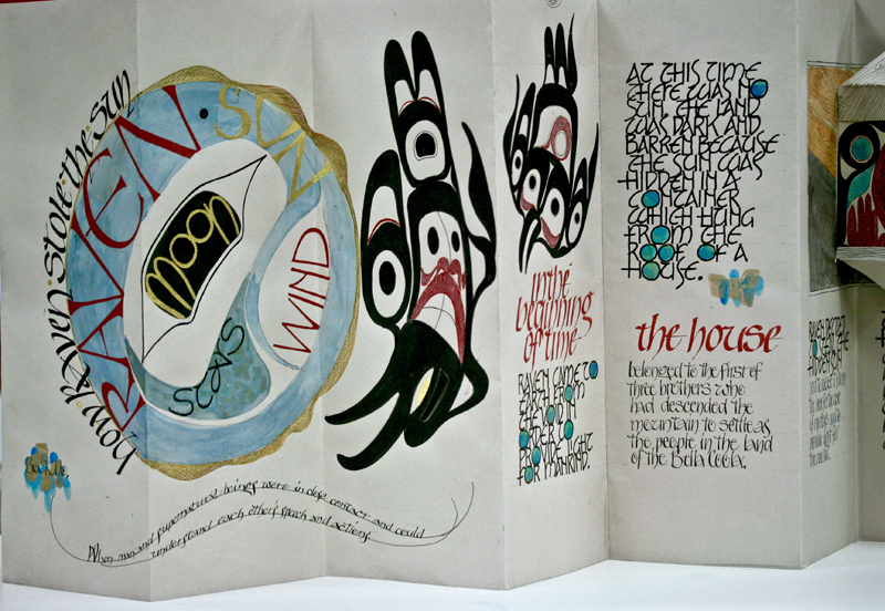
This book involves the complexity of combining two art forms; NW Coast formlines plus fulfilling the assignment of Carolingian, plus using stick inks, plus including a Roman variation for variety. This traditional, very naive story needed to be told sequentially to be coherent.
I used a fold out format with Canson (pearl) paper because it is stiff and can take some moisture. Colors are limited to red, blue, and black; as those are the only colors used in this coastal art form. |
The red was dark than I anticipated, so I highlighted it with colored pencil on top. I used a pop-up (the Pocket Paper Engineer by Carol Barton) and gilding to bring some life to it. The size of the individual pages is 5 ¾ “x 16 “.
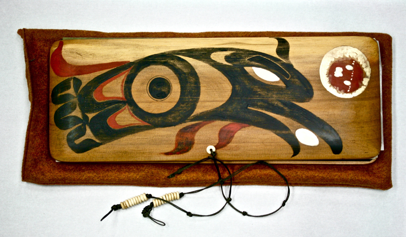
The book has wood (red cedar) covers.The spine is thin leather, attached to wood with Ecoweld water based contact cement. Otherwise, PVA glue is used. The finish is a sealer called Waterlox original (tung oil). Afterward, the surface is buffed. The cord is No. 15 seine twine, with bone beads. |
* * * * * * * * * *
Week #7
This work was done by Terry O’Connor in Chicago in 2015 for the session”Primitive to Modern”, in Primitive to Modern. In her own words:
| I
view this piece as my "final exam" after 2 years in Reggie's
class because I incorporated so many of the techniques that we
learned. This piece is written on Arches hot press watercolor
paper. The background was achieved with a watercolor wash
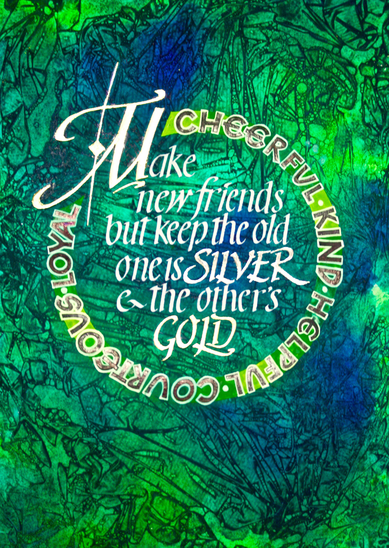
utilizing the "saran wrap" technique. In executing this work I followed the steps that were outlined in class when we copied Reggie's work. First, the gilding was done. The initial letter "M" and the word "gold" were gilded with 23K gold over 2 coats of Instacol, while the word "silver" was done in palladium. The border was under painted with white acrylic paint mixed with matte medium. |
The letters in the
border were done in Sumi ink with a Speedball B-nib with the
letters squared off with a pointed nib. They were then outlined
with Dr. Martin's white. The letters in the main text were
written with a Brause nib in Dr. Marten's white using the
Neugebauer italic letters. I then thought that the letters in
the border were competing with the main text, so I dampened the
contrast by applying pastel shavings over the border. Anyone who has been a Girl Scout will recognize this verse. I designed this piece for a friend who had recently lost her mother. Her mother was a wonderful woman who was our Girl Scout leader when we were growing up. |
* * * * * * *
Week #8
This work was done by Katie Garrod in Chicago in 2015 for the session “Experiencing the Book as a New Structure” in PRIMITIVE TO MODERN. In her own words:
| The
class was a great finale to the course. My dad died in 2012 and
had some funny ideas about being an artist. He was an electrical
engineer. He thought money spent on attending art or calligraphy
classes was a waste of time and that a "true" artist somehow
just emerges fully fledged, on the scene, driven by some inborn
ability and passion to be an artist. He was so wrong. So thank
you for "pic-ing" me so often and helping me believe that a
small part of me is capable and worthy of doing art. Being in
the class with others with such varied talents was incredibly
enriching, thank you for being the mastermind who brought us
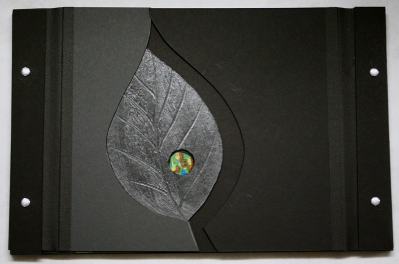
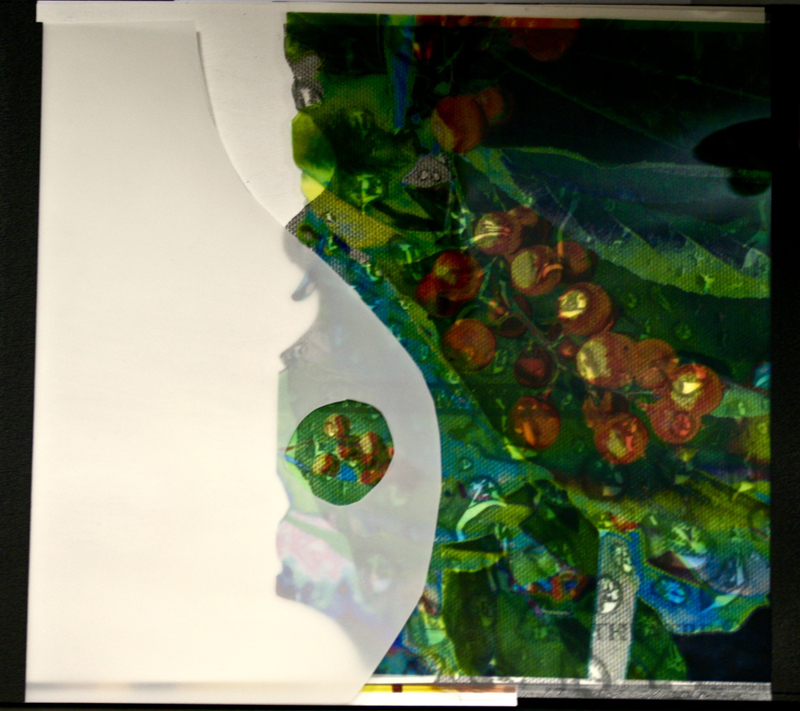
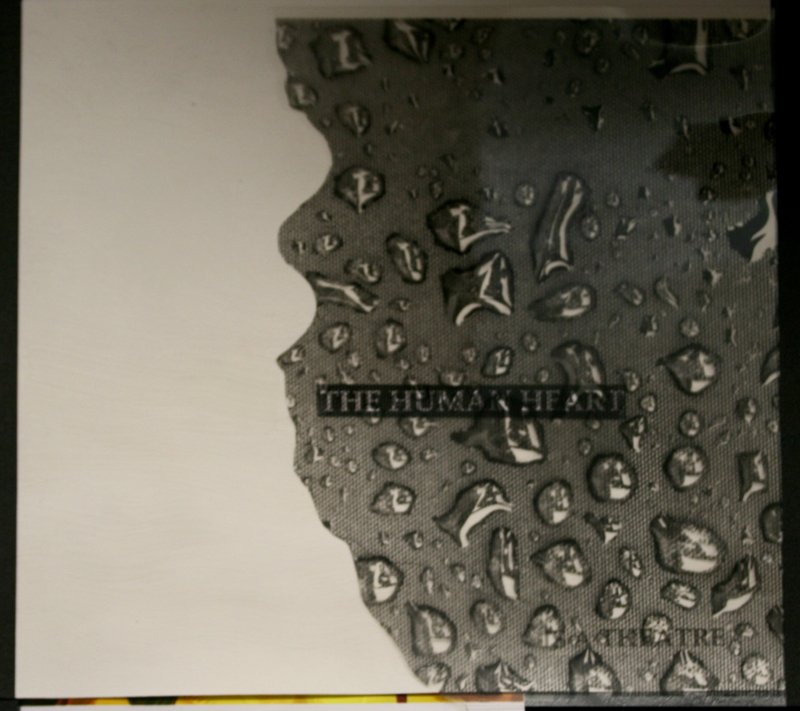
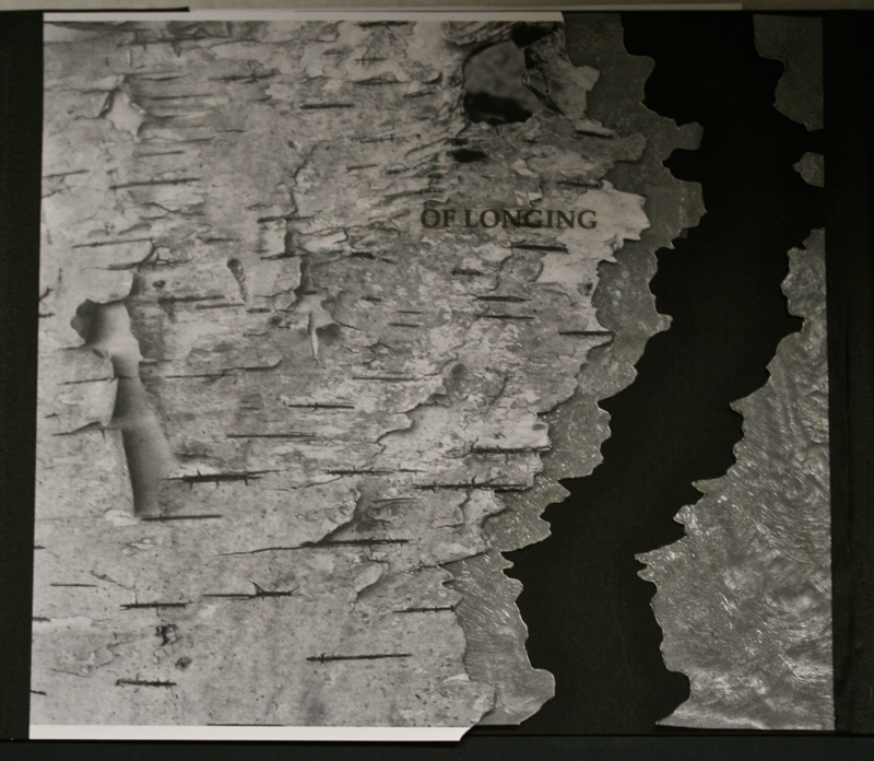
together. The book . . . This art work was the result of the last class of Primitive to Modern in 2015. We were asked to bring photocopies and transparencies, coloured, and black and white; mindful of the quote "The human heart is the theatre of longing". In class we learned about this re-imagined book form. We also found out what happens when you deconstruct images and layer them in unexpected ways. All my images were all taken on an iPhone. Unwittingly I had been doing my homework for this class all year: Dale Chihuly's blown glass, a luscious branch of bittersweet berries and leaves, the rain beaded on the top of my BBQ cover and a piece of birch bark I found while I was walking. That's the joy of a smart phone camera, it's ready when something interesting turns up; and the images are easily equal to the task of being enlarged. |
Given that we had so many choices to make in a short time
regarding the layering of the pages it was freeing to just jump
in and do it without agonizing too much. Happily the black card
which made up the front cover was a different shade on the
reverse and the leaf became yet another shade when the acrylic
medium was brushed on. Into this I scratched the veins of the
leaf. I just couldn't resist making a little hole to reveal a
hint of what came next. All the images, which had been emailed
to and printed by a local copy shop, felt like little treasures
to me but experimenting and pairing them with some of the papers
we treated in class with various kinds of acrylic medium
revealed their potential. The birch bark paired with the
translucent paper treated with a texturized acrylic was a
special discovery. However by the end of the second day of class my brain was done in but happy. Everyone in the room was so enthusiastic, sharing ideas with each other, suggesting and appreciatively oohing and ahhing! A great weekend . . . Thanks to all, especially Reggie and table mate, Kate! |
* * * * * * * * * *
Week #9
This work was done by Tomoko Zunino in Seattle in 2015 for the session “Carolingian and Variations”, in 26 Seeds: a Year to Grow. In her own words:
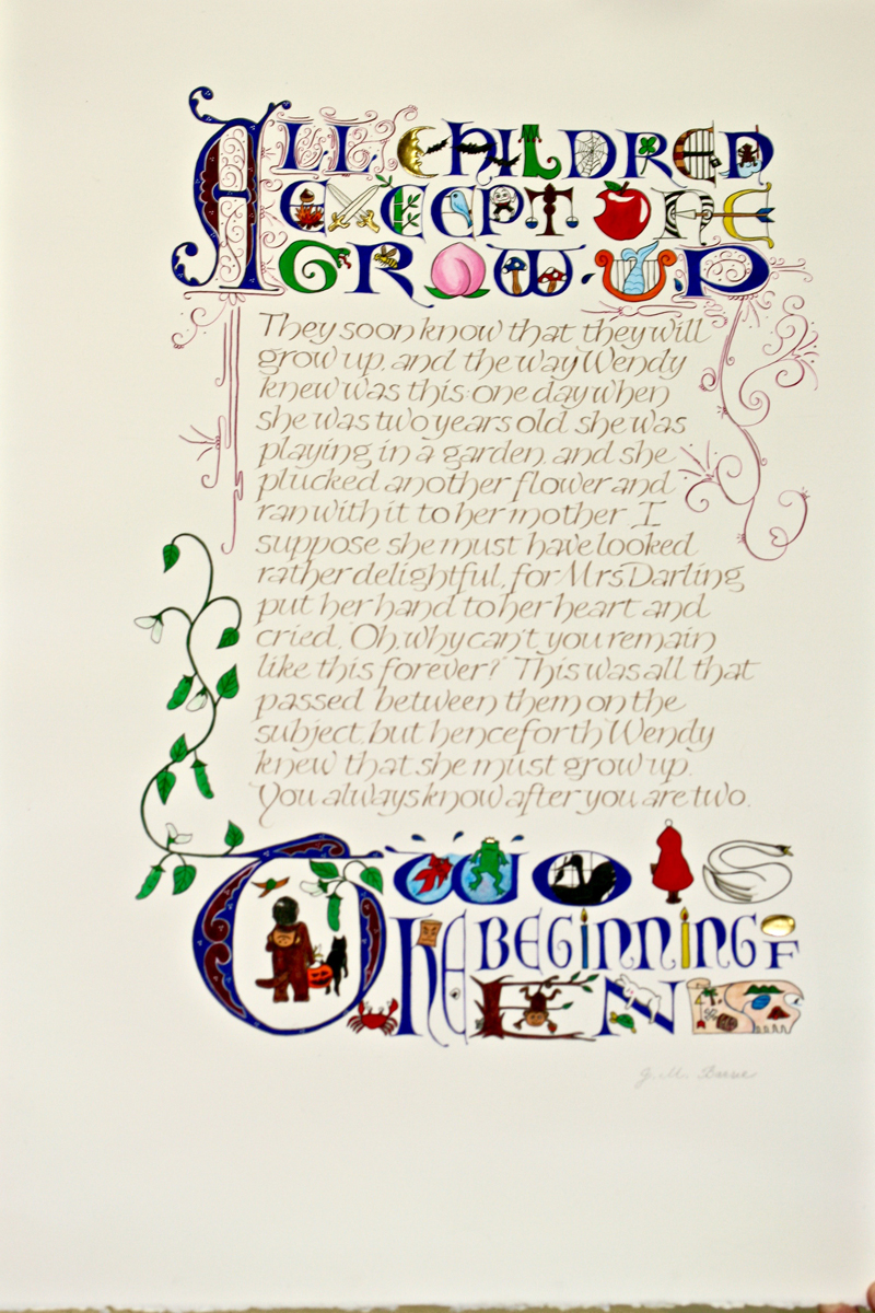
| This
quote was originally done for my nephew on his second birthday.
He can be seen in the bottom “T”, wearing his first Halloween
costume and being ready for the adventure ahead of him,
accompanied by the dog and the bird. The lettering of the main text is a wide body version of pressurized Carolingian with walnut ink and the one of the first and last sentences is Lombardic with gouache and some gilding. |
There are scenes and characters from fairy tales and folk tales. Filigree and the beanstalk are used to connect the Lombardic and Carolingian together. Also, the monkey costume and two other moneys represent, 2016, the year of the monkey. Happy new year! Arches watercolor hot press paper, 15” x 22” |
* * * * * * *
Week #10
This work was done by Marita Sheeran in 2015 in Seattle for the session “Italic and Variations” in 26 Seeds: a Year to Grow. In her own words:
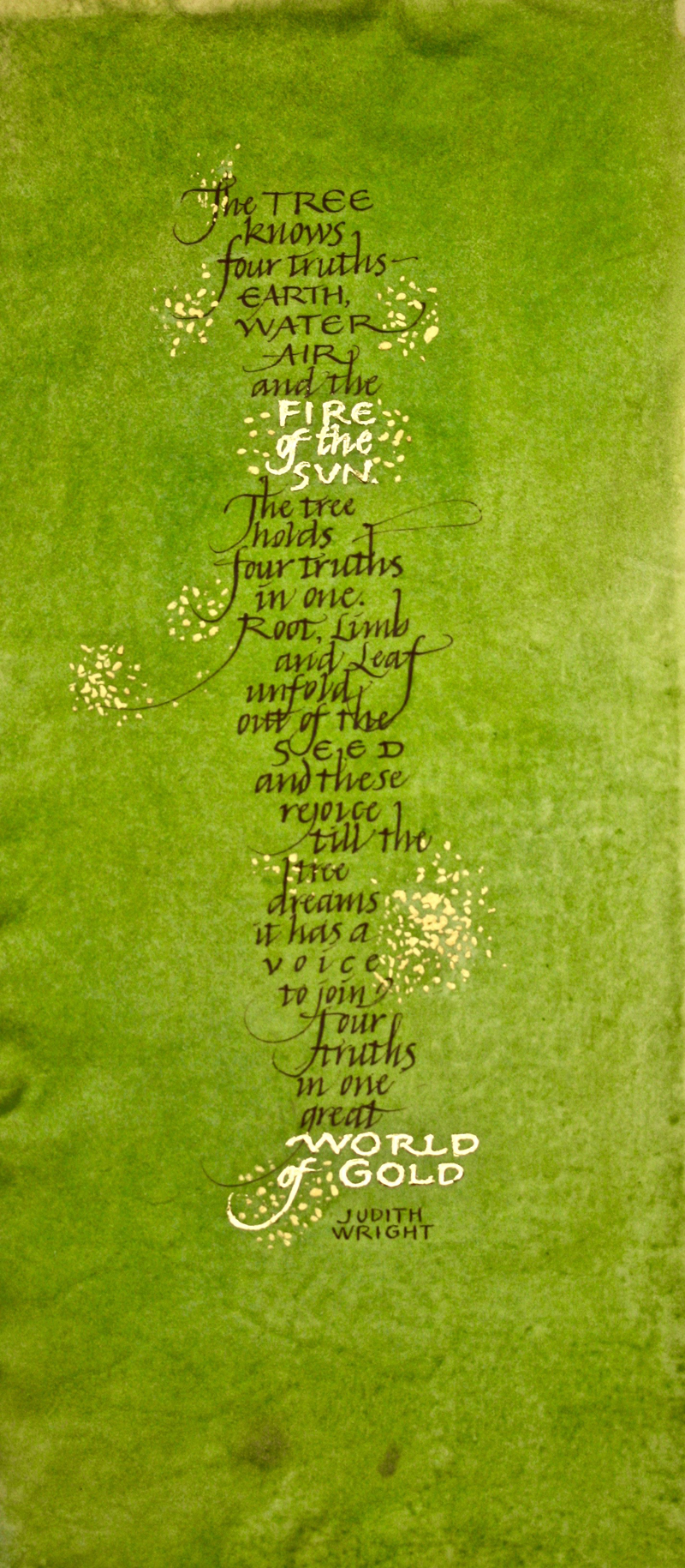
| The
text is the first stanza of poet and conservationist Judith
Wright’s 1955 poem, The Wattle Tree, which blooms gold in her
native Australia. I thought it had all the elements for a
perfect vellum assignment for the final class of Reggie’s “26
Seeds” year-long course—a tree unfolding out of seeds and
finding its voice. Plus, of course, the magic of gold. The piece is on a 6-1/2 inch by 14 inch vellum rectangle I dyed green about 40 years ago and packed away while I raised 3 children and had a career that didn’t leave much time for work with vellum. I’m embarrassed to say that back then I think I used RIT Dye bought from the grocery store. The Italic hand is written with a Mitchell #5 nib and a combination of Winsor & Newton raw umber and red ochre gouache with some black sumi ink thrown in. I burnished Wehrung & Billmeier 24K Fine Pure Gold over text written with Kölner Miniatum Ink and a Mitchell #4 nib. |
I used a fan brush to create blossoms of Schmincke gold pearl
gouche and then switched to a finer brush to achieve smaller
bits. When I scraped off media from an overenthusiastic flourish, I discovered that I also lost the 40-year old green dye. That blossom bouquet turned out somewhat larger than I had planned in order to cover the error. As I write this I am so looking forward to starting Reggie’s “Primitive to Modern” Class and experimenting with natural dyes and vellum. Like countless of his other students, I am also incredibly grateful to Reggie for helping me to find my calligraphic voice last year. The entire poem, which is really about the search for immortality, can be found at http://richard-outoftheblue.blogspot.com/2011/09/wattle-tree-judith-wright.html. |
* * * * * * * * *
Week #11
This work was done by Laura Blaine in 2015 in Seattle for the session “Roman Variations” in 26 Seeds: a Year to Grow.
In her own words:
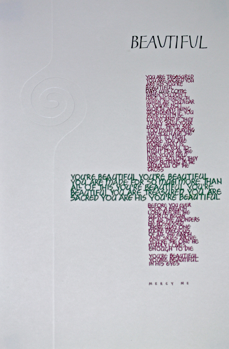
| I created this piece for the Romans Variations assignment of
doing a long quote using different Roman Cap variations and
colors from our color chart. The piece is 11”x17" with gouache
on Arches 90# HP. I love the look of embossing, so I found an image in Shrift and Symbol that I based the embossed spiral and line on. I cut the design on a manilla folder using an X-acto knife with a rotating blade to emboss with. For the long quote I choose the song lyrics, Beautiful, from the band, Mercy Me. The title was lettered with Tom Perkins Caps using a Mitchell 3 1/2 nib and the lyrics were lettered with Neugebauer Caps using Speedball B6 nib for the verses and B5 nib for the chorus. |
The credit was lettered using a school nib. For the colors I
chose a warm burgundy red and a contrasting green to reflect the
meaning of the lyrics. I had experimented with different layouts using Adobe Illustrator and finally came up with a narrow column for the verses that parallels the line coming from the spiral and a wide column for the chorus to offset the spiral. I created custom guidelines based on my design for practice and for use on my light table, so I would not have to worry about erasing lines afterwards. For the final piece I lettered the title last to make sure of the placement. Even though I practiced on loose paper first to decide where to start the lettering, I lettered the title too high with too much space between it and the first line of the lyrics. Although my solution wouldn’t work in the real world, I decided to take a line from the chorus and letter it above the first verse, shortening the space between the title and lyrics. The song has such deep, meaningful lyrics; they're worth repeating! |
Week #12
This work was done by Robin Gebhart in 2015 in Seattle for the session Roman Variations in 26 Seeds: a Year to
Grow. In her own words:
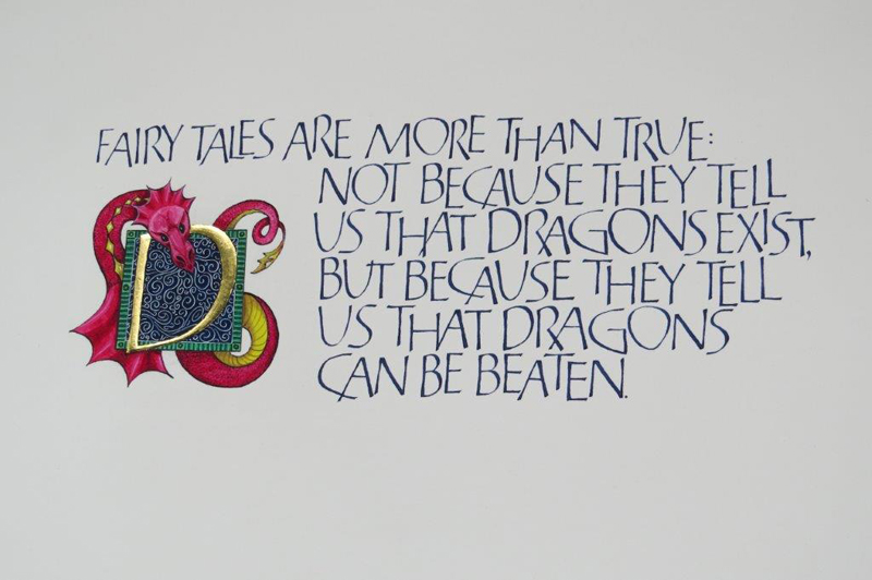
| The
text for this piece is a quote from author Neil Gaiman,
published in the epigraph of his 2004 book "Coraline." It
paraphrases a much earlier quote from British author G.K.
Chesterton, 1874-1936. As a lover of children's books, this
quote resonated for me and it was fun using it for the
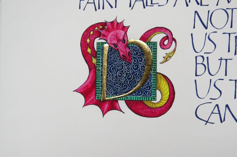
three-piece short quote assignment. This artwork was created on a 9"x 16" piece of Arches 90# HP. The lettering is Tom Perkins Roman written with a Mitchell #4 and indigo gouache. These letters are so fun to play around with - they can be pushed and pulled all over the place and I chose to add a bounce to the baseline in order to create a bit of whimsy. The main challenge with the text was balancing legibility and freedom with consistent texture. (I did place a baseline and made sure to visually balance the line of text on it). The illumination was a different challenge. Instead of the traditional large initial cap placed at the beginning of the text, I decided to place it lower in the text and use a large letter D with the dragon illustration. |
The dragon was created after researching old and new images to
get an idea of the direction I wanted to go with it. Several
sketches were made and discarded before settling on the
serpentine version in the final. The image was transferred with
Saral, then outlined with a black micron pen. The initial letter
D was built up with several thin layers of Instacoll and topped
off with 24k gold leaf. Gouache was used to paint in the rest of
the image. Because I was worried about the solubility of the
paint; I added glair to prevent any bleeding if I needed to go
back and make changes. This was a relief when I decided that the
scrolling "breath" of the dragon needed to be brightened and I
could go back over it with confidence. As I look at the piece, there are other, less conservative design options which intrigue me - perhaps I'll revisit it in a few years. . . |
* * * * * * * *
Week #13
This work was done by Lisa Tsang in 2015 in Seattle for the session “Italic and Variations” in 26 Seeds: a Year to Grow.
In her own words:
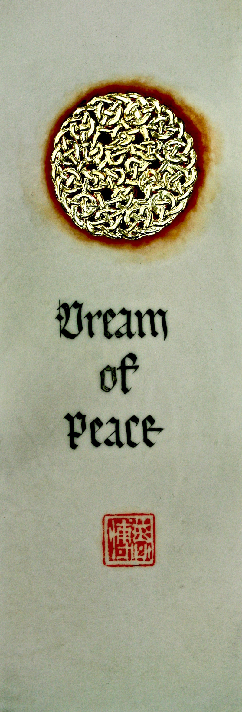
| This
was my very first work on vellum and I spent a long time mulling
over (too complicated) ideas and worrying about whether I would
ruin my 3.5"x7" offcut. But after hearing how some classmates
scraped away their mistakes multiple times, and it was 3 days
before the assignment was due, I decided to overcome my "vellum
anxiety" and take the plunge. Instead of using Saral to transfer my design, I used a Celtic rubber stamp and pigment ink to save time. To my surprise, I did not get chastised by Reggie for that! The beauty of this design was that I could apply my Instacol to small sectioned out areas-which I did in 2 sittings. I let the first layer dry completely and then came back the next day to add Instacol over the areas that had flattened out. By doing this, it gave 3 dimensionality to the whole piece. |
Two layers of patent 24K was applied, burnished, the excess
brushed off, and polished with a silk cloth. For the background wash, I mixed red ochre gouache with burnt sienna powdered pigment. I noticed some buckling of the vellum when I was working. Reggie explained this is a common consequence when you overly wet the vellum surface. The lettering was done using Black Moon Palace Sumi with guidelines underneath, an advantage when working with this translucent material. I was happy to scan & send this out on our Christmas newsletter and the original became a present for my Dad. I showed it to my first teacher, Robert Palladino, and smiling, he said I would get spoiled working on vellum. |
* * * * * * * * * * *
Week #14
This work was done by Roann Mathias in 1988 in Memphis for the session “Broad Edge Brush” in 26 Seeds: a Year to Grow.
In her own words:
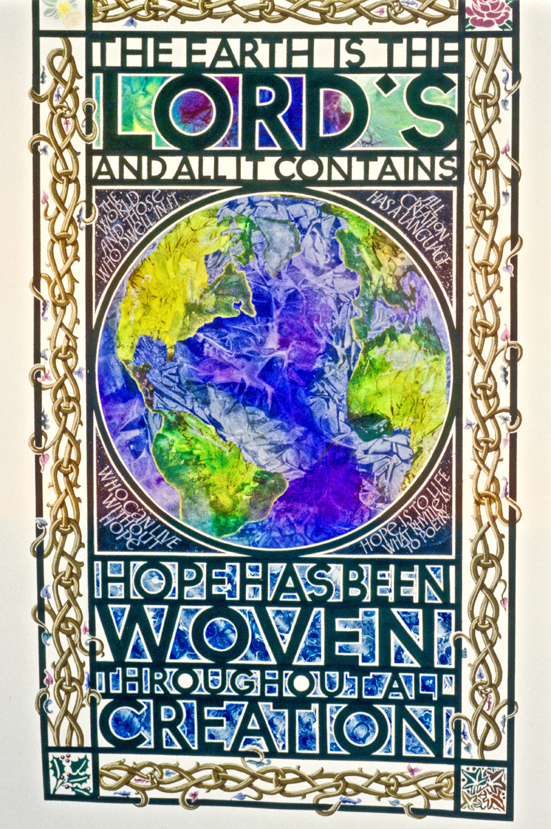
| The
Earth is the Lord’s This piece was created as a response to the gridlock assignment, in Memphis in 1998. I chose the text and lettered it out a few times. Then I figured out the spacing, including deciding which lines to make larger and smaller. The paper that I used for the lettering was over-sized. I mixed up a dark green gouache for the lettering, instead of using black. Then I worked out how to fit the border around the lettering. In each of the corners of the border I put an illustration for the four seasons of the year. For the background papers, I used some marbled paper, some black paper from a previous assignment, and a depiction of the world created with the saran wrap technique. The last step was to cut out the counterspaces with an x-acto knife. My work at the time was heavily influenced by Biblical texts, and this is a good example of that. I wanted to use the image of the world as seen from space, and spent a long time trying to find it. (The internet was not very sophisticated back then). |
When I did find the right image, I stretched a piece of Arches
watercolor paper on a huge board, estimated where to place the
blue and green inks, and covered it with saran wrap. After it
dried, I added the details of the continents. My children were
all very young at the time, and my 3-year-old son came into my
studio while the piece was still stretched out and exclaimed
“It’s the WORLD!” When I find a text that is meaningful to me, I usually create a series of works based on that text. For this quote, as with most all other texts that I choose, I spent a lot of time trying to figure out the technical details. It’s like solving a puzzle. During that thinking and planning stage I was sort of digesting the text, and letting its meaning sink in. After that, it’s all about process and technique for me. Once I put the whole thing together, it seemed that the corners around the globe were missing something. So I used other texts that seemed to reinforce the meaning to fill up those spaces. Finishing this piece was very satisfying because I think I got to say everything that I was thinking about at that time. |
* * * * * * * * * *
Week #15
This work was done by Leslie Winakur in 2016 in San Antonio for the session “Blackletter Variations” in Primitive to Modern.
In her own words:
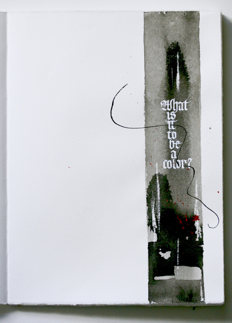
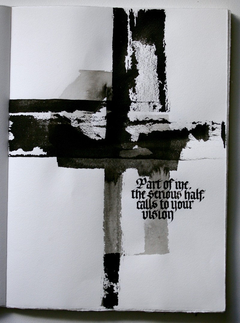
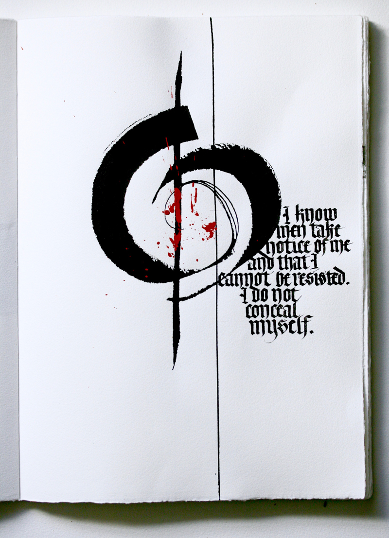
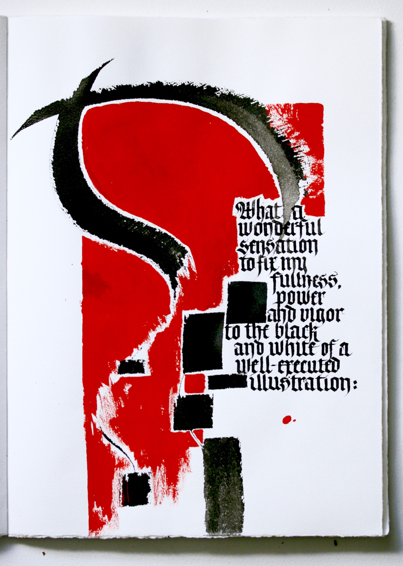
| These
images are just a few of the 28 pages in a book done for
homework after the first Primitive to Modern class. The marks
were the product of a session of play with my new Lumis pens
(the newer, straight cut ones that look a bit like automatic
pens), especially the 1" and the 2", both of which I loved.
I wanted to make marks that had elements of the various components of the traditional and modernized letters, as a background for more traditional letterforms. After I had a bunch of pages with marks, made while thinking about my text, I went back and added the words. The marks are done with Moon Palace Sumi, which has a sheen to it when dry. |
For extra contrast, I used Winsor Newton ivory black gouache for
the text, so that when viewed up close, the matte finish on the
gouache is visible, even where I wrote on top of the black Sumi.
The text is an excerpt from one of my favorite books, My Name is Red, by Orhan Pamuk. The speaker is the color red, hence the red paint, (a mix of cadmium red gouache and alizarin crimson watercolor). The white lettering on the first page is Dr. Ph. Martin's bleed proof white. The paper is Hahnemühle Schiller, page size about 9" x 12". As always, knowing Reggie would be back in a few weeks was a great impetus to work. Thanks, Reggie! You bring out the best in all of us. |
* * * * * * * * * *
Week #16
This work was done by Kate Van Dyke in 2016 in San Antonio for the session “Blackletter Variations” in Primitive to Modern.
In her own words:
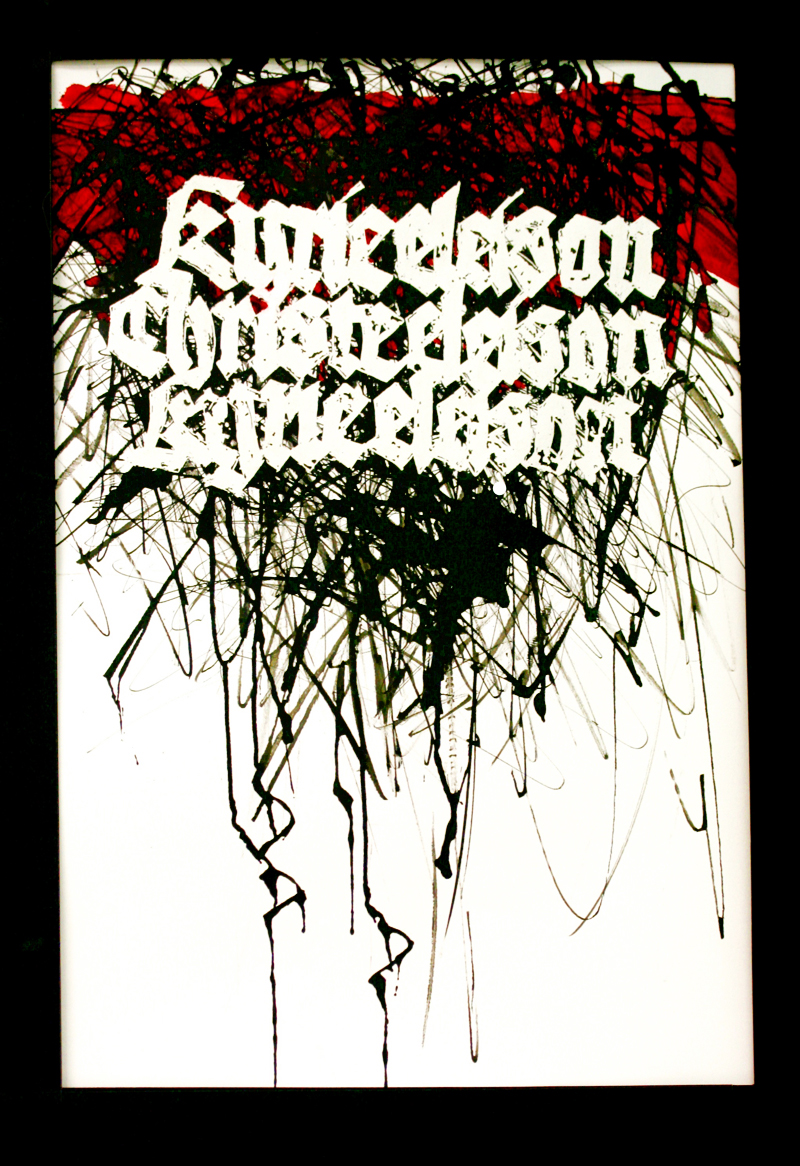
| Kyrie
Eleison This piece grew out of a study of Rudolf Koch's Ten Commandments. I wanted to understand how he made his expressive Gothic letters. At first I started analyzing in the way I have been taught – weight, slant, pen angle, serif shape and direction, similarities among letters. But he varied all of these, seemingly randomly. I wasn't getting it. The light bulb came on when I traced the counters and interlinear shapes – that is where the constancy is, where the patterns made sense. I then wrote out the words several times until I had a version I liked, with a Speedball C-1. I scanned and enlarged it, then transferred the outlines of the letters to a sheet of Fabriano Artistico HP watercolor paper. |
I painted in the letters with masking fluid and started
scribbling over them with black acrylic ink using a folded pen.
I also let some of the blobs of ink drip down. When the ink was dry, I started removing the mask and realized there wasn't enough black to make the letters show up. So I remasked what I had removed and added more scribbles. Better! I removed most of the masking fluid, but some was stubborn or the ink had gone under it. The bits of black left behind make the letters look a little like a woodcut print. An unexpected texture that I like. I let the piece sit a couple of days, thinking it was done, but it wasn't. I snapped a photo of it and tried the red in Photoshop Elements and decided that's what it needed. I then painted in the alizarin crimson gouache. The finished piece is about 12 x 18". |
* * * * * * * * * * *
Week #17
This work was done by Haley Ping in 2016 in San Antonio for the session “Lettering on Vellum” in Primitive to Modern.
In her own words:
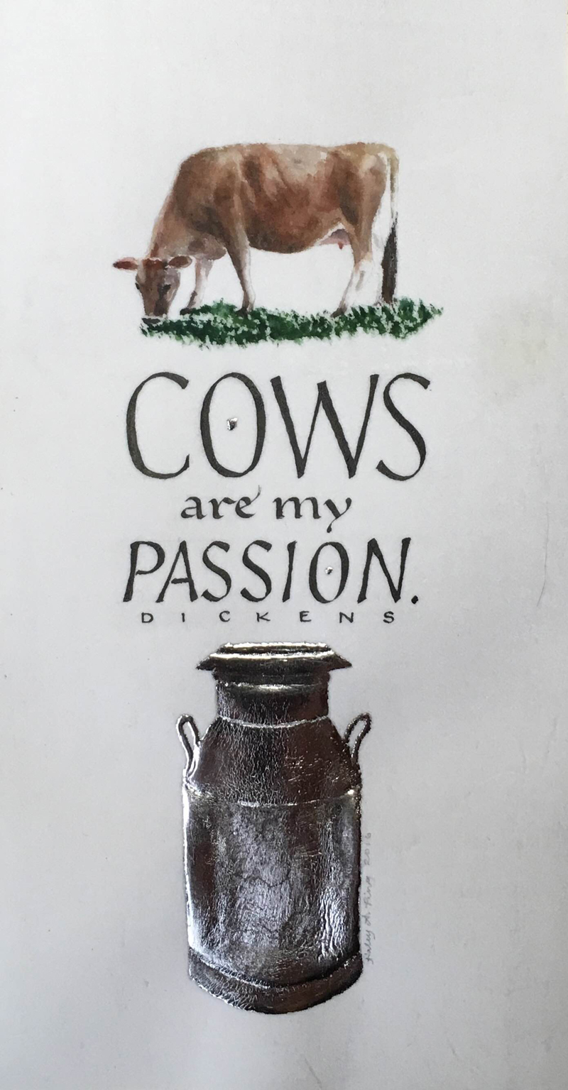
| I did
this piece for Reggie's second session of Primitive to Modern in
class on the provided off cut of calfskin vellum Reggie
prepared. It measures about 4" x 6 1/2". I used a size 5
Leonardt Roundhand nib and a Hiro 111EF nib for the lettering.
The gilding is on a built up clear Instacoll base with
palladium. And the cow portrait is done with Schmincke
watercolor. Cows, particularly Jerseys, are something I adore now that we have two of our own. They have a pleasant personality and are very clever! When I happened to come across this Dickens quote from his novel Dombey and Son last year I had to make a note of it as an idea for a future calligraphy piece. |
The design is a result of playing with the quote and knowing I
wanted to paint a portrait of Daisy and, of course, a milk can
since she is our family milk cow. The gilded milk can was the most difficult part to execute. My mother gave me the idea for building up layers of Instacoll so it would be more dimensional. I drew the outline and sectioned it. Each section I labeled with the plan of either applying 1, 2, or 3 layers of Instacoll to build it up depending on the depth of the actual object. I only applied 2 layers because I ran out of time in class but I think it turned out well anyway. |
* * * * * * * *
Week #18
This work was done by Marijo Carney in 1986 in Chicago for the session “Brush” in 26 Seeds: a Year to Grow. In her own words:
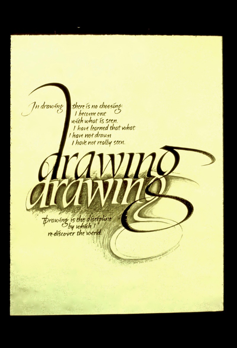
| On
Drawing This work was done in 1986 toward the end of the "26 Seeds: A Year To Grow" year long class that Reggie taught at Loyola University. I had read Frederick Frank's book, "The Zen of Seeing", and had copied these words from his book as they reflected my feelings about the value of drawing. I decided to use them in a finished piece that would be an inspiration to my drawing students at Western Michigan University. I first did the large word "drawing" with a 1/2" chisel edged brush and black gouache, on a piece of 18" x 20" Arches 140 lb hot press paper. I then traced the outline of these letters on a separate paper and lightly transferred this image to the area below my brush made letters. |
Then using a soft 2B pencil I used sketchy gestural lines around
the traced letters to leave a white negative representation. To
complete the piece I used a very small pointed brush and black
gouache to write the quote in the areas that would marry the
words into the large letters and make a successful composition. Sadly, I have lost this piece. Hours upon hours of searching has not helped me locate it. It was never framed nor exhibited and I am so pleased that Reggie has asked me to share its inception and process with you. At long last it has an audience. |
* * * * * * * * * *
Week #19
This work was done by Maggie Gillikin in 2016 in San Antonio for the session “Blackletter Variations” in Primitive to Modern.
In her own words:
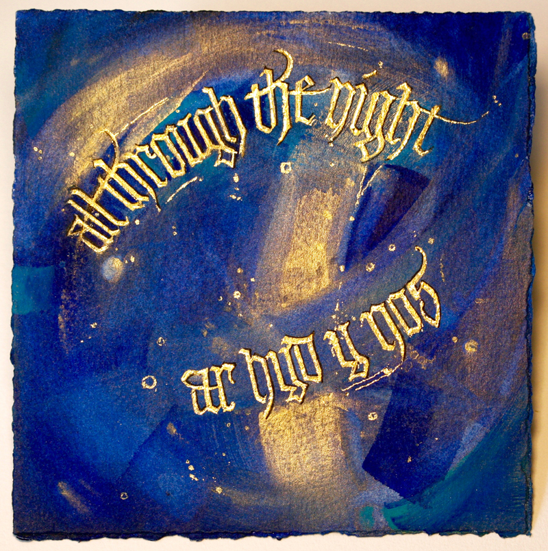
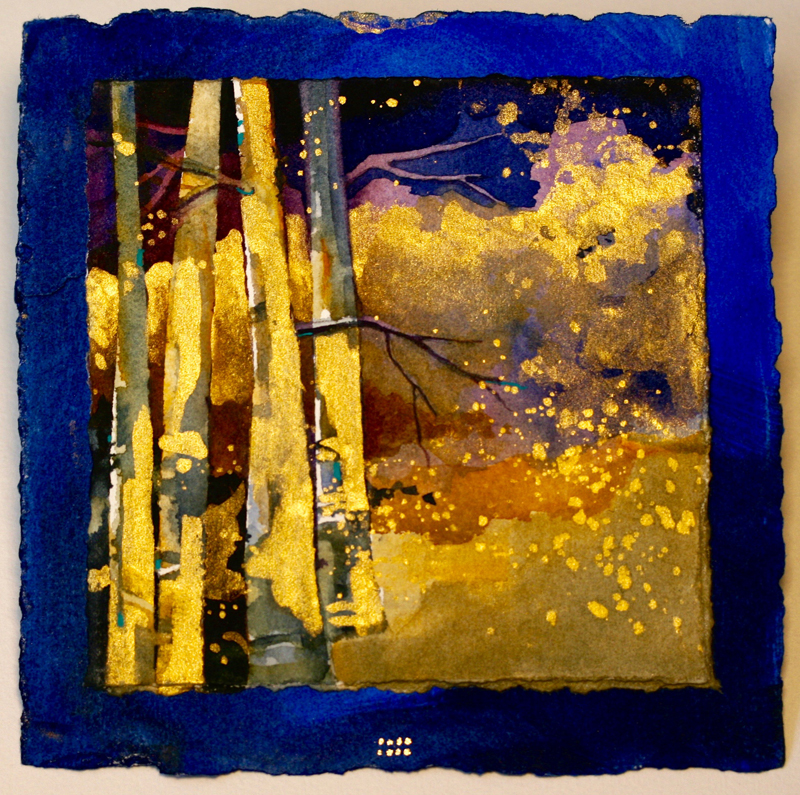
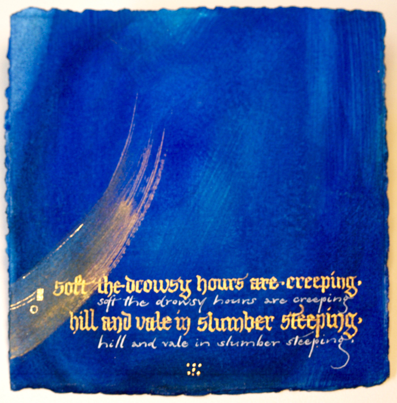
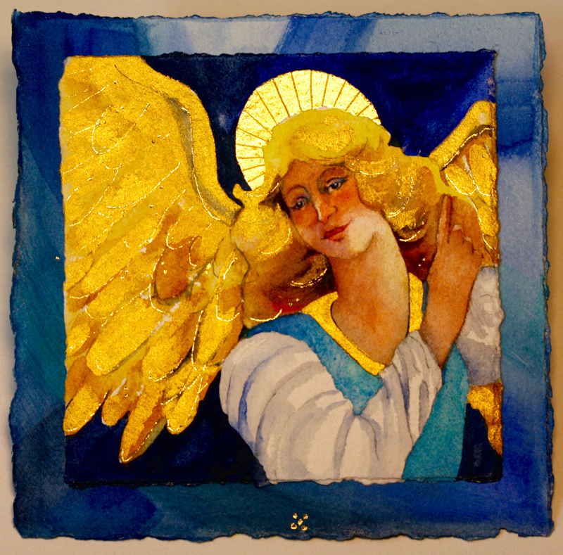
| These
thirteen unbound book pages are housed in a clamshell box. They
may be viewed individually or in sequence. The pages are 6” x
6”, and are numbered by gold dots at the bottom. The letterforms
come from two different year long classes. The blackletter is
from the current Primitive to Modern class, while the
Carolingian is from the most recent 26 Seeds class in San
Antonio. The book is titled “All Through the Night,” from a poem
by Sir Harold Boulton, set to an ancient Welsh tune. I often
lulled my children to sleep singing this lullaby. The paper is 300 lb cold press Arches cold press watercolor paper. The pages with only text are painted with watercolor, and the text is written using Schmincke pan gold gouache and Dr. Martin’s Bleed Proof White. |
The pages with paintings are double, i.e., the painting is on a piece of 5” x 5” 300 lb Arches cold press watercolor paper, glued to a 6’ x 6” painted paper, just like the lettering is on. The paintings feature gold - 24 K loose gold leaf placed in large areas which I burnished flat with a bone folder before laying the gold. Further gold, seen in fine lines of text and paintings, is bookbinders' 24 K gold on a roll, which is heat set. The tool to accomplish this is one which has multiple tips, a heat control, and is available at Talas in NY (talasonline.com, tacking tool, cool model, item #TTB068001). |
* * * * * * * * * * * *
Week #20
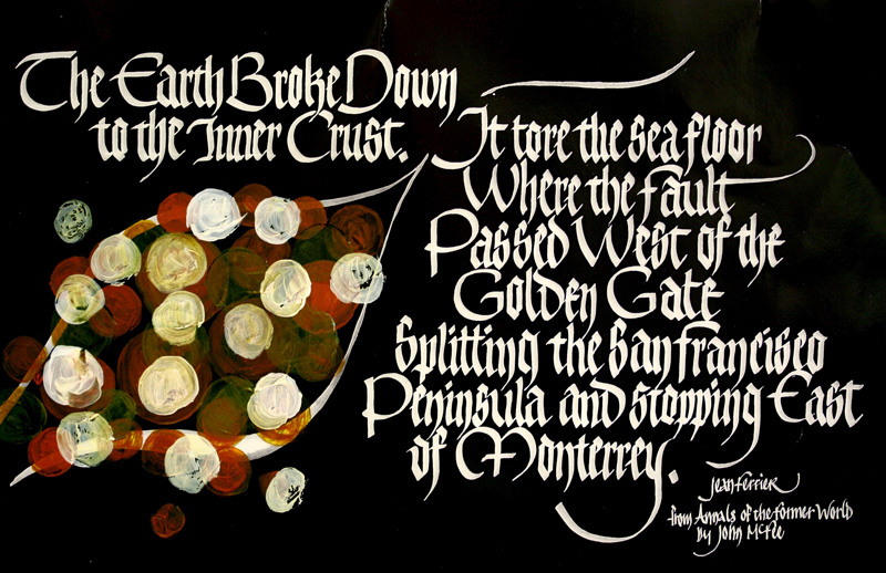
This work was done by Jean Ferrier in 2016 in Seattle for the session “How to Modernize a Traditional Calligraphic Hand: Blackletter” in PRIMITIVE TO MODERN. In her own words:
| The original, 9.5 x 15, was a black on white but reversed on a color copier, and printed on card stock. The painting was done with acrylic, on top of the printed surface. The paraphrase is taken from a fascinating geology book I am reading called "Annals of the Former World", by John MacFee. | It makes you see North America in deep time. The visual is of the San Andreas fault, a section like a bag of rocks zipping open and closed. |
* * * * * * * * * *
Week #21
This work was done by Kathy Barker in 2016 in Seattle for the session “How to Modernize a Traditional Calligraphic Hand: Blackletter” in PRIMITIVE TO MODERN. In her own words:
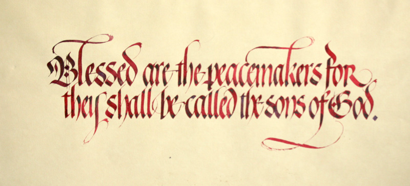
| The
final size was 10" X 19" done on "vintage", tan-toned Hahnemnhle
Ingres paper. Materials: Speedball C-0 Nib, Winsor Newton Alizarin Crimson watercolor, Moon Palace Sumi Ink. The technique, which was demonstrated in class, was to write each letter in Alizarin Crimson watercolor and then drop Sumi ink (Moon Palace) into the wet paint. This allows the sumi ink to "bleed" into the freshly written Alizarin Crimson giving it a lovely shaded effect. I found that dropping the sumi into the still wet paint at the tops and bottoms of each letter gave the most dramatic effect. It was important to do the sumi blending at the completion of each letter while the paint was still wet. |
The verse, a favorite of mine, was chosen because of the focus
on Peace and honoring those who are "peacemakers". In our
current times of world unrest, injustice and civil unrest, I
felt that this is a message that needs to be expressed. As a
part of our Gothic variations study, this piece, using a
gothicized hand with a more contemporary flavor ( taken from the
exemplar based on the typeface "Schwabacher") was done in
contrast to a more formal Gothic style. The process of developing the piece was mainly focused on arriving at a unified design that allowed the lines to fit together. This involved writing it several times and exploring the spacing and line length. The flourishes also needed to be designed so that they would add to the integrity of the overall piece. All this took much time and many trial practice pieces; so that when I did the final it could flow and have a pleasing effect. |
* * * * * * * *
Week #22
This work was done by Penni Burkum in Austin in 2016 in for the session “Basic Romans” in 26 Seeds: a Year to Grow. In her own words:
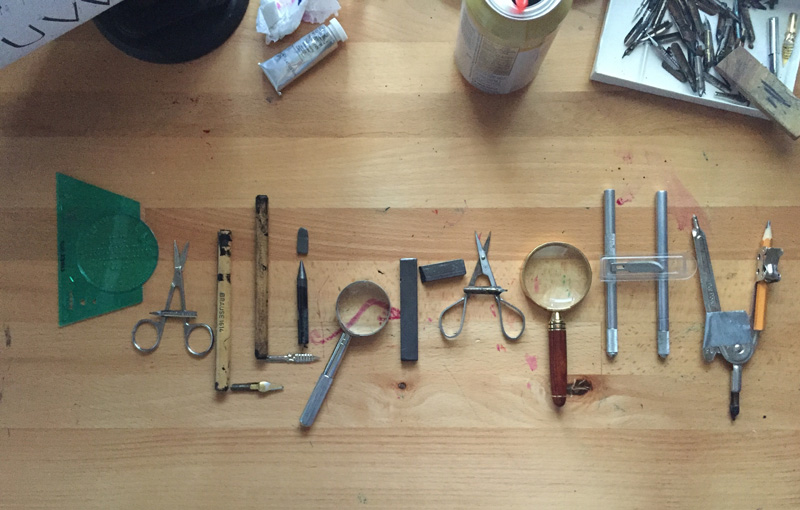
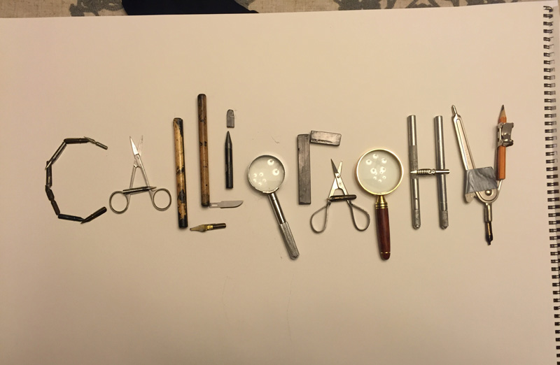
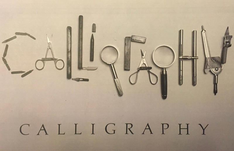
| It
took me a while to figure out how to express the word
“CALLIGRAPHY” in this spacing assignment. I don’t remember
exactly what inspired me to do it this way, but once I got the
idea, it became a fun project. I decided not to over-think it,
as is my tendency. This time I just grabbed whatever I could
find easily in my tool chest (hence the duct tape on the
compass!). The only real challenge was the C. I thought about using the Linex tool, since it has a C in it, but it wasn’t easily recognizable. |
I also considered a “coffee ring” stain, or at least three sides
of a coffee ring stain since coffee is my lettering companion.
But I was trying to keep it simple…as in I didn’t want to go
make a pot of coffee and create a coffee ring. Ultimately the C
made of nibs won out. I vacillated a little on the g, as you can
see by the two pictures. Then I spread the tools on a big pad of paper for a white background, and took the photo on my phone. I did a little editing in iPhoto, (Noir filter, and a little deeper contrast) and called it good. I know I could have dug a little deeper and found other items to express the letters, but part of the assignment, for me, was to lighten up. Otherwise, I’d still be arranging little bits and pieces on my worktable. |
* * * * * * * * * *
Week #23
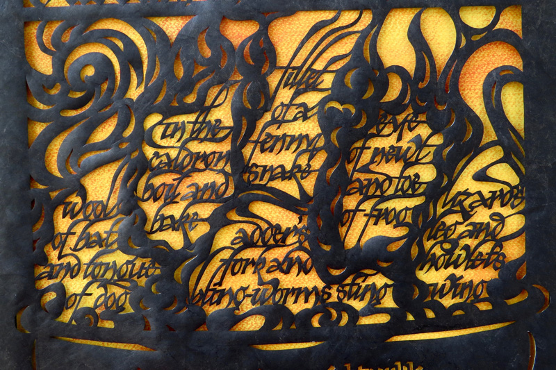
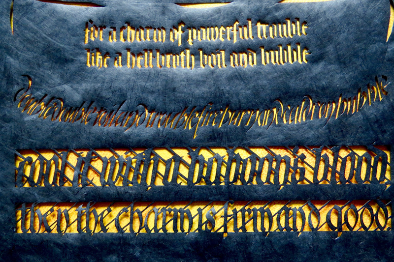
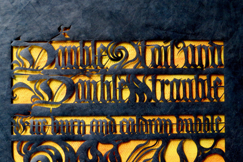
This work was done by Robin Gebhart in Seattle in 2016 for the session “Modernizing a Traditional Calligraphic Hand: Blackletter” in PRIMITIVE TO MODERN. In her own words:
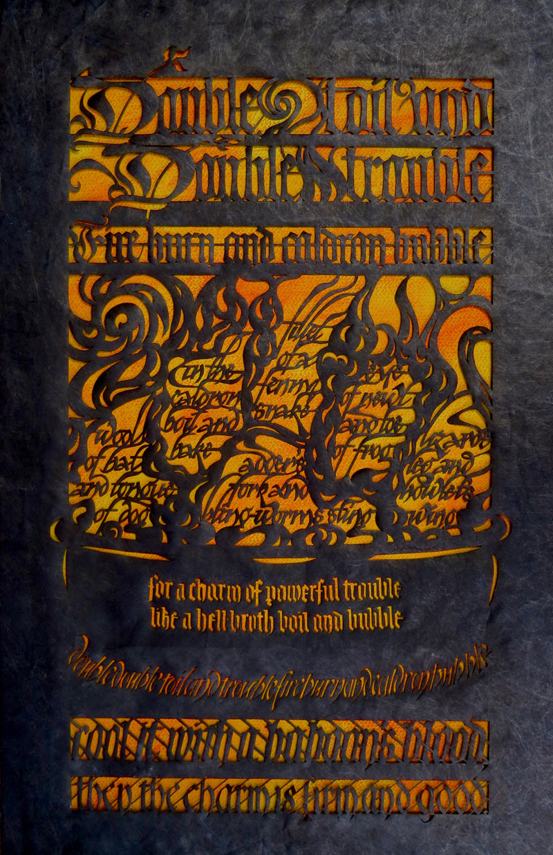
| At
our first Primitive to Modern class, Reggie taught several
blackletter hands and encouraged us to create a cut-out piece
for our homework. I kept thinking about a favorite quote from
Shakespeare’s Macbeth, the “Song of the Witches.” I roughly
sketched it out on a notepad, using all of the hands we had
learned. I felt good about the potential of it - but immediately
started whining quietly to myself: There was too much text, it
would be too large, take too much time, and I would absolutely
mess it up somewhere along the way. But the idea kept nagging at me, so I started working on it. I practiced the lettering on Gilbert Bond, then transferred it to a large sheet of Tyvek, using my light pad. (Tyvek is a sheet created from thin synthetic materials. It is difficult to tear, but easy to cut and most often used to protect buildings during construction.) |
Transferring the image this way let me be precise in the
placement and cutting of the letters. I started in the middle,
with the Elvis Blackletter in the steam. When that was
completed, I covered it up front and back and moved on to the
top, then bottom. I took my time cutting out the letters and
thinking it through. On the Friday before class, the cutting was complete, but the Tyvek was still white. So I grabbed a hake brush and covered it in Moon Palace Sumi to give it the black color. Then I breathed a huge sigh of relief! Final size is 16” x 27,” mounted on black ¼” foam core with a backing sheet of Canson Mi-Teintes yellow, which was gone over with orange pastels to create a dynamic background. (Thank you Reggie, for helping me out with that!) |
* * * * * * * * * *
Week #24
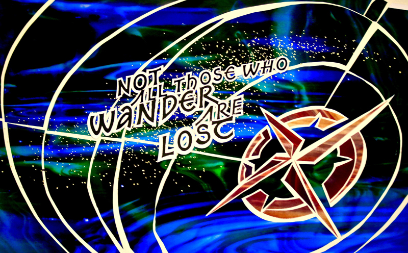
This work was done by Terry O’Connor in 2015 in Chicago for the session “Design: Deconstructing the Grid” in Primitive to Modern. In her own words:
| This
piece was done in the class "Deconstructing the Grid". Reggie
supplied photographs of stained glass that we used as
background. The letters were printed on card stock and layered
over the colored paper. Size: 8 ½ x 11. One of the things that I took away from Reggie's class was to do each piece with a loved one in mind. My youngest sister is a free spirit. She is currently teaching at an American school in Athens, Greece. |
I had intended to do a piece for her with the saying "Not all those who wander are lost"; however, my original plan was to do a traditional layout (gilded, of course) with an initial letter over a compass rose. Although sister and I are both interested in art, we have very different taste. While I love medieval illuminated manuscripts, she loves German expressionists. This assignment gave me an opportunity to make something for her in a less traditional format. |
* * * * * * * * *
Week #25
Special Video
This work was done by Lisa Tsang in 2016 in Seattle for the session “How to Modernize a Traditional Calligraphic Hand: Blackletter” in PRIMITIVE TO MODERN. In her own words:
| This
book is dedicated to all the wonderful teachers who have helped
us discover our possibilities. The pages are Fabriano Ingres and
the book was a birthday present from an artist friend. That
being said, I had to work on a pre-bound book (which posed
problems when trying to emboss close to the gutter) and required
careful planning. By keeping to a monochromatic color scheme and
textural elements, my hope is to honor those who live with
physical challenges, yet inspire us to dream big and never give
up. The reader is invited to explore the embossed pages by touch, highlighting the message of Helen Keller's text, "The World I Live in." I used Moon Palace Sumi, commercial and hand-cut stencils, as well as enlisting a friend's (Nan Robkin) Scan and Cut machine. Different Blackletter variations were explored as an assignment in Primitive to Modern. |
Anne Sullivan was the teacher who helped a 6 year old
deaf-blind defiant child decipher the world and in doing so,
improved the lives of countless others and inspired the world.
They forged a 49 year bond--the teacher never gave up on the
student. And the student surpassed all the teacher's
expectations because she had tenacity and the desire to learn.
The whole book contains quotes or passages from Helen Keller, except for one page. I included the Chinese character for "teach," written by my father, whom I love and respect with all my heart. Inspiration also came from my first calligraphy teacher, Robert Palladino, and continues with my current teacher, Reggie Ezell. Thank you for sharing your gift. |
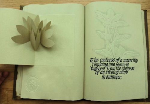
 link to video =
https://youtu.be/FXi8kwBbbbM
* * * * * * * * * * * *
Week #26
This work was done by Tomoko Zunino in 2016 in
Seattle for the session “How to Modernize a Traditional Calligraphic
Hand: Blackletter” in PRIMITIVE TO MODERN. In her own words:
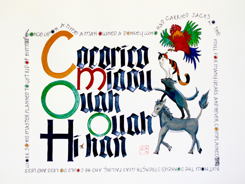
This
is a scene from the Bremen Town Musicians, which is one of my
childhood favorite stories (especially Hans Fischer’s), by the
Grimm Brothers.
The main text is onomatopoeia of a donkey, dog, cat and rooster
in French. I tried in English and German and it turned out that
the layout flows the best in French. The letterform is a black
letter variation, done with Hiro nib #8 .
The letterform of the border is a roman variation by Neugebauer
from 26 Seeds class last year, done with micron.
This letterform is also used in the capitals of the main text.
It is always fun to decide the design and layout, like playing a
jig-saw puzzle and choosing colors is always a challenge. I
settled on Oxide of Chromium, Indio, Venetian Red, Yellow Ochre
and black and white and only these are used on the entire piece.
The seal was the first my father engraved more than 20 years
ago. He is working on a new one!
Arches watercolor hot press paper, 15” x 22”.
* * * * * * * * * *
Week #27
This work was done by Haley Ping in 2016 in San
Antonio for the session “Lettering on Vellum” in Primitive to Modern. In
her own words:
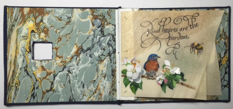
This
small book caused a lot of worry and distress especially with
the binding and the hole in the cover! It isn't quite perfect
but some of the bookbinding experts in the SA guild have
promised to teach me the real way of bookbinding with a hole in
the cover.
The idea, quote, and plan originally came from the beginnings of
an idea of a round piece I had while taking an Austin workshop
with Holly Monroe who taught a class in flourished Italic
recently. Italic has never been one of my favorite hands to
write because I don't feel I'm very good with it, but I love the
look so I practiced a lot and reworked the round idea into a
small book measuring about 3-3/4"x3-1/4".
All the pages are leftovers of slunk vellum from Pergamena
calfskins I had bought for commissions or other projects in the
last couple years. I used stick ink for the lettering and
watercolor for the illustrations. All the illustrations are of
items from my own vegetable garden and orchard except the
bluebird. I'm not sure I could ever sneak up close enough to
paint one's portrait! The last page is 23K loose gold over
Miniatum Ink and watercolor lettered in the middle.
This is one of my favorite projects I've done to date--even with
the anxiety the bookbinding part caused Link to Video:
https://youtu.be/pVmiva2EgwU
* * * * * * * * * *
Week #28
This work was done by Cynthia Stiles in San
Antonio in 2016 for the session “Lettering one Vellum”, in PRIMITIVE TO
MODERN. In her own words:
I’ve
long admired the Celtic Cross with its knotwork design within
and thought it would be fun to do one on the small vellum piece
for our homework. The John 8:12 quote was chosen since I felt
the cross and this quote best reflected each other.
I used a calf vellum offcut, the end of my widest piece, and cut
that end after I prepared the vellum, so it’s approximately 5” x
5” square. I taped the vellum down on all four sides to keep it
from buckling too much.
Winsor & Newton gouache was used for the colors which were:
Ultramarine, Permanent Alizarin Crimson, and Cadmium Yellow
Pale. The green and purple were mixed from those. I also added
white to the yellow for the edges and center to give the cross a
more luminous look. 24 K loose leaf gold was used.
Since the origin of the cross is the same as the Book of Kells I
used the lettering style from that book around the edges and a
simple design in between the letters to complete the square. I
had to study and learn how to form the letters for this piece. I
used a quill for the lettering; it loves writing on the vellum.
This was completed first.
I applied one layer of the pale pink Instacoll on all cross
outlines. When ready I applied the second layer of Instacoll on
that and a layer on the knotwork. Then when ready, one layer of
the gold, section by section. Then laid the second layer of gold
in sections over the entire cross. With a small pointed brush I
carefully painted around the gold the areas inside the cross,
the halo, and feathered the pale yellow outside the cross.
I mounted my completed piece on this beautiful purple paper. It
matches the interior of the cross. To allow the design to show
better and soften the edges of the vellum I cut a piece of white
paper slightly larger than the edge of the lettering and mounted
it to the back of the vellum using a very small piece of
Japanese hanging paper. After it dried I mounted that with a
slightly larger piece of hanging paper to the 8” x 8” purple
paper.
I feel so blessed to have this opportunity to study under Reggie
again this year and thank you Reggie for the opportunity to
present this piece.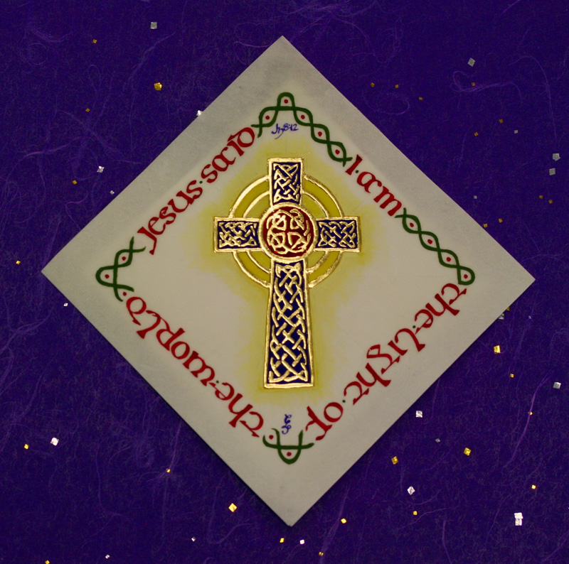
* * * * * * * *
Week #29
This work was done by Leslie Winakur in 2016 in
San Antonio for the session “Lettering on Vellum” in Primitive to
Modern. In her own words:
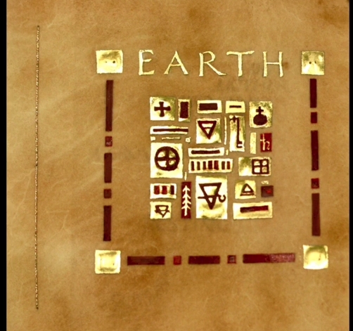
When
we worked on the single gilded symbol in class, it looked so
beautiful on the vellum, that I wanted to repeat that effect in
my homework. I’ve always loved the way the medievalists put
small areas of gold on a page, so that when the page is turned,
it gleams and glitters in the light - real illumination. So I
decided I would make a little collection of gilded symbols for
each of the four elements - earth, water, fire, and air - each
on its own page. I scoured books on symbols to find them all,
then arranged them on grid paper in my page designs and traced
them onto the vellum using a light box and pencil.
I gilded them using clear Instacoll, tinted with a bit of
cadmium yellow watercolor, just enough so that I could see the
Instacoll. I tried several times with varying strengths of
Instacoll, and finally decided that it worked best for me if I
put a few drops of distilled water in about a 3/4 full well of
Instacoll (in the 6 well palette). I then worked with a wet
brush and rinsed the brush very frequently, keeping it very wet
as I dipped it into the Instacoll. I used the Brause EF66 nib to
keep the edges straight, and that took a lot of practice! In the
end, I found that it worked best for me if I treated it like the
brush - kept the nib very wet in order to get the Instacoll to
flow off of it. And I used the nib to do the small outlines,
then filled in the centers with the brush. I had to work fast to
keep the edges wet, but it worked for me.
I’ve been trying to use quotations less and my own words more,
so I wrote the words myself, then wrote them with watercolor. I
started out with a #4 Mitchell nib, then went to a 5, and
finally decided on the Mitchell #6 nib.
The binding is a “stub binding”, also called an album binding,
which allows for every other page of the text block to be a
short stub of a page, to allow for insertions into the book
while avoiding telescoping of the fore edge. In this case, I
sewed the vellum pages to the stub using a thin gold braid,
Kreinik #8 braid. I like that this kind of binding allows the
vellum to live as it prefers, without any real constraints. The
various pieces of vellum have natural color, and none were
artificially colored. I also wanted to experiment with the
different colors of gold I’d purchased, so I used rose gold for
Earth and Fire, lemon gold for Water, and moon gold for Air. But
I forgot that the lemon gold has silver in it and will tarnish,
so having been reminded of that in class, I will go back and put
a coat of acrylic polymer gloss on the Water gilding.
The experience was a very good one, allowing me to do enough
gilding with Instacoll and different kinds of gold so that I
felt more capable in the end. To quote the master, “time on
task.” It does pay off. Link to Video: https://youtu.be/wogZz1i2eAc
* * * * * * * *
Week #30
This work was done by Katie Garrod in Chicago in
2015 for the session “Primitive to Modern”, in Primitive to Modern.
In her own words:
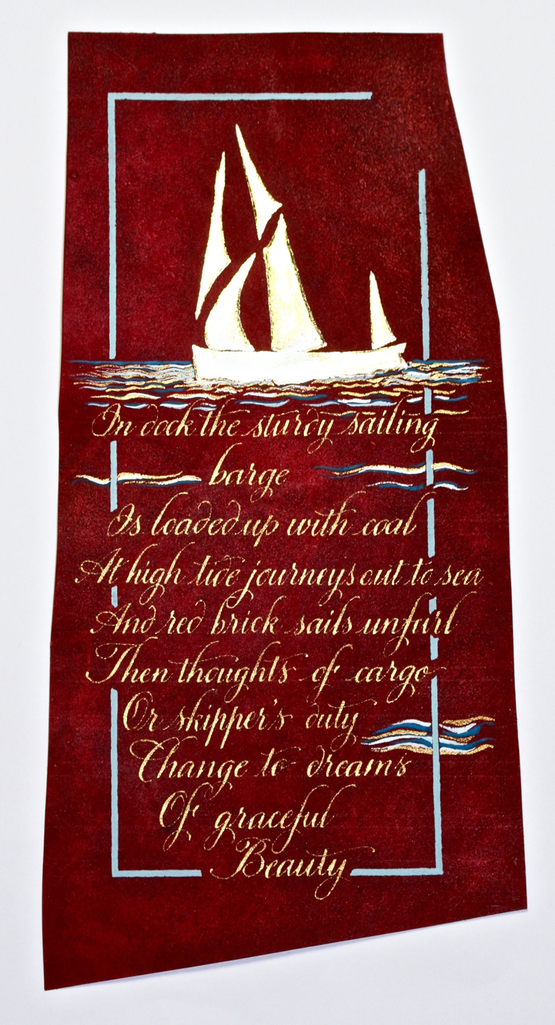
"This
piece was started in class and finished at home. Reggie's slide
show on the making of the purple vellum was simply mind
boggling! Thank you for sharing, Reggie. Because the colour of
the vellum reminded me a little of the red ochre sails of London
Barges, I used the image of a barge for my Gold Leaf image.
These Barges were the cargo movers for southern England and
beyond, prior to the industrial revolution. (My old home town of
Faversham, UK is now a hub for London Barge enthusiasts and
restoration.) Like so many vessels of their day what was
practical was also stunningly beautiful especially when in full
sail out at sea. I tried to find a short poem that described
this but couldn't, so set about writing my own. The form was
intended to look somewhat like the reflection of the barge in
the water, an attempt at "concrete poetry".
A variation of copperplate script seemed a good fit for a
swirly, watery feel. I followed Reggie's, very helpful,
technique of making photocopies of the decorated paper (with or
without a partial design) for practising. It was really a boon
for working out the glitches. Executing it in Schminke Gold on
vellum with the ef66 nib certainly added challenges. Plus . . .
there was only one little piece of purple vellum. Some practise
was done on the back of the vellum to get a feel for the
texture, although even that is a little different from the
"right side". As few guidelines as possible were used in pencil
which is why the slant might be a little off here and there. I
am still in two minds about the extra decoration, would less
have been more? It was just so much fun to add the blue waves,
honestly, I couldn't help myself!"
* * * * * * * *
Week #31
This work was done by Maggie Gillikin in 2016 in
San Antonio for the session “Lettering on Vellum” in Primitive to
Modern. In her own words:
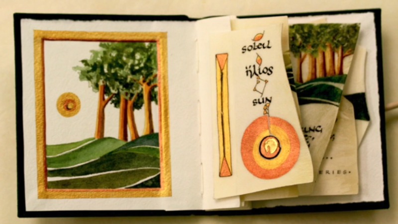
This
book was completed in the spring of 2016 during the year long
Primitive to Modern class. The text block is composed vellum
scraps, sewn onto Arches text wove 1” wide “pages.” The spine
part of the cover was glued to the text block, and then front
and back covers were glued to that spine/text block.
Vellum is a delicious surface to work on, both for watercolor
paintings and ivory black gouache quotes. I used a number 4
Mitchell nib on the quotes, while a Hiro 111 did a great job of
the small Roman letters.
The subject was the sun - from rising to disappearing, when its
fellow suns appear, which we call stars. I love to watch the was
that sunlight brings sparkle to our world. All the sun images
have a 23.5 gold element to them, with Instacoll base. Various
ancient symbols for the sun appear on each vellum page. The
column on the left of each page indicates the relative light and
darkness of the sun as it travels through the day. The column
also camouflages the sewing threads.
Click for You Tube Video
* * * * * * *
Week #32
This work was done by Tomoko Zunino in 2016 in
Seattle for the session “How to Modernize a Traditional Calligraphic
Hand: Blackletter” in PRIMITIVE TO MODERN. In her own words:
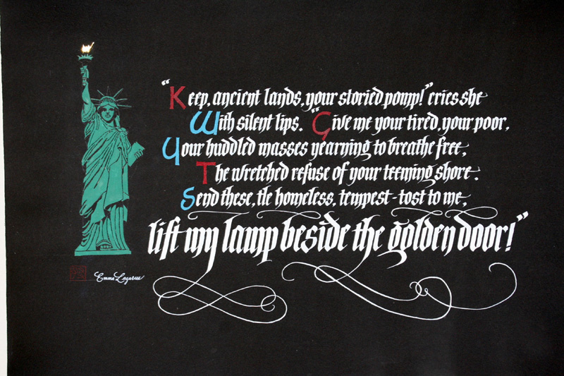
This
is a sonnet, “The New Colossus” by Emma Lazarus. When I learned
about this poem, I immediately thought about incorporating the
statue of liberty as “I” in the design because I love
decorated/illustrated/illuminated letters.
I started with the main text, Italicized Gothic, with Speedball
C-2 and C-0 nibs and switched to a brush to paint over the
letters until the black paper was all hidden behind the coat of
primary white gouache.
Then moving onto the capitals and the statue of liberty, I used
Saral to transfer the images. I outlined them with micron and
painted in white. The letterform of the capitals is a roman
variation by Neugenbauer.
I sprayed the fixatives and painted over the capitals in
Alizarin Crimson and Turquoise to suggest the flag of the United
States of America. While painting over the statue of liberty, I
noticed it repelled a lot. Using more gouache, I was able to
cover the white.
I used a Nikko G nib to do the flourish and sometimes had to
switch to a brush to paint over. 23K patent gold was used for
the lamp.
I found a mistake and I’ve been thinking about how I should
correct it. Before taking Reggie’s course, I thought mistakes
were failure, but now I think it is a challenge to make a piece
even better.
Arches cover black paper, 18” x 24
* * * * * *
Week #33
This work was done by Karen Smith in 2016 in
Seattle for the session “Lettering on Vellum” in PRIMITIVE TO MODERN. In
her own words:
In
response to the assignment, “make a small manuscript book out of
vellum with gilding”, I decided to create a valentine of sorts
for my husband. Several challenges loomed before me. Since I
missed the first class, the first challenge was to catch up by
vigorously practicing one of the blackletter hands to achieve a
reasonable proficiency. The other was to figure out how to make
a book having never made one. Several other questions also
presented themselves: how do I give the illusion of larger
pieces of vellum, hide the irregular shapes and highlight the
beautiful translucency?
Choosing one of our favorite sonnets by Shakespeare, I selected
a hand that would give a 16th century feeling and divided the
sonnet into 4 natural parts, a page for each quatrain and one
for the final couplet, hence a piece of vellum for each part.
Four pre-cut picture frame mats 5” X 7” each with a 3.5” X 5.5”
opening were purchased as frames for each irregular piece. The
openings limited the spacing and size of nib and to some extent
the size of the illuminated letter. The mat would also give room
for the raised gold letters offering some protection when the
book was closed and enhance the translucent qualities of vellum
when stood upright.
I traced the opening onto the vellum with a HB2 pencil and
added an additional margin and writing lines. A Brause 1mm nib
and Moon Palace Sumi ink was used for the calligraphy. Each
illuminated letter and illustration was drawn and then
transferred with Saral transfer paper onto the vellum. Then each
letter was finished with 24 karat loose leaf gold; the
illustrations painted with gouache. When complete, the vellum
pages were trimmed and adhered to the back of each frame by
small glue dots at the corners.
An accordion book seemed the easiest to assemble. I used book
board covered with book cloth for the front and back covers.
Marbled paper and ribbon were used for design accents and a
button for the closure. The mats were connected by the same
decorative ribbon used on the front cover. The final step was to
glue an additional precut mat to the back of each of the frames
hiding the irregular vellum pieces and glued ribbon joints. When
the accordion book is displayed standing up, it allows light to
filter through each framed window page like a stained glass
window.
This project was so rewarding. It compelled me to discipline
myself to practice, organize the steps to the finished piece,
and manage my time. Since so much was new to me, I created step
by step illustrations to put the book together and even a
project timeline with weekly goals. And the biggest reward was:
my husband was delighted. Thank you Reggie for your excellent
teaching and encouragement to create beyond our preconceived
limits. I’m grateful!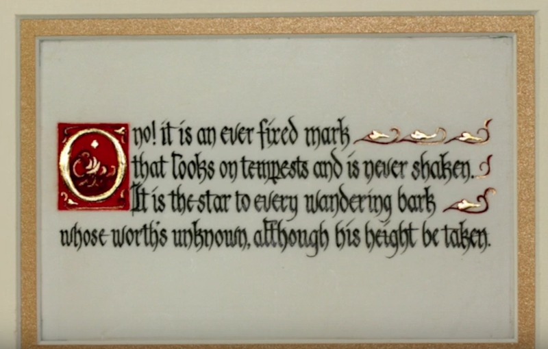
Click for You Tube Video
* * * * * * * * *
Week #34
This work was done by Kathy Barker in 2016 in
Seattle for the session “Lettering on Vellum” in PRIMITIVE TO
MODERN. In her own words:
Materials:
Vellum offcuts, prepared for calligraphy, Ground sumi ink,
Daniel Smith Powdered “Gold Pearl Pigment Paint”, prepared with
gum arabic & distilled water, Mitchell nibs - #3.5, # 2, #1,
Gold leaf with Instacoll gilding base
Overall size: 15” X 18” with three Vellum offcuts –
approximately 4” X 14 ½” each.
Inspiration, Concept and Process:
The Inspiration for this piece came from the glorious words of
the Handel’s Messiah. From early childhood memories of the
Hallelujah Chorus being sung at Christmas to the joy of being a
member of a choral group whose tradition it was to sing the
entire Messiah each Holiday Season during my college and
graduate years, I have cherished both the words and music of
Handel’s great masterpiece.
The privilege of working on vellum with gold leaf seemed the
perfect opportunity to express the beauty and glory of this work
of musical art. My three pieces of vellum offcuts with their
long slightly curved natural forms spoke to me of a triptych.
Having just been inspired by Barry Morentz’s talk on using a
favorite piece of music as a basis for a calligraphic piece,
I decided to use a selection of the text of the Messiah as
a three part statement. Beginning with the promise of light to a
darkened world on the first vellum offcut, then the grand
Hallelujah chorus in the middle piece, the third piece concludes
with the “promise of peace on earth, good will to men” and
finally the glorious Amen chorus.
But the inspiration was just the very beginning. Many
hours later, the selected words (mostly ones I had memorized and
would sing as I wrote) came together in a meaningful flow of
lines with gold interspersed. These were “rehearsed” many times
on tracing paper before even thinking about touching the
precious vellum. The decision to use a variety of Mitchell nibs
was made because the piece required three different nib sizes
and I enjoy the flexibility of the Mitchell nib in combination
with ground sumi ink on vellum. The initial concept was to have
gold surround the word Hallelujah in the middle piece; this was
a challenge on the vellum. The choice of powdered gold pigment
paint that I could mix and carefully adjust the amount of water
was essential. I practiced this on little vellum scraps before I
attempted it on the final piece.
There was still the problem of mounting the pieces. When Reggie
mentioned mounting it on black suede surfaced board, his
suggestion made all the difference; the lovely vellum and gold
glowing out from the velvet black.
Finally, because the words and text are so meaningful to me, I
may revise this piece many more times. For the present, I am
deeply grateful for the opportunity to express this glorious
music and text with the treasure of vellum and gold. Thank you
Reggie!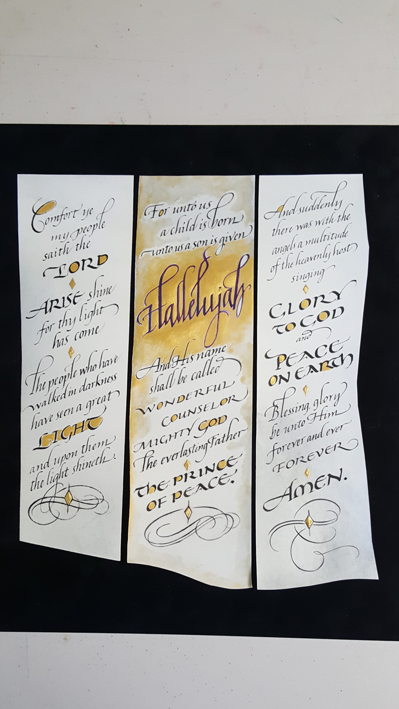
* * * * * * * *
Week #35
This work was done by Susan Welch in 2016 in
Seattle for the session “Lettering on Vellum” in PRIMITIVE TO MODERN. In
her own words:
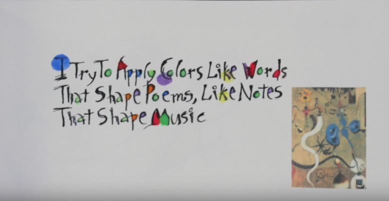
Here
are the particulars about the book: 5 x 10.5 inches, Papers:
90lb Arches hot press, Canson, Velum. 23k leaf, FW acrylic inks,
Watercolor, Xerox transfer of small portions of Miro paintings.
Quotes by Joan Miro, Letterforms by Max Marlborough / hand
drawn/ Miro -Picasso inspired. I have a collection of artist
quotes and when I discovered the hand drawn letter stye by Max I
was inspired to create the book.
Click for You Tube Video
* * * * * * * * *
Week #36
This work was done by Lisa Tsang in 2016 in
Seattle for the session “Lettering on Vellum” in PRIMITIVE TO
MODERN. In her own words:
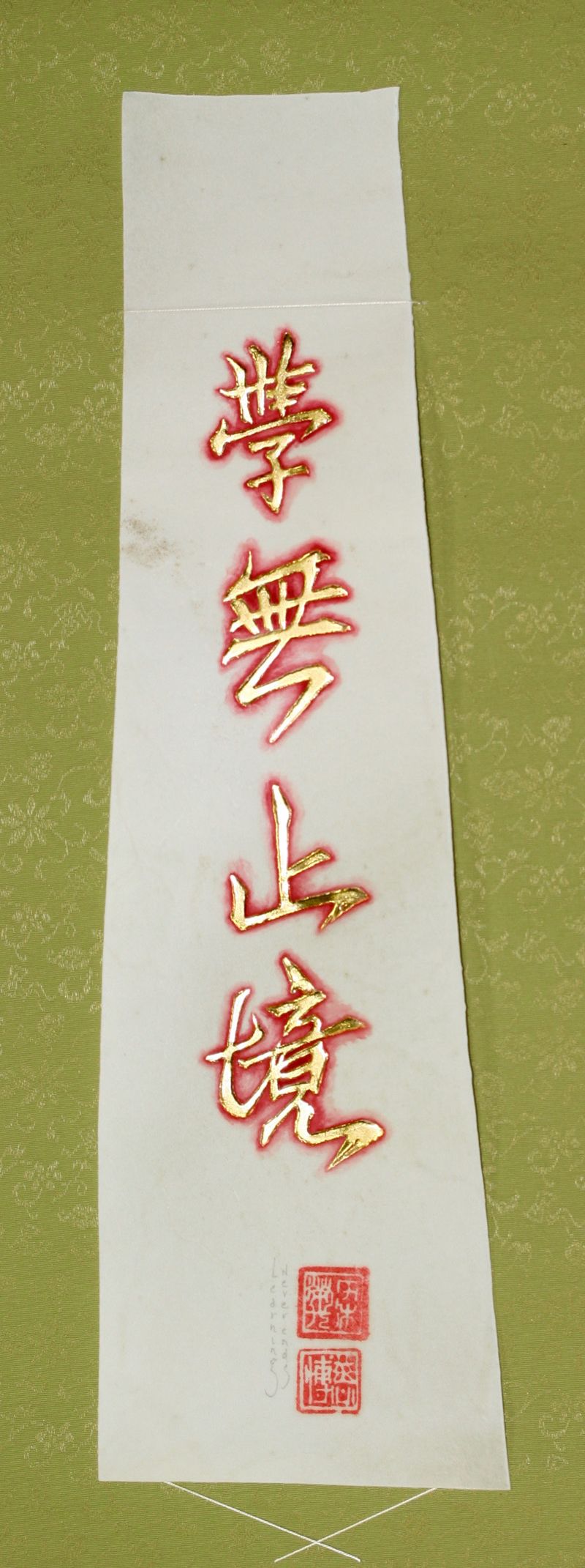
This was created for an assignment on gilding on vellum in the
Primitive to Modern class. The size is a 4"x14"calfskin vellum
offcut mounted on a scroll held with stitched thread. The 4
Chinese characters translate "Learning Never Ends," and was some
wisdom imparted by my father Wing Leong when I left home for
Reed College. I carried these words with me to graduate school
in Chicago and now it hangs in my Bellevue studio.
I He did the original using Sumi ink on a piece of mat board. I
scanned it into my computer and printed it on paper which I
traced onto the vellum using a light box. After Instacol was
applied and 23K gold leaf laid, I dry brushed Alizarin Crimson
gouache to accent around each character. Both of our chops
appear at the bottom. These are great words to live by.
* * * * * *
Week #37
This work was done by Tomoko Zunino in 2016 in
Seattle for the session “Lettering on Vellum” in PRIMITIVE TO MODERN. In
her own words:
When I was in England, I was fortunate enough to visit Ashdown
forest where Winnie-the-Pooh lives. After this magical
experience, I always wanted to create a piece that captures this
moment.
I put everything I’d like to do as a calligrapher into this book
(did I call myself a calligrapher out loud?) and being pic’ed
means a lot to me.
I
made an extensive use of Neuland, Lombardics and Blackletter which
are my top three favourite letterforms. Carolingian and Roman
taught by Reggie last year also made an appearance. I used stick
sumi ink for Neuland with Speedball C-1 nib and gouache for
other letterforms. The Carolingian is done with Speedball B-1 &
5 nibs and the Blackletter with Hiro nib #8.
When I saw the initial “I” from “Moralia in job”, I knew it
would be what I’d be doing in the future. Since then, soon after
I chose a quote for a project, I always look for possible
decorated letters. I tried to make 1-5 year olds look humorous,
childlike and fun and I drew some childhood characters. To the
contrary, 6 should look more sophisticated and grown-up-ish, so
I chose illuminated letters with gold.
On the colophon page, I drew a dragon that I’d created in the
gilded letter “C”, to add some feeling of fairy- tale ending.
24K loose gold leaf.
I fell in love with filigree and flourish one day and I started
copying them from manuscripts, other books and handouts. These
were done with a Nikko G nib and I’m still experimenting with
various other tools or technique to bring these to life.
I really enjoy perfecting the little details that make people
smile when they see my work - I made Reggie smile - mission
accomplished!
Being new to vellum and relatively new to bookbinding, I had no
idea how to bind vellum or attach them to paper. I felt it would
be distasteful to use glue or tape so I created “photo corners”
with a twist. They complement the major feature of the decorated
letters seen on every page.
Each page size is 7” x 18”. Vellum, Arches watercolor hot press
and Canson Mi-Teintes paper.
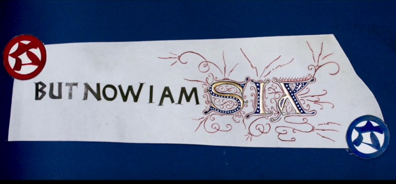
Click for You Tube Video
* * * * * * * * *
Week #38
This work was done by Kate Van Dyke in 2016 in
San Antonio for the session “Illumination on Vellum” in Primitive to
Modern. In her own words:
I
made these letters as a way of experimenting with the decorated
letters in manuscripts. They are all copied from manuscripts – I
found them in online museum collections, of which there are now
many!
After downloading an image, I manipulated it in Photoshop
Elements to get rid of the background and decoration already
around and inside the letter, so I could more easily trace it.
Sometimes I enlarged it.
I then transferred the letters to various papers – Fabriano
Artistico HP, Schiller, Frankfurt, and Daler-Rowney Canford. I
used Saral or a lightbox.
I gilded the parts I wanted to, then traced the outlines
carefully with a very fine Zig marker. All the colors and the
black filling were done in gouache with a Hunt bowl pen. For
most, my decoration does not match the original. The dots were
done with a glass pen – a gift that I found useless for writing
but great for consistent dots.
The letters range in size from about 1¾ to 3 inches high.
I discovered an unexpected design issue when I added a circle of
gold around an "M" – the finished piece suggests a quite
unintended modern meaning!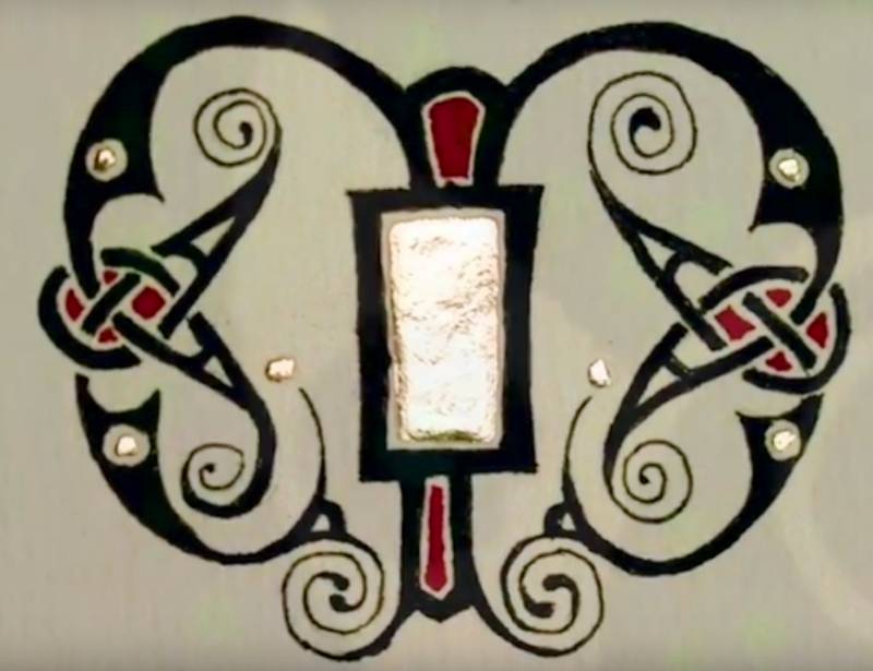
Click for Video
* * * * * * * * * * *
Week #39
This work was done by Leslie Winakur in 2016 in
San Antonio for the session “Illumination on Vellum” in Primitive to
Modern. In her own words:
First piece - watercolor:
The homework assignment was to do a piece based on the Codex
Aureus. Our summer secret pal program theme is Art Deco. And
Reggie encouraged us to use some modernized lettering and design
styles. So I decided to use Art Deco lettering, sorta, in an
Adolf Bernd take on the Codex Aureus. I sketched my idea on
scrap paper, then drew it more carefully on grid paper.
When I looked at the design, I knew I’d go crazy trying to paint
those tiny spaces, so I enlarged it on my printer and then
traced it onto Arches 140# CP watercolor paper. Then I added
some more elaborate design elements in pencil, and then I
painted in watercolor saving all the whites, as Bernd did,
painting around the pencil lines and erasing them when the piece
was complete and dry. My brushes were small, Winsor Newton
Sceptre Gold II, in sizes 0 and 00, and Winsor Newton Series 7
in size 1, 0, and 00.
I was immediately in love with the Bernd letters when Peter
Thornton taught them to us a few years back, and I find painting
in his way is very relaxing. I added the little bird with the
olive branch in one of the thin bands because Bernd has a lovely
bird in one of his pieces. And I used some traditional designs,
like the wave pattern and the Greek key design in order to
include some medieval motifs along with the modern. The text is
a line from a favorite James Taylor song. The narrow bands are
3/8” and the wide bands are 1 1/4”, with a final size of 4” x
8”.
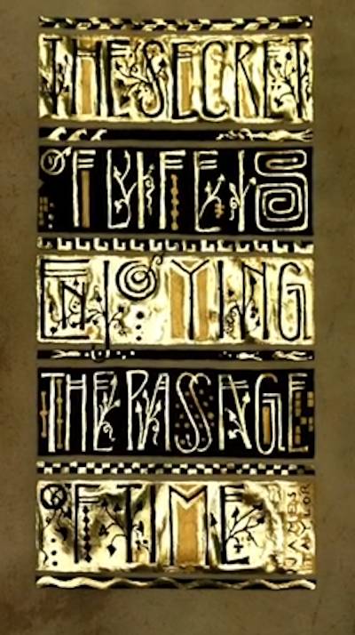
Second piece - black and gold:
I was enjoying the painting process in a watercolor version of
this piece, letting my mind wander as I painted. And I kept
seeing a big Art Deco book on the coffee table when I took
breaks from painting.
About three quarters of the way through the watercolor piece I
suddenly got the idea that this piece would look good in black
and gold, probably inspired by the black and gold cover art on
my Art Deco book. When I finished the watercolor version, I felt
compelled to go ahead and try the black and gold as well. So I
found a nice piece of slunk vellum, traced the design onto it in
pencil, using my light box, and then the fun began.
I used Instacoll (clear Instacoll with a little red watercolor
for tint) as the base and laid all the Instacoll first. That
turned out to be harder than I expected, because I didn’t have
enough tint in my Instacoll to make it visible on the warm beige
color of my vellum. So that took well over an hour, but I was
still able to activate the Instacoll by breathing on it. (In
spite of the ridiculously hot days we’ve had here, even with the
air conditioning going strong, the humidity in the house is
around 70%.) I laid all the gold - loose gold, one layer - in
one session. Then I used Winsor Newton black gouache to paint
around all the gold, and to paint around the design elements
(leaves, dots, etc.) that were not gilded.
I used Schmincke pan gold to paint in the places I hadn’t
gilded. I also used the gold paint on top of the real gold here
and there in order to simulate the mix of colors that Bernd gets
in his watercolors. I liked the look of the gold paint on and
around the real gold, and it turned out to be a good way to
touch up a few ragged edges here and there (don’t tell Reggie!).
The text is a line from a favorite James Taylor song. The narrow
bands are 3/8” and the wide bands are 1 1/4”, with a final size
of 4” x 8”.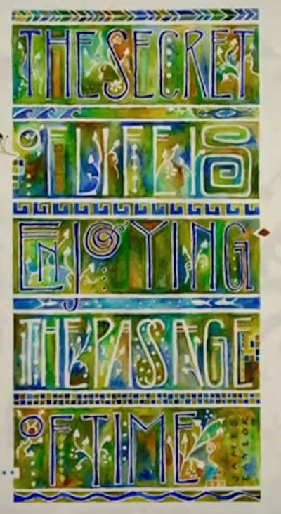
CLICK FOR YOUTUBE VIDEO
* * * * * * * *
Week #40
This work was done by Cynthia Stiles in San
Antonio in 2016 for the session “Illumination on Vellum”, in
PRIMITIVE TO MODERN. In her own words:
The
world will pass away but love and music last forever.
Gaelic proverb
This piece derives its inspiration from the Stockholm Codex
Aureus, I really liked that piece and looked forward to creating
my own piece using that style. Not having much time when I began
its creation I was quite surprised it turned out so well, it was
such a fun piece to do.
I found the Gaelic proverb in English which seemed to be the
right length for what I wanted to achieve. I don't know how long
it has been around but I'm pretty sure it's ancient. I went with
the same lettering style as the above codex, the main thing that
changed were the colors I selected which I believe helped to
give this a more modern feel as those colors were not available
when the Stockholm Codex Aureus was created.
I started off by drawing the letters of the proverb on grid
paper to see if it would work with the diamond format, after
several tries I had a layout that I was pleased with. Upon
determining the size of the overall design I laid the letters
out on 90# Arches Hot Press watercolor paper, sketching lightly
at first and then going over this with dark pencil lines. With
the lettering completed I took it to a copy shop to have a
transparency and copies made.
I painted on the Arches to determine if the patterns and the
colors I wanted to use would work out. I had intended to
complete this process but was short on time and wanted to have
the vellum completed for our class, since the colors and
patterns flowed and looked great so far I decided to go for it
and began on the vellum.
Originally I planned on using the deerskin vellum but as I
looked at the design on the deerskin and calfskin I realized
that the lighter less variegated calfskin would be a better
choice. I cut out the size needed (10.5" x 10.5"), sanded it
then wiped it down so it would take the gold and paint with
crisper edges. With the transparency taped to the back of the
vellum and using a light box I traced the design with a hard
pencil. When completed I removed the transparency, slid a piece
of white paper behind the vellum so it would read better and
taped the vellum down on all sides to a slightly larger davy
board for ease of handling and to keep it from buckling.
I tried to follow the order of steps Reggie had us go through in
our class in the creation of the letter 'R', I didn't always
succeed yet it was so helpful to have that experience as a
guide. The outside border was outlined using a black micron pen.
I applied the prepared gesso (2 coats) where the gold was to be
placed first. I did the borders using a ruling pen for the outer
lines and brush to apply the paint in-between for the borders,
alternating with the quinacridone magenta gouache and cobalt
blue turquoise dark powdered pigment and used a black micron pen
for the lines near the colored borders. From that point on I
worked from the top down, line by line, applied the instacol,
laid the gold, painted the letters or spaces adjacent the gold,
used the black micron marker to outline around the gold, then on
to the next line. The dots were last. A ruling pen was used for
the magenta 'music' lines. As I was quite low on the clear pink
tinted instacol I ended up alternating between that for the
letters and the yellow instacol in-between the letters (I made
them both slightly orangey in color). It ended up more matt than
shiny, not intentional but a good look for this piece I think.
Lemon loose leaf gold was used for the top design and the birds,
24K loose leaf gold was used for the circle at the top, the
hearts and music notes and the bottom design, moon loose leaf
gold was applied everywhere else, two layers were used for each.
The paint colors used in addition to those noted above were
cobalt blue turquoise light powered pigment and titanium gold
ochre gouache, the oranges and purple were mixed from the colors
listed. Note: on the blues, I used gouache from a tube on the
Arches and switched to powdered pigments on the vellum even
though the colors were very similar the powdered pigments
appeared slightly more lively. Also, all the colors on the
vellum appeared deeper, more rich and intense thereby making the
same colors on the Arches look a tad dull next to the vellum, I
was surprised and delighted by that.
I have to say I had no idea that I had it in me to create such a
piece as this, that is using those vibrant colors and not have
it look garish, that level of fine detail, and to be able to
imbue it a depth of meaning that reflects the quote. I give a
lot of credit to having a wonderful teacher, Reggie, who guided
us every step of the way beginning with his 26 Seeds course. But
I also know my hand drafting background played a huge part as
well as putting in the time to practice and do as much of the
homework assignments that Reggie assigned to us as I could. It's
like building something, you have to go through the steps, as
you do it teaches you and that takes time and hard work. I had
fun creating this piece even though I had to put in several late
nights to get this completed in time.
Yes this piece has a lot of depth to it....but that's for you to
discover - Enjoy! 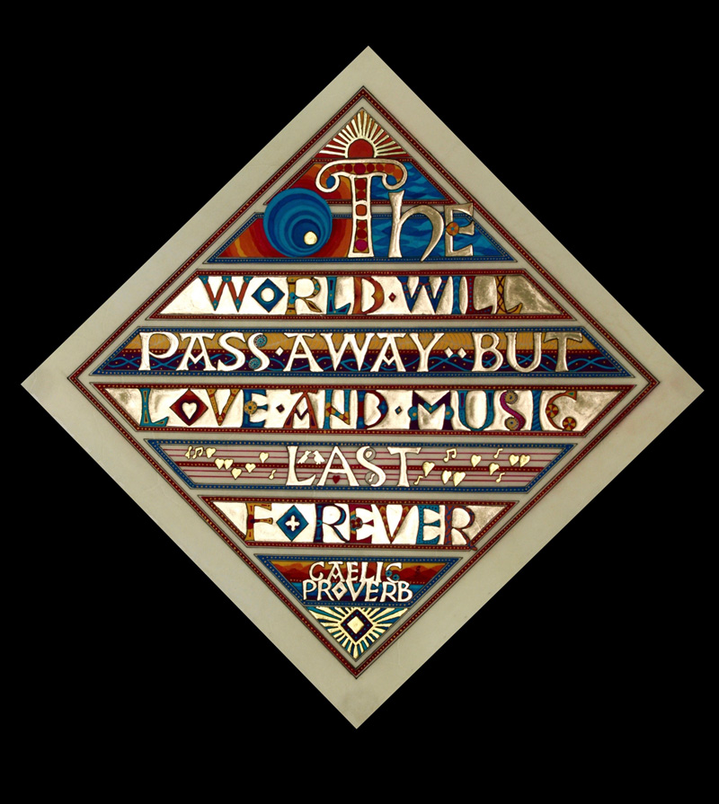
* * * * * * * *
Week #41
This work was done by Haley Ping in 2016 in San
Antonio for the session “”Illumination on Vellum” in Primitive to
Modern. In her own words:
This
assignment was to mimic a master so I chose a piece from the
handouts that was from the 12th century which reads in Latin
Titulus Sci Petri Westmonasterii. All the letters in the
original are irregular capitals and tucked into each other which
I thought would fit nicely with a typically wise but quirky Mark
Twain quote.
I used a Rosemary and Co. watercolor brush (my new favorite
brand!) with watercolors to paint in "Clothes make the man" on a
white Arnheim 1618 245 GSM sample. The gold dots were the new
technique Reggie taught in class with Golden gesso and molding
paste mixture beneath the clear Miniatum for a more raised
gilding. The smaller lettering was done with a Hiro 111EF nib
and watercolor.

* * * * * * * *
Week #42
This work was done by Penni Burkum in Austin 2016
in for the session “Variations on Romans” in 26 Seeds: a Year to Grow.
In her own words:
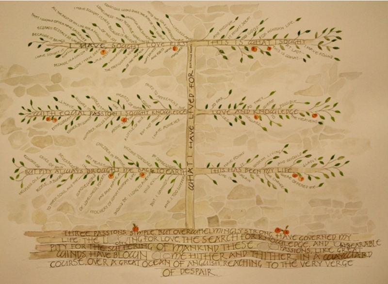
"There is a scrap of paper on my bulletin board with the word
“espalier” penciled on it. I put it there because these
beautiful branched trees, disciplined to grow so beautifully,
made me want to think about them, and compare them to other
beautiful things, such as motherhood. When I saw “The Three
Passions” by Bertrand Russell, I recognized the same transparent
intensity in his life as in the espalier.
My biggest challenge was to illustrate the quote in such a way
that it could be read in the order that it was written. In doing
so, I had to sacrifice some “wildness”, to make it look rather
organized. Challenge #2 was to choose writing instruments that
were consistent.
I chose sepia markers (a decision I regret) because I couldn’t
seem to write the smallest letters with anything else! Challenge
#3 was to keep the quote front and center, by not creating any
distractions, such as excess foliage, or too much wall behind
the lettering. The fruit was added to bring a little more
interest and color.
The dimensions for this piece are 22 x 30. The paper I used was
a luscious piece of Cold Press Moulin du Roy Paper, 140#. The
paint was a combination of watercolors. The part that was the
most fun was creating the layers of earth."
CLICK HERE FOR VIDEO
* * * * * * * * * * * * *
Week #43
This work was done by Robin Gebhart in 2016 in
Seattle for the session “Primitive to Modern” in Primitive to
Modern. In her own words:
Reggie’s homework included a “make it your own” assignment using
the techniques of the Codex Aureus with a short quote for our
third class in Primitive to Modern. With these guidelines, I was
inspired to create the following piece.
The sentiment is one that is common among creative circles. That
a subject (art, science, philosophy, literature, etc.) seems
pretty straightforward at first glance, but you soon learn that
a lifetime can be spent on discoveries within that narrow field.
For me, calligraphy has that depth and breadth. I could find no
“official” credit for the thought and, with the help of my
daughter, we retooled it to suit our tastes.
It was roughly sketched out, then tightly refined. I wanted to
take the idea and letterforms of the Codex Aureus, but update
the style to a more modern feel. So I limited the color palette
and simplified the patterns within and around the letterforms.
With a nod to tradition, the colors are made from the powdered
pigments lapis lazuli and malachite. The only other colors used
were titanium white and vine black to create the tones. These
colors were quite heavy and gritty.
They separated so quickly in the pan that the paint had to be
vigorously stirred every time the brush/pen needed to be loaded.
But they are beautiful and lasting. The other traditional motif
was the patterns used in the green backgrounds. The patterns are
all based on Trinity symbols.
I modernized the piece by using a lighter color palette with
limited colors. The patterns were kept simple, open and
repeating. Gilding on it is a modern technique and not
traditional gesso gilding. The first line of the text was gilded
in high-relief. This was created with several layers of the
tinted gesso/acrylic molding paste, then the instacoll, as
taught in class. Then, the lower lines were done in a flat
technique – a style I needed to work on. To keep it flat, the
layering of gesso mix and instacoll was the same, but fewer and
thinner layers were applied in order to keep it as smooth as
possible. A real challenge for me.
I really enjoyed working on this piece - it was challenging and
rewarding, and took MUCH longer than I thought it would to
complete. But I think it was worth it!
Image Area: 9.5” x 7.5”
Powdered Pigments, W&B Pale Gold on Arches 300# HP Watercolor
paper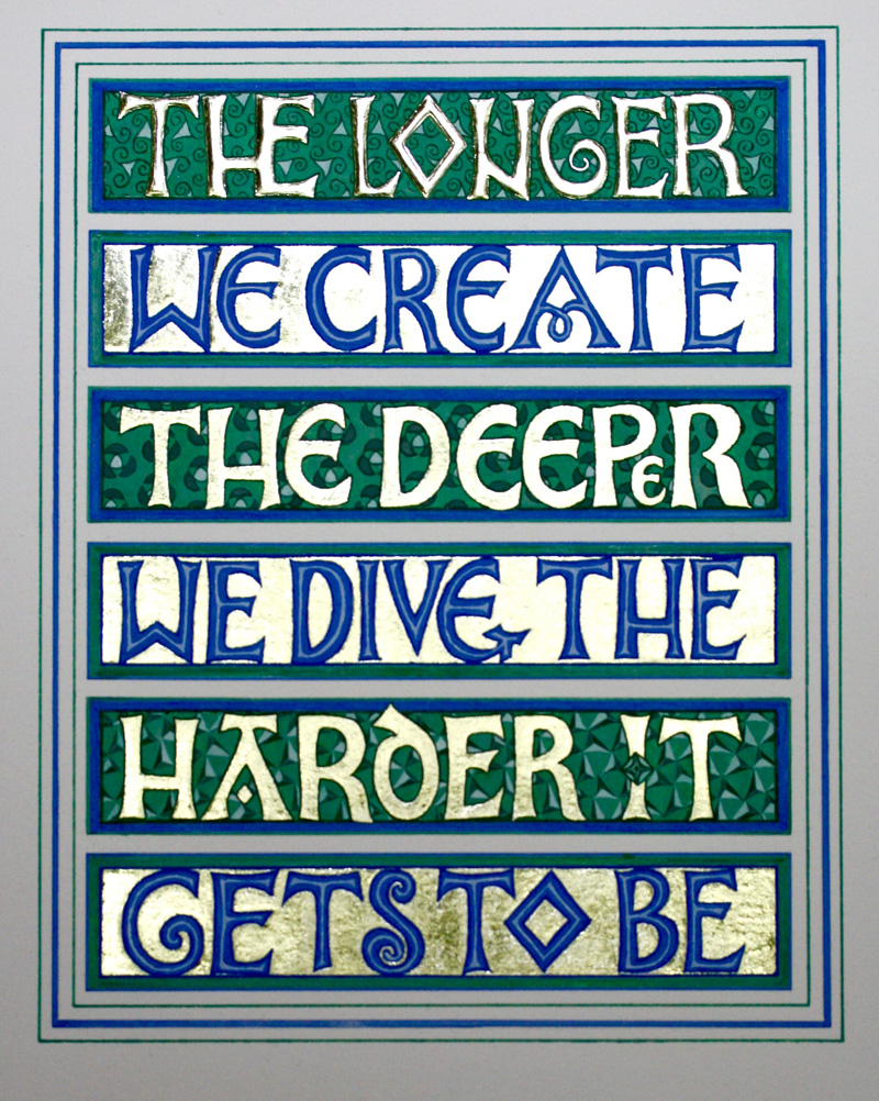
* * * * * * * * *
Week #44
This work was done by Jean Ferrier in 2016 in
Seattle for the session “Primitive to Modern” in Primitive to
Modern. In her own words:
This is deer vellum, done with a 'traditional ' approach. The
saying is the motto of Choc Full O Nuts, New York City . The
deer was frustrating, as it belled out in the thinner areas when
paint was applied. I wanted a duller, brushed finish of gold,
because there is so much of it .Instacoll used as a base,gives
such a brilliant finish, and I wanted less, so I used Jerry
Treshers gilding base.
Reggie says you can use matte medium as a gilding base, for a
similar effect. I used gouache for paint. When you see it
through a translucent vellum, it looks streaky. Because of this
observation, I intend to try casein paint, which is absolutely
opaque. Working on a large, 12”x15” piece of vellum was
frustrating, as I could not do the water effects I like to do on
paper, so had to adjust to another world!
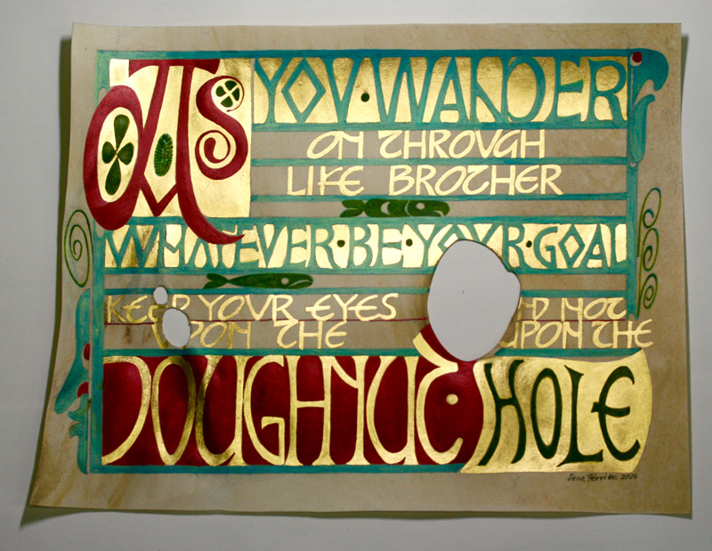
* * * * * *
Week #45
This work was done by Kate Van Dyke in 2016 in
San Antonio for the session “Primitive to Modern” in Primitive to
Modern. In her own words:
For this piece I started with a scan of some beautiful
decorative paper that is impossible to write on. I spray-fixed
the inkjet print and transferred the letters and clip art (from
Reggie's handouts) with Saral paper.
I filled in the letters with gouache, alternating two colors,
Prussian blue and phthalo green, in the bowl pen so they would
have some variation. The flourishes and attribution were done
with watered-down gouache. I gilded the tree and dots with
regular gold, lemon gold and moon gold over Instacoll.
Unfortunately, although I applied four coats of spray fixative,
a couple of drops of spilled water caused the inkjet color to
redissolve. I should have masked off the areas I wasn't working
on to protect them. Size approx. 8 ½ x 11.
This quote is from a poem written by a friend, Elaine O'Brien.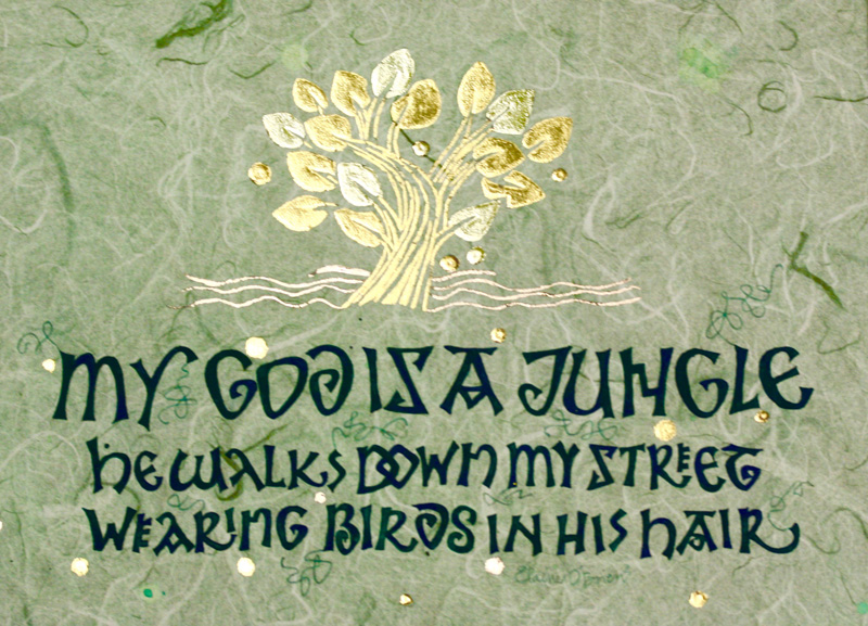
* * * * * * * * * *
Week #46
This work was done by Karen Smith in 2016 in
Seattle for the session “Primitive to Modern” in Primitive to
Modern. In her own words:
This piece was done on vellum with 24 K loose leaf gold,
ultra-marine blue gouache and ground turquoise mixed with gum
Arabic.
With the Codex Aureus as our model, the assignment was to keep
the basic design of alternating letters in gold on one line and
counters in gold on the next line. I wanted to keep the sacred
feeling of the text but modernize the design and break out of
the grid a little so I embarked on a simple exchange. Instead of
a Chi Rho symbol, I used a cross. Instead of a vertical script,
I chose a modern gothic italic at a distinct slant that would
complement the spikiness of the cross image. Instead of a
straight line in back of the gold letters I drew a curved one.
Additionally, I wanted to capture a triune theme, therefore, I
chose three words, on three lines, three diamond shapes and a
hint of a turquoise triangle bordered by the ultra-marine blue.
For such a small off cut of vellum, this piece proved to be
difficult for me. Besides the script, I wrestled with the color
and the vellum itself. I completed this project three times on
paper before I attempted it on vellum making corrections each
time. Yet, my challenges weren’t over when I forgot to stretch
the vellum on a backboard before painting! It curled and warped
and generally looked terrible and looked even worse when I
scraped some paint off, behaving quite badly. Refusing to cry, I
stretched it flat on a hard surface with tape and finished
painting it. And surprise! After a couple of days, it calmed
down. I started to like it again. Do you think we could become
friends?
In spite of my struggles, my experience taught me a great deal
about design, color, gilding a thin line, gilding a large space
and especially the organic nature of vellum. Invaluable!
Thank you Reggie, for the opportunity and encouragement.
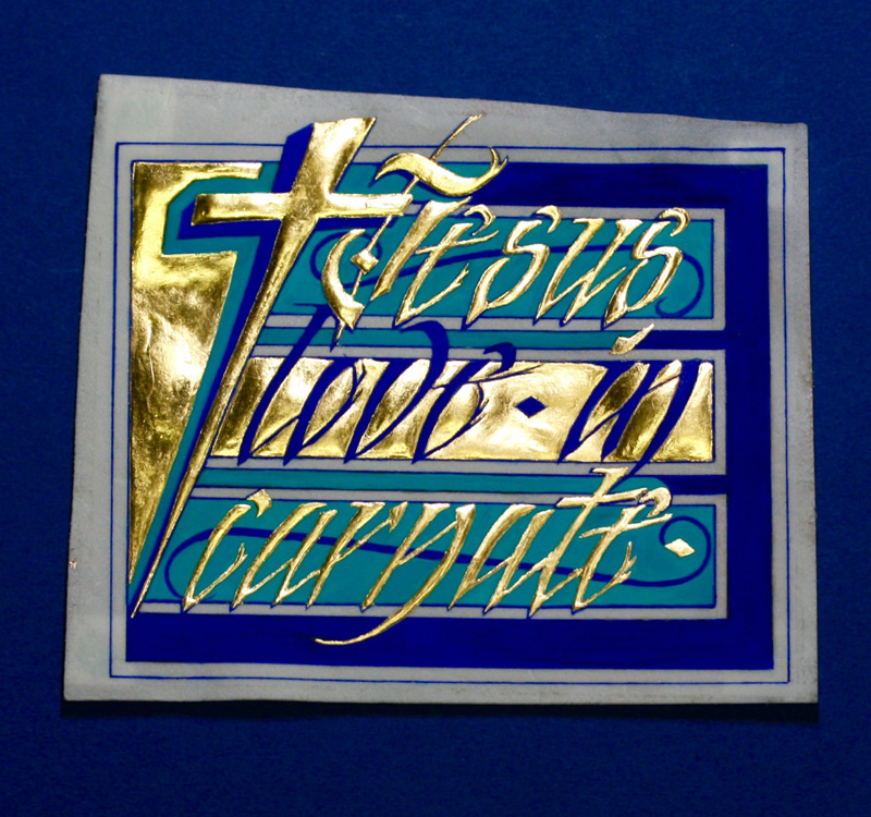
* * * * * * * *
Week #47
This work was done by Gabi Glass in 2016 in
Austin for the session “Variations on Romans” in 26 Seeds: a Year to
Grow. In her own words:
“I simply can’t build my hopes on a foundation of confusion,
misery and death.... I think peace and tranquility will return
again.”
Anne Frank
This piece was inspired by a quote from Anne Frank and
reflecting the current refugee crisis of 2016.
I started off by creating the background. First was a watercolor
straight line that I thought would frame the calligraphy well.
It was too plain and this quote needed more dramatic background.
So I kept adding layers. First, I added all watercolor layers (I
used powder Brusho watercolors) and then I used a Vis-à-vis
marker. Then I sprayed the marker line with water for less
defined marker lines. Lastly, I used white acrylic and dabbed it
in dark spots to create cloud like areas.
I used a draft paper and created the layout first. By changing
the lettering size and thickness of letters I wanted to
emphasize the most important words of the quote. Once I finished
the main quote, I lettered the quote on 90 lbs Arches Watercolor
HP paper with background. I used warm grey gouache for the main
quote lettering and PearlEx gold for the small quote that runs
along the other side of a straight line. Size 9” x 12”.
I have to say that at this time last year I wouldn’t have been
able to create a piece like this. What a blessing to have the
privilege of studying with Reggie in this year long course.
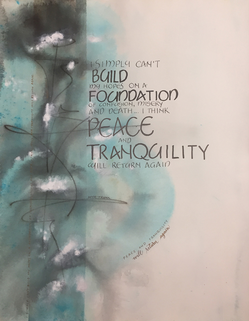
* * * * * * * *
Week #48
This work was done by Lisa Tsang in 2016 in
Seattle for the session “Primitive to Modern” in PRIMITIVE TO
MODERN. In her own words:
After Reggie taught us about Brazilwood dyed vellum, I tried to
find a short cut to using the 6 hr process and decided to try
Angelus leather dye product from Dharma in Winetone. It was
applied with a wool ball applicator and took two minutes. The
first experiments proved that the vellum needed a gentle heat
setting with a hair dryer to "set" the dye otherwise the color
tends to leach into the ink. Too much heat (embossing gun)
deformed the vellum.
I used a palette knife to apply Golden fiber paste of the koi to
give it dimension, then applied Gesso followed by instacol
before adding 23K patent gold leaf. The water swirl was done
with a flat dry brush, and the lettering with an EF66 pointed
nib in an oblique holder. This was done in Finetec gold.
My Mom was the recipient of this work as October is her birthday
month. Further experiments are sure to follow!
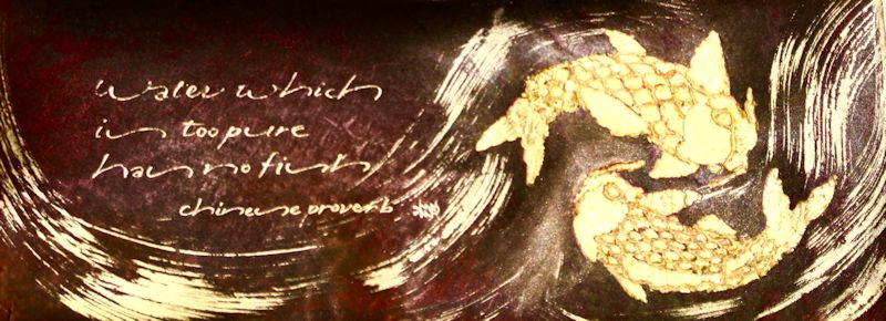
* * * * * * * * * * *
Week #49
This work was done by Tomoko Zunino in 2016 in
Seattle for the session “Primitive to Modern” in PRIMITIVE TO
MODERN. In her own words:
This Halloween inspired piece starts from design techniques of
Codex Aureas. I chose “O” for a decorated letter. I needed
someone to hold this jack-o’-lantern, “O”, so I drew a boy in a
cowboy costume, then drew some Halloween images to make this
piece more Halloween-y.
I followed the sequence taught by Reggie. First, I traced the
letters and designs onto vellum with a pencil, painted gesso and
clear instacol and applied 23k gold leaf. Second, I drew the
spider webs with a micron pen and painted the letters and images
with gouache.
Finally, I drew black outlines with a micron pen, orange lines
with a ruling pen and flooded in with a brush. When dry, I drew
black dots. I also drew some images, a cat, pumpkin, moon, star
and witch’s hat, among dots. Good luck on finding them!
I cut out a crescent moon and tombstones on Arches cover black
paper to hold the vellum.
Happy belated Halloween!

* * * * * * * * * *
Week #50
This work was done by Laura Blaine in 2016 in
Seattle for the session “ DESIGN: Deconstructing the Grid ” in
PRIMITIVE TO MODERN. In her own words:
The project I started in the Deconstructing the Grid class was
not very successful so I wanted to re-do the same quote and a
bridge image in a new piece. I thought a bridge was a good
representation of the connection between wonder and wisdom.
I wrote the quote on Arches #90 HP paper and lettered with a
Speedball #2 nib for “wisdom" and “wonder" and with a Speedball
#3 nib for "begins with” using Moon Palace sumi ink. I
squared-off the letters with an EF-66 nib and sumi ink. I cut it
out with an X-acto knife and set it aside to work on the
background. Reggie always encouraged us to use our skills
outside of calligraphy in our projects. As a web designer I
finally got an opportunity to use my computer skills for the
majority of a project, especially since the design was meant for
reproduction.
I used Adobe Illustrator to create the background and the bridge
design using the dimensions of the original assignment 11”x17".
Illustrator has the feature of using layers so you can have
images on top of each other to build your design. I placed a
blue stained glass image for the “sky” and “water” on the bottom
layer. I found a vector illustration of a bridge at an online
stock image company and downloaded it. A vector illustration is
made of several shapes grouped or locked together that are
scaleable (meaning that it can be enlarged or reduced to any
size without distortion).
I placed the vector illustration on a layer above the blue
background and ungrouped (unlocked) the vector illustration. I
then placed a red stained glass image on a layer between the the
bridge the blue background. I then selected the shapes in the
vector illustration that I wanted to be the red stained glass
color. With those shapes selected, I used a special mask in
Illustrator to convert the vector shapes to show only the red
stained glass image. The shapes selected act like a window to
the layer below and hide the rest of the red image so you just
see the blue background around them. To get a white outline
around the bridge, I placed two copies of the same vector bridge
image in white on two layers beneath the bridge layer and offset
them to outline the bridge.
I scanned the Arches paper with my quote on it, and used
Photoshop to clean it up by making the white paper area pure
white and the black sumi lettering pure black. I also added a
drop shadow to the image. Then I brought the bridge and
background design that I created in Illustrator into Photoshop
and placed my quote image with a drop shadow on a layer above
it.
To create the gold dots I used the brush tool with a "gold glam”
style selected. To get the right size of the dots I scanned in a
small piece of paper with gold dots created using a hot foil pen
and sized my brush dots accordingly. I printed the file at a
copy store using the Mohawk Color Copy paper that Reggie gave
us.
This assignment was a fun opportunity to use Illustrator and
Photoshop in ways I hadn’t used before. You can always learn
more ways to use any creative tool!
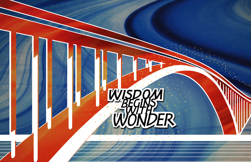
* * * * * * * * *
Week #51
This work was done by Kate Van Dyke in 2016 in
San Antonio for the session “ DESIGN: Deconstructing the
Grid ” in PRIMITIVE TO MODERN. In her own words:
While working in class with color copies and a waxed layout
sheet, I kept thinking, "This would be so much easier in
Photoshop!" And so at home I tried it. I did a couple of layouts
completely in Photoshop Elements but of course, you can't get
the unique irregularity of line in the "cracks" without cutting
up actual paper.
I took a dark gray colored paper, transferred the outline of the
water and rocks, cut it up, and started arranging the pieces on
the waxed sheet. After I was happy with it, I scanned the page
-- in two parts, since my scanner is only about 9 x 12 inches. I
overlapped the two scans until they matched up and created a new
document. This now consisted of dark shapes on a white
background.
I then copied stained glass photos from Reggie's files and
pasted them into my document, each in a separate layer. (You can
see the layers on the right in the screen shot.) I could then
select each shape with the magic wand tool and move the selected
outline around on one of the stained glass layers to find the
part I wanted to use. Copy, paste, repeat.
I scanned in my writing and played around with resizing
different words and lines in Elements, just like we did in class
with the various photocopies. When I was happy with it, I merged
it into one layer. I created the white around the letters by
selecting the black words, increasing the size of the selection
area and filling with white. Put that layer behind the text and
it creates an outline. I resized the writing block as a whole
and moved it around on the background.
For the sky I tried several different stained glass images, but
none were quite right. Finally I scanned in some paste paper,
manipulating the color and brightness. It still needed
something. I remembered the dots we added in class, so I found
an image of random dots online and added them to the sky.
Finally I cropped and resized it for printing.
I know this sounds like just as much work as the hands-on
process, and it probably is, but what I like about using the
computer are two things. First, many more possibilites are
available for resizing and recoloring every part of the whole
and trying out different image patterns.
Second, for me, composition is the most difficult part of making
art. I love to write with a broad-edged pen on lovely paper with
a delicious color, but then what? I have long used Elements to
help with the layout process, using it instead of thumbnails and
practice sheets to guide my finished work. It takes me a long
time to produce a single piece I am happy with.
But doing the work in class with the aim of making postcards and
having Reggie's digital images available at home just turned a
switch in my head. Why not create art that exists only
digitally? I will always enjoy working with physical materials,
but this opened up another avenue for creating pieces that can
be reproduced for gifts or, dare I imagine it, for sale.
Thank you, Reggie, for the inspiration and for the weekend of
labor that led to it.
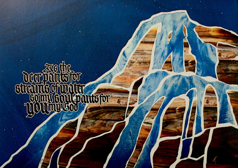
* * * * * * * *
Week #52
This work was done by Terry O’Connor in Chicago
in 2015 for the session”Primitive to Modern”, in Primitive to
Modern. In her own words:
The piece was executed on the beautiful Brazilwood dyed vellum
that Reggie supplied. The letterforms are from a versal alphabet
by Claude Mediavilla. The letters were transferred to the vellum
with Saral transfer paper. I applied 2 layers of Gesso the the
crown in hope of achieving a 3-dimensional effect that was not
entirely successful.
Then 2 coats of instacoll were applied on both the letters and
the crown before applying 23K patent gold leaf.
Of all the techniques that we learned in Reggie's class, the
gold leaf on the deep purple dyed vellum was my very favorite!!
The answers to most of your questions regarding “Primitive to
Modern” or “26 Seeds: a Year to Grow” can be found
through the main page at the web
www.reggieezell.com .
—————————————————————————————
There are now NO openings left for
2017!
Consult coordinators in those cities to see if there are openings for
individual students in those classes.
You can contact me directly at
contactreggie@comcast.net
or 773-202-8321
___________________________________
Click to see several short (free) Calligraphy videos:
http://www.youtube.com/reggieezell
___________________________________

Full length calligraphy videos by Reggie:
www.reggieezell.com
PORTFOLIOS of individual calligraphic styles and GUIDELINES FOR CALLIGRAPHY.
Click here for descriptions.
