WELCOME TO PICK OF THE WEEK - 2014
* * * * * * * * * *
 |
** ** ** ** ** ** ** ** ** ** ** ** **
Week #1 with Video
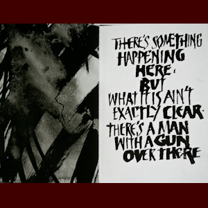
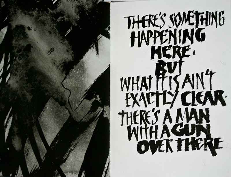
This work was done by Leslie Winakur in San Antonio in 2013
for the fifth session in 26 Seeds: a Year to Grow. In her own words:
I've never been able to watch the news, because I find it so
terribly disturbing and anxiety provoking. In fact, it's been so
bad at times that my parents once called to ask if I knew they
were trying to impeach the President! But I do know what's going
on, and I keep my feelings about it inside me until I feel like
I'm about to explode. Then it all comes out in my art, usually
in a book.
This book is the culmination of a year of particularly
distressing events that seemed to come at us in such fast
succession that there was barely time to digest the news of one
before another came along. The headlines alone sent me reeling,
let alone the details. And the songs of my younger days came
flooding back into my head, leaving me wondering how it's
possible that fifty years later, we haven't changed.
I wanted the headlines to look as stark and black and
disturbing as they are, and I wanted the poetry, songs, and
prayers to look calmer, more thoughtful, more prayerful. So I
painted all the papers first, using sumi ink and a large brush.
I washed parts of the ink away to leave the grays and whites, by
holding the papers under the kitchen faucet. I was surprised at
how my emotions poured onto the paper as I painted. After both
sides were dry, I tore down the papers and made them into
signatures. |
Then I wrote the starkest parts with a "cola" pen, but one made
from litho plate as taught by Peter Thornton. The smaller
lettering is done with the Esterbrook vintage nib suggested by
Lisa Engelbrecht for lettering on fabric, since my inked and
washed Hahnemuhler Schiller paper was - very appropriately -
rather rough and unfriendly to a regular metal nib. The white
lettering is done with Winsor Newton permanent white gouache.
I bound the book in simple black Japanese silk book cloth that
has a bit of gold "mohair" thread in it, and I used the same
paper as in the text block for the wrap on the slip case. I
wanted a bit of red, for painfully obvious reasons, but didn't
want to overdo it, so I used red leather end bands and a red
grosgrain ribbon for a pull in the slip case. The overall size
of the book is about 6 1/4" x 9". The binding is a flat back
case in.
Despite all the dark and upsetting content, as I worked in this
book, the words of Paul McCartney kept going through my mind, so
I chose to end the book with his words and a sense of hope. |
CLICK HERE TO PLAY A
 VIDEO OF THE ABOVE VIDEO OF THE ABOVE
* * * * * * * * * * * * * * * * * * * *
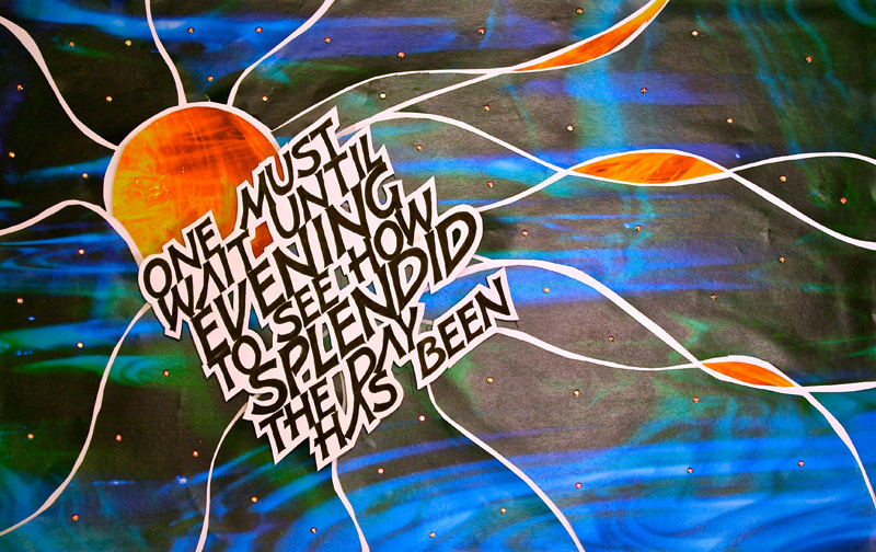
Week #2
This work was done by Ann Cobb in Nashville
in 2013for the fifth session “DESIGN; Deconstructing
the Grid” of PRIMITIVE TO MODERN. In her own words:
This piece was done for the fifth
month of Primitive to Modern: Design -- Deconstructing the Grid.
It is 11" x 16.5" attached to Borden and Riley Paris Paper for
Pens. The papers were from images that Reggie took of some of
his stained glass pieces.
When I saw the beautiful dark blues
and greens, they seemed to call for the Sophocles quote, "One
must wait until evening to see how splendid the day has been."
The papers reminded me of a clear night sky. I chose the orange
and yellow paper to represent the setting sun.
The lettering is the Raucous style,
done with a Speedball B nib, then retouched, drawn in, and
squared off with a Micron pen. Once the lettering was done, the
quote was reduced and enlarged so that we could determine the
best size for the piece. This allowed us to move words around
and alter spacing until we were satisfied with the result. My
final design was transferred onto Borden and Riley Paris Paper
for Pens.
We drew our design onto tracing paper
and laid it over our color copies to find the most desirable
placement. Our finished piece was to be cut apart so that the
background white showed through and became an element of the
piece. |
Our designs were transferred to the color prints with Saral
Transfer Paper. We then cut the paper around the transfer lines,
leaving white space between each cut. Pieces were then glued to
the white background paper using stick glue. The paper for the
sun and its rays was cut from the orange and yellow paper and
worked into the design.
The quote was cut as one piece, leaving white border around the
letters to emphasize them and cutting out the negative spaces of
some letters. The quote was "floated" above the color background
using foam squares. This technique give a shadow effect when the
piece is photographed.
I envisioned stars in the night sky to accent the piece. I chose
to use hot-fix AB crystals to represent the stars because of
their beauty when light strikes them.
The finished piece is actually a photograph of the piece itself.
This was a most interesting exercise as it combined various
techniques into the creation of the finished piece. I enjoyed
the process very much. Thank you to Reggie for teaching us this
technique. And thanks to each of you for looking at my work. |
* * * * * * * * * * * * * * * * * * * * *
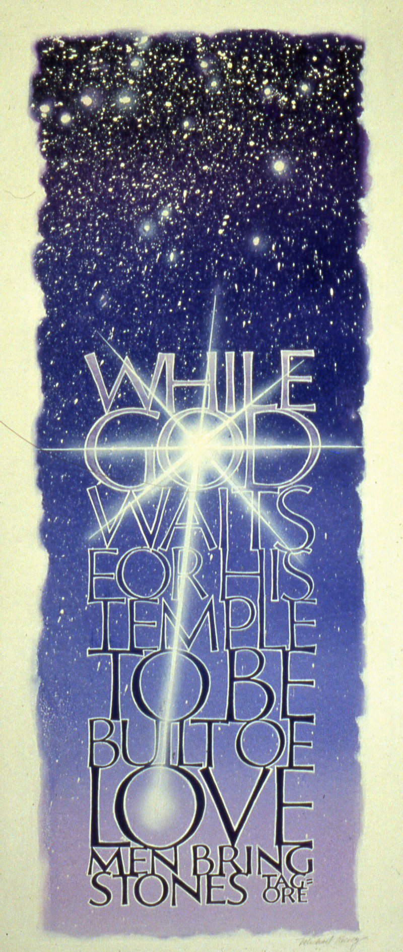
Week #3
This
work was done by Mike Kecseg in 1987 for the second session “Pressurized
Romans”, in 26 Seeds: a Year to Grow. In his own words:
This piece was done on illustration board and is approximately
10" wide by 24" long. I used frisket which is basically a low
tack clear contact paper and adhered it to the board. The
letters were cut and removed from the board and they were
airbrushed with a blue acrylic doing a gradation from light to
dark.
Once that dried the frisket was removed and another layer of
frisket was applied, this time cutting the letters but leaving
the frisket on them and removing the background. I also cut the
frisket on the sides of the piece to give it a look of a deckled
edge. |
I then airbrushed the same color I used on the letters but this
time reversing the gradation from dark to light. I also
splattered on some masking fluid to create the look of a starry
sky to clean up the edges of the letters and to help make them
stand out a bit I added a white outline to each letter.
Finally I used some white opaque acrylic paint in the airbrush
to emphasize a few of the stars in the dark sky and added a
starburst effect that traveled from the center of the "O" in the
word God to the center of the "O" in the word Love. |
* * * * * * * * * * * *
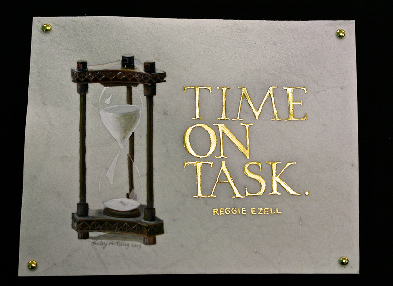
Week #4
This work was done by Haley Ping in 2013 for the fifth session “Italic
and Variations”, in 26 Seeds: a Year to Grow. In her own words:
|
Reggie gave us a long skinny piece of prepared vellum to use for
homework in the 5th 26 Seeds session. He really wanted us to to
use the vellum to try out the quill he cut for us, so I decided
to cut off a section (about 5" by 6 1/2") for this piece and use
the rest for the requested technique. |
The quote, "time on task" was something Reggie said at least a
dozen times every session. I drew out quite a few designs but
decided on this one with the hourglass. The gilding was done
with Instacoll and loose 23K gold. The hourglass was watercolor.
The watercolor was more difficult to paint on than the
Instacoll, possibly because of the nap on the surface of the
vellum. I had to wet the section to be painted with plain water
before the watercolor lay down smoothly. To mount it, I used
some brass mini brads to pin the corners to black matboard. |
* * * * * * * * * * *
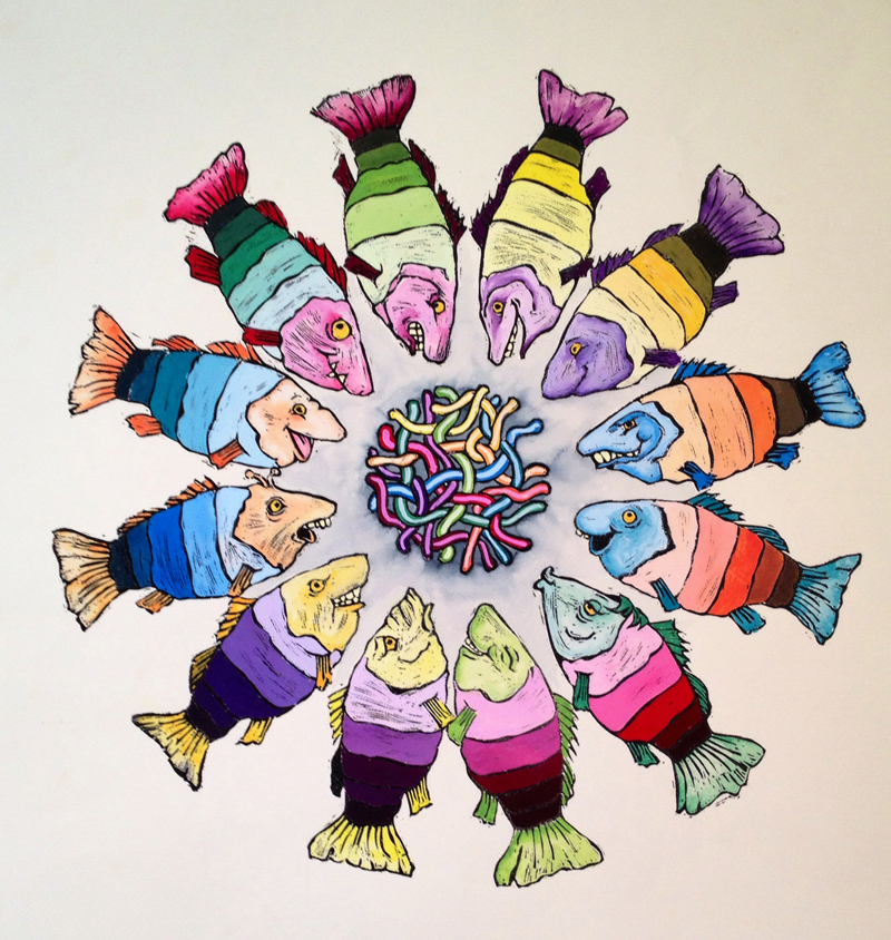
Week #5
This work was done by Nancy Hills in Milwaukee in 1997
for the third session “Roman Variations”, in 26 Seeds: a Year to Grow.
In her own words:
Color Wheel Assignment
This project was done for the May 1997 class and measures just
under 15 inches across. In music theory, keys can be arranged in
a 12-part circular progression called a Circle of Fifths. Since
we had 12 colors to work with and I like goofy puns, I thought
it would be fun to arrange them in a Circle of Fish.
But first I had to create the fish. I sketched out a basic body
which had five stripes for holding the color and its tints and
shades. I decided to use the color’s complement to tint the
head, fins, and tail. |
Using the same fish 12 times would have been boring, so I drew
twelve different heads (one of which is a caricature a certain
instructor we all know and love).
The next step was to transfer the pencil drawings on to rubber
for carving. I used linoleum carving tools to carve the images,
and then did a test print. It was missing something. All of the
fish faced inward, and it felt as if they needed something to
look at, so I carved a tangled knot of 12 worms for the center.
I printed the final piece in black ink on diploma parchment, and
used embossing powder and a heat gun to raise the printed images
and to make them waterproof. Finally I mixed the gouache and
painted in the fish and worms. |
* * * * * * * * * * * *
Week #6
This work was done by Carol Hall in 2013 for the fifth
session “DESIGN: Deconstructing the Grid” in PRIMITIVE TO MODERN..
In her own words:
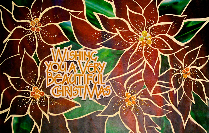
I began with a photograph I took of poinsettias and did an
outline of the basic shapes of the leaves. I then enlarged this
drawing and transferred it to the red ink-jet print using a
micron marker. I laid the print on a cutting mat and cut the
shapes out with an exacto knife, carefully transferring them
onto a waxed sheet of card-stock which Reggie supplied in class,
and leaving space between the shapes for a stained glass effect.
After this step was complete, I chose the shapes that I wanted
to be green, I then pulled them up, one by one and laid them
onto the green ink-jet print, tracing them and cutting them out.
I placed the green shapes back onto the waxed sheet, where I had
removed the red leaves. I did the same process with the central
part of the poinsettias with a gold paper.
Next I did a little research on the poinsettia, and included it
on the backside of my Christmas postcard. |
One fact was that the Latin word for poinsettia means "very
beautiful," and so I made up the greeting on the front to say,
"Wishing you a very beautiful Christmas."
After working out the lettering size and spacing with black ink,
I did the final in gold gouache with a Mitchell #2 and EF-66
nibs onto white bristol card stock. I then cut out the letters
with an exacto knife, leaving some white space around them. I
elevated them with small pieces of foam core glued to the bottom
of the letters and then affixed to the poinsettia background.
Foil pen dots of gold were added for a festive look.
Finally, I photographed it and, with Reggie's help, learned how
to do some basic adjustments on the computer to get a crisp
clean print. I had them printed on oversized postcards and sent
them as Christmas cards for 2013. |
* * * * * * * * * *
Week #7
This work was done by Marijo Carney in Chicago in 1997
for the session “PressurizedRomans”, in 26 Seeds: a Year to Grow. In her
own words:
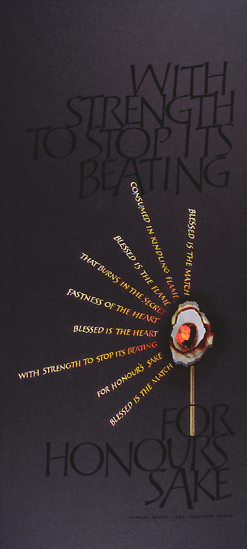
Blessed is the Match: Holocaust Victim Hanna Sennesh
by Marijo Carney is 19"x36" and is executed on Black Arches
Cover paper using gouache and colored pencils.
A few years ago I visited the Holocaust Museum in Washington
D.C. where I first read these words in a display documenting the
bravery of the Jewish Resistance fighters in World War II.
"Blessed is the match, consumed in kindling flame, Blessed is
the flame that burns in the secret fastness of the heart.
Blessed is the heart with strength to stop it's beating for
honour's sake."
This was written by Hannah Sennesh, a 23 year old Jewish woman,
who was a published poet, a pilot, and part of the resistance
movement. |
Her plane was shot down over Germany in 1941, and she was
publicly executed for her resistance activities. These words
were found in her cell after her death.
I wanted to create a piece that would demand respect and be a
testimonial to the bravery of Hannah and all others like her who
"died for honour's sake."
I chose Roman Capitols and black gouache on black Arches Cover
paper to convey the power and reverence of what I felt were the
most important words. I actually burned paper and arranged it in
three dimensional layers to create the flame with a colored
pencil heart at it's core.
The quote in it's entirety creates the light rays around the
match in gradated values of yellow, orange, and red gouache.
Hannah's words, like her courage to face death bravely, burn
brightly in contrast to the overwhelming darkness of war
depicted in black on black. |
* * * * * * * * *
Week #8
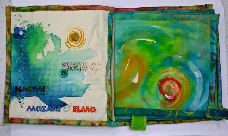
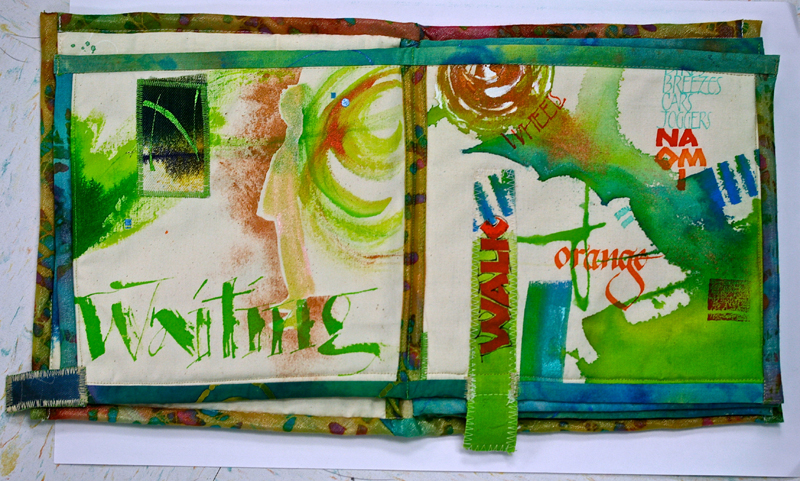
This work was done by Maggie Gillikin in San Antonio in
2013 for the fifth session “Italic and Variations, in 26 Seeds: a Year
to Grow. In her own words:
These pages are in a fabric book made of muslin and canvas. It
celebrates the early life of my granddaughter Naomi, born the
week after the Legacies I conference. In the yearlong class,
Reggie taught writing on different and difficult looking
surfaces, so writing on canvas and muslin wasn’t hard at all.
The writing, as well as the painting, was done with acrylic
inks, mostly FW acrylic inks, which come in a myriad of colors.
I used bright colors to delight a small child’s eyes. |
The words describe the activities that she and I did almost
every day as I babysat her. They serve as a reminder for both of
us as we age together.
Speedball nibs (which I normally do not like) work beautifully
on fabrics. A workshop with Lisa Engelbrecht also aided in the
creation of this book. Machine and hand sewing were used
throughout. Naomi has chewed and played with all the images
shown. She still uses this book as a house with many rooms for
her littlest Pet Shop characters. Pages each about 8” square. |
* * * * * * * * * * * *
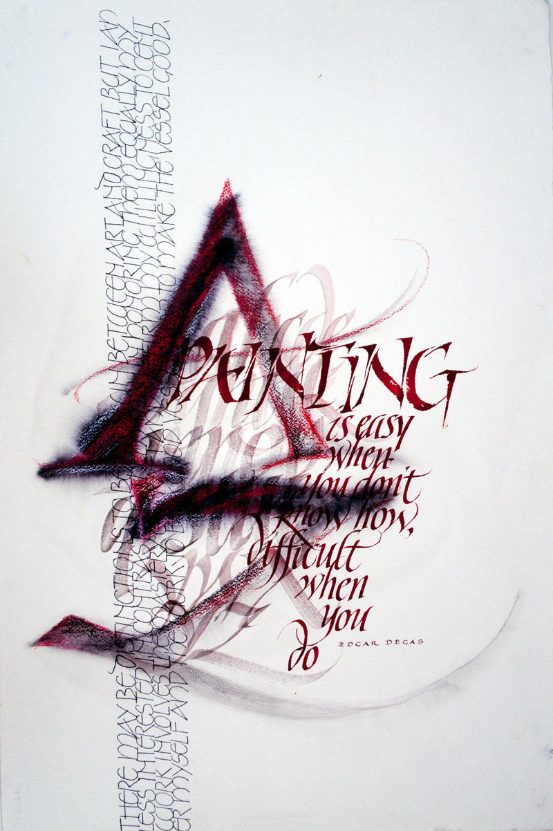
Week #9
This work was done by Carrie Imai in Los Angeles in 19
for the third session “Variation on Romans”, in 26 Seeds: a Year to
Grow. In her own words:
Materials – Arches 90# cold press, Caran D’Ache Neocolor
(watersoluble), gouache, Automatic, Speedball and pointed pen
Techniques – To create the large A – Z, I wet the paper and used
an Automatic pen and watery black gouache, then drew the outline
in red Neocolor. I used an #5 Automatic pen for the manipulated
“Painting” in broken lettering to match the mood. The quote is
so appropo to what we do as calligraphers. After finishing one
semester of calligraphy, I thought I was pretty hot, but as I
learned more, I found out how much I didn’t know. |
This piece was done in Reggie’s year-long a while ago in Los
Angeles. That’s the hardest I’ve ever worked in one year, but
you wanted to do it because, not only did Reggie ask for it, but
he’s so nice that you wanted to do it for him and for the rest
of the class participants.
I used to need to have everything planned, so did thumbnails and
blow-ups so I knew exactly what the finished piece would look
like. Along the way, I found that the “good stuff” is in the
“play.” So I spent an hour or so with a stack of different types
of paper and all kinds of tools and media and just wrote A Z
using different techniques and tools. Then when I had time, I’d
take one of those out and create a piece with that base. Pretty
much I just let the piece tell me what to do next, depending on
what was there. Sometimes it works, sometimes it don’t and
sometimes it’s not done yet. Size – 18” x 24”. |
* * * * *
Week #10
This work was done by Sandy Mundy in Cincinnati in 1990
for the third session “Variations on Romans”,
in 26 Seeds: a Year to Grow. In her own words:
Materials - Arches 903 Hot Press, approximately 18" x 24"
Nu-pastel color sticks, Aquarelle color pencils, gouache, a
mono-line pen, broad edge (Speedball & Mitchell) nibs
and pointed pen.
"Variations on Romans"
To determine the various size of the letters, I first drew the
large letter A. Added the pencil caps, traced them with a
mono-line marker. The plain caps were added and retouched. |
The remaining letters were completed in gouache.
I found theoriginal layout paper; it appears the letters were
enlarged or reduced - using the copier as a tool. All decisions
made, I then lined the Arches. The script capitals were written
last. Looks like I added the 'toothbrush speckling' at the end
too.
This piece was created after my first year long class with
Reggie, over twenty years ago, in Cincinnati. |
* * * *
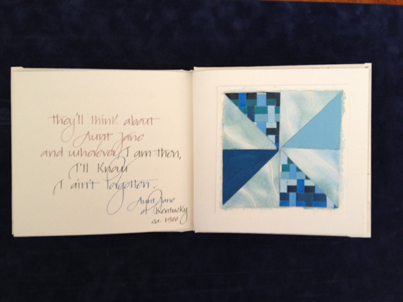
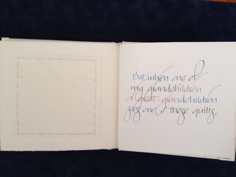
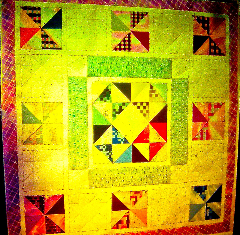
Week #11
This work was done by Jill Novell in Washington, D.C. in
1989 for the third session “Variations on Romans”,
in 26 Seeds: a Year to Grow. In her own words:
The piece measured roughly 28 x 28 and I used Arches 90lb. hot
press, Rising 2 ply Bristol, gouache, masking fluid, Mitchell
nibs. The text was the Aunt Jane of Kentucky quote provided to
the class.
There were two types of quilting squares used. The colored
squares were pieced together using painted papers I made for our
color wheel assignment earlier in the year. There were panels of
woven strips, watercolor washes over masking fluid lines, and
solid colors. The solid white squares were solid paper with
embossed patterns. The text pieces and the quilting squares were
hand-stitched onto the larger white paper upon which I had
already created a cross-hatched colored border. I added
additional stitching as needed to emphasize the quilted effect. |
Now, as radio announcer Paul Harvey used to say, "Here is the
rest of the story"... I came across this piece a decade later
and decided to re-purpose it into several books I was thinking
of making. I cut apart all of the quilting squares and using
similar materials I made three 6 x7 books. The quote was the
same , but this time I used Gwen Weaver's beautiful "Weaver
writing" for the text. So, to paraphrase the quote "when I am
dead and gone and one of my grandchildren or great-grandchildren
sees one of these books, I'll know I ain't forgotten".
Thanks to Reggie for all he has given his many students over the
decades, he too will never be forgotten! |
* * *
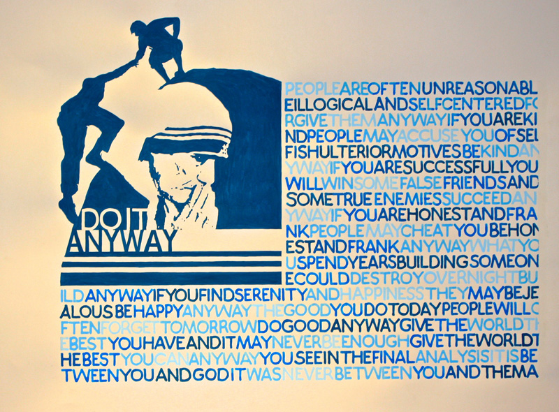
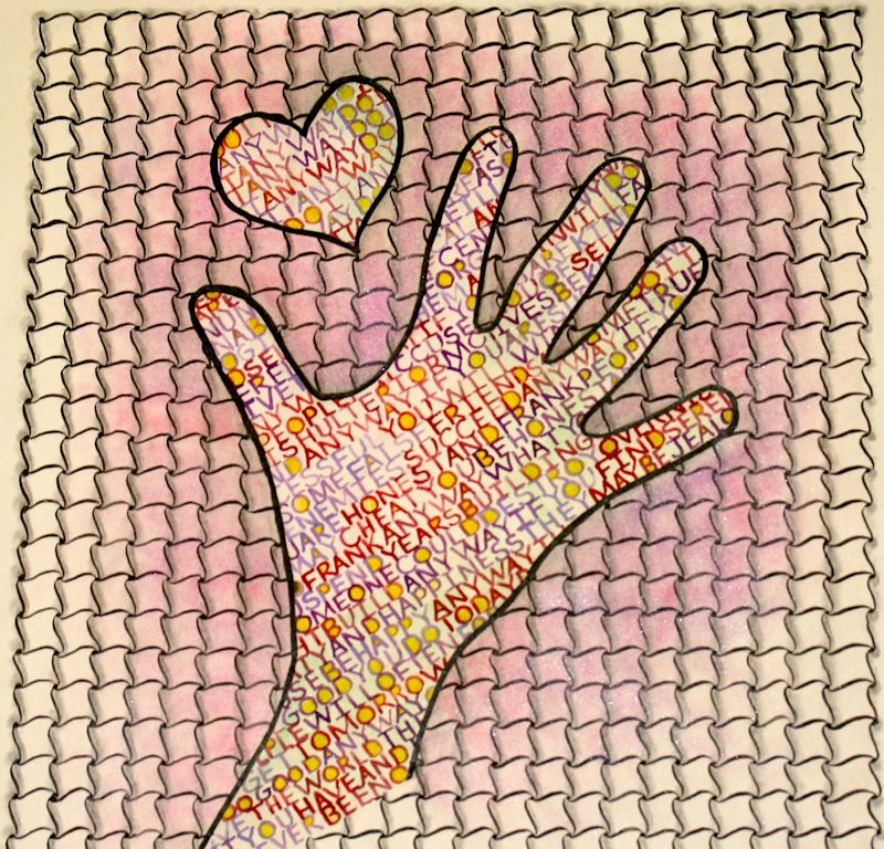
Week #12
This work was done by Julia Silbermann this year in
Raleigh for the first session Monoline and Broad Edge
Romans , in 26 Seeds: a Year to Grow. In her own words:
Do It Anyway: written by Mother Theresa
Materials: 22" x 30" Arches Watercolor Hot Press 90 lb, gouache,
Speedball B-2 nib, #1 Watercolor Brush When I read the poem for
the first time, I wanted to add some kind of design to the text,
that showed people helping each other. So I decided on a
silhouette of two people helping each other to cross a big gap.
As a "quote" of the person of Mother Theresa, I incorporated the
blue lines from her habit. But the big blue area of the rock
seemed too "heavy" in comparison to the written text, so I added
the image of Mother Theresa herself to break it up.
Because I only had many short time spans to work on this piece,
I decided not to continuously write the text. The color scheme
is five distinct gradations of the color blue. I wrote each
group of the separate same value words in one session. |
Then four more separate lettering sessions finished the
job. To do so, I planned the spacing and layout by writing down
the whole text in ink on bond paper, cut it in strips, and
pasted them together, so they fit the chosen text area on the
final sheet.
I then placed one strip after another under the line I wanted to
write on and wrote the word in the chosen color right on top of
the same word on the paper strip. This saved me quite a lot of
time, because I did not have to mix five colors every time I got
to work on the piece and I did not need to clean nibs and
brushes after each word or to use five brushes and five nibs. |
* * * *
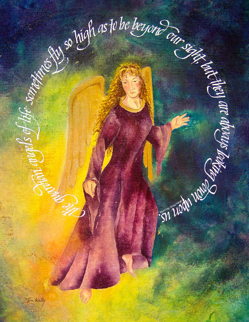
Week #13
This work was done by Toni Kelly in 2003 in Pittsburgh
for the fifth session Variations on Italic , in 26 Seeds: a Year
to Grow. In her own words:
Title of the piece: “The Guardian”!
The quote: The guardian angels of life fly so high as to be
beyond our sight, but they are always looking down upon us. -
Jean Paul Richter!
Materials and size: 16 x 20 on canvas, Image painted with F&W
acrylic ink, Lettering done with Gouache using speedball nibs.
This piece was done for Reggie’s 26 Seeds to Grow year long
class during the Italic Variations session.
I have often combined imagery with lettering on canvas. Working
with acrylic inks for the paintings provides a better surface to
write on than acrylic paint would.
The ink is transparent like a watercolor and permanent so it
will not lift off when you letter on top. For this piece I
wanted the lettering to surround the angel like a halo or circle
of light. To achieve the correct spacing for the circle I
lettered the quote in a straight line then measured the line
with a flexible object such as string. |
You can then make your curve with the flexible object to
acquire the circumference needed to letter in a circle or arch.
The reverse would work also by first creating the circle or
arch, measure and then straighten out your line and letter for
the correct height and spacing.
I found the Speedball Nibs worked best for me when it came to
lettering on canvas but have also used the Mitchell Nibs. The
lettering was done with Gouache which is opaque and stands out
against the background plus it is forgiving if you need to make
a correction. Since the background is acrylic ink it will not be
disturbed when lifting the Gouache for errors.
I will always remember my class with Reggie in 2003 with the
attention to detail and instruction. Toni Kelly
http://tonikellystudio.com |
* * *
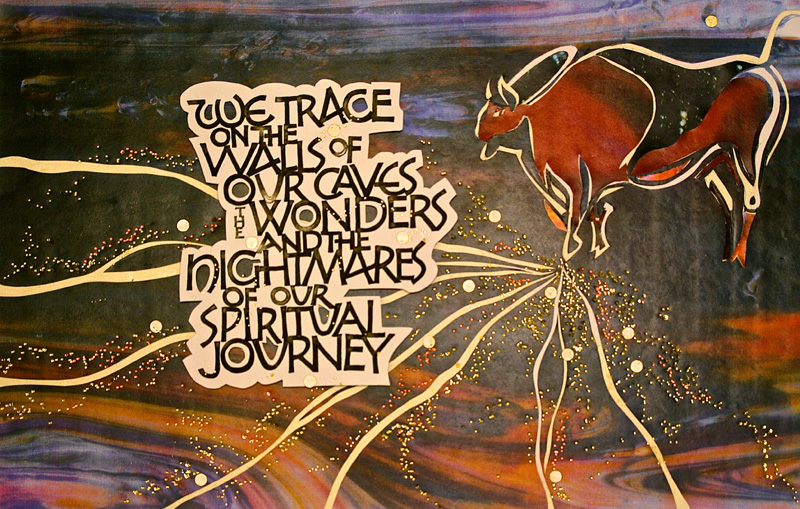
Week #14
This work was done by Jen Grove in Nashville in 2013 for
the fifth session “DESIGN; Deconstructing the Grid” of
PRIMITIVE TO MODERN. In her own words:
I certainly had a sense of accomplishment finishing this
distinctly unique assignment in Reggie's Primitive to Modern
class. Being from the late seventies, early eighties paste-up
generation, I was familiar with selecting items and positioning
them on a waxed surface, VERY familiar with an exacto knife...so
I got that much of the concept... and I like to think that I
usually know where Reggie is headed in class, yet, this time I
hadn't a clue.
NO CLUE. You have color printouts from the Hubble Space Station
for what? You want me to do what? I have always thought it
terrible when students take their work up to their teacher, and
say the dreaded words, it this right? what do I do next....? I
always had thought what unimaginative dolts can't make a move
without their instructors approval and direction? Well, sad to
say... It happened to me. What do I do next Reggie? it took me
two involved attempts to finally get the concept of this
assignment. I had to think this through a little more, than the
"just doing" in my first attempt.
My train of thought was simple, I was looking at constellations,
okay isn't there one with an ox? lets goggle ox. OH whoa! there
are primitive from earliest of times cave paintings of Bulls! Oh
Oh Oh , what an interesting juxtaposition of a human
representational drawing projected into the timelessness of
space. hmmm. loved that. Then, it was time to pick a quote, yes,
googled again, found this profound quote about, just what I was
attempting to express about identity in space, in an infinite
universe or a small earthen cave etc.
Reggie taught us in 26 seeds how to square off b-nib letters
with and Ef66 so i was ready for that, them he provided us with
a waxed surface and some handouts as a taking off point for what
shapes we wanted to work with. He also provided these amazing
11x17 color copies of photos he had taken of stained glass, and
a variety of other abstract extremely colorful photos. Then the
most valuable of instruction on how to space your words into a
designated space by using acetate over lays and folding your
sheets of text, AND using the photocopier to experiment with
different SIZES of words and lines. It is to involved to explain
here. but it WAS invaluable.I LOVED the way everyones piece
turned out so different. |
Then I began to experiment and to experience the image I
had chosen by cutting away and switching out the various color
copies. it was satisfying! and fun, to fit the images in and add
the flowing lines and make decisions about placement. I decided
to have the tip of the hoof of the ox be a focal point, like the
magic touch of a mythical beast.
Then I got to dit dot ditdot my life away! I really liked the
effect when it was done, and it was another opportunity to work
intuitively by going with the flow and not over thinking the
gold dot patterns. Dots were made with gold heat pen. Reggie
also encouraged us to use some larger dots to create more
contrast.
The cutting away of the white around the letters and then
suspending them with little bits of corrugated cardboard to
create depth was more decision making, about how much to cut
away, etc. if I do it again I would probably take of more white.
This particular picture of Reggie's does not represent the color
well and there is some reflection, it is much more purple in
reproduction, and much crisper in reduction of course, which was
part of the assignment to have this image reduced down to card
size, on good card stock and to come back to class with our
horror stories of Office Depot and Kinkos.
All and all, I am very pleased and actually love my quote very
much, it gives me pause to reflect, it reminds me that this
world is a tragedy full of joy, and that I am a Spiritual being
on a journey... maybe that journey goes from scratching on the
walls of cramped caves to the great beyond. oooorrr |
* * * * * * * * * * *
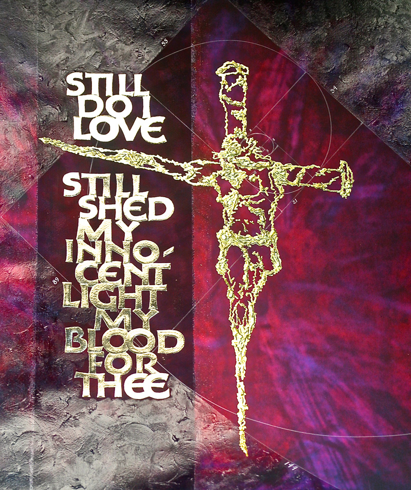
Week #15
This work was done by me, Reggie Ezell, here in Chicago
in 2014.
In her own words:
The poem “Still Falls the Rain” was written by Dame Edith
Sitwell in 1940 during the air raids on Great Britain. It
ponders our relentless, senseless cruelty to one another and an
everlasting love that may redeem us. I have calligraphed this
rather long poem in excerpts and in entirety many times over the
course of the last forty years.
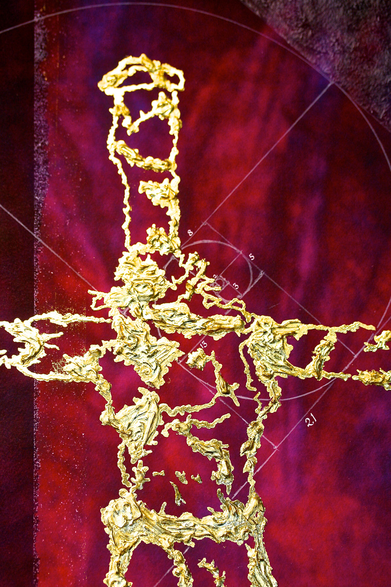
In the mid 1980’s, on the Isle of Ibiza a couple who lived
there, had on a wall, a torso of Christ; much like ancient
greco-roman statues, the limbs were broken off. It was lashed
with baling wire to two large corroded spikes that had been
brought up from the wreck of a spanish galleon. Soon after I
created the central image in this work. I have used it several
times for this poem; in book and broadside, sandblasted into
glass, on primitive fig bark paper, and in this current
rendering.
This background started as a calfskin vellum that I had stained
purple with brazil wood dye. I made a digital photograph of it
and modified it in Photoshop. |
I printed it on archival paper with archival inks; then painted
into it with watercolors and acrylics.
There are several acrylic bases used to create a sculpted effect
onto which are applied layers of both 24 Kt. and lemon gold
leaf. The words too are acrylic bases with moon gold leaf atop.
The Fibonacci series is a sequence of numbers starting with (the
prime) 1 and continues without end: a mathematical expression of
infinity. I’ve placed the number 1 within Christ’s aura, so that
as it spirals out, creating the unending repetition of the
Golden section,
it suggests the spiritual expression unending, uncompromising
love, generated from within a single living soul.
I hope to do this poem yet another time in the future. |
* * * * * * * * * * * * *
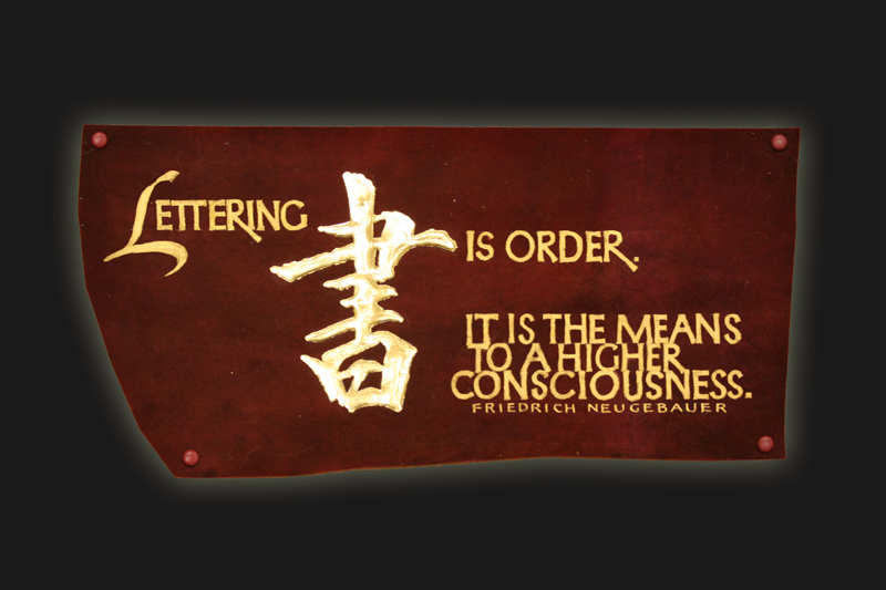
Week #16
This work was done by Carol Hall in Nashville in 2013
for the fourth session of PRIMITIVE TO MODERN.
In her own words:
|
I admire Friedrich Neugebauer's book: The Mystic Art of Written
Forms. It has been a source of inspiration for me throughout
Reggie's classes. For this piece I chose a quote from this book
and the Chinese symbol for writing. |
The lettering was done with Schminke gold with metal nibs. The
symbol is gilded with patent gold on acrylic. The material is
purple dyed vellum and the size is approximately 3"x6". It is
attached to a mat board with colored button fasteners from
Michael's. I gilded the symbol in class and did the lettering at
home. |
* * * * * * * *
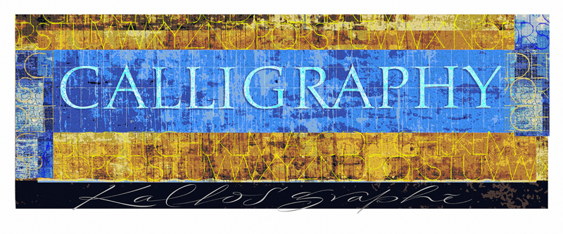
Week #17
This work was
done by Alan Ariail in Chicago this year for the first session “Monoline
and Broad Edge Romans”,
in 26 Seeds: a Year to Grow. In his own words:
Even though I have been a commercial lettering artist for over
three decades I had never truly studied mono line proportions
until the first workshop session of 26 Seeds. In an attempt to
learn the basics I concentrated drawing cap letters on grids.
After a month of practice sketches I decided to combine some of
the better monoline studies into a digital painting combined
with the word Calligraphy.
All the letters that appear in the composition are scanned
pencil sketches imported to Photoshop. The scanned sketches are
used as reverse masks on various textured layers. The background
texture of the composition has pencil strokes of monoline
letters and grids all scaled at different sizes. The pencil
marks were painted into, distorted and posterized to create a
graphic appearance. Many of the techniques in the painting are
no different from traditional techniques I used in the pre Mac
days. The word Calligraphy and the bright colored monoline caps
are pencil outlines created as reverse masks, and painted into
with a rough texture brush. |
As with any painting I had no idea were this composition was
headed. Elements continually changed throughout the process.
Kallos "beauty" and graphé "writing" were lettered with a
pointed marker, finessed as vector art, imported and filled with
color to add contrast of styles. With this being a digital
painting I was able to reproduce archive quality prints and
enjoy to sharing them with fellow classmates. The major benefit
of this experience has been my use of preliminary monoline
studies on a daily basis for both personal and commercial
lettering projects. Another skill learned that will better my
craft as a lettering artist.
The tools for this project:
- Mechanical pencil with .3 lead
- Chartpak fine tip marker
- Grid paper
- iMac with desktop scanner, Adobe Photoshop & Illustrator
* Epson Stylus Pro 3880 inkjet printer |
* * * * * * * * * * * * * *
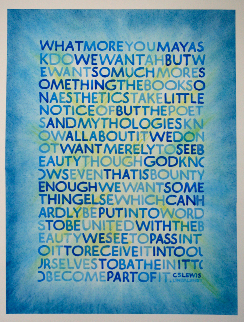
Week #18
This work was done by Linda Lundy in Ellensburg,
Washington this year for the first session “Basic Romans” , in 26 Seeds:
a Year to Grow. In her own words:
This piece was done in our current Amazing Reggie Class, 2014,
as a study in ROMANS.
Arches 140 lb watercolor paper, 19”x 22”
Speedball B-2 nib
Primary Blue Windsor and Newton Gouache, with white and more
white
Pastels: blue, green, yellow
The lettering was ½” with no punctuation or spacing.
Each word was done in a different color. I had three pens and
nibs, and three brushes of the three colors.
I began this project with trepidation because the style and
letters are awkward for me. I determined to go ahead because
this was a quote I loved and I wanted to create something
beautiful with these words to match their sentiment. |
The letters flowed easily on the page once I finally found
the right dilution of gouache and shades of the colors.
When I was done with the letters they looked so stark on the
page against the white background. They looked cold and lonely.
They needed softening and warmth, and a diminished contrast. We
had recently experimented with pastels in our class with
wonderful results, so I began to explore possibilities for
backgrounds for this piece. I used several practice papers and
decided on different blues, greens and yellows . This was Fun!
The whole quote is about beauty and I wanted this to appear as a
blast of beauty!…drawing one into the design, experiencing being
immersed in color……and beauty. I was pleased with the result and
plan to give it to my daughter, who gave me the quote. |
* * * * * * * * *
Week #19
This work was done by Starla Snead in Chicago
this year for the first session “Monoline and Broad Edge Romans”, in 26
Seeds: a Year to Grow. In her own words:
I was really inspired by the quote by Mother Theresa. There are
so many things I want to try or accomplish but fears and life's
challenges get in the way! Do it anyway because that is where
your heart is!
The piece is 16x16 on arches watercolor paper. No special reason
just happened to be the first sheet of paper I came across when
I became inspired. The background is a Zentangle pattern. |
I am a Certified Zentangle Teacher (CZT) and am always looking
for ways to incorporate zentangle into my work. I used a pointed
pen to complete the background as well as the roman letterforms.
Speedball and I did not get along too well. Pastels and pencil
were used for the shading. |
* * *
Week #20
This work was done by Ronald Ross in Nashville in
2013 for the third session “Illumination on Vellum”, in PRIMITIVE TO
MODERN: In his own words:
This piece was inspired by the “Codex Aureus”. It is on calfskin
vellum (7” X 20”) and is illuminated with 23K gold leaf.
I started by laying out the entire project in pencil, then I
lined in the areas that received gold with waterproof black ink.
I prefer a KOH-I-NOOR Technical Pen (Rapidograph 2/.60). The ink
is waterproof and the lines are always consistent. After it was
laid out, I stapled it to a plywood board around the outer
edges. I then laid a coat of Instacoll in the gilding areas, let
it dry for approximately 1 ½ hours (depends on the humidity) and
applied the gold leaf. |
The straight lines are done with a ruling pen; this is the
only way to get consistent borders. Rule in the outlines, and
then fill in with a brush. I used W/N Gouache, although I am now
experimenting with Acrylic.
I cut away the staples after a few days and mounted it on suede
mat board over ¼” plywood. I drilled small holes and attached it
with brass fasteners from the hobby store. |
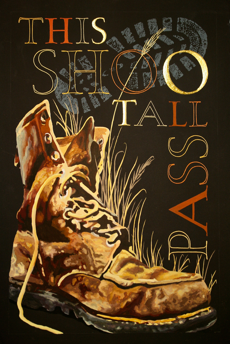
* * * *
Week #21
This work was done by Julia Silbermann in Raleigh
this year for the session “Pressurized and Drawn Romans”, in 26 Seeds: a
Year to Grow. In her own words:
"This Shoo Tall Pass": A quote by my husband.
Materials:
11"x17" Arches Cover Black, Gouache, Dr. Martin's Bleedproof
White, #1 Watercolor Brush, #5 Watercolor Brush, Saral Paper,
Matte Sprayfix, 23K Patent Gold, Instacoll.
"This Shoo Tall Pass" is a quote by my overtired husband, while
we lived through the first challenging months with our baby son. |
Of course he meant to say:"This Too Shall Pass". But his mix-up
made us laugh so hard and has become sort of a motto to us. We
say it quite often in challenging situations and smile about it.
It is gouache and gold leaf on black water color paper. All
colored areas have a white underpainting with Dr. Martin's
Bleedproof White. The piece was done in several layers, that
were treated with sprayfix. The gold leaf on the letters S, O
and T was laid on a base of Instacoll. |
* * * * * *
Week #22
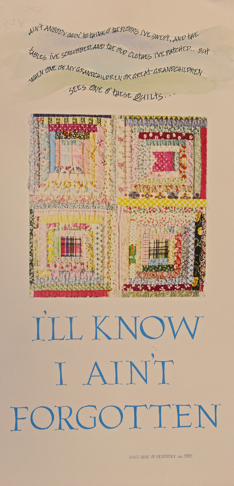
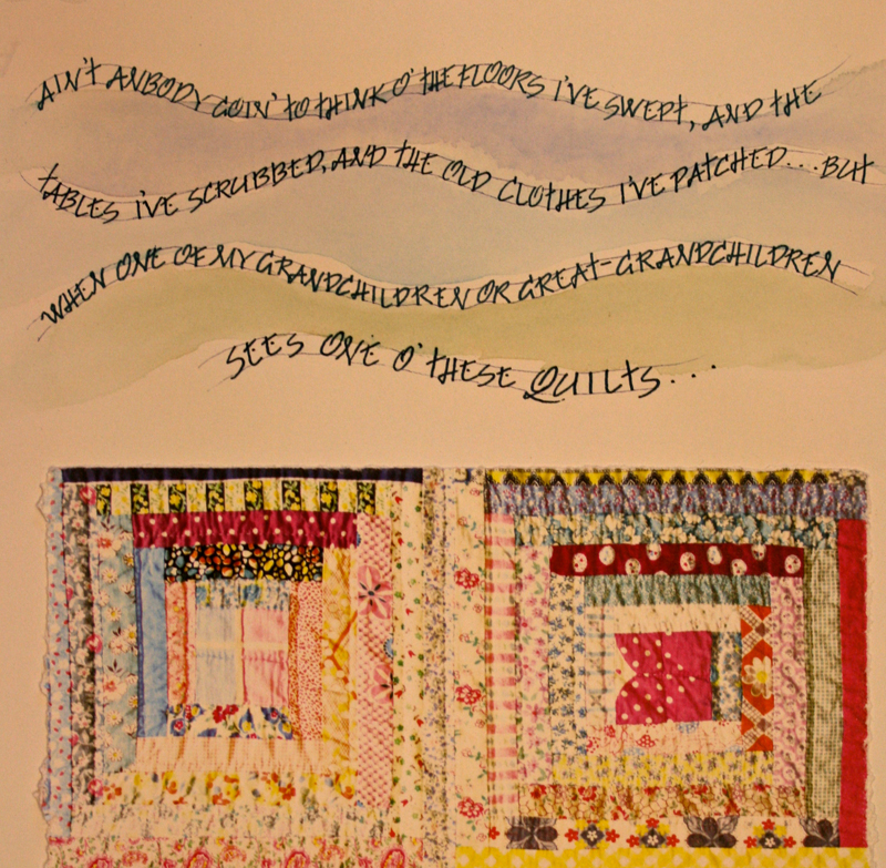
This work was done by Harriet Davis in Raleigh
this year for the session “Pressurized and Drawn Roman Capitals”, in 26
Seeds: a Year to Grow. In her own words:
|
When I read the quotes about quilts by Aunt Jane of Kentucky
which were provided for our class, I immediately thought of my
paternal grandmother. She was born in the mountains of eastern
Tennessee and later moved to West Virginia. She spent all of her
life learning and doing the countless mundane tasks involved in
taking care of her family and home, and did them with much love.
She only went to school through eighth grade, was not
well-traveled, and was a little suspicious of restaurants, but
she could make beautiful clothes for my Barbie doll out of
scraps and quilt with tiny hand stitches. I remember her working
on this log cabin pattern quilt, which she later gave to me for
my high school graduation. I was fascinated with the way she
pieced together the lights and darks from scraps she had
accumulated. I knew I wanted to use this quote and somehow
picture her quilt. The assignment was to use pressurized Romans,
and while they seem formal for a quilt, to me they give a
timeless “not forgotten” sense to the words. |
My son helped me take photographs of the quilt with a good
camera then I had them printed at a FedEx office onto Arches
90lb.HP paper because I initially wanted to write directly on
the photograph. However, that seemed much too “busy” and just
didn’t work. I mulled over many possibilities and finally
settled on a very simple design using a photo of just four
squares of the quilt. I tore the edges of the HP paper and glued
it on the larger piece with YES! paste.
I lettered the last words 1 inch high on a grid, cut them out
and pieced them together for spacing, then put them under Arches
90lb. HP paper (11.5” x22”) on a light board. They were written
with the #2 Mitchell and EF66 nibs in gouache mixed from WN
primary blue and white to coordinate with the blues in the
quilt. I used clothesline lettering for the first part of the
quote to represent one of the many chores my grandmother did.
After several sketches, I penciled it directly on the paper,
lettered with the edge of a waterproof blue Zig marker, and used
a very fine point waterproof marker for the clotheslines. Then I
used WN watercolors for a light wash of colors in between the
lettering to evoke the mountains. My grandmother ain’t
forgotten. |
* * * * * *
Week #23
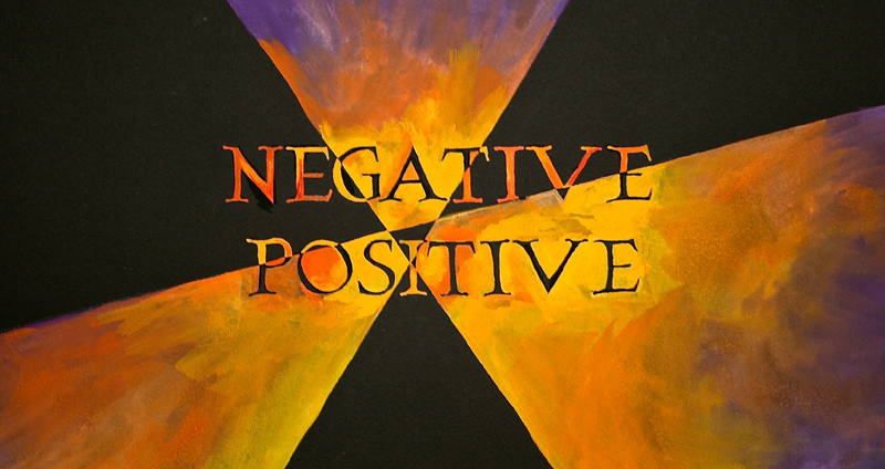
This work was done by Alexis Bach in Chicago this
year for the second session “Pressurized and Drawn Romans”,
in 26 Seeds: a Year to Grow. In her own words:
This piece was our main homework assignment for our Session 2:
26 Seeds. I was quite intimidated by the assignment. As a new
calligrapher, I can definitely relate to the the "fear factor"
when beginning a new project. I kept telling myself to be
"positive." I knew that I wanted to incorporate negative space
somehow into my composition. I have seen and admired many
beautiful works of calligraphy and I had not experimented with
this aspect of the craft. I began the quest for a proper length
(that would be short) quote. It just hit me to do
"Positive/Negative." I was struggling to maintain a positive
mindset about my work and it just seemed a perfect phrase to
depict.
So, I set to work. I drew my pencil letterforms on a grid. I
spray-fixed my paper. Then, I transferred the letters onto the
Arches black cover paper using white Saral. After I transferred
my letters, applying the principle of balance, I drew the
diagonal lines across the paper— paying careful attention to
what parts of the letterforms I was dissecting to create the
positive/negative effect. |
I purposefully created the small interior space to symbolize the
confusion where positive/negative thoughts often converge (at
least in my head). I under-painted all positive surfaces with a
white acrylic (water added) wash. I let this dry overnight and
the next morning used the black eraser to remove any of the
white Saral transfer remaining on the black paper.
From my color chart I chose bright colors that appealed to me:
red-orange, yellow-orange, and purple. I set myself to the task
of over-painting using a No. 1 pointed brush and two sets of
eyeglasses! When I was finished with the composition, I went
back and touched up the letters with black gouache. Lessons
learned include: when I am tracing my letterforms to trace on
the inside of the line and then to paint on the outside of the
Saral line; don't water down my acrylic under-painting; love
that black eraser; and I need more practice mixing colors.
Overall, a successful endeavor for me! |
* * * * * * * *
Week #24
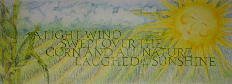
This work was done by Jane Doherty in Chicago
this year for the second session, “Pressurized and drawn Romans” in 26
Seeds: a Year to Grow. In her own words:
After our long winter I wanted to do a piece that celebrated
sunshine.
The paper, 30"x11"s, is a Twin Rocker 'second' from their
version of a discount bin ( I couldn't locate any flaws).
The sunshine, corn stalk etc. are done in colored pencil. It
started as a quick little sketch in a small sketch book; then
half size one in a larger book, then full size on tracing paper. |
I used a soft graphite pencil on the back of the tracing paper
to transfer the image on to the good paper.
Essentially I did the same thing with the letters, though once
they were transferred on I did them in gouache, pressurizing
with the #2 Mitchell nib. It needs a touch of work here and
there and the Ann Bronte attribution. |
* * * * * * *
Week #25
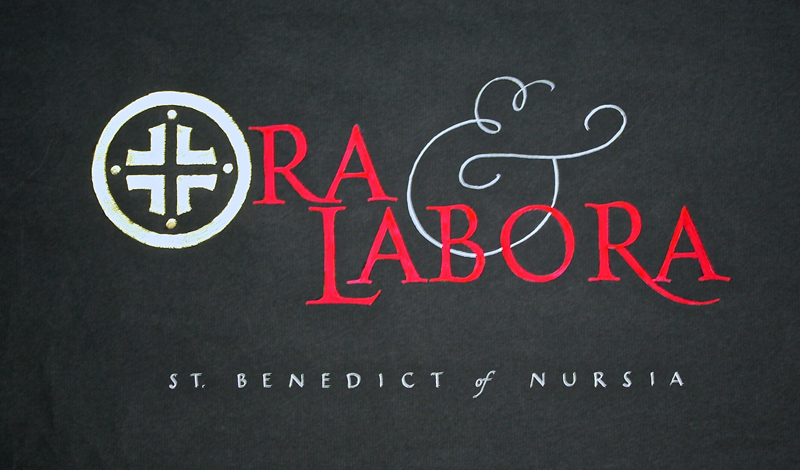
This work was done by Theresa O’Connor in
Chicago this year for the second session, “Pressurized and Drawn Romans”
in 26 Seeds: a Year to Grow. In her own words:
|
Whenever I do calligraphy, I am reminded of the monks in the
scriptorium -- those men who created exquisite works of art
while toiling in obscurity "all for the honor and glory of God."
Last spring I had the opportunity to visit the Abbey at Subiaco,
one of Benedict's first monasteries. There, I was privileged to
see firsthand some of their original illuminated manuscripts at
the very site where they were created. So, for my first foray
into gilding, I chose the Benedictine motto: "Ora et Labora",
"Pray and Work" in honor of these anonymous artists. |
This piece was executed by drawing Roman letters on a grid. They
were transferred using Saral transfer paper to black paper. The
symbol was then drawn as a modified form of the St. Benedict
cross. The symbol was gilded with 23KT patent gold on an
Instacoll base. The letters were then under-painted with white
gouache and then painted over with primary red gouache. |
* * * *
Week #26
This work was done by Mary Zabrin in 1997
in Chicago for the second session “Pressurized and Drawn Romans”, in 26
Seeds: a Year to Grow. In her own words:
“The Color of Love” by Mary Zabrin
I’m an alumni of Reggie’s 1997 class. During April of that year,
we worked on drawn Roman Caps with “serifs on steroids”. For
homework, we were tasked with creating our own pencil drawn caps
and using them in a short quote of our choosing on black paper.
I chose a haiku by Izumi Shikibu.
Using my hand drawn alphabet, I traced each word of the haiku
(always mindful of the letter spacing) and then cut and pasted
the words until I was happy with the layout. |
I transferred the letters to black Arches paper with white
Saral transfer paper - my letters are just a touch over ¾ inch
tall. The color was added with Prismacolor pencils and small
gold dots were painted in between each word to make it more
legible.
This was one of my favorite homework pieces that year and still
hangs in my home today. |
* * * * * * * * * * * *
Week #27
This work was done by Sam Bicchieri in
Ellensburg, Washington this year for the session “Carolingian and
Variations”, in 26 Seeds: a Year to Grow. In her own words:
This piece was done as a homework assignment in the Carolingian
section of our year-long course with Reggie. The selection of
image and text came from my wish to complete it as a gift for my
sister for whom it would have special meaning. I pretty much
knew what I wanted to do. I just wasn’t sure how to do it.
The background image was taken from a low-resolution photograph
that I imported into the iPhoto program on my Mac computer. In
iPhoto, I cropped the picture to highlight the mountain range;
manipulated the image to be “softer” and more blue-ish; and then
added a border to create definition. After an unproductive back
and forth with our local copy shop (sigh), I found through trial
and error that even our low-budget HP color printer could handle
heavy paper and be formatted to print on paper up to 14” long.
The final image is 3.75” x 12.5,” printed on an 8.5” x 14” sheet
of Arches 140# HP watercolor paper. I made several copies and
coated each with spray-fix. |
With the background set and the hand (Carolingian)
predetermined, layout and design were relatively straight
forward. After some experimentation, I wrote out the poem on a
separate piece of good paper using a #5 Mitchell nib for the
letters and an EF66 for the punctuation. I copied that onto
tracing vellum; then cut and (with removable tape) taped the
lines onto the image. Once satisfied with the layout, I used a
light box to transfer the key elements onto a second copy of the
image. With luck, this would be my finished piece. Key elements
marked and Linex lettering guide in hand, I penciled in the
guidelines.
The lettering was done using blue indigo stick ink. With all the
mistakes I made, it was a relief to find that I could scrape
off, reline, and rewrite on the image with little difficulty. It
probably helped that the background was pale and patchy to begin
with, but God bless spray-fix. It got ‘er done. |
* * * * * * *
Week #28
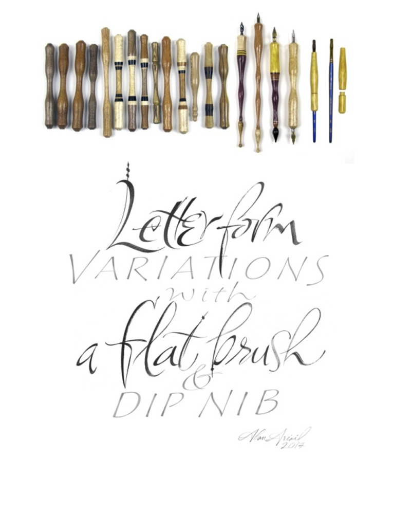
This work was done by Alan Ariail in
Chicago this year in 26 Seeds: a Year to Grow. In his own words:
For the longest time I had never had any success with dip nibs
or traditional calligraphy pens. Prior to participating in
Reggie Ezell's year long workshop “26 Seeds…”, I could not
produce a consistent stroke on the paper surface with a broad
edge or pointed nib. Watching Reggie demonstrate pen techniques
as well as other workshop participants was extremely beneficial.
However, attempting the same techniques in my studio produced
nothing but awful looking letterforms until an unplanned pen
accident.
One evening I was lettering with a brittle wooden pen holder.
While removing the nib my holder cracked in half at a thin spot.
I decided to continue lettering with the broken holder. The
small size required a change of my grip and finger placement.
For the first time ever I produced a straight vertical downward
stroke. This broken pen holder episode led to milling my own pen
holders on a lathe. I was searching for a shape to fit
comfortably in my hand and allow ease of nib manipulation. In
“26 Seeds…” we had begun practicing pressurized letterforms. I
began to experiment with different pen holder shapes to find
something to benefit stroke placement and pressurized
variations. I'd mill a pen holder in the morning, practice with
it during the day and determine what needed to be changed to
fine tune a shape for my hand grip.
Within a month I had milled many different holder shapes: small
and large diameters, stub size to long length. Some of the pen
holders had textured surfaces for ease of rotation. After a
couple months of practice with various holders my preference
changed to large diameter size with no texture. I noticed better
control of the nib including leverage to expand the tines of the
nib with a large diameter holder. During this milling and
searching process I felt as if I was fine tuning a precision
writing instrument. |
My skills with the lathe improved as did the construction and
finishing techniques for a beautiful and durable surface. I also
gained the knowledge of creating a customized pen holder which I
believe can help people who may be struggling as I was with dip
nib pens. Small changes to the shape of a pen holder can make a
significant difference with the nib flow and placement on the
paper surface.
While writing about this pen episode I decided to mill a brush
holder similar to the pen holder shape. I wanted to find out if
increasing the brush handle diameter might benefit control of a
small #6 flat brush. Voila! The brush holder worked like a
charm. I began putting down brush stokes on paper previously
unattainable. As with the nib holders I ended up milling many
different brush holder shapes to find a shape for ease of
manipulating the brush. I now feel as if I am lettering with a
magic device as the brush stroke effects during practice
sessions are more than I ever imagined possible.
This pen and brush holder milling episode has been one of those
breakthrough moments in life. Prior to Reggie’s workshop
creating letters with a nib or brush was a daunting task. The
workshop assignments required practice with dip nibs. It's
amazing how unplanned moments in life lead to something truly
beneficial. If I had not broken my brittle dip nib holder my
Variations lettering composition with a #6 flat brush, Speedball
C4 nib, gauche on bond paper would not exist. |
* * * *
Week #29
This work was done by Edna Bjorge this
year in Ellensburg, Washington for the session “Carolingian and
Variations”, in 26 Seeds: a Year to Grow. In her own words:
These pages were done as part of an assignment in the
Carolingian section of our year long class. I have been
collecting Haiku for quite some time, especially the poems of
Basho dealing with nature, and this seemed like a perfect
opportunity to start putting them in book form. I wanted to be
able to add to the book over time, so I chose a post-bound
format. The elongated pages seemed to fit the poems and also to
go well with Carolingian, a book hand custom-made for long lines
of small writing. I wanted the book to be spare and elegant, in
keeping with the subtlety and austerity of Basho’s work.
I chose Arches 90# Hot Press Watercolor paper for the pages
because it could take the abuse I intended to give it, and
because it folds easily: all the long pages are soft-folded
about 11” in from the right side, in order to decrease the size
of the book and to add a little mystery to each page. Each page
is 6” x 21 ½” when unfolded, almost the full width of the paper.
The closed book measures 11 ½” x 6 ½” in a horizontal format.
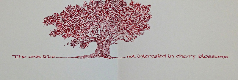
For the Oak Tree poem, I chose a plain page and lightly drew a
single line 2” up from the bottom. I did the drawing first,
taking care to keep most of the image to the left of where the
fold would be. |
I then did the calligraphy, using a Mitchell #3 nib and wine red
stick ink for both. I love the rich color with the tree image;
it reminds me of oak trees in the fall. This poem is one of my
favorites; Basho seems to be reminding us to be ourselves, and
not to seek after transient glory.
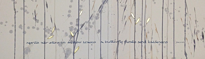
For the April Air poem, I used a page cut from a full sheet of
paper that I had previously altered by taking it outside,
hanging it on the fence and flinging water and various dilutions
of walnut ink and black gouache at it, letting the splatters run
at will, and then cutting it into pages. The page I chose for
this poem seemed to be asking for a few simple leaf shapes, so I
added them using a black Micron .01 pen, and then gilded them
using Instacoll and Lemon Gold. It was a dry day, but the gold
went down easily, which surprised me. I did the lettering with a
Mitchell #3 nib and black stick ink. I resisted the urge to add
the butterfly, but who knows what might happen in the future?
I love this project because it fits so well with the organic way
I like to work, and because I loved learning Carolingian, so
full of possibilities. I know I will use Carolingian and
variations for many projects and this book will continue to
grow. I hope my granddaughter will love it, too. Thank you,
Reggie! |
* * * * * *
* * * * * * * * *
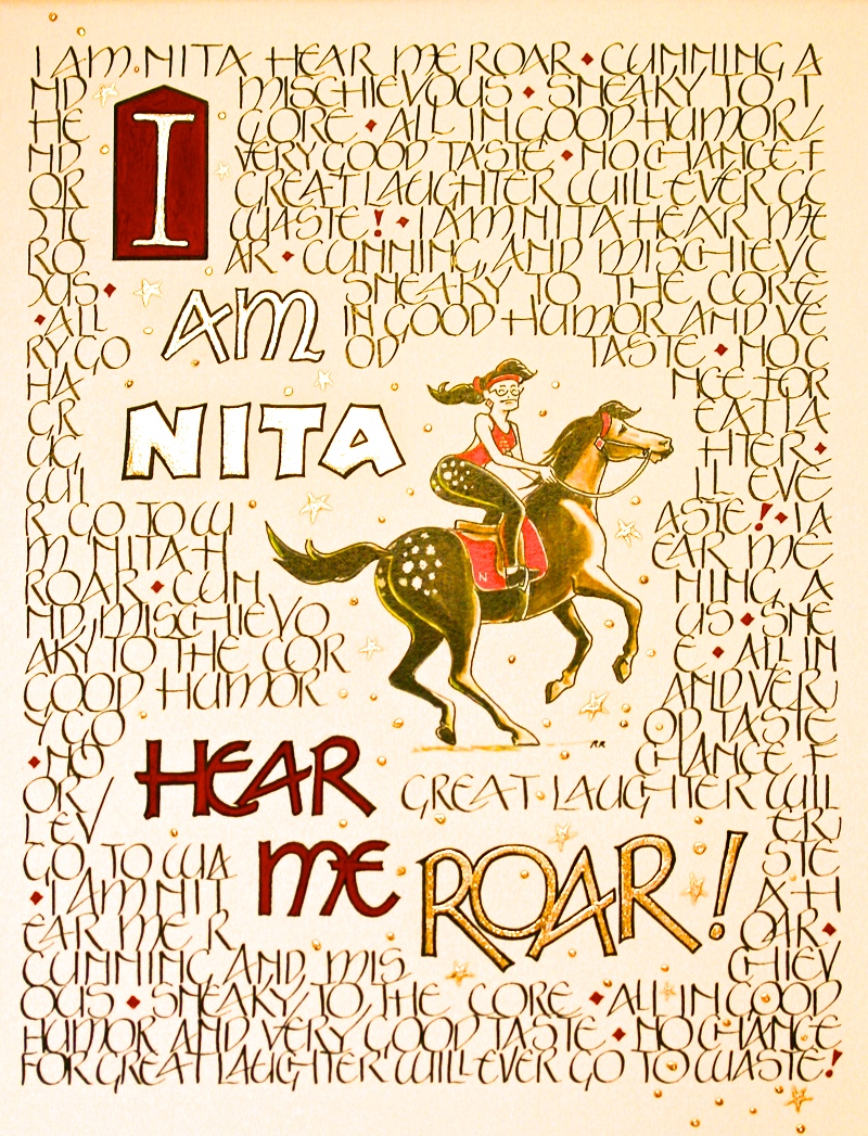
Week #30
This work was done by Nita Whitfield in
Raleigh this year for the third session “Variations on Romans” , in 26
Seeds: a Year to Grow. In her own words:
Hello Everyone! My name is Nita Whitfield, and I have had a
blast taking Reggie’s year long workshops. I was a “technical
illustrator” for 25 years, and then became a copying/printing
specialist at Kinkos/Fedexoffice. Only two years ago, I took my
first set of classes in Calligraphy, and its been pure love ever
since.
This piece was inspired by the central illustration, which is a
caricature of me, done by a longtime friend, Ron Ragland, who is
a retired illustrator, about 20 years ago. What I truly so love
about this illustration, is my friend got so carried away with
the spots on my horse, and me…. that he left the EARS off my
horse! The words are a funny little ditty I wrote about myself
back in those days, too. So, I combined the two into this art.
I copied the original illustration on a Canon color copier, at a
Fedexoffice, using area designation, to get it centered on the
sheet of 11x14 Arches Hot Press watercolor paper. It was also
reduced and the colors enhanced. I also made it drop out some of
the yellowed background. I sketched out this whole project on
tracing paper, using the copier to enlarge/reduce the larger
words to get them the size and “hand” that looked best to my
eye. I poured over our handouts from the class to figure out
what looked best to my eye. Then I penciled in all the words in
the background, in Neugebauer, which I so totally LOVE to death!
The larger letters are variation of Neugebauer. |
Then several of us got together for a study session. I was
totally against a brick wall on how to proceed, when Julia
Silberman told me to proceed by making lots of rough drafts to
determine where to use color, and make lots of test swatches on
sample papers. I took her advice, and made sure everything
worked well on samples before going to the real layout. I
transferred the whole design with a light table. Inked in all
the words in the background with a #4.5 Mitchell Roundhand nib,
using Sumi Ink. I also used lots of scraps of paper to shield
the work as I proceeded. I did not use any fixative.
Completed all the gilding next. Combined Reggie’s tips from
class, with the video on IAMPETH by Harvest Crittenden, gave me
great results for a beginner. Harvest’s tips on how to “pool”
the instacol was invaluable! I used Instacol, and 23 k gold,
from Reggie’s class. Totally have fallen in love with gilding.
On my test samples, I found trying to outline the gilding with a
small brush was painful, so I pulled out one of my Koh-I-Noor
technical pens, and it worked just beautiful to outline the
gilded letters!!! All the red in the piece is Gouache, primary
red.
In retrospect, I would have done the block with the large “I”
last. It is the starting point for the piece, and I was not
sufficiently warmed up when I started it. I also toyed
considerably with sprinkling some royal blue stars down through
the piece, but after getting opinions from several people, I
decided against it, as they would attract too much attention,
and settled for simple, non-outlined stars and dots. I tried a
white matt on the piece, but the red matt just set it off. This
is the first real piece of art I have done in years. Listening
to the advice of Reggie, and fellow workshop friends, allowed me
to complete a piece of which I am very proud. ( Nita Whitfield) |
* * * * * * * * *
Week #31
This work was done by Martha Petty in
Raleigh this year for the third session, “Variations on Romans” , in 26
Seeds: a Year to Grow. In her own words:
This piece is 21 ⅜ "x 29 ⅝". It is done on Arches 90 lb hot
press watercolor paper mounted onto a piece of Arches 300 lb.
cold press watercolor paper. Our homework assignment was to gild
an image, word or symbol and paint a dark background behind the
gilding to create contrast. We also had to use at least one
Roman Cap variation; and the Tom Perkins letters immediately
came to mind. I also knew the image that I wanted to use - a
small rubber stamp, which I enlarged on a copier, that showed a
man looking through a telescope at the stars and planets - would
be perfect to gild.
In my excitement to do this piece, I made some mistakes. I
forgot to put lines to guide my writing of my large Roman Caps
so they have a noticeable slope. I also moved this wording
further up on the paper and my heavy handed tracing of the first
position of the wording using the gray Saral paper showed
underneath. I could not erase this old tracing no matter how
hard I tried. I even tried using sandpaper to scrub away the
marks. Since I knew that I would have to do something to cover
up this error, I decided to use FW Acrylic Ink in indigo mixed
with Jacquard Lumiere acrylic paint in burgundy. I knew that the
acrylic ink would let me do a watercolor wash over that area
later, which I never got around to doing. |
That was a good thing because when we presented our homework,
Reggie suggested going back to the area with some darker shades
of purple around some of the stars on the left side to help
balance the visual weight of the night sky on the right (I still
need to do this). This was a very good suggestion because I
always forget that I can use pastels in the background. While
doing my Roman Caps with a # 2 Mitchell nib and going back with
a tiny brush to fix some areas........well, you know how that
goes. I had to go back and cut away some places in my Roman Caps
with an x-acto knife that had gotten a little too tweaked. I
knew that I had to get on with the rest of the piece, so I made
sure that I put lines under my enlarged and traced Tom Perkins
letters. I used a #2 Mitchell nib on these and then I went back
with a Brause 66-EF to square up the corners. I really enjoyed
doing these letters.
I need to mention that I did all my gilding first, trying the
various techniques that Reggie had showed us. The sun image was
textured using the heavy gel medium. The pink tinted gesso was
used as the moon's base and an Instacol base was used for the
stars and planets. I used every sample of gold and other leaf
that Reggie had given us. After the gilding was finished, I went
back and painted the sky with the mixture of FW acrylic indigo
ink and the burgundy Lumiere acrylic paint. I am learning so
much in this year long course. Thank you, Reggie! |
* * * * * *
Week #32
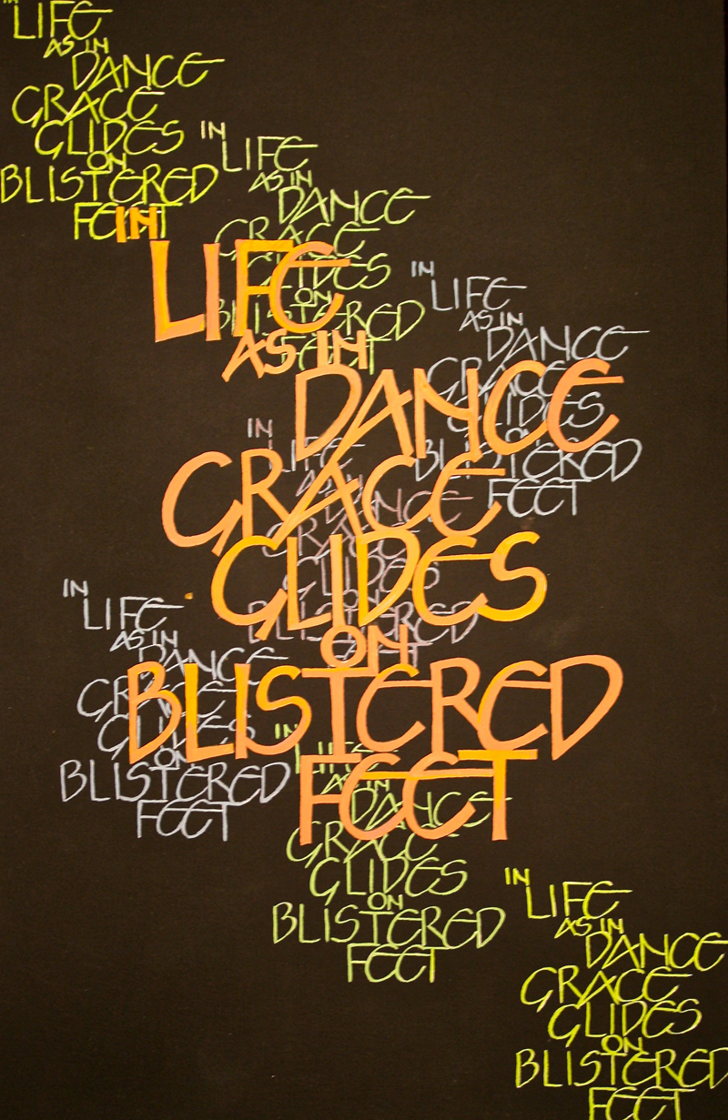
This work was done by Harriet Davis in
Raleigh this year for the third session “Variation on Romans” , in 26
Seeds: a Year to Grow. In her own words:
"In life, as in dance, grace glides on blistered feet." Alice
Abrams
11" x 17" black Arches cover paper, WN gouache
This piece was done as part of the assignment to do a short
quote as three separate pieces, using a different Roman Cap
variation in each piece. One of my daughter's passions is dance
and over the years of watching her dance this became my favorite
dance quote. I wanted to see if I could convey something of the
gracefulness and movement of dance using only the Neugebauer
caps.
Initially I didn't like these caps much, but as I worked with
them I came to appreciate their form and beautiful repeated
shapes. This quote has several repeated letters that reminded me
of the weaving of repeated steps in choreography. I wanted the
small letters to "enter the stage" of black, glide across, and
then exit.
After playing and sketching with the letter placement, I wrote
the large letters first in monoline, then with a large B nib,
touching up with an EF66. Then I wrote the small monoline
letters in the same placement. I made copies of the quote in
small letters, cut each quote out very closely, and placed them
on a sheet of grid paper with removable tape until I got the
placement right. |
After a few coats of spray fix on the black paper I transferred
them with white Saral. I traced the outline of the large letters
on tracing paper for placement, then transferred that to the
black paper with yellow Saral.
At first I wanted to use different colors, then I thought a
black, white and red scheme might have more impact. I wrote all
the small letters in white gouche with a Nikko G pointed nib,
underpainted the large letters with white gouache, then painted
the large letters in red. But.... the large letters didn't stand
out enough and the white ones were too bright, so.....back to
colors. I mixed yellow and white in with the red to get some
varying shades of coral, from yellow orange to a "ballet shoe"
pink.
I painted the small white letters with shades of greens and
blues using a small pointed brush, spray fixed, painted over the
red with white, then with the corals. Now the colors worked. I
outlined the large letters with a black micron to "crisp them
up" and that made them stand out even more. |
* * * * * * * * * *
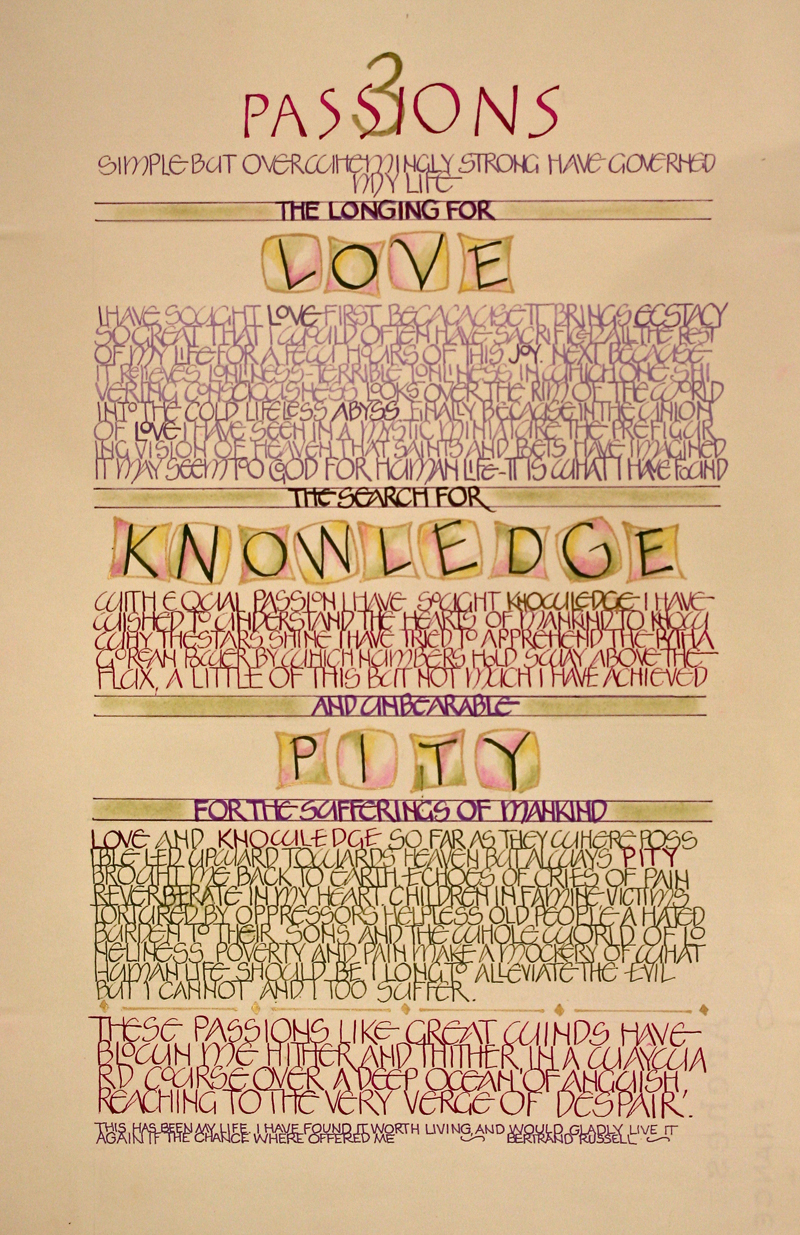
Week #33
This work was done by Nell Hall in Raleigh
this year for the third session “Variations on Romans”, in 26 Seeds: a
Year to Grow. In her own words:
When considering the layout and design for our homework
assignment to do “Three Passions” I decided I wanted to have the
three words LOVE, KNOWLEDGE and PITY stand out. After playing
around with many different layouts I decided to frame the words
to give them prominence.
The assignment was to do the lettering in Neugebauer hand but I
also wanted to add some other Roman Variations. For the title 3
Passions I used the Tom Perkins hand, in the frames are
clothesline Caps and at the very bottom skeleton Romans. I made
each segment a different size so as to give the eye a rest from
reading the same size for such a long reading. |
I used Gouache for all of the lettering. The magenta is Winsor &
Newton, the olive green is Turner Design and the purple is a
combination of several, I believe it’s Liquitex brilliant purple
mixed with a little FW pearlescent. I water colored inside the
frames using water color pencils. Inside of the lines I used
pastel chalk after taping on the top and bottom of the lines. I
sprayed a little fixative on the chalk.
The paper is Arches water color hot press. A mistake I made was
cutting the paper before I started lettering. Even though I laid
it out first with pencil, after I started lettering I wanted to
use space differently and ended up doing it over again. So be
sure and start off with a nice big piece of paper, it will save
you a lot of time!
The finished size is 11x17 |
* * * * * * * * * * * *
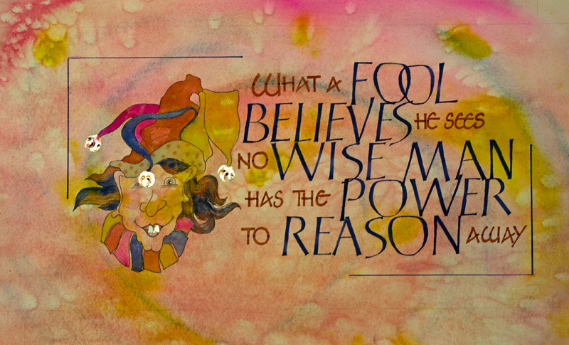
Week #34
This work was done by Cheryl Lee Lawrence
in Chicago this year for the session “Variations on Romans” , in 26
Seeds: a Year to Grow.
In her own words:
What A Fool Believes – Cheryl Lee Lawrence
This piece measures 13 by 20 inches and was done on Arches text
wove paper. It was done as a homework assignment for Reggie’s 26
Seeds class session on Roman variations, using Neugebauer caps.
I’d had the words to the song, “What a Fool Believes” (Michael
McDonald and the Doobie Brothers, 1978), rumbling around in my
head for some time. I chose to do the quote for this assignment
because I thought the letter forms suited the words. I’m not an
artist, but had desired to incorporate more art work into my
pieces, which are usually just letters and words.
I started with a wash on the paper using watercolors and
gouache, which I then spray fixed.
I lettered the quote onto grid paper until I had the desired
layout. Using the layout as a guide over each line, I directly
lettered the words onto the paper using a Speedball B1 nib and a
Mitchell 2.5. An EF66 was used to touch up and square off each
letter. For the color choices of the words, I knew I wanted
certain key words to stand out, so I made them larger and
darker. In retrospect, I think this makes the darker lettered
words look disproportionately larger than the others. Reggie
suggested flipping the colors of the lettering and if I have a
chance, I will redo it in that way. |
I found the image of the fool on the internet, copied it and
adjusted the size before tracing it onto the paper next to the
lettering. I outlined it with a very fine, black micron marker
and then did the gilding of the bells on the hat. I’d intended
to use variegated gilding, but it did not fully adhere to the
Instacol, so I applied lemon gold and 23k gold to the areas that
needed to be filled. It came out surprisingly well!
After the gilding, I painted the image, using very thinly mixed
gouache, as my last step in the completion of this project.
However, when I looked at the fool, I realized he wouldn’t fully
look the part without a gold tooth – so I gilded one of his
front teeth in lemon gold. Final touches included the addition
of the blue dots to the smaller letters to pull the dark blue
color through the piece and the rule lines, which helped to
unify it.
I cannot say enough good things about all I am learning this
second time around in Reggie’s class. |
* * * * * * * * *
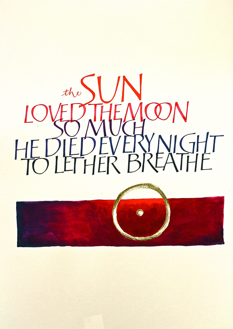
Week #35
This work was done by Joanna Zdzienicka in
Chicago this year for the session “Variations on Romans” , in 26 Seeds:
a Year to Grow.
In her own words:
Our assignment was to gild a symbol or words, paint a dark
background behind the gilding, and use at least one Roman Cap
variation for lettering.
The idea for my piece started with the image of the sun I found
in a book. I really liked the raw, organic line the sun was
drawn with. It took a while to find a moving text about sun, but
once I found this one, I fell in love with it. It is a part of a
beautiful story and I still need to research more to find out
who the author is.
Tom Perkins' Caps are my favorite of all, so I didn't think
twice about using them here. To keep the 'organic' quality of
the piece I wrote the letters without any guidelines, loosely
following a pre-written layout. That way all imperfections in
the text are imitating the imperfect outline of the sun symbol.
I used mixed gouache in colors associated with sunset, every
line getting significantly darker and different in shade than a
previous one. |
After lot's of touch ups I covered the written text and worked
on gilding. I laid 2 layers of Reggie's pink gesso, 1 layer of
Instacoll ,and gilded with 2 layers of 23K loose gold. Such
rewarding fun!
At last I painted the background around the gilding using the
same colors as for writing - again, there were no straight lines
and no measuring involved in the process. I wish the background
turned out more even and subtly blended like with watercolors,
but with no experience with painting with gouache I didn't know
how to do it better.
The size of my piece is about 11x14", made on Arches WC HP.
Calligraphy is done with Mitchell #2 and #3 1/2, with an accent
(word "the') written with Nikko G nib. |
* * * * * * * * * * * *
Week #36
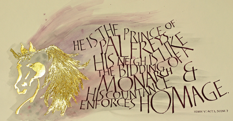
This work was done by Alexis Bach in
Chicago this year for the session “Variation on Romans” , in 26 Seeds: a
Year to Grow. In her own words:
This piece was completed for the Session 3 Homework. The
assignment was to guild a symbol or image and letter using at
least one Roman Cap variation. I chose the Tom Perkins
variation. For session 3 we had learned how to guild flat as
well as a textured surface so I began to think about ways that I
could combine the two methods within one image. I really want to
to experiment again.
I was looking through some art books and I saw a picture of a
horse done in the style of a Japanese ink painting. That was my
initial inspiration. I decided to do a gilded drawing of a
horses head accompanied by a quote from Henry V by Shakespeare.
I started researching, which of course, entailed a trip to the
art store so I could buy more art supplies! At the store I
purchased a set of bamboo pointed brushes and when I got home I
set to work using online video references for brush painting and
Sumi ink to create the horses head and mane.
My other inspiration was a series of sketches that my friend
Linda had done for piece she was working on. And her sketch the
lettering was very curvaceous and free-flowing as if on currents
of wind. This is the same form that I envisioned the horses mane
taking. |
I had grown-up with horses and had them into my early 20s
so I was very familiar with their anatomy. The combination of
the two types of gilding with the flowing letters was a perfect
combination to me.
I worked for several days creating the perfect ink drawing of
the horse's head, which I then scanned into Photoshop, printed
out and transferred using Saral transfer paper. It took me
another couple of days to do the gilding. I slowly built up the
layers and I used a tooth pick to create the texture in the
mane. I found myself being very patient and peaceful during this
process. This is highly unusual for me as usually I want to get
things over and finished as soon as I start. It was another
couple of days figuring out exactly how I wanted the layout to
look and once I had accomplished that, I used pencil to trace
onto my Arches hot press the lines for my letters to follow.
Then I used gouache to paint the background. Which, I learned
later, was a big mistake because I couldn't erase my pencil
lines when I was finished!
Then it probably took me another eight or nine days to slowly
letter my way through the quote a few letters at a time. When I
was finished, I kept trying to get rid of those darn pencil
marks—to no avail. Another lesson learned. Anyway, I am happy
with this piece. It is my first "real" finished calligraphic
composition! |
* * * * * * * * *
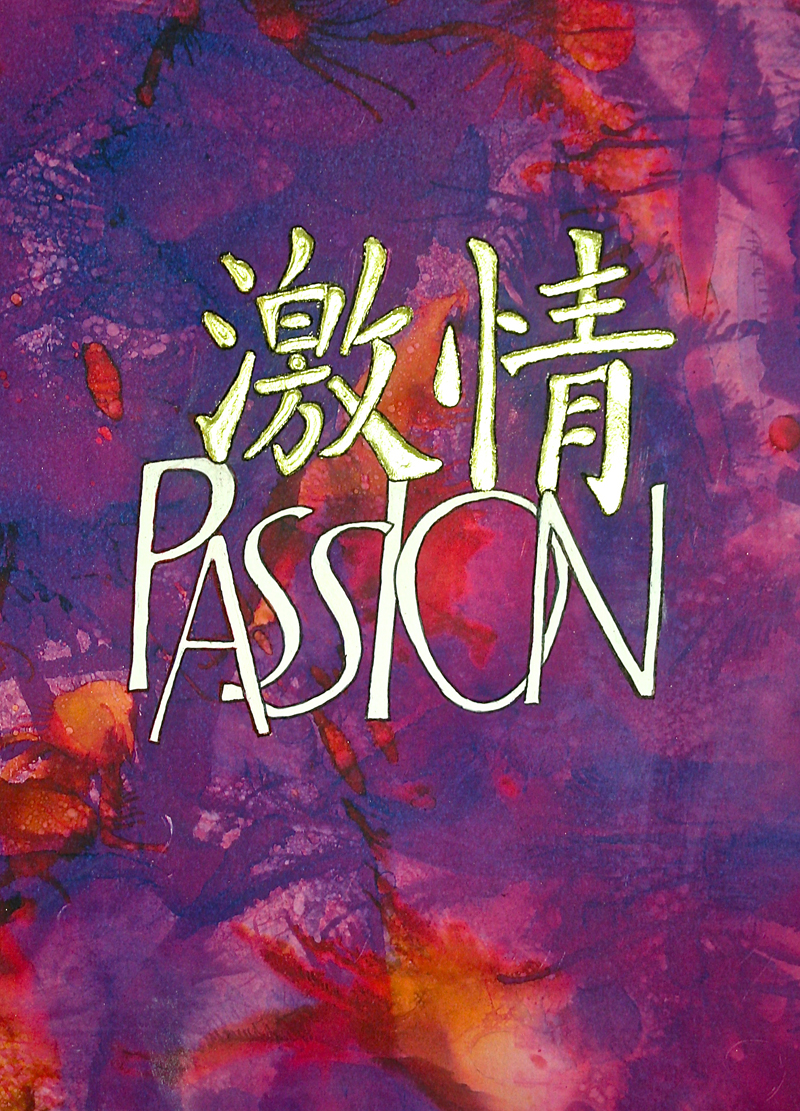
Week #37
This work was done by Starla Snead in
Chicago for the session “Variation on Romans” , in 26 Seeds: a Year to
Grow. In her own words:
This piece came about out of a lot of trial and error and
inspiration from the guild study group.
Original size was 18 x 18 on paint sample paper from Ace
hardware. I used alcohol inks for the background. Originally I
had the PASSION in gold. Learned a lot about gilding on that
part. Was unable to write on the paper after that point. |
II really really liked the effect of the alcohol inks for the
background. Was able to make a copy of the background onto
Arches watercolor paper at the local copy center. This enabled
me to write and gild on it.
It is now 11x14 on Arches watercolor paper with the alcohol ink
background. The PASSION is Dr. Martins Bleed Proof White with
Tom Perkins Caps. The Chinese symbol for Passion is gilded
above. Glad that one is finished! |
* * * * * * * *
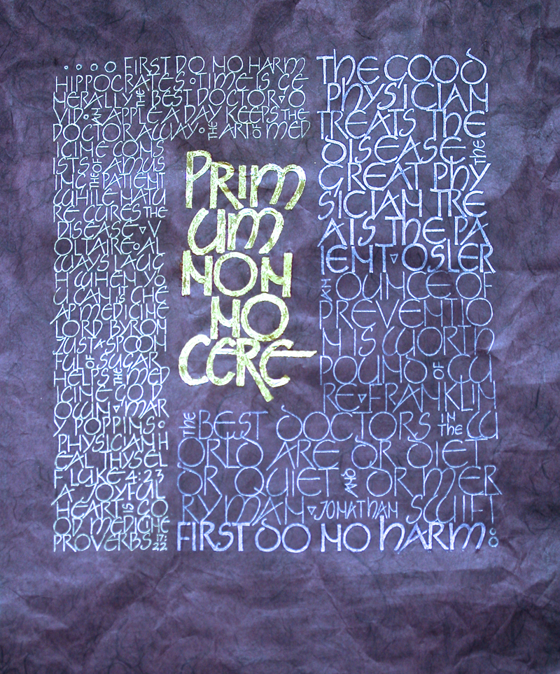
Week #38
This work was done by Theresa O’Connor in
Chicago for the session “Variations on Romans”, in 26 Seeds: a Year
to Grow. In her own words:
We were studying Roman variations and I was particularly drawn
to the Neugebauer letters. I started with the quote, "Primum non
nocere" which I wrote out with a Speedball B2 nib and squared
off the ends. I then chose a collection of aphorisms about
doctors and medicine. Using the grid paper, I lettered the
various quotes around the larger quote using 2 variations of the
Neugebauer caps.
While looking for a background for my project, I fell in love
with a handmade paper --Black Ink Thai Unryo in a beautiful
aubergine color. Using the transfer paper, I traced my layout on
to the deep purple paper. |
I applied 3 layers of instacol and gilded the central
quote with 2 layers of 23 karat gold. However, I then had a
dilemma. I wasn't sure how I wanted to do the rest of the
lettering on a dark background. Luckily, I came across a piece
by Sheila Waters where she did letters on a black background
with a gel pen. I figured that if a gel pen is good enough for
Sheila Waters, it is good enough for me! So the background
letters are done with a gold and a purple gel pen.
I enjoyed doing this piece and I have especially enjoyed
learning to gild. |
* * * * * * * * * * *
Week #39
This work was done by Ann Erickson this year in Raleigh for the session
“Carolingian and Variations” , in 26 Seeds: a Year to Grow. In her own
words:
The assignment was Carolingian. But I had a calligraphy event
that required Carolingian combined with Lombardic. Time
constraints encouraged me to “kill two birds with one stone”. So
I searched amongst my collection of quotes for one that would
have a single short word that might be good highlighted with
Large Lombardic Caps.
The piece is 13 x 20 on Arches 130# Hot Press Watercolor paper.
The black is
Chinese stick ink. The Caps are Indigo watercolor in various
shades of washes with the paper showing through as the white.
The floral motif is also watercolor and gouache. The gold border
and tiny gold highlights are of lemon gold. |
In gilding, I used miniatum ink as a ground because I wanted to
use it in a pointed pen for the border. Instead of letting it
dry, I reached up to touch up something in the floral motif and
dragged something thru the wet miniatum. You would think I had
learned my lesson by now! I got as much as I could off the paper
before gilding, but it was impossible to completely clean up. Of
course, this is the first thing I see whenever I look at it!
Incidentally, the piece I demonstrated in the calligraphy event
(Illuminated Letters: A Calligraphy Performance by the Friends
of the Alphabet guild in Atlanta) was in black and white only
(no gilding) and had quite a different feel. |
* * * * * * * * * * *
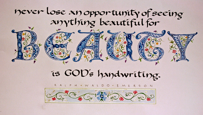
* * * * * * * * *
Week #40
This work was done by Martha Petty this year in Raleigh
for the session “Variations on Romans”, in 26 Seeds: a Year to Grow. In
her own words:
This work, Three Passions, by Bertrand Russell, was done for
Reggie's third month's homework assignment using Monoline
Romans. I knew this quote would be a long one to write and I
immediately thought of doing an accordion style book. I always
try to do most of the homework in book form just in case my
calligraphy cannot stand on its own. I knew at least the book
part of it would be competent.
To see what others had done with this long quote, I looked at
students' work from Reggie's archives on his website and I saw a
beautiful accordion book by Nita Padamsee from Boston who had
taken Reggie's PRIMITIVE TO MODERN workshop in 2013. I loved
this book, with the Hubble photographs and the written white
pages mounted on the black, folded Canson paper. I wanted to
borrow some of her ideas for my book, but I had to make this
book my own.
For the structure of the accordion book, I used black (black
core) matboard. Each panel is 8" x 10½" and when it's opened it
spans approximately 53". The words, Three Passions, Love,
Knowledge and Pity were cut out using an X-acto knife into one
of the matboard panels. Portions of paper colored with beeswax
that I had made using Stonehenge heavy weight paper were
attached to the backside of the first panel. A second matboard
panel was glued to the first panel with PVA glue to to hold the
colored waxed paper in place. The other panels done with the
Monoline Romans are done on a single piece of black matboard.
The panels are attached with black Gaffer's Tape.
I used diluted white gouache and a ¼" flat brush to make the
faintly white Neuland type letters in the background of the
single panels. The pale green Neugebauer lettering is done with
a Sakura Gel Pen. I would be remiss if I didn't mention that I
made the lines for all of this writing using a white Fons-Porter
pencil and erased the lines the next day with a Factis black
eraser. |
Thanks to the ton of homework that Reggie assigns us, I'm
starting to feel a little more confident to let my calligraphy
stand on its own. Thanks, Reggie!
When considering the layout and design for our homework
assignment to do “Three Passions” I decided I wanted to have the
three words LOVE, KNOWLEDGE and PITY stand out. After playing
around with many different layouts I decided to frame the words
to give them prominence.
The assignment was to do the lettering in Neugebauer hand but I
also wanted to add some other Roman Variations. For the title 3
Passions I used the Tom Perkins hand, in the frames are
clothesline Caps and at the very bottom skeleton Romans. I made
each segment a different size so as to give the eye a rest from
reading the same size for such a long reading.
I used Gouache for all of the lettering. The magenta is Winsor &
Newton, the olive green is Turner Design and the purple is a
combination of several, I believe it’s Liquitex brilliant purple
mixed with a little FW pearlescent. I water colored inside the
frames using water color pencils. Inside of the lines I used
pastel chalk after taping on the top and bottom of the lines. I
sprayed a little fixative on the chalk.
The paper is Arches water color hot press. A mistake I made was
cutting the paper before I started lettering. Even though I laid
it out first with pencil, after I started lettering I wanted to
use space differently and ended up doing it over again. So be
sure and start off with a nice big piece of paper, it will save
you a lot of time! |
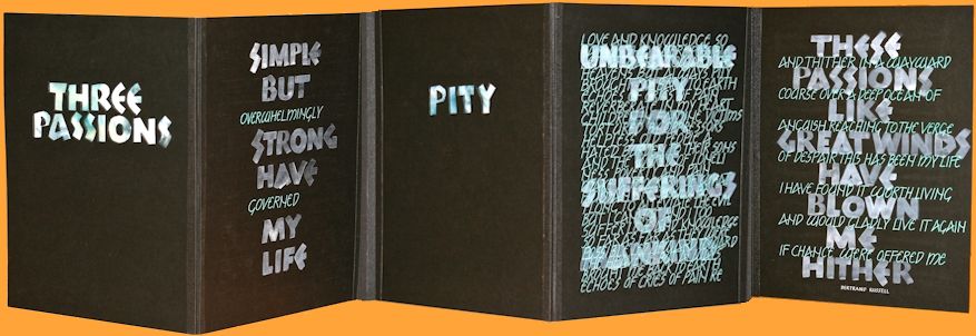
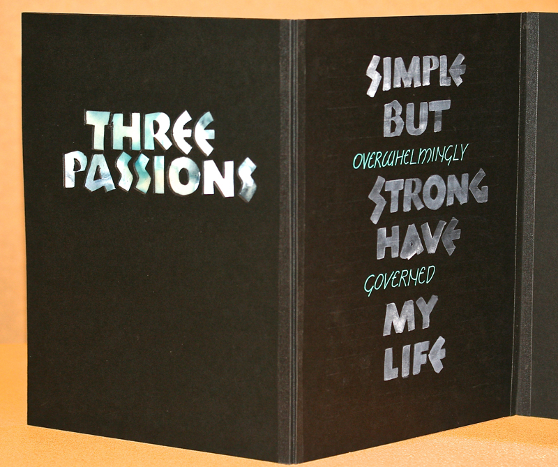
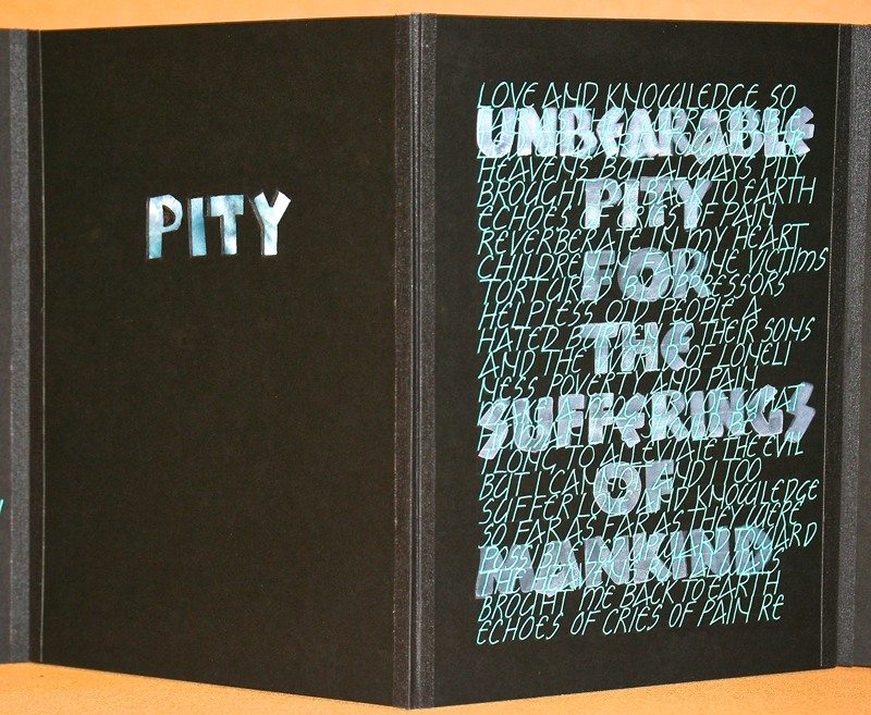
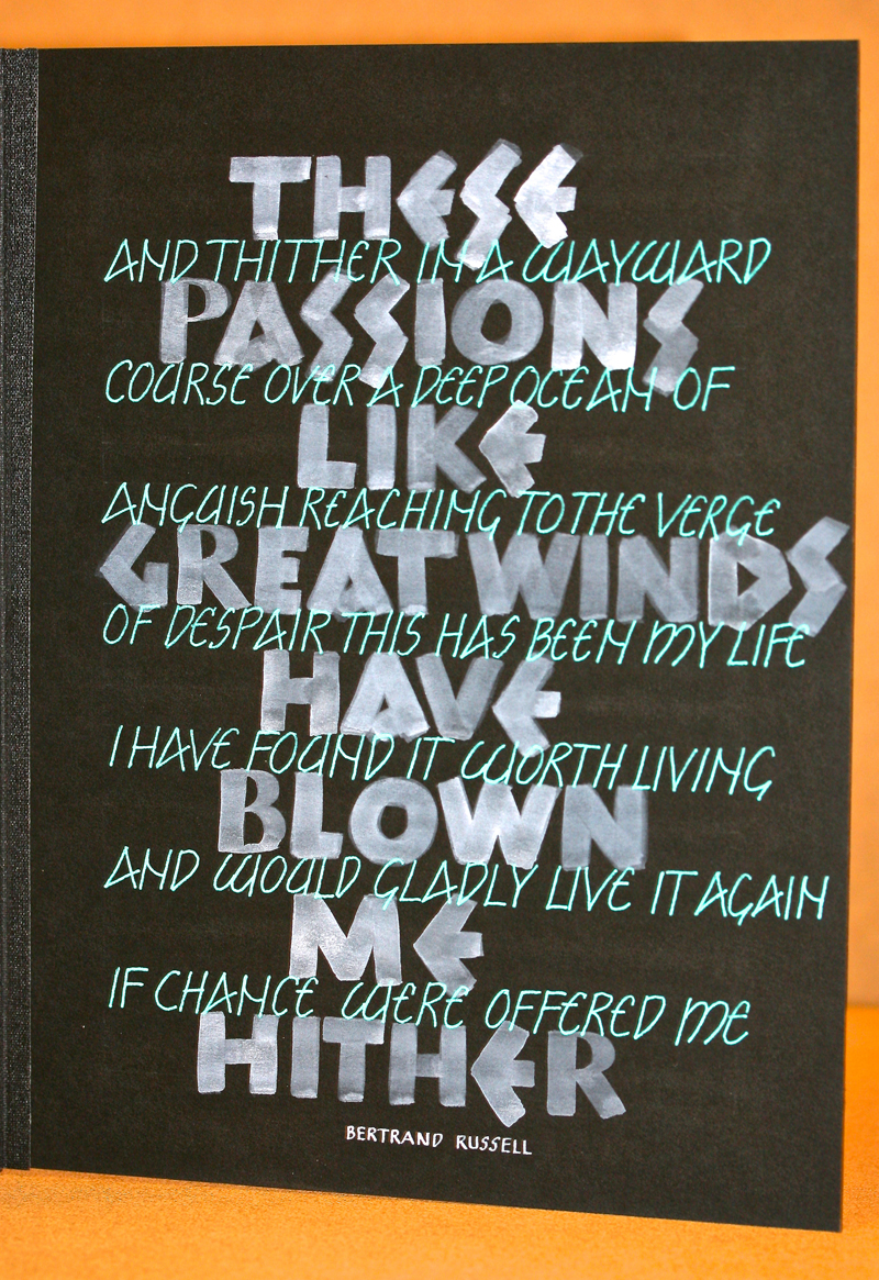
* * * * * * * * * *
Week #41
This work was done by Jane Doherty in Chicago this year
for the session “Variations on Romans”, in 26 Seeds: a Year to Grow. In
her own words:
This work is a passage from Ellis Peters' Brother Cadfael's
Penance. The book, set in the Middle Ages, informed how I chose
illustrate it. The piece is 15x25, on Hahnemuhle Ingres paper,
which in spite of feeling delicate, can take a fair amount of
punishment.
The lettering was executed with gouache using a Brause nib. The
harvester images are toner based printer transfers, colored with
Prismacolor pencils. |
The
top and bottom boarders are made from stamps carved from rubber
stamp material using stamp pad ink. The center decoration
gouache and gold leaf.
There are 4 different golds on an Instacol base. This took a
long while and a lot of deep breathing to execute. |
* * * * * * * * *
Week #42
This work was done by Nell Hall this year in Raleigh for
the session “Variations on Romans”, in 26 Seeds: a Year to Grow. In her
own words:
I have had the joy of participating
in Reggie’s “26 Seeds Year To Grow”. Although it has been a
challenge at times it has been an extremely rewarding experience
as I have seen myself “grow” more than I thought possible during
this year.
This piece was month 3 homework assignment. We were instructed
to guild a symbol, word, or phrase and paint in the dark
background behind the gilding using at least one Roman Cap
variation for our lettering.
I entitled this piece “Sermon Notes” because I got the idea of
what I wanted to do while listening to a sermon in church.
The sermon was on Grace and the pastor had mentioned the Greek
word for Grace is Charis. |
When I got home and looked over my notes I realized the
positioning for the letters of Grace and Charis could be in
perfect placement to form a cross.
The gilded image is Christ’s monogram and it was done in 23K
gold leaf. The background is painted with Turner Blue Violet
gouache. The background of the cross is the Blue Violet gouache
mixed with Winsor Newton White gouache. The lettering in the
cross was done with FW Pearlescent Liquid Acrylic. The lettering
around the cross and circle was done with Dr. Martin Iridescent
Bronze. The border was done with Gelly Roll Metallic pens –
silver on the inside border and gold on the outside border. The
shading was done with soft pastels and a make-up sponge. The
size of the finished piece is 11x17.
Thank you Reggie, for your excellent instruction, patience and
great sense of humor. You keep us laughing while we all learn
all so much! |
* * * * * * * * * * *
Week #43
This work was done by Starla Snead this year in Chicago
for the session “Carolingian and Variations”, in 26 Seeds: a Year to
Grow. In her own words:
This piece was a combination of assignments for Carolingian
homework.
I created the background using alcohol inks. I then took it to
the local copy shop and copied onto to Arches text wove. It came
out a little darker but I liked the effect. I then sprayed it
with Blair fixative. |
The
writing was done with #3 and #4 Mitchell nibs using Dr. Martins
bleed proof white. I drew the lines on the paper using a white
fabric marking pencil. The ornate T was designed on tracing
paper and transferred using white Saral paper. The gilding on
the Arches did not come out smooth, but I ultimately liked the
textured effect. Size: 11 x17 |
* * * * * * * *
Week #44
This work was done by Yukimi Annand in 2008 in Orange
County for the session “Italic and Italic Variations”,
in 26 Seeds: a Year to Grow. In her own words:
The size of the original was written 5" x 12”.
The original writing was done with Mitchell nibs and gouache.
The original writing was scanned.
Then the image was “inversed” and colors were layered under the
image in Photoshop. |
It
was an assignment for Italic variations.
After learning the basic structure of Italic and analyzing
different variations,
we were challenged to design our own italic variations.
I was happy with the result of designing this Italic form with
plenty slant. |
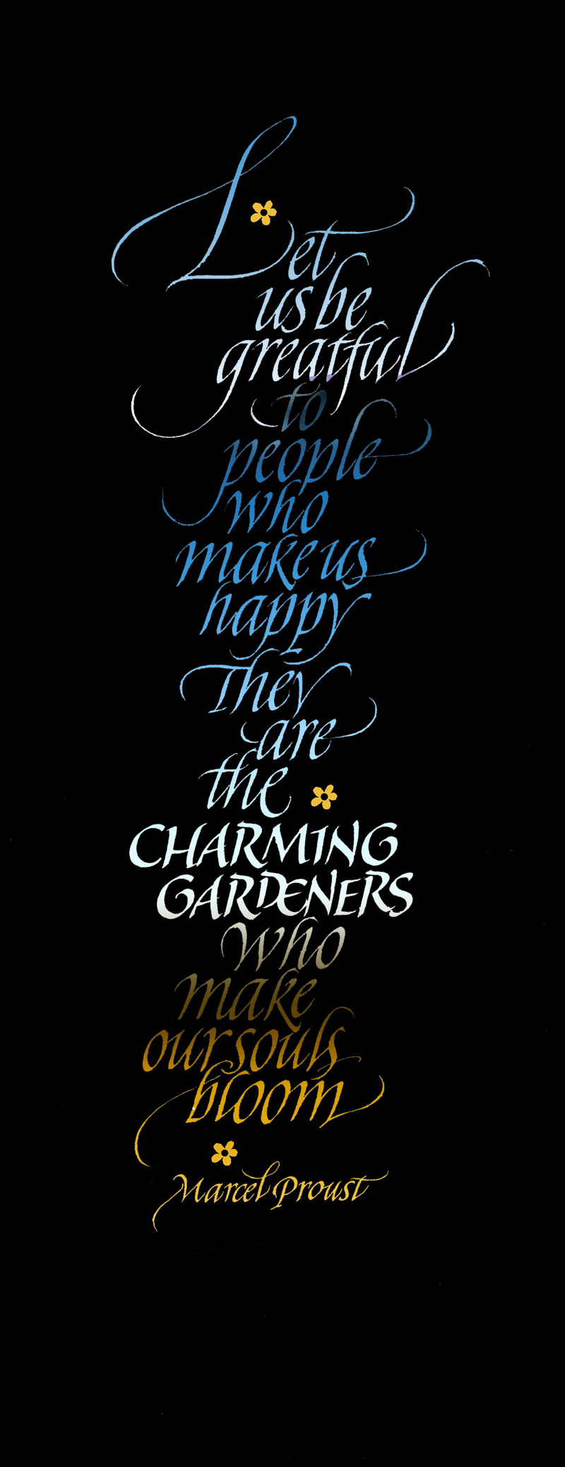
* * * * * * * * * * * * *
Week #45
This work was done by Christie Burns in Salem, Oregon in
2002 for the session “Variations on Romans”,
in 26 Seeds: a Year to Grow. In her own words:
Alphabet Study
10" x 15"
3 ply Bristol, graphite, acetone transfers, pastel.
Graph paper block Romans on squares divided by circles and mid
lines, color added.
I loved this assignment so much I think I did 4 or 5 variations.
I took advantage of the copy transfer method once I got my
letter "stencils" drawn and inked the best I could. I was
fascinated by the architecture of the letters on the grids. We
learned that the eye has it's own way of seeing, and that going
exactly by the grid will not produce perfectly balanced letters.
The rule needs to be flexible. (Reggie's teaching methodology is
to provide the experience that will allow the lesson to be
discovered by the student. No amount of "telling" is as
effective.)
I became a fan of sharp mechanical drawing pencils (in varying
degrees of hardness) and push up erasers with a razor blade to
cut a fine edge for refinement. To tell the truth, I thought it
was a bit overkill when I saw the razor blade on the supply list
but I eventually became a convert.
Note to self: Trust Reggie. |
Roman
majuscules are the epitome of form, the lessons are vast. But
when the work is exacting and repetitive I get an urge to do
something wild and free, in this case a scribbled alphabet
background texture, both as a relief and as a contrast of
alphabets. I think the color was added at the very end. Pastels
worked very well over acetone transfers, and of course unscented
spray fix is a pretty handy thing. Alphabets have never ceased
to fascinate me in their varied forms.
I feel a little sad that Reggie's long and fruitful traveling
teaching career will be coming to an end in the next few years.
Don't procrastinate if this is something you've been "thinking
about." Sign up. Now! I've enjoyed seeing work done by his
students, and can feel the excitement in their descriptions.
His travel was a labor of love and his teaching was inspiration.
Thank goodness he has videos, but do it in person while you
still have the chance. Everyone who has had the opportunity to
study with him will never forget the experience, or the people
they will become friends with, and will forever benefit by the
lessons that spilled over into life. Thanks, Reggie! |
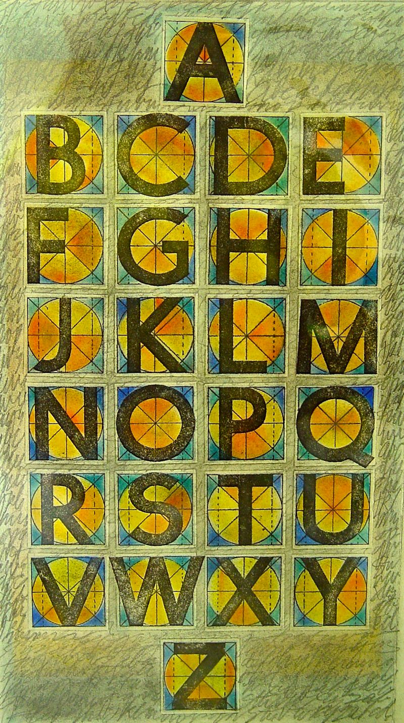
* * * * * *
Week #46
This work was done by Betsy Rivers Kennedy in Washington D C
in 1997 for the session “Roman Variations” ,
in 26 Seeds: a Year to Grow. In her own words:
|
That piece and 3 more variations of the quote were entered into
the Tidewater Art Alliance Portfolio Art Show the year after
your class and accepted and won an honorable mention!
After I did the cut-out bristol board over the watercolor Saran
wrap piece, I reassembled all the cut off scraps of letters into
a template which I used for an embossing in "white-on White",
with 24k gold dots separating the words.
Then, I took the original cut out piece and had color copies
made to which transfer gold adhered. I used scraps of gold from
used papers that probably someone else would toss.
|
I
called these "original prints"' as no two were alike. Now they
call it mixed media.
The forth version was in footed Roman caps.
I have sold the 2 big originals and a number of the prints. But
I still have the plain roman cap version.
Those 2 years with you were some of the best times of my life.
Thank you for providing the means to create the experience.
You were and are a great teacher and gave us so much in your
courses.
I am still passing it along in teaching a class here & there.
And still doing free-lance commission work.
I do miss Gwen.
|
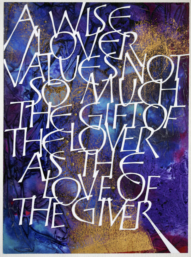
* * * * * * *
Week #47
This work was done by Ann Binder in South Bend Indiana
in for the session, in
26 Seeds: a Year to Grow .
In her own words:
|
The dearest of dear clients asked me to letter a prayer her
father had taught her when she was young. She wished to frame
the original and make high quality copies as Christmas gifts for
her own grown children. Having done several other commissions
for her, I knew her taste leaned toward simplicity and
legibility, but I asked her to come to the studio to choose
paper, letterform, and color.
This was right after the November 1996 class with Reggie so I
was armed with the handout, “How to Analyze a Calligraphic
Hand”. I thought I would show Marge several samples of lettering
that I was anxious to try making my ‘own’. Marge chose Arches 90
lb watercolor paper, viridian gouache, and the lettering sample
of these wonderful uncial/foundational forms which happened to
be the handout “How to Analyze a Calligraphic Hand”.
|
Marge loved those letters. I am so glad I asked for her input
because I was going to do something easier with indigo gouache
going for simplicity and legibility.
The handout was in monoline, so I translated the forms into a
pressurized version, adding some extra pen widths to the
x-height to give some boldness to the forms. If I remember
correctly, at some point while trying to work out the alphabet,
I came across a sample of the letters I was striving to create
among the many samples Reggie gave us in the mountains of
handouts. Re-inventing the forms became much easier after that.
What you are looking at is the page I did for our guild’s
calendar. I re-did Marge’s prayer for reproduction. It was done
on Arches Text Wove using 30205 stick ink. Original size:
10”x12.5” |
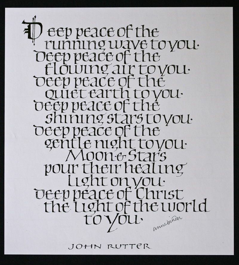
* * * * * * *
Week #48
This work was done by Bruce Hawksworth this year in
Raleigh for the “Italic and Italic Variations” session in
26 Seeds: a Year to Grow. In his own words:
|
A few years ago a gifted singer had a vision looking up into the
night sky at the three stars of Orion’s belt. Minus the graphic
images from the Hubbel telescope, which I didn’t include because
of time and know-how, I wanted to write out my depiction of what
the singer saw using a few variations of Italics.
The content is written in colored Gothicized italic and black
Chancery italic. The setup required using a lighted slant board
and a ruled transparency, with both the previously written out
black lettered page and a blank 90# Arches hot pressed water
color (HP WC) paper placed on top so the lines could show
through and the lettering be as straight as possible.
The colored Gothicized italic letters were written with Pebeo
Drawing gum masking fluid and 2 ½ Mitchell broad-edge nib. After
the masking fluid dried, the whole area was completely covered
in Sennelier watercolor washes.
The masking fluid was then removed, leaving the negative white
image of Gothicized italic letters against a colored background.
These letters were colored in with Prismacolor color pencils and
the black Chancery italic letters written with blackMoon Palace
Sumi ink and a #5 Mitchell nib.
|
In the rough draft, spacing was a problem because the 15 lines,
written out in black gothicized italic and Chancery italic took
up three-quarters of a page and was wider also. So, I compressed
the lettering allowing for a 6mm body height and a 2mm
ascender/descender height and reduced the interlinear space to
zero before rewriting it using a larger broad-edged nib for the
colorized Gothic italic and a smaller nib for the black Chancery
italic thereby differentiating the two hands. Some of the
colored Gothicized italic sentences were capsularized using a
Pigma Micron 01 black ink pen, separating the letters from the
background. Size 10” x 12”.
Many thanks go out to Reggie and all my very talented peers for
exposure to materials, techniques, and inspiration. My hope for
this project was to focus more on the mechanics of lettering and
design than the content. The content, though, is a premonition
of a future prophetic event, one attached to a blessed hope.
Hence, “comfort one another with these words”. Sincerely, Bruce
Hawksworth
PS---If interested, please view the YouTube interview of Freddy
and Annie Hayler
http://www.youtube.com/watch?v=Kl1lTnO-lLA
|
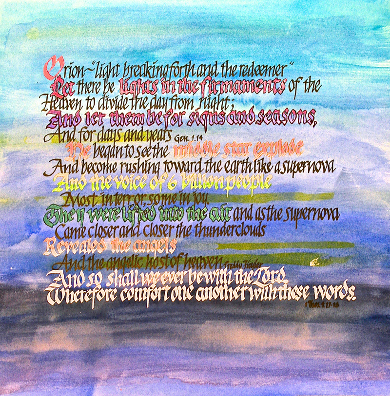
* * * * * * * *
Week #49
This work was done by Cheryl Lawrence this year in
Chicago for the session “Italic and Italic Variations” in
26 Seeds: a Year to Grow. In her own words:
|
This piece was inspired by my recent trip to the hot air balloon
festival in Albuquerque, NM – something I’d wanted to do for
years! The class assignment was to use Italic letterforms – and
I could think of no other letterform that came so close to a
feeling of big, beautiful drifting balloons floating across the
sky. The words are my own – a major surprise since I’ve not
attempted poem writing since elementary school.
I used a 22” by 16” piece of Diploma Parchment on which I traced
outlines of the balloons. The patterns on the balloons were from
those I actually saw at the festival. I chose from the dozens of
photographs I took of the first launching of hundreds of
balloons.
First, I painted the balloons using gouache and water colors. I
deliberately placed them to float off the page. I wanted to give
the feeling of having them float out of sight.
I placed lines for the lettering next with the goal of having
the letters follow the shape of the balloon. The lettering was
also done in gouache using a #4 Mitchell nib.
|
The Italic form, which we’d just learned from Reggie in class
#5, was done at a 25 degree slant. This was because I thought
the exaggerated slant would give a feeling of motion – as if the
words were being blown along with the balloons. I did as much
flourishing as I dared – if I’d been more confident, I’d have
flourished more.
Once the lettering was completed, I used a paint brush and
toothbrush to splatter the balloons for an airy feeling. I also
splattered the background to denote the sky.
To say that Reggie is a great teacher is to say something
everyone reading this already knows. I do know that I’d not have
found the inspiration to do this piece nor had the skills to do
it had it not been for his ability to truly educate us to the
process of creating works of beauty. I am so grateful to have
had the opportunity to study with Reggie one more time. This
experience, like the class I took with him before, is something
I will always remember and cherish. |
* * * * * * * * *
Week #50
This work was done by Vivian Carter
in Chicago who took the 26 Seeds: a Year to Grow in 1990.
|
The pressurized italic in this work was done with a #4 Mitchell
nib using Dr Martins Bleedproof White on Arches Black Cover
weight paper, 9 x 12. Collaged atop, pressurized romans on
Arches Text Wove. The quote is from Reggie.
|
This was a page from a book presented to Reggie by his students
from all over the U.S. and Canada in 1997.
We lost Vivian in 2009, one of the most gracious souls and
talented individuals it was our privilege to have in our lives.
Thank you to her daughter Melanie for permission to share this
work. |
* * * * * * * * * * *
Week #51
This work was done by Mike Kecseg
in 1986 in Chicago for the session “Brush Lettering”, in 26 Seeds: a
Year to Grow.
In his own words:
|
This was a piece I did towards the end of my year long class
with Reggie. We were asked to do a piece on vellum with gilding.
We had a choice of small pieces of vellum to work on and I chose
a piece with a large dark spot in the upper left corner of the
piece. I was probably the last person to choose from what was
left! At first I thought I may have been able to sand the area
and at least lighten it up a bit but that didn't work. So
instead of giving up and choosing another piece of vellum I
decided to use the dark spot as a focal point and highlight it
with the gilding. It actually helped make the gilding on the
star stand out much more than if it would have been on a more
even colored piece of vellum.
|
The gilding was done on a base of gum ammoniac with patent gold.
I also gilded the center of the abstracted poinsettia flower.
The lettering in the piece is rather simple with outlined roman
caps on the word "JOY" and brush lettering on the word
"Christmas". This was one of my first attempts at brush
lettering and I cringe a bit when I look at now. Since the piece
was supposed to be an exercise in vellum and gilding I think in
that respect it was a successful piece. |
* * * * * * * * * *
Week #52
This work was done by Jo Falk in Detroit in 1996 from
the course 26 Seeds: a Year to Grow. In her own words:
|
This was a page in a presentation book (to Reggie).
My materials were Speedball B nib, micron pigment pens, colored
pencil, and India ink on a sheet of Arches paper 9 x 12.
|
This was one of many sun faces with knotted rays that I
produced. Conceived on Beaver Island MI. My “Sun series” was
nurtured at Ghost Ranch N.M. and blossomed in Reggie’s class in
Detroit 1996. |
* * * * * * * * * *
HAPPY NEW YEAR EVERYONE ! |
|