WELCOME TO PICK OF THE WEEK - 2012
Week #1
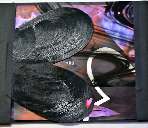
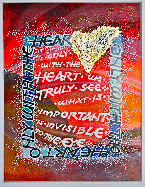
This work was done by Carolyn Lueders in Boston, in class during the last
session, 2011 "Experiencing the Book as a New Structure". In her own words:
“The human heart is a theater of longing” I was not relating heavily to this
particular quote, but when Googled, I found whole excerpts from John O’Donohue’s
book that fleshed out the meaning for me in a really helpful way. So when it
came time to go to the copy shop, I armed myself with a load of digital options
both personal and copyrighted. The book was only for my personal use and when I
thought of longing and connection, Picasso and Van Gogh (among others) hollered
out. Reggie, thanks for the beautiful stained glass images as well.
The copy shop experience was very worthwhile for me because I tend to stay away
from modern technology.
I was determined to complete as much as possible during class knowing that I
would probably not take the time to work on it once class was over, so I took it
all home Saturday night. This allowed me to formulate some ideas for the cover
and for page layouts. Much of those ideas changed during class on Sunday, but
those extra hours enhanced the Sunday process.
Somehow, I could not find a way to incorporate transparencies or the textured
papers into my final, much as I loved them. And I have more images to include,
too. Generally, I did not attain as much of a non-verso/recto feeling as I would
have liked; for me, all of the previous would require way more additional time
and thought. Attaching the binding cloth to the pages was fun once you got used
to the pernicious behavior of the gaffer’s tape!
11.5x18in, book board, gaffer’s tape, white gel pen, glue stick.
.jpg)
.jpg)
* * * * * * * * * *
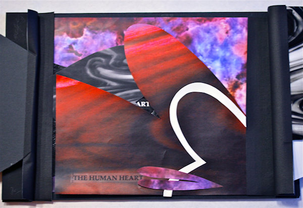
Week #2
This work was done by Gail Turgeon in Boston, in class during the last session,
2011 "Experiencing the Book as a New Structure". In her own words:
The typical book is experienced sequentially: we begin with page one, proceed to
two, and so on. The books produced in the sixth class of Primitive to Modern
were anything but typical. The words and their images unfold more like a flower
than a printed volume. Pages, which partially obscure and partially reveal other
pages, can open from the right, the left, the top, and the bottom of the book’s
base.
Step one involved constructing this base. We were given a rectangle of gator
board measuring 17 1/2 by 11 ½ inches.“ Using a template and our electric
drills, we drilled two holes on the left and right ends of the board. On one
side of any page we planned to affix to the base, we added gaffer tape, taping
two pieces together and simultaneously sandwiching1/2 inch of our image between
the pieces. We punched holes in these gaffer tape binding which corresponded to
the holes of the book’s platform. Pages of the book could be now joined to the
base using screws and posts.
Where to go from here was the question. I answered it with a picture of our
galaxy taken by the Hubbell telescope. This photo, reproduced on an 11 by 17
inch piece of paper, would serve as the last page of my book. From this point, I
assembled the pages which would precede this final image.
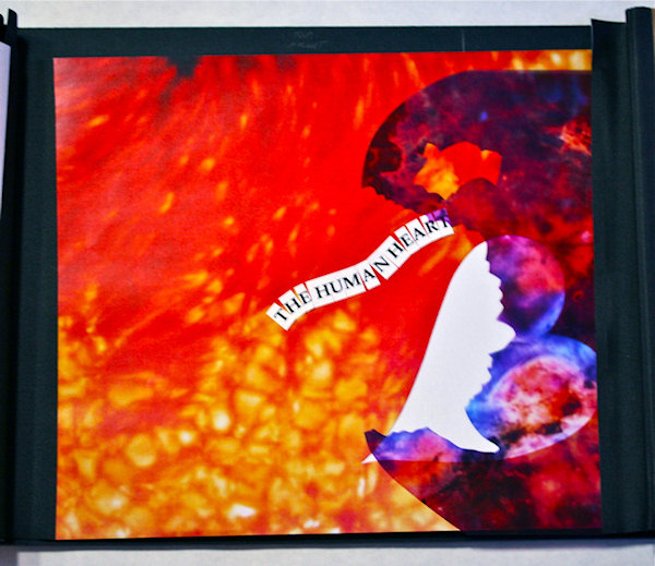
The text of our book is an excerpt from Anam Cara by John O’Donohue. We were
asked to take the first line of the excerpt, “The human heart is a theatre of
longing,” and to break in into three segments. Each of these segments would
become sections of our book, and each section must include at least four layers.
When creating a book with this process, it is important to remember layering.
The individual leaf is part of a something bigger as well as an image in itself.
Our pages were constructed, for the most part, using photos of stained glass
that were reproduced in color and black and white on both paper and
transparencies. We also added acrylic gel medium to various papers, thus
creating textured materials to use in the project.
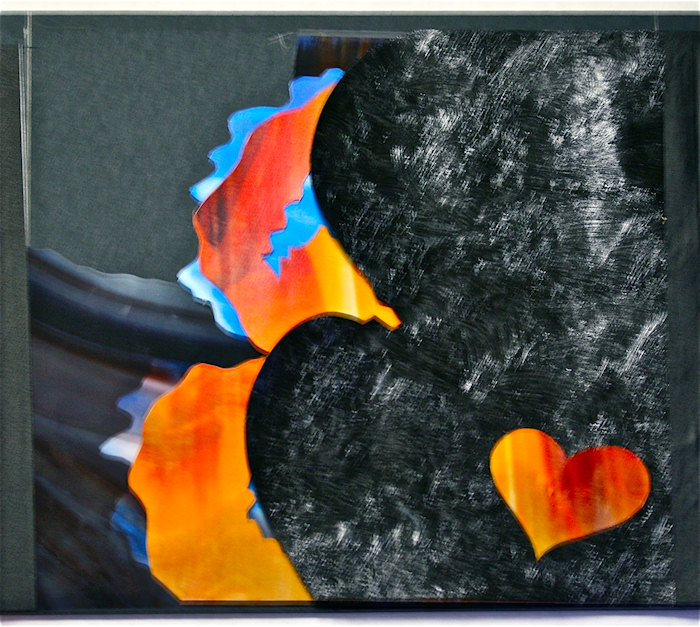
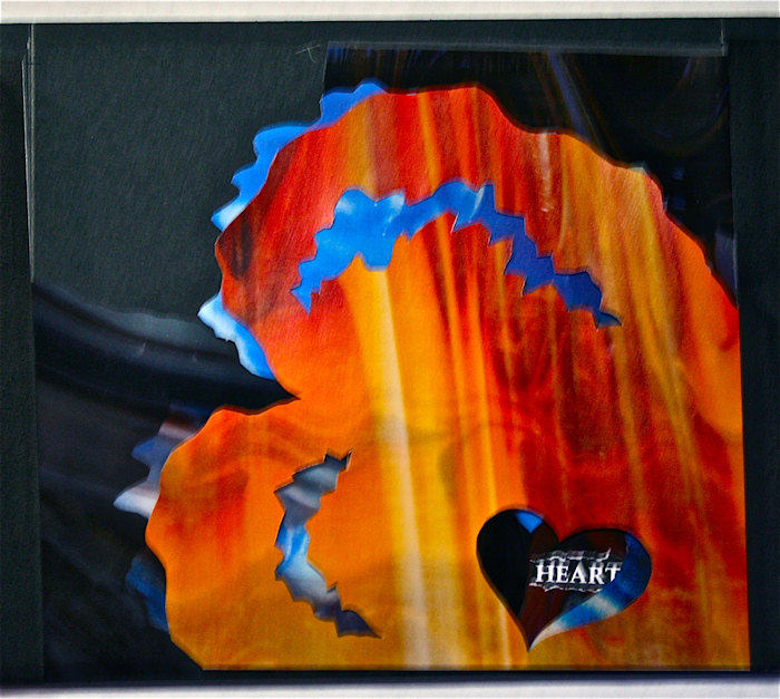
I liked how overlapping hearts created spaces of interest into which I could
insert text or parts of text. For example, noting that the worked heart
contained the word art allowed me to position the text “the human heart” in such
a way as to reveal this inner word.
My cover was fashioned using black mat board that I textured with the acrylic
medium and cut into spaces to represent the top and bottom of a heart. The
bottom overlaps the top when closed, forming another heart shape.
What I completed in Boston is but a chapter in my book. The longing to create is
eternal, for it originates in the human heart.
* * * * * * * * * *
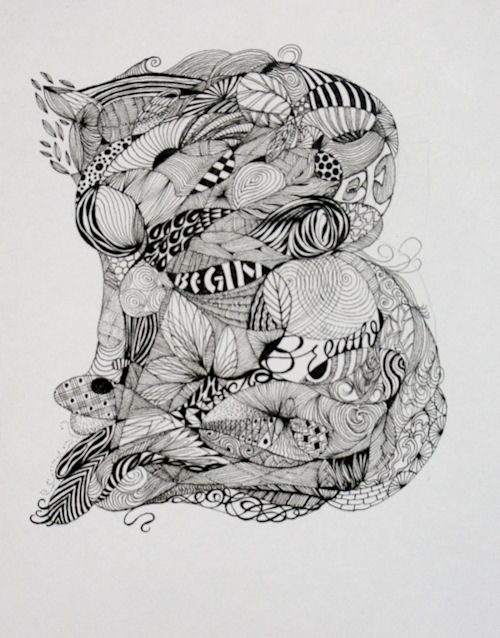
Week #3
This work was done by Eileen McAllister in Boston, in class during the last
session, 2011 "Experiencing the Book as a New Structure". In her own words:
"The human heart is a theatre of longing," were the words of John O'Donohue that
Reggie gave us during our weekend session of "The Book as a New Structure." The
experience he orchestrated was interesting, fun, confusing, frustrating, chaotic
and mysterious, and frequently several of those things at once. Sometimes it was
a little like a treasure hunt or game--our collecting of materials carefully
laid out on the back tables, the directions to do and measure certain things
without knowing exactly why the instructions were important, the choosing of
color prints or transparencies before some plan formed in our minds--leading to
an understanding of how his Everest book evolved.
My book, in process, is 17 1/2" x 11 1/2" closed and 36 3/4" x 11 1/2" open. So
far, I've used some of my photographs, printed at my local Staples, and some of
Reggie's beautiful stained glass photos, as well as some Hubble images. I
started with the idea of using one of my flower center images toward the
beginning of the book, and a close up of a tree trunk ring toward the back. I
remembered something about heartwood as being the center part of a tree and that
made a loose connection with the quote for me. I thought those images would also
lend themselves to a feeling of motion and movement which I liked as a metaphor
for longing. With those wisps of ideas, I and my classmates cut, glued, drilled,
hole punched and taped all weekend!
After a few days at home, I looked at the book again and was surprised that some
new ideas occurred to me. I also realized that setting up the book with the pegs
and playing with the sequencing reminded me of an animation class I had taken
many years ago, and that the last minute cutting and arranging I had done in
class with the words was a lot like the hand work I did with type when I was a
graphic designer. While I was in class, I knew something felt familiar about
parts of the work, but couldn't put my finger on it until a couple of days
passed.
One tip for anyone else who has a lot of corrugated to cut on a curve--my Tajima
LC-501 utility knife with the snap off blade worked great as I worked on my
intricate cover mock-up!
* * * * * * * * * *
Week #4
This work was done by Dave Flattery in Boston, in class during the last session,
2011 "Experiencing the Book as a New Structure". In his own words:
*****************************************************************************************************************
This was done during the last weekend of the Primitive to Modern year long
course. The title "Experiencing the Book as a New Structure" could , and should
, be interpreted in two ways. On the obvious structural side , the book opened
up from both sides and the pages were not all the same size nice neat
rectangles. On the not so obvious side the "story" didn't unfold in a normal
sequence. The book became an adventure of discovery, We all used the same quote
"The human heart is a theatre of longing.", In my case , not until opening the
three pages that made up the cover , then two more inside pages, was the word
"heart" revealed,,not until opening two more pages did you get to read "the
human".
Reggie gave us a disc of images taken from close up photos of stained glass. We
used those images to make color and black and white copies on paper and
transparencies for our book pages. Through shapes, cut outs, textures and
transparencies the reader was drawn into the book..never seeing everything at
once and being anxious to see what was coming next..
Actually assembling the book was a whole different aspect. Reggie gave us very
specific instructions for this book . If you have never made multiples of
anything that needed to be assembled from parts it was a great eye opener. If
you keep an open mind and use your imagination you could take concepts from
class and create your own jigs , patterns and templates for your own projects
with your own dimensions.
* * * * * * * *
Week #5
This work was done by Claire Griffin in Boston, the fourth class session in
2011: "DESIGN: Deconstructing the Grid". In her own words:
This piece was done as homework for Reggie’s Boston Primitive to Modern class.
After working on the in-class project, I was excited about returning back to my
desk at home to start another piece on my own. I inserted the cd of stained
glass images Reggie handed out at the end of the weekend into my laptop. The
images were incredible, and I must admit, a bit overwhelming, with so many to
choose from I had to take a moment to just think about what I wanted to do.
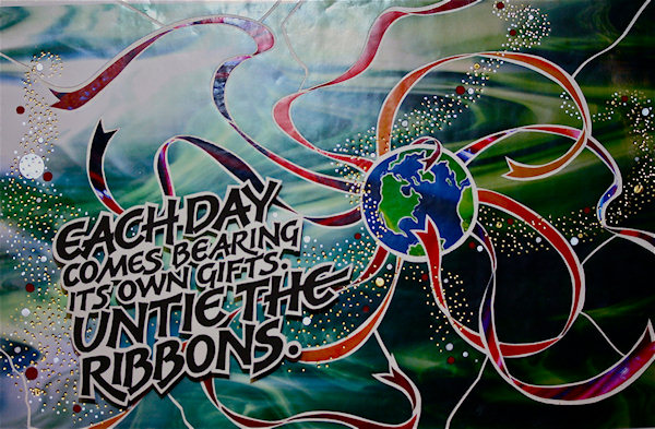
After working on some ideas I came up with the quote, “Each day comes bearing
its own gifts. Untie the ribbons.” I then returned to the overwhelming stained
glass selection on the cd and picked out the colors and textures I thought would
work, especially a gorgeous red/blue mix that I chose for the ribbons. Then came
the really fun part. I got out my waxed piece of Arches paper (thanks to my
great classmate, Eileen!). I took the exacto knife and said to myself, “Let the
cutting begin!” And begin it did. By cutting and “exploding” the image piece by
piece, the image became more and more alive and glowing like a stained glass
window. WOW!
I lettered the quote with a B3 nib and copied it in different sizes, choosing a
layout that felt right to me and cleaned up the edges, sharpening everything
with my 005 pigma. I wanted to achieve the shadow effect when I photographed the
piece, so I took little rubber spacers and raised the lettering that I had cut
out and trimmed with @1/16th” of white all around. I also trimmed out some of
the counters so the background would show through. Using the hot foil pen that I
ordered on ebay (cost more to ship than the price, but it was worth it!) I added
the foil dots as an accent and let them flow between the quote and the Earth,
plus some larger silver and red dots for good measure. DONE... not quite.
Now to photograph the piece and achieve that magic effect that Reggie inspired
us to seek was much harder than I expected. But with my trusty lights camera and
step stool I found the effect I was looking for, as pictured here. I printed the
piece on a good quality, heavyweight photo paper and then breathed. DONE...
really.
* * * * * * * * * *
Week #6
This work was done by Lois Rossiter in 2011 in Boston for the fourth month's
class "Primitive to Modern". In her own words:
"Still working on the grid...and off it: simulated purple-dyed vellum via paste
paper and pigments; graphite pencil; Schminke gold pan watercolor ; ruling pen;
ball point nib; Fons & Porter white pencil; Prismacolor pencils. Writings of
Robert Henri; 8 x 10 "
* * * * * * * * * *
Week #7
This is a work I did myself last year for the fourth month's class "Primitive to
Modern". It serves as a teaching example for the
processes, techniques, and materials used in this project: background watercolor
manipulated in computer, watercolors, sumi ink,
Dr. Martins Bleed proof White, mica powders, pastels, "B" nibs, pointed nibs,
brushes, spray fix, acrylics, 23 kt. gold leaf, lemon gold, shell gold, 9" x
12".
* * * * * * * * * *
Week #8
This work was done by Victoria Langsford in 2011 in Atlanta. Her web site is:
http://www.victorialansford.com/
In here own words:
The Falcon
Eastern repousse bound, one of a kind, long stitch book
Copper, hand lettered and mixed media over printed photo montages of original
collages
5-3/8" long x 3-3/8" wide x 1-5/8" high
Ancient alchemists sought to transmute the plain into the precious. My modern
day version of that quest similarly seeks to transform the simple into the
complex...the mundane into the beautiful...the ordinary into the extraordinary.
Materials unformed, crafted into two or three dimensional explorations of time
and space, express the vulnerability and passion of the human spirit,
paradoxically contained within the seemingly timeless elements of metal and
mineral.
This project was extremely significant to me because it represents the complete
merging of my metal and my calligraphy worlds in a single inseparable work.
Until 2011 those worlds remained seemingly discreet ever vying for my time and
attention. Since completing The Falcon, I feel far less divided as a maker of
things.
I created the relief on the front cover of The Falcon using an ancient Egyptian
technique called, Eastern repousse. This technique involves the raising or
pushing out of shapes from sheet metal by alternately hammering the front and
back with specialized tools over semi flexible materials for support. THERE ARE
NO MOLDS OF ANY KIND. It's just my design, my tools, and me.
For the book cover I first hammered the entire design on the front on the sheet
with a line tool, which looks like a dull chisel. Next I hammered the metal from
the back with oval shaped tools with the metal sitting on a block of plasticine
for support. It took approximately 7 rounds of this back and forth hammering to
get the height and shape of the wing. In between each round I annealed the piece
by heating it with an acetylene torch to about 1100ºF to return the metal to a
malleable state.
To achieve the look of the letters sitting on top of the wing, I first
delineated their outlines from the front with my line tool while the piece was
supported from underneath by warmed pitch (pine tree resin) so that the echo
marks of the line tool would allow me to see the letters' location from the back
side of the metal. Next I put the piece face down on plasticine again to hammer
the letters out from the back with the oval shaped tools. It took four rounds of
hammering this way from the back to achieve the height of the letters, again
annealing in between in each round.
One I had puffed out the letters, I began hammering the metal from the front
over pitch with tiny rounded tools and the line tool to create the details of
the feathers and the peaks and valleys of the word, Falcon. This final step of
refining the shapes and letters took days. Eastern repousse is a long but
rewarding process that cannot be duplicated by any other smithing technique.
The text of the book is William Butler Yeats' politically charged poem, The
Second Coming. I used Photoshop to create a continuous digital montage from
larger mixed media collages and drawings that I had previously created and
printed it on Arches hot press watercolor paper using an Epson R1900 ink jet
printer. I used various paints and pastels to enhance the printed images then
lettered the poem over the top in the Carolingian hand and variations of it with
Japanese stick inks and a snipped Brause EF66 nib. As always, there was much
spray fixing in between the steps.
I bound the book as a long stitch French fold with glassine that folds down over
each right page to protect the pages from rubbing against each other. The spine
is made of copper leafed handmade paper to match the covers. I attached the
copper covers by folding the edges of them over the extended tabs of the book
block's stitched spine.
.jpg)
.jpg)
* * * * * * * * * *
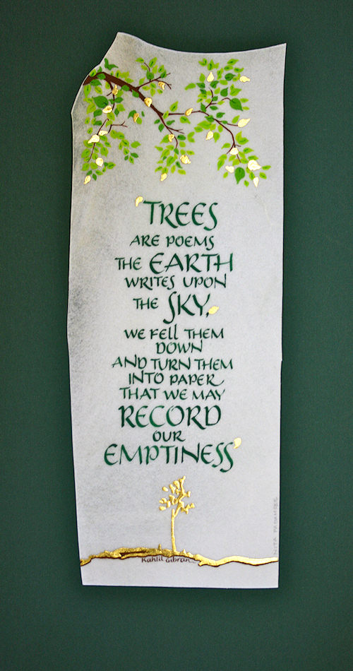
Week #9
This work was done by Nita Padamsee in 2011 in Boston for the second session's
homework, "Lettering on Vellum". In her own words:
Man's relationship with trees transcends the beauty, form and canopy they
provide, among a multitude of other things. It is a deep symbiotic relationship
by which we are connected & in fact, what we inhale, the trees exhale & what we
exhale, they inhale!
When I came across this verse by Kahlil Gibran, I was so moved by the poignant
beauty that his words evoked about mans wanton waste by felling down trees to
immortalize their empty miseries that it felt so apt for this assignment. It
would have been ironic if this piece were rendered on ‘crushed bark’ rather than
on calf skin vellum.
The assignment was to combine word & image on calf skin vellum. All the color is
done with W & N gouache. For the gold I used 23K patent gold that I had bought
in 1988. I have found it easier to use than loose leaf gold. Waste is minimized
& static electricity doesn’t play any part in the gold flying away!! It is
believed to be not as “shiny” as loose leaf, but when you are covering a small
area, one doesn’t see that difference at all.
Ah, the OptiVISOR! I had bought it & it was sitting for over a week on my steps,
in its unopened box. I guess I was not ready to admit to myself that I was not
young anymore & needed it badly. However, once I put it on, there was no turning
back! Size: 3 1/2 X10 in.
* * * * * * * * * *
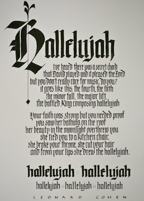
Week #10
This work was done by Jan Boyd in Boston in 2011 for the first session's
homework, "Blackletter: Modernizing a Traditional Calligraphic Hand". In her own
words:
This piece was done as homework for the second session of Primitive to Modern.
After being introduced to many variations of Gothic lettering during the first
weekend of class - from traditional to very modern and swashy - the challenge
was to do a piece incorporating some variations. Leonard Cohen's Hallelujah
seemed to me to be a perfect vehicle, a relatively modern lyric with an ancient
theme. The lettering was done with sumi ink on Arches 140 # hot pressed paper,
the image was then inverted in Photoshop and printed onto Arches Text Wove.
Size: 9 X12 in.
* * * * * * * * * *
Week #11
This work was done by Lynda Jolly in Tulsa in 2010 for the fifth session
"Design: Deconstructing the Grid". In her own words:
This piece is one that pushed the boundaries of “comfortable” and is not
something I would have done on my own. However, with “gentle” encouragement from
you-know-who, it was fun to do. Using a mirror image of the quote, I also
contrasted colors and line-types. Of course, there were not enough gold dots, so
I continued to add, and add, and add… I like the lettering style and have used
it again; I did have to purchase a waxer so I can make my own backings for this
kind of art. Techniques and knowledge learned in Reggie’s classes last forever
and, as a result, there is always more stuff that I need (want?). Thanks,
Reggie!?
* * * * * * * *
Week #12
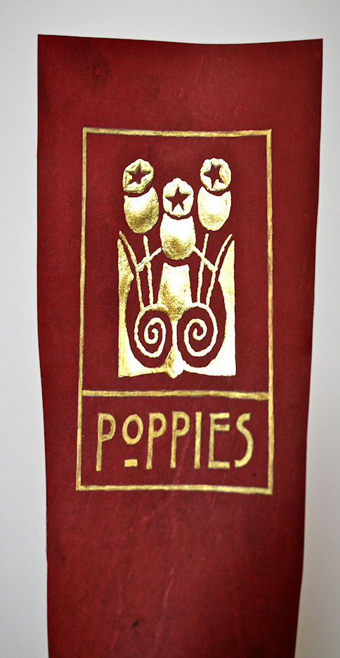
This work was done by Eugenia Uhl in New Orleans in 2010 for the fourth session,
"Primitive ti Modern". In her own words:
I love art nouveau designs and decided that was what I wanted to use
for the design on my red vellum. I copied a piece of a larger design
from a book called Art Nouveau Designs. I chose the word poppies,
because the design reminded me of poppies. The letters were based on
some that I saw in a Charles Rennie MacKintosh book about flowers. I
drew the lines around the words and the symbol to unify the piece.
I loved it and it is sadly missed.
Oh and the symbol was in raised gold using instacol and 23 karat gold
leaf. And the word/lines were done with that japanese gold that comes
in the shallow dish. I chose that because it was a little darker.
Thanks.
* * * * * * * *
Week #13
This work was done by Bonnie Houser in San Antonio in 2008 in the fifth session
"Design: Deconstructing the Grid". In her own words:
This was my last piece of homework accomplished in Reggie's Primitive to Modern
class, 2008. In addition to
using the photocopied papers used in previous assignments, I supplemented them
with other collage papers
from my "stash". The shapes were inspired by the quote itself and by studying
some postcards of artwork by
Hundertwasser. One in particular, "The Path From You Back To Me", gave me the
domed shape to work
with. It also had a "hand" and a "circle" in it... so therefore a hand and
circle was included and became parts
of a morphed human??? I knew I needed some white space for the lettering (brush)
and additional white was
added as detail in areas I'm sure the "bulls eye" was not the best placement
choice.. oh well... forever learning .
The whole process became a joyous adventure...
* * * * * * * * * *
Week #14
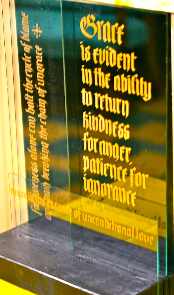
This work was done by Bob Zuranski in Chicago in 2009 for the first session "Blackletter:
Modernizing aTraditional Calligraphic Hand".
In his own words:
“My original thought for this project was to create a simple three layer layout
where each layer was on its own plane. In this case the three planes were plates
of glass. A fourth panel of black acetate served as a back drop. The panels were
spaced one half inch apart and mounted on a cedar 2 x 6.
The predominant panel was the largest one, placed behind two subordinate smaller
panels. Fractura (or a reasonable facsimile thereof) was used on each panel. The
lettering was done on a scrap of Fabriano and taped face-down onto a sheet of
contact paper which was adhered to the back side of the glass panel. Letters
were cut out on my light table with 30 x-acto blades, 7 bandaids and a gallon of
brandy. I remember it as a happy project. The etched letters were colored with
gold colored pencil; it was easier and more cost efficient then using Rub n Buf.
The obvious contrasting elements included letter size, weight, orientation and
pattern. The less obvious contrasting elements included overlapping subordinate
layers vs the unobstructed predominant layer and using the glass edges of the
subordinate layers to interrupt each other vs using them to define the text area
of the predominant layer.
‘Grace’ is the theme of the piece and each layer represents a separate thought
in that theme.”
* * * * * * * * * * *
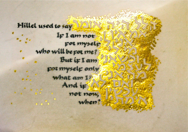
Week #15
This work was done by Corinna Taylor in Chicago in 2009 for the second session,
"Lettering on Vellum". In her own words:
It’s approx 5 x 7, sumi ink and 23k gold leaf on vellum. I used Instakoll. The
pebbly texture comes from forgetting to dilute it first. The Hebrew letters were
inspired by the work of Ismar David, and strongly resemble the Jerusalemite
style based on the Dead Sea Scrolls, about the time of Hillel.
* * * * * * * * * * * *
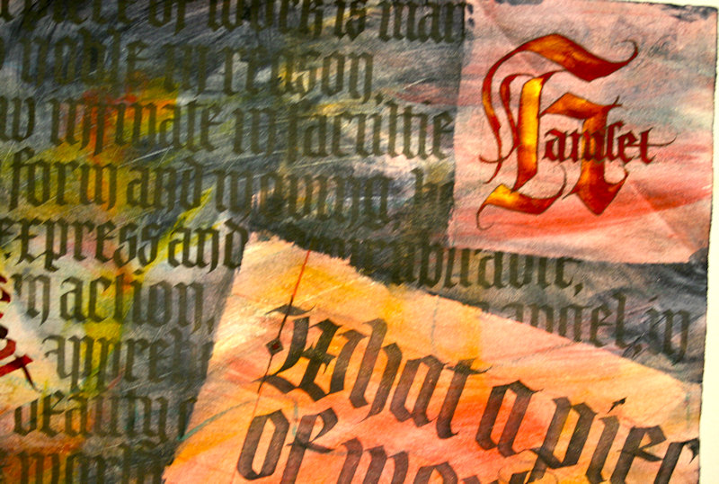
Week #16
This work was done by Chris Orsolini in Kalamazoo in 2009 for the first session,
"Blackletter: Modernizing a Traditional Calligraphic Hand". In her own words:
This piece was done on a sheet of paste paper I'd made some years ago. The
variations of background color were formed by laying wet sheets of paper over
the lightly colored page and stenciling the shapes by going over those areas
with deeper colors.
We'd been practicing different forms of Gothic lettering in class. The text,
from Hamlet, seemed to lend itself well to the letter forms. I used a different
variation in each of the sections of the paste paper, including dark letters
over the dark center of the page.
I used McCaffery's black ink in a Parallel Pen for the larger black letters, and
dropped a little McCaffery's black (not sumi) into the red. I used sumi ink for
the black-on-black section. For the letters on the left section I dabbed black
onto the corner of the nib filled with diluted red. 13" x 19".
* * * * * * * * * * * *
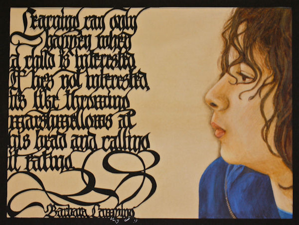
Week #17
This work was done this year by Victoria Lansford in Atlanta for the first
session, "Blackletter: Modernizing a Traditional Calligraphic Hand". In her own
words:
Marshmellows
"Learning can only happen when a child is interested. If he's not interested,
it's like throwing marshmellows at his head and calling it eating." - Barbara
Lamping
These have been words for me to live by in the journey of unschooling (child led
homeschooling) our 12 year old son, Skyler, so I wanted to create a complex
piece using this quote. My first idea was to take a photo while throwing
marshmellows at Skyler. While the results were comical and memorable (and tasty,
according to him) , they lacked a certain clarity. Instead I opted to draw a
portrait, based on a photograph I'd taken of Skyler last year.
I'd recently seen the images of a re-discovered portrait probably by Leonardo da
Vinci, which is of a young woman, drawn in ground pigment sticks and ink on
vellum and believed to have been cut out of a book. Drawing in ground up
homemade pigment sticks was too involved even for a process junky like me, so I
created the original drawing in Prismacolor and graphite on goatskin vellum. The
process was incredibly fun! Friction from drawing causes the wax base of the
pencils to meld like hard oil pastels, and the translucence of the vellum adds a
luminosity to the pigmented areas. I scanned the image and extended the color of
the vellum in Photoshop so that the image would be wide enough to fit behind the
lettering. I printed it out on Arches hot press watercolor paper with an Epson
R1900.
I lettered the original quote in stick ink on Nideggan paper and traced the
outlines of the lettering, adjusting the spacing and line breaks to make the
letters touch wherever possible, and adding flourishes and connections as
needed. After scanning and enlarging the lettering, I transferred it to Arches
black cover paper and began the long slow process of cutting out the counters,
negative spaces, and finally the window for the portrait with an X-acto knife.
Although this paper was a good choice for strength, it was not easy to get clean
cuts. I had to go back and recut each interior corner to remove the fuzzy fibers
that clung onto almost every letter. I placed small pieces of cover paper on the
backs of some letters and flourishes to make the lettering paper stand up off
the portrait paper. I secured the portrait behind the lettering with gummed
linen tape.
* * * * * * * * * * * * *
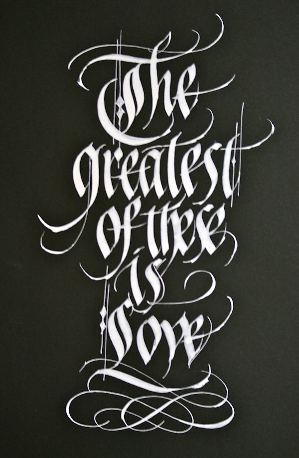
Week #18
This work was done by Maria-Helena Hoksch in New Orleans in 2010 for the first
month's
class "Modernizing a Traditional Calligraphic Hand". In her own words:
White on Black in Gothic Script 10"x7", Dr. Martin's white on Black Canson
paper,
speedball C nib, pointed pen.
This is the first bit of homework I ever did for Reggie's class. It
was done after first month class, after exploring Gothic variations.
So this is my version of Gothisized Italic. I had decided to take at
least an hour to create a piece of homework for the next class, as I
had seriously promised myself I would do homework this time around. So
I sat down one night, too lazy to create even a draft or initial
layout, I just played around with my pen, and that's what came out
that day. No planning was involved whatsoever. The quote is obviously
a part of a famous saying from Bible that drifted into my mind.
Interestingly, I think sometimes we just have to create something
mindless to get the creative juices flowing, to prepare for something
more serious and devoted to come. That is what this piece did for me.
There was much more homework to come. So that's why I really treasure
this worthless little thing...
* * * * * * * *
Week #19
This work is by Jo Miller in New Orleans in 2010 from the last session,
"Experiencing the Book as a New Structure". In her own words:
One of the great things about Reggie is that he pushes his students outside of
the box, sometimes while they are kicking and screaming to stay within the
comfort of that box (haha). But once outside, you realize how confined and
uncomfortable that box really was.
One of these experiences for me was the task of creating 'the book'. Now don't
get me wrong, I love 'me some book making'. But this was not a the usual book
construction and these were not the usual supplies and the quote, well . . . But
then Reggie gave a little more about the origin of that quote and I loved the
line ...There is a divine restlessness in the human heart, and from there I
embraced the project.
The book was constructed to open from each side allowing the content to be
discovered through the layers. Words are partially revealed through the journey
allowing the meaning to grow in the viewer's mind.
Materials: 1/2" foam core, black matt, lace papers, stain glass images, galaxy
images, and abstract Photoshop designs printed on fine velvet art paper,
gaffer's tape and hardware to bind the pages.
.jpg)
.jpg)
.jpg)
.jpg)
* * * * * * * * * *
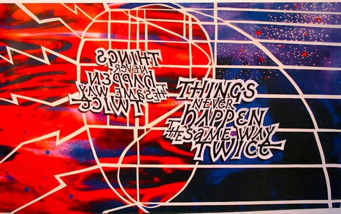
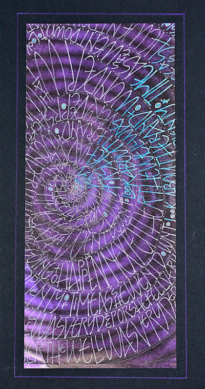
Week #20
This work is by Lois Rossiter in Boston in 2011 from the fourth session,
"Primitive to Modern". In her own words:
Inspired by the class demonstrations of using 'borrowed' images and working the
grid from another perspective, I chose a line from Alice in Wonderland: " Either
the well was very deep or she fell very slowly, for she had plenty of time as
she went down to look about her and to wonder what was going to happen next."
Inkjet print of Internet image imported into Photoshop, warp filter; printed on
watercolor-washed arches text wove paper; Bleedproof white; B6 nib; Prismacolor
pencils; Schminke Aquarelle silver; 4 x 10"
* * * * * * *
Week #21
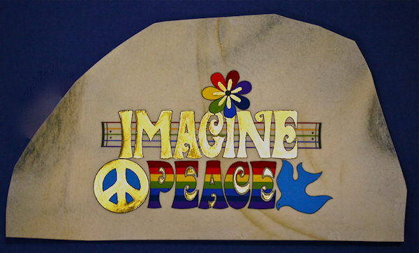
This work was done by Nita Padamsee in Boston in 2011for the third session,
"Illumination on Vellum". In her own words:
Asked by Reggie to render our version of the Codex Aureas, I used the words
IMAGINE & PEACE. My inspiration was John Lennon’s song ‘Imagine.’ For me it was
only appropriate to render this in true 70’s style!
It was a fun project, but extremely challenging to cover the word ‘Imagine’
with gold. The piece is approximately 11” X 6.5”, done on calf skin vellum.
For the gold, I first applied gesso and then the instacol, before laying down
the gold leaf. You have to make sure that the instacol covers all the gesso by
using the OptiVisor or a magnifier. In spite of that, laying down the gold so
that it would adhere to the instacol was tricky to say the least. I had to apply
several layers of gold and still had a hard time making the gold stick.
Personally, I prefer just using the instacol without the gesso. In this case
however, I wanted to have the word ‘Imagine’ have a ‘raised’ look and therefore
put down the gesso as the first layer.
The color work was done with Winsor & Newton gouache and I used the black Micron
marker for the outlines. I used a ruling pen for the lines of the staff.
* * * * * * * * * *
Week # 22
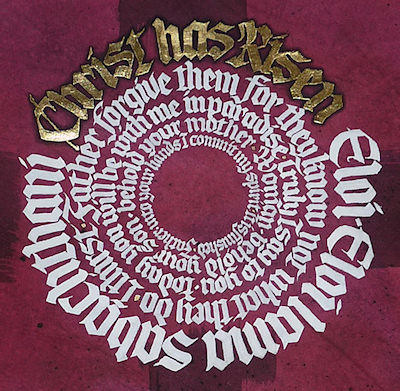
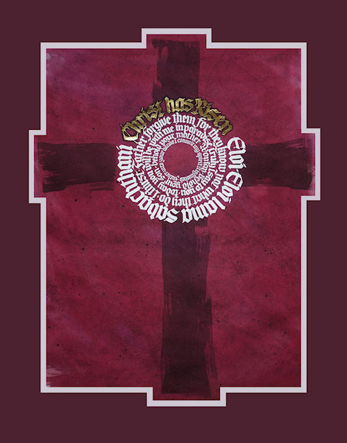
This work was done by Janell Wimberly in Dallas this year. In her own words:
A major church in Dallas has sponsored a juried art exhibit for the last 5
years, and I have managed to pursue the creative muse and come up with entries
for the last four years. This year over 150 pieces were entered to vie for the
94 spaces available, paintings, drawings, sculpture even video presentations
were entered.
The themes are always chosen from Biblical references, and this year it was the
"Passion and the Promise", revolving around the crucifixion and resurrection of
Christ. Three themes and Bible verses are offered to chose from.
They always give plenty of notice, several months, but I just couldn't get the
themes in mind or "see" my vision. I had just about given up; but while
preparing to teach a class about "writing in the round" I started practicing and
just happened to try using the seven last statements that Christ uttered while
on the cross. As I practiced and played with the blocky gothic letters, I
realized that I had "found my muse"!
Keeping with the theme of royalty, passion and death, I would have wanted to dye
vellum the rich purple that Reggie has showed us in his teachings. Well, no
vellum, so I opted to dye some Arches Text Wove to mimic the dyed vellum... hmmm
not bad... I like it!
I used Dr. Martin's bleed proof white and several pen nibs from automatics to
Mitchells to execute each letter size on it's individual "round". The theme, of
course, is "He Is Risen" and I chose to do that boldly using instacol and 24K
patent gold.... Now we're cookin'!
The more I worked it, the more excited I got about the effect and result! The
"cross" was kept simple and rough, a darker purple stain. The mats were cut
specifically to accommodate the extensions of the cross
Although it didn't win top prize for the theme I'd chosen (The Cross), it was
accepted and then won one of the 13 coveted "special award" spots. It was good
to show everyone that calligraphy IS an ART and not just for addressing
envelopes!
Couldn't help but think it would have fit right in with the classes on using
gold and Gothic letters that Reggie is presently teaching.
The Last Words of Christ
Janell Wimberly
* * * * *
Week #23
This work was done by Tina Cronkite in 2009 in Kalamazoo in the fourth session,
"Primitive to Modern". In her own words:
The size for mine is around 10 x 22. I used bleach with the Ruling Writer pen on
black Arches for the alphabet for the first round. Then rubbed pastels in
between the letters. I love the way the color pops! Then added the “Zentangly”
marks with pen and also added colored pencil. The whole piece was pretty
spontaneous, testing how pastels work on black, bleach…
* * * * * * * * * *
Week #24
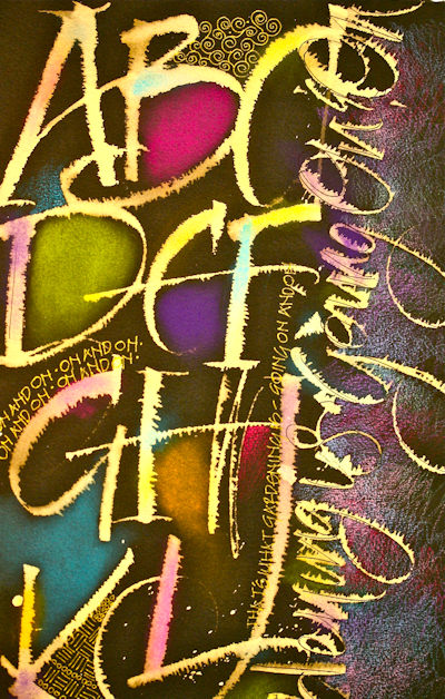
This piece, which I titled "The Straight Line is a Man-Made Danger," (a direct
quote from Hundertwasser) was inspired by Hundertwasser, an Austrian artist of
pre- and post-WW II. I've admired his work for a long time, since it's a very
spirited combination of art and architecture. The assignment was to use a grid,
and I had a comic book sort of grid in mind. I began with very loose pen and ink
(I drew with black acrylic ink, using the dropper that came in the bottle as my
"pen" ) drawings of faces, thinking sort of self portraits, though they're
really not recognizable as such. And then I added the rice papers over that,
using a thin coating of watered down Golden acrylic matte medium as my adhesive,
because it can be written or painted on without disturbing what's underneath it.
Then I added the watercolor parts of the faces and the words. I did the
lettering, such as it is, with a #6 Mitchell nib and the same black acrylic ink,
writing over the rice papers. The surface was rather rough and helped me get the
wild look I wanted. And I used primarily my own handwriting as the lettering
style, because I felt that it best suited the self portraits and the text. The
text is excerpted from some writings and lectures by Hundertwasser, in which he
expresses his belief that the straight line is unnatural and ungodly. At one
point in his career, he designed the facades of a number of mid-century
institutional concrete buildings, adding bright colors and curving lines that
make the buildings appear to be works of art. Those were the inspiration for my
concentric wavy lines around the faces. All in all, I found the assignment great
fun, and I found it an enjoyable challenge to try to do something of my own but
in the style of an artist I admire. Size: 10 x 15.
* * * * * * * * * * *
Week #25
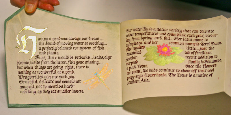
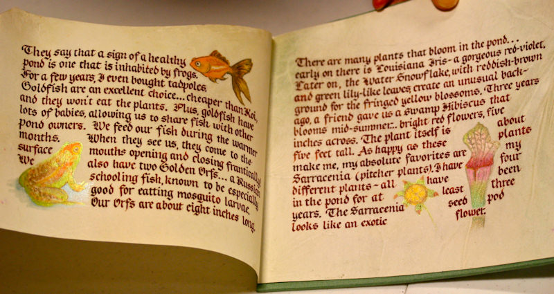
This work is by Carol Gray in Atlanta this year for the second session, "
Writing on Vellum". In her own words:
At our second Primitive to Modern Class, Reggie had a lovely assortment of
vellum off-cuts for purchase, and something about the 30" long,
irregularly-shaped one really appealed to me. It reminded me of a mountain range
and I loved the subtle coloration. It is 9" tall at the highest point and 5"
tall at the lowest.
One of our assignments was to make a book, and I have always loved accordion
books for their ability to display the whole book but also divide it up
comfortably...so I thought I could fold the vellum into four panels. In
hindsight, I probably should have tried it with a thinner piece of vellum, as
the piece I have is quite thick and tends to have a mind of its own!
Reggie had encouraged us to choose subject matter that we felt passionate about,
so I decided to turn my book into a sort of journal and write about the pond we
have in our backyard. Since I wanted to do a mock-up, the first thing I did was
trace my vellum piece onto a sheet of Parsons Diploma paper and then began
laying out the wording on that. I love miniature illustrations, so I researched
pictures of dragonflies, water lilies, frogs, goldfish and pitcher plants. After
sketching the illustrations in, I began writing around them, using my most
comfortable gothic style and black Moon Palace Sumi ink. After the writing was
completed, I went back and used watercolor pencils to color in the images. Once
the mock-up was completed, I turned to the actual vellum.
I wanted a look that was reminiscent of an old document, so I decided to use
burnt sienna ground pigment to letter with.
On a small piece of test vellum, I tried the watercolor pencils but wasn't as
happy with the results (perhaps if I had treated those areas of the vellum a bit
differently? Wiped them down? Sanded them a bit more?) So, I decided to use
fairly dry, iridescent watercolors to color in the illustrations. It looks more
subtle than the original mock-up but I was ok with the results.
The large H at the beginning of the journal is 23kt patent gold leaf. The book
boards for the cover were cut in the same irregular shapes as the vellum and
then covered with some light green Hahnemuehle paper. The title was written on
the Parsons paper, in Walnut ink with some Dr. Martins green ink dropped into it
while wet, to give it a variegated effect. The edges of the paper were torn.
This was then mounted onto the light green paper.
This was my first experience writing on a large sheet of vellum, but it won't be
my last. I've learned quite a bit and I've already purchased another piece for
my next project! I am glad that Reggie challenges us with these homework
assignments!
* * * * * * * * * *
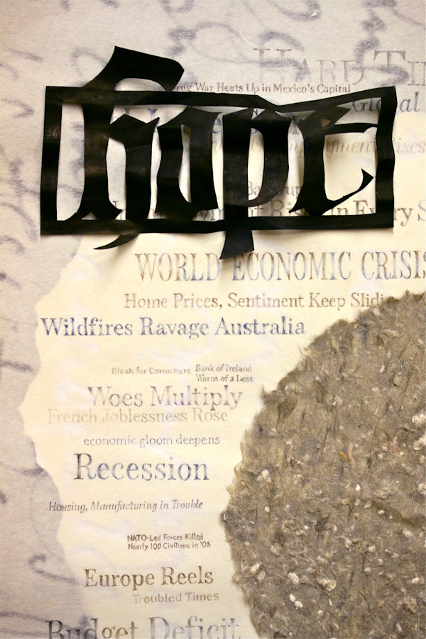
Week #26
This work was done by Marijo Carneyin 2009 in Kalamazoo for the first session
"Modernizing a Traditional Calligraphic Hand: Blackletter".
In her own words:
WITHERED HOPE
It was January 2009, and the gloom and doom of the economic recession seemed to
surround me at every turn. In response, I created this layered collage piece to
reflect the spirit of the times and what I was feeling.
I used a piece of round handmade paper to represent our world and placed it on a
17” x 11” rectangle of thin Japanese made paper that had gestural marks as part
of the paper. I used colored pencils to make letters in a variety of earthen
tones to surround my paper “world” with the headlines of the most current Wall
Street Journals. I added a round piece of white D’Arches hot press paper with
torn edges behind the “world” so the lettering would have more contrast and thus
be more readable. All this was placed on a piece of dark grey Canson paper 14” x
22” with edges torn before framing. (This grey Canson is not visible in this
photo)
Using an exacto knife, I cut the word “hope” out of black paper, sprayed the
back of it with water, wrinkled it, and glued the now 3 dimensional word to the
composition to convey the feeling that my “hope” was battered.
* * * * * * * * * *
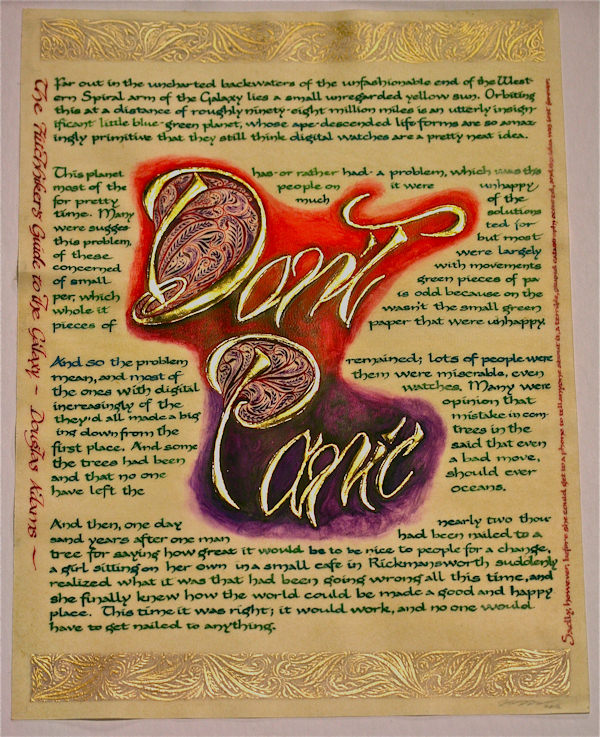
Week #27
This work was done by Victoria Lansford in Atlanta this year for the second
session, "Writing on Vellum". In her own words:
"Don't Panic"
One of the joys of having a child who is geeky like his mom is getting to share
and enjoy again some of my favorite bits of British humor. My son and I now
trade bits of these comedies back and forth (or I should say I quote them, and
then he corrects me right down to the exact accent and intonation of how they
are "supposed" to be said). One of our favorites is the line from Douglas Adam's
book and TV series The Hitchhikers Guide to the Galaxy, which describes the
guide's being popular because, "It has the words Don't Panic inscribed in large
friendly letters on its cover."
Of course rather than being a sacred manuscript on vellum, to survive traveling
through the galaxy the Hitchhikers Guide is supposedly like a 1970's concept of
a Kindle and is regarded by spaceship stowaways as something of a cross between
a Bible and a Lonely Planet Guide. My goal was to juxtapose these very different
concepts of holding onto the comfort of books in the face of our fears of the
unknown.
To me the spontaneity and fluidity of lettering that can be done with a Pentel
Brush Pen equals large and friendly, so I used one for the lettering design for
the gilding and lettered around this area my favorite passage from the book
about humans and our obsession with our lack of happiness. The piece is on a 9"
x 12" sheet of goatskin vellum with a quill used on the Carolingian, a snipped
EF66 on the vertical lines of text, and a Gillot 303 on the flourishing. The
materials were dry pigments (all the text), 23k patent gold ("Don't Panic"),
watercolor (around the gilding), pastel dust (the top and bottom bars of muted
color), and Finetec gouache (filigree flourishiing over the bars of pastel
dust). It is a gift for my son.
* * * * * * * * * *
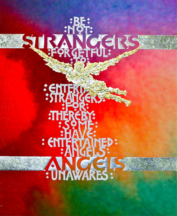
Week #28
This work was done by Reggie Ezell this year in Chicago for the fourth session
"Primitive to Modern". In his own words:
STRANGERS AND ANGELS
In two of my favorite films, Charlie Chaplin's City Lights and Charles Dickens's
Great Expectations we are asked to look deeper than we might want, to discover
who our true "benefactors" are in life. Throughout my 30 years of travels,
teaching, and staying in households there have been more "angels" than I can
number. This quote, Hebrews 13:2, has had continued resonance in asking me not
only to discover the nature of the soul who stands before me, but question who I
might be as well.
The background started as a watercolor wash. I took a digital photo of it, then
did extensive manipulation of it in iPhoto. It is printed on archival paper with
pigmented inks on an Epson 4880 printer. During the process of doing the work
several watercolor glazes were applied.
The image of the angel is a sculpted acrylic base with two gold leafs applied:
24 karat loose and lemon. The bands of "Strangers" and "Angels" have multiple
layers of smooth acrylic base gilded with moon gold, a deep rich pewter color,
and atop it is stippled a textured lemon gold.
The lettering is based on a typeface by Renee McIntosh, done with B nib, pointed
nib, and Dr. Martin's Bleed proof White.
The design process I teach in my Year Long Classes, the use of transparencies
atop one another to make decisions, was employed here.
It was a relief to finally do this quote myself after so many years of assigning
it to my students!
Size 13 x 15
* * * * * * * * * *
Week #29
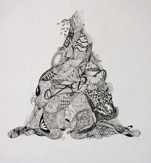
This work was done by Claire Griffin in Boston this year in "26 Seeds: A Year to
Grow", Session three: Drawn and Pressurized Romans. In her own words:
While attending Reggie's 26 Seeds Class here in Boston I've been surrounded by
ROMANS.
I have drawn them with pencil, pressurized them, monolined and studied them in
every imaginable shape and size.
I've tried to save Romans in need of TLC. I've performed autopsies on Romans
that I killed with too much pressure, not enough body and broken "bones".
The 26 Roman letters have invaded my soul and live in my every waking moment.
Let's just say that learning about Romans has been the life and near death of
me.
That said, I've decided to incorporate one of my other favorite things into a
new twist on my beloved Romans.
Using techniques from "Zentangles" (thanks to Maria Thomas) I decided to start
"tangling" my letters.
I drew the letter with a pencil, then ran a line through it to create spaces.
Using a micron (01 or 005), I filled the spaces with different patterns and
words, just letting the design build itself.
I've done 7 of the 26 letters so far, and each time I finish one I feel like
I've created something special.
The Letters "A" and "B" were picked for this post.
A nice start to what I hope will be a very creative relationship.
* * * * * * * * * * * * * *
Week #30
This work was done by Elissa Barr this year in Boston In "26 Seeds: a Year to
Grow", Session three Drawn and Pressurized Romans. In her own words:
While I was practicing my drawn Romans I had done a number of them on
tracing paper and they were loosely piled up on my table. I became
intrigued by the way the letters were overlapping. So since this was
all a "jumble" on my desk, I started playing with the word "jumble",
creating more and more overlaps of the letters. First I was using
tracing paper, then I put them on transparencies and later I scanned
them into Photoshop Elements so that I would be able to print out my
designs with out having to retouch out lines from the transparency
pieces. I printed lots of variations on 8 1/2 x 11 Arches Text Wove
and then chose several to play with. In the first image I painted in
everywhere a letter did not overlap another letter. In the second
image I used shades of gray and red gouache to paint in the letters.
I liked this approach because I drew the letters, created the designs
all by hand and then used the computer to facilitate getting the look
I wanted on the paper. Photoshop also allowed me to tweak the image
size so that the images fit nicely on the 8 1/2 by 11 paper. My
printer is a Canon Image class 480 laser copier.
* * * * * * * * * * * * *
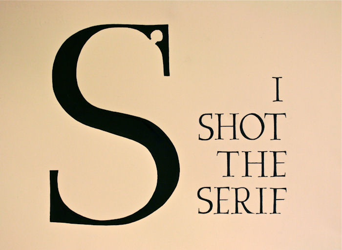
Week #31
This work was done by Linda Floyd in Nashville this year for the third session
Pressurized and Drawn Romans, in "26 Seeds: a Year to Grow". In her own words:
We were knee deep in Romans when I came across this quote on the internet. I
wish I could claim it, but I will have to say I laughed out loud when I saw it
and knew I wanted to make it for homework. The quote is a play on words from the
old Eric Clapton cover of Bob Marley's classic "I Shot the Sheriff (But I Did
Not Shoot the Deputy...)." Given my intimidation of Romans, it expressed my
feelings perfectly at the time.
This was a great exercise in drawn Romans for a beginner like me. First I
plotted the large 'S' on grid paper, playing endlessly with the placement and
structure of the bullet hole. Once I was satisfied I traced the 'S' and placed
it on my waxed layout paper. Next came the 1 inch Romans, which I drew on my
layout paper, traced, cut out separately, and experimented with various
placements around the 'S.' I was happy with the dropped, right justified design,
so I traced the whole thing. Next I used Saral to transfer to a large piece of
Arches Text Wove. I used Sumi ink and a brush to paint the large 'S', and a
Mitchell #2 to VERY CAREFULLY write the 1 inch text. Whew. Talk about nervous!
Then I used my trusty EF66 to make the serifs, fill in all the ragged edges, and
shape up the large 'S.' The whole piece is approximately 11"x 13".
For something so simple looking, I learned a great deal. This was the first time
I had played with layout on waxed paper, the first time I had used Saral
transfer paper, the first time to draw Roman letters, and the first time to use
an EF66 for exquisitely detailed (and much-needed) touch up.
Now if I could just get that song out of my head...
* * * * * * * * * * *
Week #32
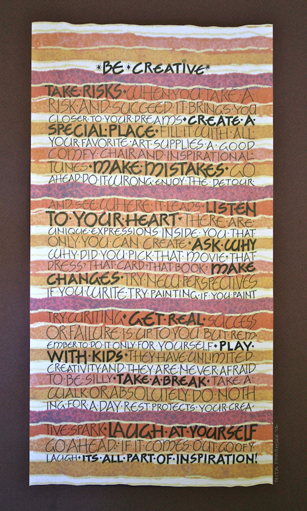
This work was done by Nita Padamsee in Boston this year for the first session of
"26 Seeds: A Year to Grow", Monoline Romans.
In her own words:
This piece which is 7" X 13.5", was done for the first month's assignment for 26
Seeds.
I was at the store Paper Source looking at paper for another homework
assignment,
when saw this vibrant wrapping paper. Of course I had to buy it!
On my return home, against the bookshelf in my daughter's room, I came across
this poem. Inspired to "Be Creative" I decided to use it as my background.
Being recently introduced to Neugebauer's work, I chose to use this style for
the mono line lettering.
The background was enlarged to 300% on arches text wove and spray fixed before I
wrote on it.
Since the original wrapping paper was so vibrant, the contrast and brightness
needed some tweaking
(on the copy machine itself) in order for the letters to be legible.
I used a #2 Micron marker for the lighter weight letters and a Sharpie marker
for the heavier ones.
I have to give my son credit, as he came up with a math formula that
helped me fit this poem in the line length that I had set.
Yeah! all those math lessons are paying off!!
* * * * * * *
Week #33
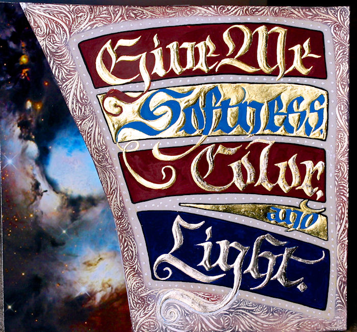
This work was done by Victoria Lansford in Atlanta this year for the third
session, "Illumination on Vellum". In her own words:
One of the challenges I face as a metalsmith is the often monochromatic world in
which I work. The shininess of the metal and the gorgeous colors of patinas and
stones don't happen until the very end of a piece, so the matte gray (silver),
yellow (gold), or orangey pink (copper) of my metal is the only one I can play
with for weeks or sometimes months on a single work of art. In a fit of
rebellion, I once wrote the illuminated sentence and had drawn the Fraktur
letters with the idea of making it into a copper book cover. As I began
imagining ideas for a Codex Aurius inspired piece, the sketchy form, taped above
my drawing, table jumped out at me to be illuminated.
The top layer is a calfskin vellum off cut. I altered the design to curve in a
way that fit the odd shape as well as to soften the rigidity of the blockiness.
I laid 2 layers of gesso under 2 layers of Instacol. "Give Me," and the negative
space of "Color" and "and" are 23k gold, a layer of patent leaf, topped with a
layer of loose leaf. "Light" is 22k Moon Gold. After gilding "Color" I used a
tiny piece of SotchBrite pad to randomly sponge on a thin layer of Instacol over
the 23k gold and gilded again with Moon Gold to give the word a shimmery effect.
The blues, reds, and blue-black outlines are dry pigments. I laid a line of
masking fluid around the whole design and sponged Diane Townsend pastels between
the masked line and the edge. The flourished filigree and the dots between the
outlines are Finetec gouache with pointed pen.
The image behind the vellum is a Hubble photograph of the Orion Nebula, one of
my most favorite things in the universe because of its colors and shapes. In
order to keep the piece from looking too flat, I mounted the vellum to Bristol
Board with PVA behind the opaque areas to build up the thickness of it before
adhering the photograph.
The size and square shape of the piece (7" x 7") were dictated by the
requirements of the Participants' Exhibit at the recent Calligraphy Northwest
conference in Portland. I was just lucky that piece of vellum would work. Alas,
the then not quite finished piece traveled across the country and back with me
without being completed or hung. Working on it after the conference was good
therapy. Sometimes odd constraints push creativity in positive ways even when
they turn out not to have been necessary.
* * * * * * * * * *
Week #34
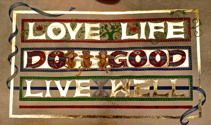
This work was done by Maria Turk in Atlanta this year for the third session
"Illumination on Vellum" in PRIMITIVE TO MODERN. In her own words:
“Golden Rules"
Codex Aureus is Latin for Golden Book - my mind translated this to Golden
Rules…. I was contemplating that this would be my first true piece using gold on
vellum and I wanted something important and lasting to design for it, something
worth having as a constant reminder - my own “golden rules” to live by. For two
years I have been on a personal journey of self-improvement, a search for a new
direction to use and improve my artistic skills, and trying to be mindful to
enjoy the ride along the way. Coincidentally this timing paralleled with Reggie
Ezell’s classes. As I looked for a quote that would bespeak my quest, I
discovered Kevin Ngo’s motivational quote, “Love Life. Do Good. Live Well.”
Simply stated, this summed it up.
I prepared the 6" x 9" calfskin vellum using an orbital sander and 220 and 400
sandpapers. I created a layout similar to the Codex Aureus exemplar but with a
modern twist – starting with pressurized roman letters, but then enlarged and
redefined the shape in my own style. The tree of life, monkeys, and the hour
glass were found in clip art then reduced to fit. The gilding was completed
first, using Instacol and 23 kt. patent gold leaf. I carefully protected the
gold by covering it with tracing paper while rendering the remainder of the
design with a very fine Grumbacher 000 brush, an EF66 nib and a Hunt Globe Bowl
Pointed 513 EF nib using W&N watercolors and Dr. Ph. Martin’s Bleed Proof White
Ink. (I had recently taken a watercolor journaling workshop which may have
helped me refine my detailing skills on the monkeys!) Straight edges were
accomplished using a ruling pen, parallel bar and triangles.
The red, blue and green borders around the words mimic Ngo’s favicon (favorite
icon) from his personal logo. The designs I chose for each set of words had
symbolism too:
LOVE LIFE - The Tree of Life idea came from Reggie’s suggested movie “The
Fountain”
DO GOOD - The monkeys speak for themselves
LIVE WELL - The hour glass symbolizes Time…Live Well before we run out of it!
* * * * * * * * * *
Week #35
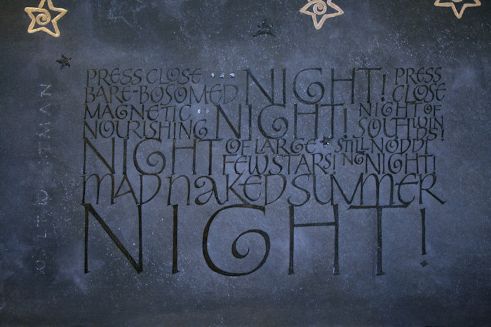
This work was done by Lydia Batten in Boston this year for the third session
Roman Variations in 26 Seeds: a Year to Grow.
In her own words:
I set out to work on black paper, since I hadn't finished that part of the
homework for the June session and still wanted to do it. After finding the
Whitman quotation about summer for our Vermont Study group's July project, which
coincidentally suited itself to black paper, I set out on my 'journey' to a
finished piece. I started on white paper for practice and layout of built up
Roman caps (based on what we had played with in the June session and what I was
finally reconnecting with from previous studies), then moved to black Strathmore
Artagain paper, and then finally, the Arches Cover black. Somewhere along the
way I decided I wanted to write black on black to give emphasis to the stark yet
rich description in Whitman's poetry. I settled on Ziller's Glossy Black (all
the blacks I tried looked great wet, but then, sadly, dried flat...). Since part
of working on black paper is to lay down a layer of white first and then apply
colors atop it to make them 'pop', I wondered if this would also hold true for
black???? Experiments and models followed--several of them! I started out on the
Arches cover and immediately made a mistake--as usual! When I tried to scrape
it, the paper looked so gouged, I scrapped it. And besides, it seemed to
uniformly black. Hmmm, what else did I have for 'black' papers???? I began
rifling through the drawer with my hoarded pile of paste papers from years gone
by and found this sheet of black Ingres (I believe) paper on which I had
attempted a 'night sky' motif. But honestly it was the most hideous paste paper
in the collection--truly awful--what made me think that white and pink were good
colors to use on black paper for a night sky???? And as I was preparing to put
it away, I noticed quite by chance, some interesting bleed-throughs of the white
color from that hideous front appearing on the back side. This bleed-through
created the subtle changes in black that I had seen in my head, and even the
star rubber stamp images I had pressed into the front faintly appeared on the
back too, only much more subtly--I experienced a moment of serendipity! I had
found my piece of paper! So, this piece measures 12 1/2" x 17", which, I
believe, is a half sheet of Ingres paper (within the 11 x 17 I had originally
intended for the project).
I spray fixed the back side of the paper, laid down the guide lines, mixed up
the white gouache, took MANY deep breaths, then using my drafts as models, began
lettering! I used Mitchell 4 nib for the smaller lettering, Mitchell 3 for the
mid range size, and Mitchell 2 for the last word 'night', all the while
combining both double stroke techniques and pressure to get the effects I
wanted. It looked great. I sprayed again, then began applying the Ziller Glossy
black with the same series of nibs and strokes (this was much more time
intensive). I even surprised myself at how nice it looked. When I came back the
next day I saw that the black had crackled... it looked like distressed leather
and I thought it would add texture, until, after handling the piece and doing
the gilded stars, I saw that the black crackles were flaking off here and there
(I think I laid the gouache down too thick underneath). That's when, in
frustration, I walked away from the project... and when I came back a few weeks
later I did what I knew I had to do--spray fix and add another coat of black
(another 2 1/2 hours of work). It paid off though. Then I added more stars,
another gilded one using the dame Moon Gold, on top of two layers of Gesso and a
coat of Instacoll (I had four and was promptly told it had to be an odd
number--4 was the number of death in Japanese design...yikes), and some smaller
ones that I applied using a combo of black gouache and WN Iridescent Medium
mixed in on top of which I applied Liquitex Pour Acrylic Gloss Medium to give
them some shine. The dots in the first lines I created with Golden Glass Bead
Gel and a toothpick. Walt Whitman's name on the left side of the lettering was
done with the same black/iridescent mix I had used on the stars with a Mitchell
5 nib. I opted to not use the Pour Acrylic on the name--it was too viscous to
apply and I wanted the name to be more subtle.
What I learned: yes, white underneath does make the black pop on black paper
(just use it a bit thinner); using spray fix during HUMID weather causes
problems (if only I'd read the caution on the label!) which this time were to my
benefit--the small random flecks of white here and there when I sprayed that
second coat on a really hot, humid day created the night texture I was seeking
but 'ruined' the pure blackness of the Arches Cover I also sprayed; perseverance
pays off, especially in light of unexpected difficulties, and contributes to a
very worthwhile learning experience!
* * * * * * * * * *
PICK OF
THIS WEEK - 2012
* * * * * * * * * *
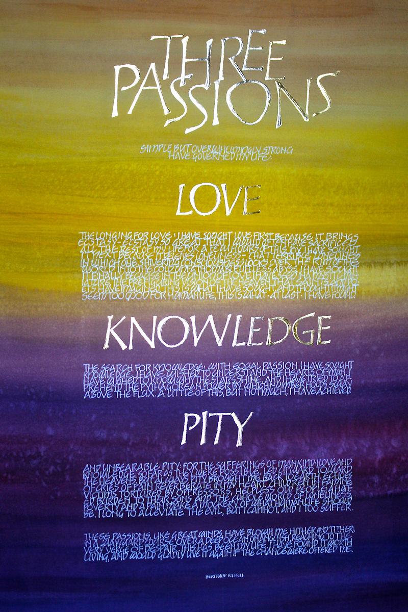
Week #36
This work was done by Dan Mooney in Boston this year for the third
session Roman Variations in "26 Seeds: a Year to Grow". In his own
words:
The "Three Passions" piece is
20x30, 24k patent gold and moon gold on top of 3 layers of
Instacoll on 110 lb. Farbiano HP watercolor paper. The
background is a watercolor wash. I decided to do a bright to
dark gradient in the background to enhance the emotions of
"love" to "pity". There were no feelings connected to the words
of this piece for me.
This was an exercise in discipline and letter form. Realizing
that this piece would be one of those pieces you glance at and
not read the entire text, I decided to use gold Roman caps to
grab attention to the piece and how they danced with the color.
For the long text, I used a Uniball Signo broad pigment pen
because it is so easy to work with. The layout was done with
In-Design on my mac to achieve the justified borders. |
This is actually the second
version of this piece. The first background was a mixture of the
same colors mixed with a thin coat of gesso for some texture and
covered with acrylic mediums and a glazing medium. It was
beautiful and very shiny. When I applied all the gold on top of
the 3 layers of instacoll, it became a lesson on how nicely gold
sticks better to a glazing medium than to Instacoll.
Several attempts to remove the stray gold was pure frustration,
so I recreated the second piece with background colors using
just watercolor, and sprayed with a coat of fixative. Mistakes
make me learn so much. |
|
* * * * * * * * * * |
PICK OF
THIS WEEK - 2012
* * * * * * * * * *
Week #37
This work was done by Nancy Galligan in Boston this year for the third
session "Roman Variations", in 26 Seeds: a Year to Grow. In her own
words:
The actual
size of this piece of Arches HP watercolor paper is 15" x 18". I
had painted the watercolor background onto it years ago. I used
gouache for the writing as well as the symbols which have some
Schmincke gold added for pop. I used three Speedball B nibs -
#2, #4, and #6.
I chose this piece of paper for this homework assignment because
of the three distinct colors choices predetermined by the
original watercolor wash! It was a challenge to match gouache to
the watercolors of the background but the biggest challenge was
to figure out how to get this massive amount of text on the page
in a pleasing, legible, attractive manner.
I originally thought to write with guidelines but found them too
constrictive/restrictive. The letters seemed stagnant to me and
I decided to write without guidelines which, I hoped, would
result in the liveliness and movement that I imagined for the
piece.
|
I worked my way around and down
the page, feeling pretty satisfied, until toward the end of the
quote, at about the word LIFE, my paintbrush ejected a big blue
blob of paint (where the lower left symbol is now located).
Blotting, scraping, erasing - nothing removed it. I finished the
quote and set it aside, pretty discouraged.
After a period of time, I came back to it and thought of
symbols, a la Koch, as a means to cover the blob and chose some
Native American symbols of life, home, hearth, etc. To balance
the design, I drew a few to move and dance across the page. I
traced the symbols onto the Arches with the Saral transfer paper
and painted them in with gouache and the Schmincke gold with my
Princeton Monogram brush. |
* * * * * * * * * * |
PICK OF
THIS WEEK - 2012
* * * * * * * * * *
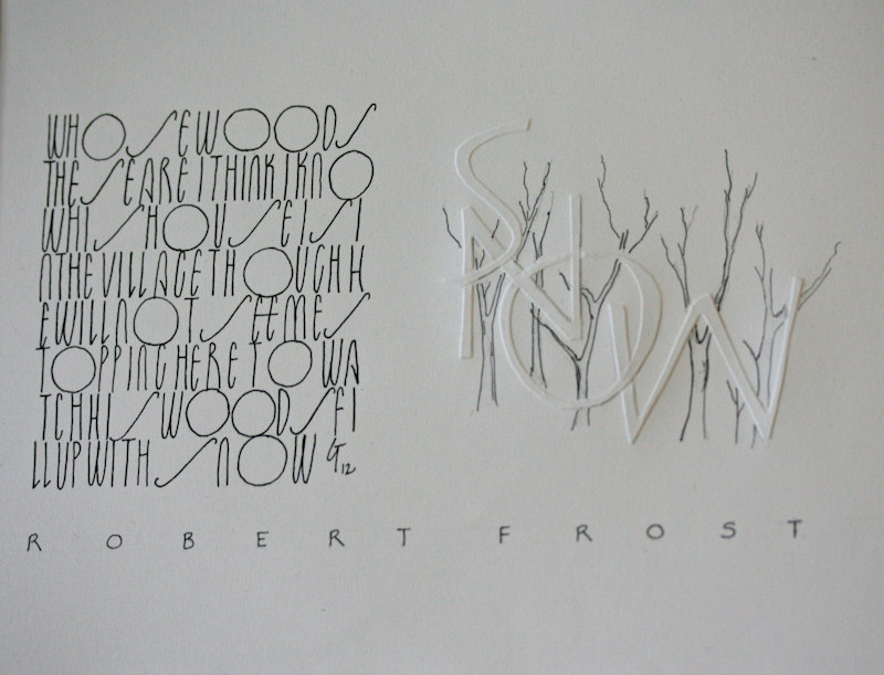
Week #38
This work was done by Gail Turgeon in Boston this year for the third
session "Roman Variations",
in 26 Seeds: a Year to Grow. In her own
words:
| This piece was completed
as part of the homework for session 3, Roman variations. I liked
the monoline font of Hans Burgert in which the S's "recline" and
the O's are voluminous compared to the other letters which are
quite compressed. I penned the first stanza of Frost's "Stopping
by Woods on a Snowy Evening" using this font. For contrast and
to balance this block of writing, I embossed the word SNOW,
using letters created by Tom Perkins.
|
Then I penned trees
"behind" these embossed letters. I liked that the calligraphy,
especially the embossing, reinforced the poem's meaning. The
large SNOW filled up the space around the penned trees (the
woods). Lastly, I wrote the author's name across the bottom to
unify the work. All of the writing and drawings were done with a
01 Micron pen. |
|
* * * * * * * *
|
PICK OF
THIS WEEK - 2012
* * * * * * * * * *
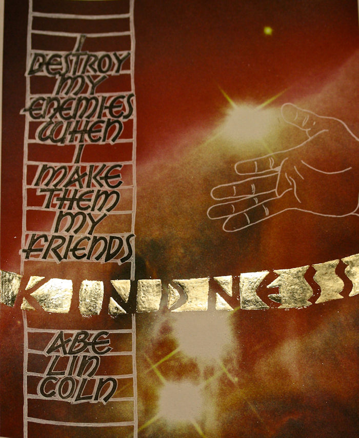
Week #39
This work was done by Michael Smith this year in Atlanta for the third
session "Illumination on Vellum" in
PRIMITIVE TO MODERN.
In his own words:
Using Reggie's 'great tip' of downloading free "fantastic"
images from the Hubble series, I found an image that simply held
my attention for its grouping of elements, and still had a
relatively consistent color range. I had come across the Abraham
Lincoln quote earlier, and wanted to use it in an appropriate
setting.
As we were exploring the design techniques of Codex Aureas for
home work, I printed the Hubble image on Canson 90 lb drawing
paper at 8 1/2" x 11" and spray fixed the ink-jet print before I
started.
The line breaks were worked out with several "dry runs" until I
found the one I liked best and the size to make them. The ladder
was transferred to the print using Saral transfer paper, then
the main body of text written out in the Neugebauer style
monoline caps using a Speedball B-series pen and Moon Palace
sumi ink. |
Afterwards, the letters were 'sharpened-up' with a Brause EF66
nib. Dr. Martin's Bleed Proof White was then used to outline the
letters and create a drop-shadow for them, as well as an outline
for the ladder (around the Saral transfer line). These were then
filled in with white color pencil, which just defined the
letters and made them jump off the page.
I needed a simple image to represent KINDNESS, which was my
theme, so I took a cell-phone pic of my hand and created a line
drawing of it, which I sized and transferred (with Saral) to the
print. Dr. Martin's B/P White was again employed to make it pop.
K-I-N-D-N-E-S-S was written out between two upward curved lines
(to suggest a warm smile) with the negative spaces creating the
solids. I then laid down Instacol in these areas to accept the
lighter Lemon Gold (loose leaf) that I wanted to use. (I have to
admit that I waited too long to apply the gold leaf and had a
hard time making it stick.) Nevertheless, I was pretty pleased
with the end result.
p.s. I would never have believed that such a "seemingly" simple
piece would have so many moving parts, and be as demanding as it
was. Great lesson... it looks simple!!! |
* * * * * * * * * *
PICK OF
THIS WEEK - 2012
* * * * * * * * * *
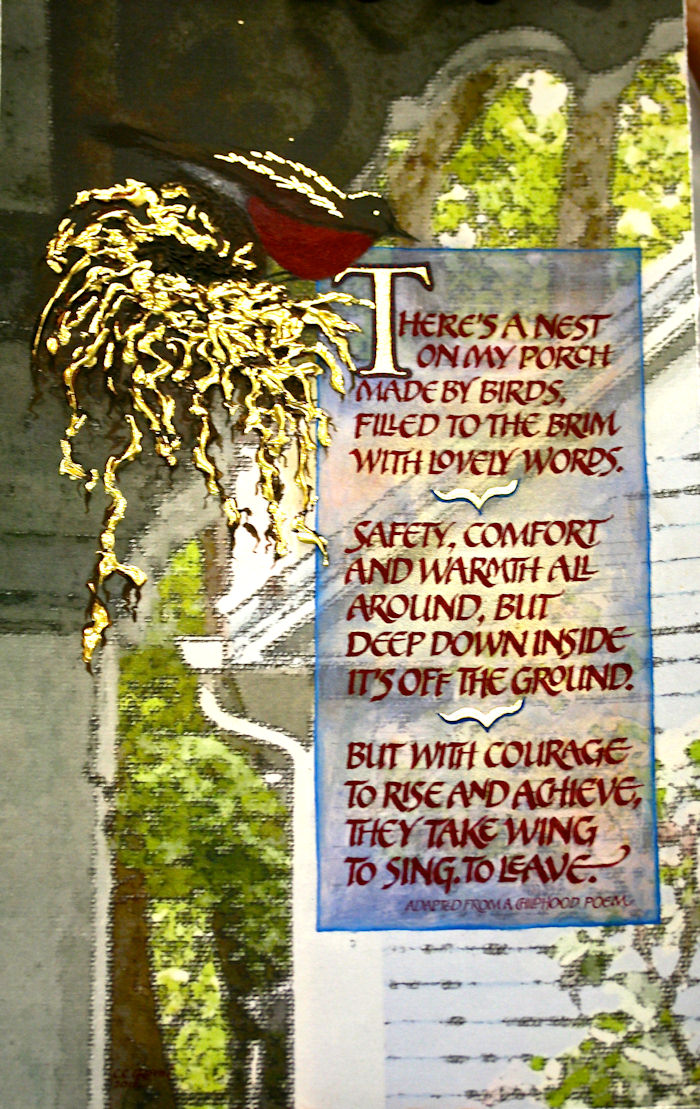
Week #40
This work was done by Claire Griffin
in Boston for the third session "Roman Variations" in
26 Seeds: a Year to Grow. In her own words:
I did this piece as an assignment for gilding on a sculpted
base, but as one can see, that empty nest thing was clearly on
my mind. Earlier this summer, as if to hammer the nest thing
into my brain, a lovely robin built a nest which was perched on
above a post on my back porch. Everyday my college bound
daughter and I would check on the babies waiting to hatch, much
to our enjoyment.
One morning as we were heading out for another round of dorm
shopping I caught this moment. The mother robin was just leaving
the nest to pickup some nice bugs or berries for her little
hatchlings. I grabbed my Iphone (love that camera feature!) and,
much to my delight, captured the image that became the
background for this piece.
I loaded the image into Photoshop and manipulated the color and
texture to enhance it. Printing it on a nice parchment and a
nice spray of fixative was the next step. Then came the layout,
which was a challenge. I knew I wanted to gild the nest, so I
got out the Golden Texture Medium and built up a base on which
to lay my instacoll and 24k gold leaf.
|
I wanted the lettering to go to the right of the porch pillar,
but had to improve the background to hold the letters better.
Out came the pastels and my sandpaper. I masked the area around
where the letters would go and created a more muted section with
those magical pastel powders and my trusty cotton balls.
Success!
Now for the gouache and a mitchell nib to do the calligraphy, a
bit of a poem from my childhood that I adapted to fit my
message. Finally I enhanced the robin with a little gouache and
a touch of gold leaf. Finished.
This piece is near and dear to my heart, almost as much as the
days raising my daughters, who have flown into adulthood before
my eyes. Thanks for looking. |
|
|
* * * * * * * * * *
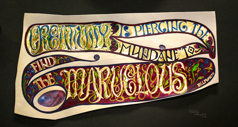
Week #41
This work was done by Victoria
Lansford this year in Atlanta for the third session
"Illumination on Vellum" in PRIMITIVE TO MODERN.
In her own words:
"Piercing the Mundane"
The beauty and complexity of illuminated manuscripts are what
have made me always want to learn calligraphy. After Reggie's
"Codex Aurius" session, I was at long last able to dive into the
process like never before.
Among Reggie's handouts was a copy of an 8th century Spanish
manuscript page that was filled with wild vines and animals,
wrapped around drawn undulating letter forms. I couldn't stop
looking at them and wanted to create my own set of letters based
on their quirky lusciousness.
I started with the word 'creativity' as an exercise. When it
turned out well, I began looking for quotes in which I could use
the design. (Yes, a backwards approach!) I discovered Bill
Moyer's quote, "Creativity is piercing the mundane to find the
marvelous," and knew instantly on what piece of "pierced"
calfskin vellum it would be perfect.
My obsession with drawing the word 'marvelous' in this style
kept me company on a long day of rerouted travel after teaching
out of town. (Drawing letters is a great way to forget I'm
nervous on puddle jumpers.) Many layout sketches. and many many
hours later, I had the design that had seemed to come together
so quickly in my head. |
In my eternal quest for smooth gilding (I'm a metal smith even
when I'm working in leaf), I applied a slightly heavy coat of
gesso, a coat of Rolco gilding base, and a layer of copper leaf.
On top of the copper leaf I applied a coat of instacol, a layer
of 23k patent gold and a layer of 23k loose gold leaf. The idea
of gilding twice came to me when I had to correct a mistake on a
previous piece and noticed how much smoother the result was when
the instacol was laid over leaf. I highly recommend this method
if you have an extra 3 days to spare. I might even try it again
myself one day.
The colors are a combination of dry pigments and watercolors
with egg to add a little glossiness and more permanence. The
images, showing through the windows in the vellum are from a
NASA photo of the Lagoon Nebula with a bit of Photoshopping. I
attached pieces of Dura-Lar over the areas of the photo that I'd
selected and cut out and then painted light watercolor washes on
the film to enhance the depth of the images' colors and make the
windows look less like I'd stuck photos behind them
I mounted the vellum with acid free foam core spacers behind the
opaque areas and then to a sheet of Art Again paper. I slid the
window images underneath and attached them with archival
mounting tape.
It was an intense labor of love but one which makes me want to
do more. |
* * * * * * *
~~~~~~~~~~~~~~~~~~~~~~~~~~~~~~~~~~~~~~~~~~~~~~~~~~~~~~~~~~~~~~~~~~~~~~~~~~~~~~~~~~~~~~~~~
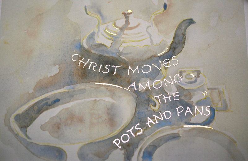
Week #42
This Work was done by Eileen McAllister in Boston this year
for the third session "Roman Variations"
in 26 Seeds: a Year to Grow.
In her own words:
This piece was done in response to #1 in the assignments for the
third month of Reggie's 26 Seeds class. I found the St. Teresa
of Avila quote, "Christ Moves Among the Pots and Pans," a while
ago and thought I would like to do something with it for this
assignment. I pictured it as an illustration of pots and other
kitchen items with gilding used for the metallic highlights.
I experimented with small watercolor sketches and some minimal
gilding, but had trouble with the composition. At that point, I
was using hanging pot racks as source illustration material and
the imagery was too modern and floated in the rectangular frame
I pictured. I then saw a couple of beautiful black and white
photos of old pots and pans on a rugged stovetop by Dorothea
Lange in a book of mine, and thought the soft and reflective
mood conveyed in the photo matched the words of St. Teresa of
Avila.
Putting copyright concerns aside for the moment, I scanned the
photo, put it in Photoshop, did just a little bit of alteration
and printed it. I fixed the copy with workable fixative and
tried to gild, but had a terrible time with the Palladium. I
finally gave up and figured I'd bring it to class as is.
I then did a watercolor based on the black and white photo. I
had used yellow Saral paper to transfer some reference points of
the image. I let some of the yellow show through the paint and
liked the way it glowed through the watercolor. I used a limited
palette of WN cobalt blue and burnt sienna and when I was
satisfied with the painting, I scanned it and printed it on
Arches 90# cold press watercolor paper and fixed it with
workable fixative.
|
For the lettering portion of each of the tries, I used the David
Mekelburg lettering on page 13 of the third month's packet as a
guide. I first tried working from the Donald Jackson sample on
page 6, but thought the David Mekelburg letters gave me the
opportunity to put more "bounce" in the layout. I had worked
through the "How to Analyze a Calligraphic Hand" sheet, page 3,
and practiced with both before I settled on the Mekelburg
sample.
When I was satisfied with the lettering layout, I traced it very
lightly onto the prints using my lightbox. I applied the
Instacol and two layers of Moon Gold in stages, and had much
more success with the Moon Gold than with the Palladium. On the
watercolor version, I then gilded some 24 Karat looseleaf gold
onto a few of the highlight areas. I like the subtlety of the
gilding--I think it captures the simplicity and gentleness of
the quote.
I nearly gave up a number of times with this piece. I wrestled
with the imagery and the technical part of the work and felt
like I was going in circles most of the time, but I tried to put
pride aside and decided that doing bad job was better than not
doing it at all. In the end, I wound up with something that may
not be perfect, but gives me a lot of satisfaction and pleasure
to look at!
Materials: WN watercolors, Moon Gold, 24K looseleaf gold, Arches
HP 90# watercolor paper |
* * * * * * * * * * * * * * * * * * * * * * * *
Week #43
This work was done by Nita Padamsee
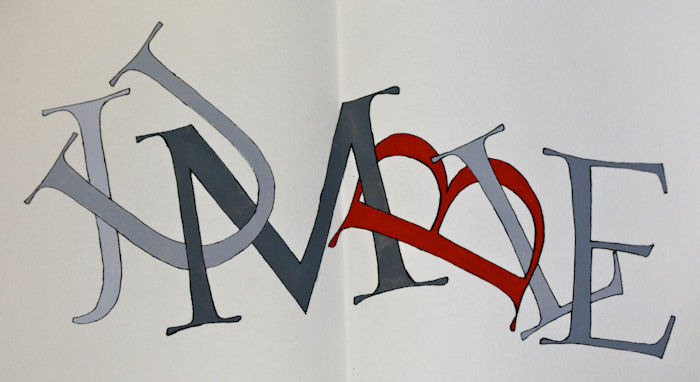
in Boston this year for the
fourth session "Carolingian and Variations" in 26 Seeds: a Year to Grow.
In her own words:
Bombarded by news about the shootings in Bengazi on September
11, 2012, I felt compelled to exemplify the convergence of where
East meets West.
The layout of my piece is often seen in Islamic manuscripts,
Qurans and broadsides throughout the Middle East and many parts
of the Indian subcontinent.
The assignment was done for month four of 26 Seeds, ‘Carolingian
Variations’, and is
16" X 12". The Carolingian script lent to the feel of an Arabic
script with its dense 'x' height letters, yet graceful ascenders
and descenders, which were improvised to look like those seen in
Arabic manuscripts. The Kufic script (Arabic geometric script in
gold at the very top) reads, 'In the name of Allah the most
beneficent the most merciful' from right to left. The large
medallion to the right, also in Kufic script, reads 'Allah', the
title of Longfellow's poem. The smaller medallions interspersed
within the text were traditionally used at the end of a verse or
paragraph.
The gold is 23K patent. The very top Kufic script, the large
medallion on the right and the three geometric patterns at the
bottom, were laid down with Instacol that was loaded into a
ruling pen and then filled in with a brush. The medallions
within the text were laid down with Miniatum ink.
|
The little floral patterns at the bottom were done with Dr.
Martin's Spectralite gold applied with a brush. The rendering
above and below the word Allah, were done with an EF 66 nib. The
three colors seen throughout the piece, simulating lapis,
turquoise and garnet, were all done with W&N gouache. The poem
is written on 90lb Arches HP water color paper. The paper around
the poem, which is called 'vellum' is from Paper Source.
Originating in the 18th century from a German poet and then
translated by and stylistically incorporated into Longfellow's
work a century later, this poem echoes the pluralism of the past
and offers hope for the future. The previous embrace of
intertwining cultures has become rigidly detangled, and this
piece seeks to recover a union by merging two cultures through
language - English words written with the feel of an Arabic
script. I pray that we may achieve peace through understanding
and respecting each others’ differences.
My daughter has always been my 'editor in chief' for all my
pieces here on Reggie's ‘Pic of the week.’ I am blessed with
talented and wonderful children and a very supportive husband. I
couldn't ask for anything more. Thanks for viewing my pieces. |
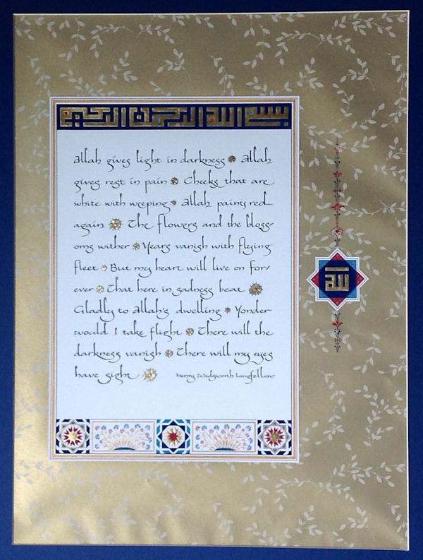
* * * * * * * * * * * * * * * * * *
Week #44
This work was done by Javier Alfonzo in Boston this year for the fourth
session "Carolingian and Variations"
in 26 Seeds: a Year to Grow. In his own words:
This project was created as part as the homework assignment for
Session #3 where the inspiration was taken while studying
Neugebauer Roman Caps. After I saw a sample book that Reggie had
brought into class, I decided to create my own "Neugebauer Caps
book". The simplicity of his strokes being just monoline, yet
highly contrasted by different weights and sizes inspired me. I
had done a few sketchbooks using Japanese and coptic binding
style before, so I chose the basic 4-hole Japanese stab binding
with a "twist".
These pages are part of the book acting as "End-papers" and
"Center Piece", which add a more interesting look to the design.
The pages of this manuscript are known as Iyoo Glazed Japanese
Hand-made paper, so to be able to work on them, guess what? I
had to apply spray fixative for more control of the ink and to
avoid bleeding :-) The End-Paper illustrations are based on the
work of Visual Artist Clara Liue, whose experiments with sumi
ink and washes captivated my attention; soon enough I began my
own experimentation with her so called "One-stroke brush", and
after many, many....many tries, I was able to improvise my
version of a One-stroke brush. |
Black ink stick was used, a medium size Japanese Brush made of
horse hair was previously damped in water, then half of the
brush was dipped into the sumi ink to accomplish the one-stroke
technique. To complement the design, I added a quote by Khalil
Gibran, "Rest in reason, move in passion" where only pencil lead
was used, the letter form is a Roman Caps variation.
As for the center page, my inspiration came from a previous
class with Peter Thornton based on textured letters. He had an
example made with different Roman Caps, obviously in pencil, but
I turned them into wreath of forms. I used Arches Black Cover,
and different tools and pen nibs, like Brause EF66, Mitchell #3
and #5, White gel pen and to provide a more delicate design, I
used Fine-Tec watercolor Gold to the outer ring Roman Caps. |
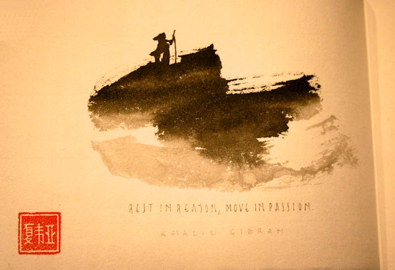
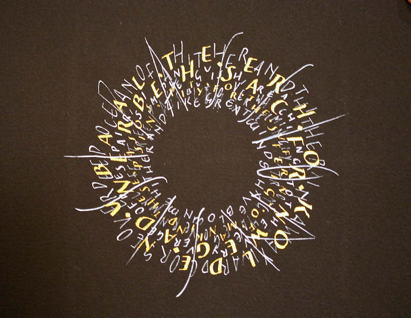
* * * * * * * * * * * * * * * * * *
Week #45
This work was done by Lydia Batten in Boston this year for the fourth
session "Carolingian and Variations" in 26 Seeds: a Year to Grow. In her own
words:
I have always been intrigued by this song, 'A Whiter Shade of
Pale', especially the stand-out refrain, ever since I heard it
as a young child. Recently, on my morning commutes, I called up
my Annie Lennox CD on my iPod, on which she recorded this as a
cover, and just enjoyed the song and sang along (when I could
make out the words). Then, I started thinking that this would be
great to do as a calligraphic piece… so haunting, so lovely, so
confusing… and then when I remembered the black-on-black piece I
had done over the summer, I thought this would be a great
complement to that: a white-on-white piece! Then I was really
intrigued…
Fast forward to Google and how easy it is to find lyrics
there--and they were strange, no wonder I could never make them
all out! Another click brought me to Wikipedia where I read some
background on the band, Procol Harum, whose two lead members
wrote the song, and even saw a music video' they did of it… (60s
flashback!) And another click brought me to background on
Chaucer's 'Miller's Tale'…
Now to the drawing board… Of the four stanzas in the original
song only two were actually recorded, but I wanted all four.
LOTS of text. Now how would I approach the white on white,
incorporate all the text, and capture the haunting, ghostly aura
of the song… I tried writing white on off-white charcoal
paper--looked pretty good, but not much contrast. So, based on
words in the song that refer to the sea, I took out a slate blue
sheet of Canson pastel paper and started to rub white pastel on
it. Funny how the pastel would NOT adhere to the pastel paper!
Nuts! How could I get a muddled white background????
|
In frustration, I took a China White Pencil and just started
writing in very loose cursive writing the lyrics of the song
until the whole sheet was filled up (thank you, Laurie Doctor!).
That pencil has a bit of wax in it so I wasn't sure if the white
gouache would lay down smoothly over it--no time to worry
because it was 'crunch' time, so I lined the paper with the Fons
Porter White graphite pencil, took some deep breaths, and just
started writing the lyrics using a compressed/pressurized
Carolingian hand, a Mitchell 5 and some Holbein Pearl White
gouache with a touch of white added. Yes, it laid down
smoothly!!!! Once dried, I spray fixed and waited till the next
day to continue. The large lettering in the center of the piece
was next. I used the traditional Carolingian hand, the Horizon
5/16" nib and white gouache mixed with Dr. Martin's. When dry, I
noticed it had crackled--again (this had happened on my
black-on-black project too--I'll figure that out later…). So, I
applied more to 'fill in' the cracks. Good, it worked.
The last lettering to go on was the cursive Carolingian. I used
the snipped EF 66 nib and WN Permanent white gouache for these.
I had originally intended to write these lines of the refrain
only once, between the large text lines. After I did that
though, I quickly realized there was too much open 'negative'
space left over. So, I decided to just repeat each cursive line,
(many deep breaths…) above and below the lines I had just put
down, and (thank you, Universe!), it all fit quite nicely on the
page. As much as I worked out closely some of the details of
this piece, there were equally as many 'details' where
spontaneity, reality-hitting-home, and just going for it came
into play! It's a great first try, and now that I've done it, I
have many more ideas on how to do it again…
I highly recommend listening to this song--it's actually one of
the all-time top rated rock songs in England today (thank you,
Google)! |
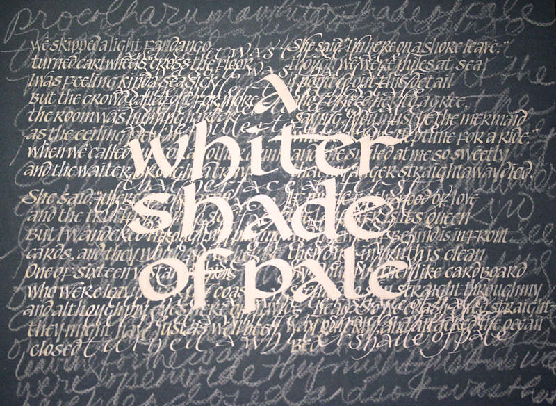
* * * * * * * * * * * * * * * * * * * * *
Week #46
This work was done by Carol Gray in Atlanta this year for the
fourth session PRIMITIVE TO MODERN. In her own words:
Reggie's Raucous alphabet has intrigued me from the beginning. I
find it very satisfying to do, with it's clean strong capitals,
easily stacked and with a bit of a whimsical look, when you mix
some of the alternative letters.
A client in Nashville had used the Rilke quote as her tag line
and I just loved it. I decided I would try lettering it as a
gift to myself and to her. I started playing on layout paper,
using 4 different sizes of the Speedball B series nibs. Although
I wanted the lines centered, I thought they might have more
energy if they weren't completely straight, so I tried lettering
with and without guidelines.
|
Reggie has shown many beautiful examples of lettering done on
grids, and I thought the lines might help the design, so I drew
those in in pencil to see how it looked. I also did a larger
version on a sheet of 18" x 20" arches text wove, without lines,
to play with later.
I remembered that I had some color copies of photographs of the
night sky over Utah's canyons, by Salt Lake City photographer
Royce Bair. I pulled out one of those and used it to make the
image that you see here. It is 8 1/2" x 11".
I considered all of this to be work in progress, but during our
class critique decided to share what I had and was encouraged
enough that I think I will continue to play with it. |
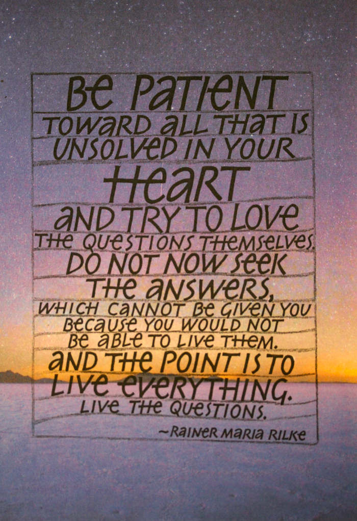
* * * * * * * * * * * * * * * *
Week #47
This work was done by Nita Padamsee in Boston this year for the fourth
session "Carolingian and Variations" in 26 Seeds: a Year to Grow. In her
own words:
This assignment was done for month three of 26 Seeds, ‘Roman
Variations’ and each panel is
5" X 7". A common saying found on mugs, magnets and
t-shirts, emerged from its 2-dimensional encasing, with each
anchoring word taking on its own personality in this piece.
Liberated from a previous monotony of font and a lack of
dynamics, I provided each word a distinct character, in hopes of
invoking particular emotions associated with the words through a
play with color, script, texture and dimensionality.
The word 'DANCE' was originally done in gouache; however,
drawing inspiration from Nancy Galligan's cut-paper alphabet, I
implemented this technique and re-did this panel using shapes
cut out of paint samples from Home Depot. The thickness of the
samples lends itself to the effect of relief letters, thus
exemplifying the silhouettes and movement of dance. |
The word 'LOVE' was rendered with 'Inktense' watercolor pencils
in Neuland script.
'SING' was done with Moon Palace sumi, emulating Tom Perkins
letters, and the background was done in Inktense also.
'LIVE' utilized the lively lettering of the Belgian calligrapher
Liesbet Boudens done in Moon Palace sumi and the the background
was rendered with Cotman pan watercolors.
The paper used is 140 lb HP Arches watercolor. In order for the
black ribbon not to show through the paper and to make the piece
a little sturdier, black card stock was adhered to the back.
This piece was so much fun to work on. Thanks for viewing my
pieces. |
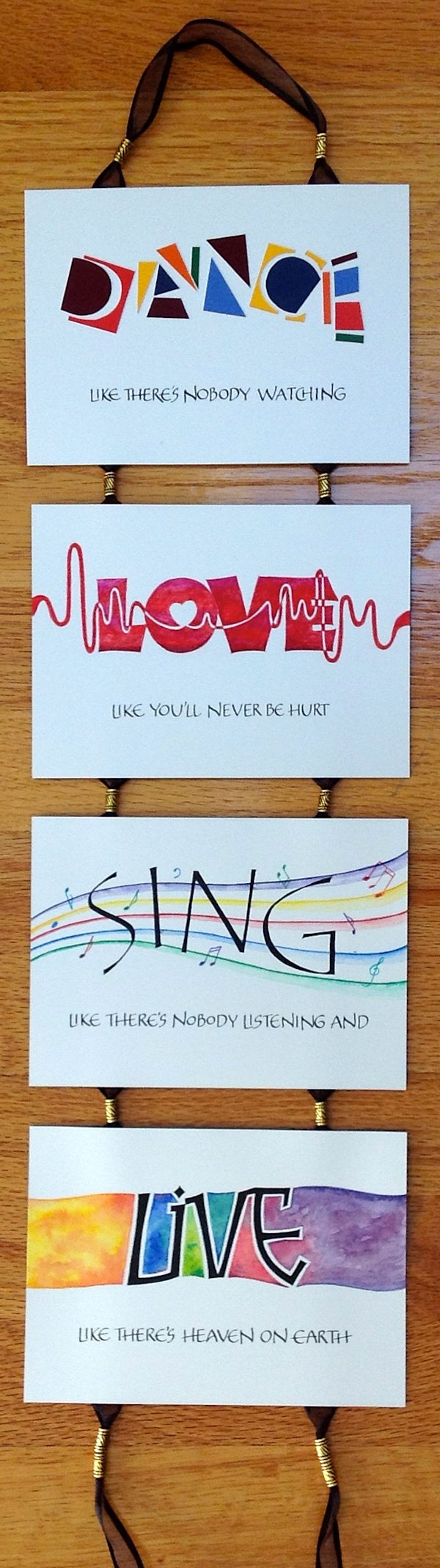
* * * * * * * * * * * *
Week #48
This work was done by Dan Mooney in Boston this year for the fourth
session in PRIMITIVE TO MODERN.
In his own words:
For many months I had been thinking about the concept for this
design. I wanted to construct a tree made from a collection of
words that describe the aspects of a loving relationship. The
challenge was two fold. First was the placement of the words to
actually look like a tree without drawing a tree, and the second
was the lettering choice.
After months of roman lettering classes, this design did not
look very good in all caps, so when the assignment was to create
a piece using a variation of carolingian/foundational, this was
perfect. The leaf design is a result of about a dozen or so leaf
sketches. I wanted simplicity, so decided on a pointed oval
shape placed somewhat randomly between the words. The tooling on
each gold leaf is done with a sharp stylus and the area around
each leaf is de-bossed with a rounder stylus to make each leaf
look even more raised. |
The words were written with black stick ink. The leaves are 24k
gold on instacoll. The background is a watercolor wash on
Fabriano HP watercolor paper with a bit of pearlescent powder
through the dark green watercolor section. Because of some
unfortunate results in the past, I learned how important it was
that the color background needed to be sprayed thoroughly
several times with fixative before any lettering or gilding was
done. As a result, the gold only adhered perfectly to the
instacoll and not at all on the background. That lesson alone
was one of the most valuable lessons I learned from this class.
Thank you Reggie! Finished size is 18"x24" |
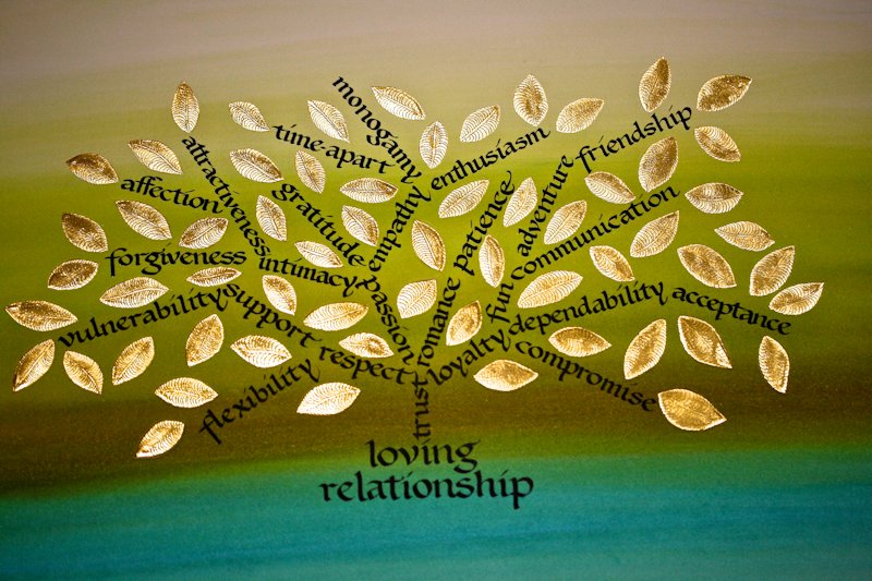
* * * * * * * * * * *
Week #49
This work was done by Carol Hall in Nashville this year for the fifth
session “Italic and Italic Variations, in
26 Seeds: a Year to Grow. In her own words:
|
This piece was done for the homework for Session 5, a short
quote in three italic variations. The quote is by Mary Oliver,
whose poetry I have grown to love through her introduction to me
in Reggie's class. The materials are Arches Black Cover paper,
dry pigments: Titanium White with a tiny bit of Cobalt
Turquoise, and Cadmium Red #2, and a Mitchell #4 nib. |
The alphabet I fell in love with for this
piece was constructed from Reggie's handout with the quote "The
spirit of man is the candle of the Lord." My challenge was to
come up with the w, u, and y, which were not in the quote and
although I begged Reggie to help me, he simply replied, "You can
do it!." And so I learned. 8” x12”. |
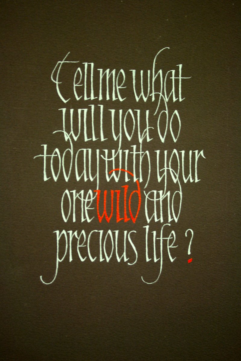
* * * * * * * * * * * *
Week #50
This work was done by Meshelle Callahan in Atlanta this year for the
fourth session of PRIMITIVE TO MODERN. In her own words:
This is a homework piece done for Reggie’s Primitive to Modern
5th month class. After experiencing a busy weekend packed with
excellent instruction on this design process, I could not wait
to get started with my homework. The quote was chosen with my
two kids in mind. I was blessed for many years to wake up each
morning to the beautifully peaceful sound of little voices
singing from their cribs. As my children grew, I continued to be
blessed with morning melodies, a voice echoing from the shower,
or exuberant singing in the car. I knew early on that music was
engraved in each of their souls. My childrens’ love of music is
still booming and reflected through the instruments they play.
This 11” x 17” piece is lettered with a B3 nib using Moon Palace
sumi ink and a Pentel Hybrid Tehnica pen. After lettering the
quote, copies were made and edges cleaned up. Eventually more
copies were made at different sizes onto transparency film. I
cut the words from the transparency and rearranged the various
sizes of words according to my vision. I then focused on colors,
textures and images I wanted in the piece. |
The cd of stained glass images given by
Reggie provided an excellent source to choose from. I was
especially excited to use one image in particular from the cd
that had a look similar to the wood grain of a guitar.
My goal for the piece was to make it very vibrant and bold and I
felt this was mainly accomplished through the color scheme I
focused on. I then needed to make my own backing to adhere the
design to. I did not have a waxer and instead used
repositionable glue made by Modge Podge. It worked well but did
have a little bit more tack making it hard at times to
reposition without tearing the paper a little. Although the glue
worked fine for the purpose, a waxed background would have been
ideal. Once I finished designing, cutting and rearranging like a
crazed fool, I kind of went nuts with the hot foil pen adding
gold and metallic blue dots emphasizing the instruments. I love
this tool! I felt the use of it really gave the overall piece
that added lift needed to accomplish the bold and vibrant
statement I was working towards. Thank you to Reggie for the top
notch instruction, tools, direction and vision! |
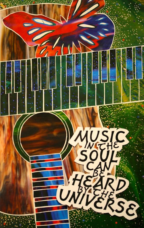
* * * * * * * * * *
Week #51
This work is by Victoria Lansford this year in Atlanta for the third
session “Illumination on Vellum” in PRIMITIVE TO MODERN. In her own words:
|
Before I was able to learn Fraktur from Reggie I taught myself
the hand based on exemplars from various books and then lettered
this personal declaration on a 7 foot span of wall in my dining
room. The letters were definitely quirky and the spacing a
little challenging, but the flourishing made me happy. When I
began the homework for the Gilding session, I decided to
recreate my design on a smaller scale with the style of Fraktur
that I had learned more formally in the Modernizing Blackletter
session. |
The calfskin vellum off cut is 7" x 4-1/4" and lettered with
Indigo stick ink, using a goose quill. I used two layers of
instacol for the flourishing and gilded with 23k patent gold
leaf. To make the gilding pop I drew around it with Derwent
metallic water soluble pencils and blended the colors with a
Pentel water brush. The back piece is matteboard that I covered
in metal leafed washi paper. I embroidered the vellum to it with
silk button hold thread using a chain stitch. |
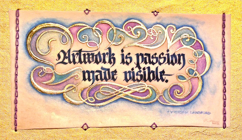
* * * * * * * * * * * *
Week #52
This work was done by Maria Turk in Atlanta this year for the fifth
session “DESIGN: Deconstructing the Grid” in PRIMITIVE TO MODERN. In her own
words:
“Seed of Love”
Inspired by the P2M Month 5 class on Stained Glass Backgrounds,
I first worked out several small sketches that would go with
quotes I was considering. About the same time, I happened to
take a local one hour art class that led me to create a stained
glass effect on black paper using colored pencils.
I continued to dabble with my small original designs but using
the black paper and colored pencils. These were all small
sketches, only 3x5 inches, but they gave me the courage I needed
to get started on the homework assignment!
My initial concept was to have the piece look like stained
glass. I researched designs from the Arts and Crafts period, as
well as the shapes of the glass pieces in those designs. I also
researched styles of lettering that were popular in that time
period. I found several styles which I practiced until I decided
on the one to use with the piece.
I started by asking for permission to use a photograph of a
sunrise taken by a friend in Ohio. The colors looked like the
jewel tones of stained glass and were perfect for my “sky”. I
cropped it using Adobe Photoshop Elements 6.0 creating a
vertical or “portrait” image from a landscape image to make it
fit my 11 x 17 layout. While the top third of the photo was
perfect for my design, I needed a different image for the bottom
third to create the “ground” the seed was planted in – something
with interest and texture. |
I found it in a photo of real stained glass that Reggie had
provided for our optional use. I saved the images on a
flashdrive and had the local copy center print them at 11x17. I
laid tracing paper over the enlarged photos and sketched until I
achieved a stained glass effect.
I sprayed repositionable stencil adhesive on thick black paper
to use as the background. A light table enabled me to copy the
design onto the enlarged photos with a Sharpie. I used a #11
Exacto blade to cut out all the shapes and stick them on the
black paper background.
The quote and the heart were added last, just before
photographing. They are raised with foam core board strips to
float the words above the piece and create shadows. The
lettering was done with a B-3 nib and Sumi ink on graph paper,
then cleaned up with micron pens, printed out on Transparency in
multiple sizes and “played with” until I felt comfortable about
the layout – then copied onto cardstock, and cut out with an
Exacto.
After the final photo was taken, I enhanced the yellows slightly
in Photoshop to give the heart further definition. This homework
assignment was really fun, and I shall be ever grateful to
Reggie for sharing this process! |
* * * * * * * * * *
THE END!
Go to All Picks for 2013
The answers to most of your questions regarding PRIMITIVE
TO MODERN can be found through the main page at the web www.reggieezell.com
Reservations are now being taken for next years classes. You can also contact me
directly at contactreggie@comcast.net
or 773-202-8321.
There is now
ONE slot left for a city
in 2013. Thanks, Reggie
Return to Home: http://www.reggieezell.com/
* * * * * * * * * * *
| |