Apparently age is catching up with me, as this time
around attending Reggie’s Year Long class, I kept
coming up short on ideas and of course eventually
short on time. In reviewing past projects that I had
done in his previous classes, I dug out my gimel
book and was surprised to see how well it had held
up and the lettering looked ok, as did the layout,
so I decided to bring it to the class that dealt
with making books. (If you get through the video,
you will see the date on the colophon page.)
I remembered doing extensive layout of the pages
of the book before actually doing the final version
and after looking in several places, I found my
original layouts done on the back of some old flyers
that I had never thrown away. Despite knowing that
one should always practice on good paper, I was
amazed to see how almost finished my original ideas
for the book were, being done on just plain copy
paper. I had even done the washed-out water color
areas.
I recalled checking other resources
for maybe a more intensive meaning of the Hebrew
letter “gimmel” and the words “gimulat Hasidim”. All
Hebrew letters have a name and usually a meaning and
some actually also have a numerical number. But
there didn’t seem to be any other interpretation or
meaning than what Reggie had given us, so I then
concentrated on making different gimels and how to
use them in the layout. I loved the open stylized
letters that I used in the title page and I have no
idea how I came up with the idea of making the “i”
in gimel, a “gimel”.
Then I made one gimel and copied it over and
over again to make the gimels on the wave page. |
In my original layouts, I kept using regular
solid gimels and then realized that I needed to isolate one gimel as
the one soul and so kept repeating the open gimel letter from the
title page somewhere once on each page. And at some point, I think I
finally made a rubber stamp gimel for the last page, as it was too
time consuming to keep drawing the gimels.
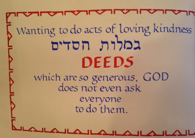
I also did a lot of
research on decorated letters and page borders. However, I decided to
only put a border on the middle pages, as they were the only pages
with just text and needed something to tie them together and be a
little more interesting to read, which is why the border design looks
inward. It was quite difficult to make the border design come out even
with the corner motif, it took a lot of precise measuring. Then I did
all the lines carefully with a ruling pen. The Hebrew letters were
done with a left handed cut mitchell nib and all the lettering was
done with stick ink. The front and back cover pages are a folded over
Japanese paper. The cover itself was a leftover piece of fabric that I
had and the gimel on the cover is a piece of cut out mat board that I
glued on before stretching the material over it. The inside book pages
were done on a printmaking paper called “incisioni”. It is a very soft
pinkish cream colored paper and nice to work on.
I am very
honored to have Reggie choose it for a pic-of-the week and so glad
that I included all that information in the colophon. I didn’t realize
what a great way it is to record useful and important information. |
 Video
Video