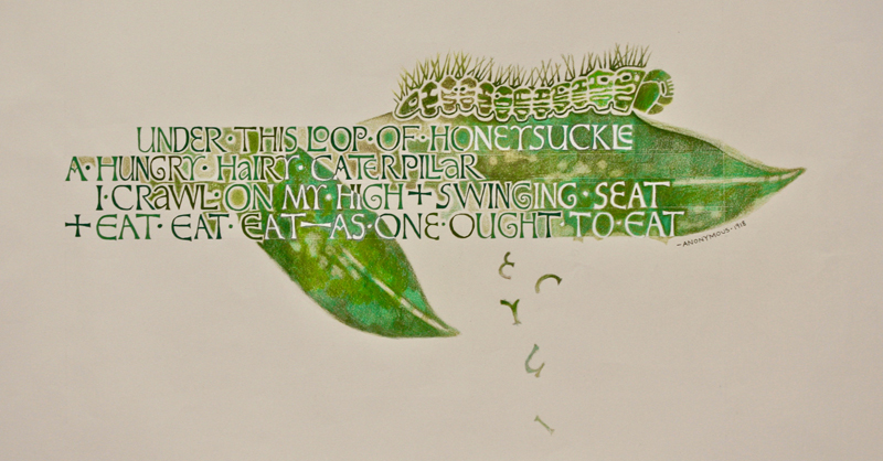
The idea for “Hungry Caterpillar” began with an
illustration I had drawn of a caterpillar in an old
sketchbook. I found a playful poem online and thought
this stanza would be perfect for an image of a
caterpillar munching on some leaves.
The calligraphy designs of
Marina Soria inspired me for this project. I
particularly like the way she emphasizes abstract shapes
between letters and thought it would give the impression
of the caterpillar chewing on leaves, creating holes
that become letters or the white spaces between them.
For the lettering, I thought David Jones’s variation on
Romans would give the piece a wonderfully quirky,
organic feeling. To create a sense of unity and prevent
needless distraction, I thought it was important to make
the piece monochromatic. Various shades of green—from
brightly saturated shades to duller tones —would also, I
believed, give my drawing a subtle, organic quality.
I started by drawing the letters in graphite on grid
paper and arranging the lines of text. I then
transferred the letters to Arches text paper by creating
a carbon with transfer paper. I created four shades of
green with gouache and drew the letters using a Mitchell
3 nib. A different shade of green was selected randomly
every few letters to enhance the organic feel. |
I then penciled in an outline of the leaves and
transferred the caterpillar design. As I colored in the
leaves with Prismacolor pencils, I changed my mind about
the color of some of the letters—deciding it would be
more interesting to have those letters appear as
negative shapes inside the leaves. So I painted over the
green with Dr. Martin’s bleedproof white directly on
top. Having pieces of letters oating down as if
partially eaten by the caterpillar also was a last
minute decision.
This was an important project for me because it
introduced me to the calligraphy of David Jones. I’m new
to calligraphy and working with nibs. His letterforms
seemed more forgiving and accessible to me. Although the
piece was a stretch, I approached it with a level of con
dence (no doubt aided by the hours of practice on
Romans). I really fell in love with the David Jones
variation on Romans during this project and de nitely
will use it in the future. |
